Description
| Status | Subtype | Assigned | Task | ||
|---|---|---|---|---|---|
| Resolved | Dbrant | T207338 [EPIC] Suggested edits V2 (Add/edit/translate image captions) | |||
| Resolved | cooltey | T224051 Add image captions in “Suggested edits” | |||
| Resolved | cooltey | T224500 Tweak gradient at bottom of cards (captions and descriptions) |
Event Timeline
Hi @schoenbaechler
Would the view be scrollable if it has the fading edge (gradient) on the bottom? For Android, when the view has a fading edge, it means that it is scrollable.
I had a PR of doing that, it the vertical scrolling action does not conflict the swiping action.
Hey Cooltey, I added some more screens to Zeplin:
https://app.zeplin.io/project/57a120b91998d8977642a238/dashboard?seid=5d00d9fe3fdadb5e16c90935
In general, I think truncating text like that does not necessarily indicate to the user that the view is scrollable. Would an approach like the one described below work?
- Stretch text field to bottom of the card (z-index: 1):
- At the bottom of the card, add an overlay (z-index: 2):
I’m having an equivalent in HTML/CSS in mind, which should work like that. But yeah, we both know it’s not quite same ;) Lets discuss it together!
Thanks @schoenbaechler, it looks good!
I can try this way and will let you see some screenshots after the works finished.
Hi @schoenbaechler, I've followed your suggestion to update the UI, and in a certain situation, it will have the text reaches the bottom to close. Not sure if it looks good to you.
Hey @cooltey, it’s already better than before 😍. How much control do we have over the gradient overlay? Can we make it, let’s say 48px high to add some kind of spacing at the bottom?
Hi @schoenbaechler, we can have full control of the gradient overlay.
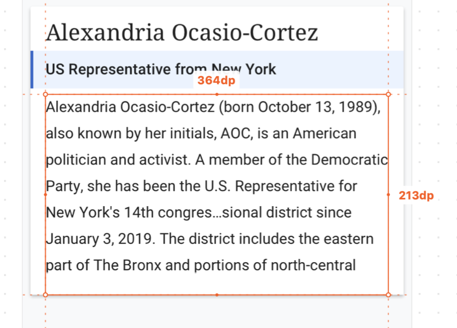
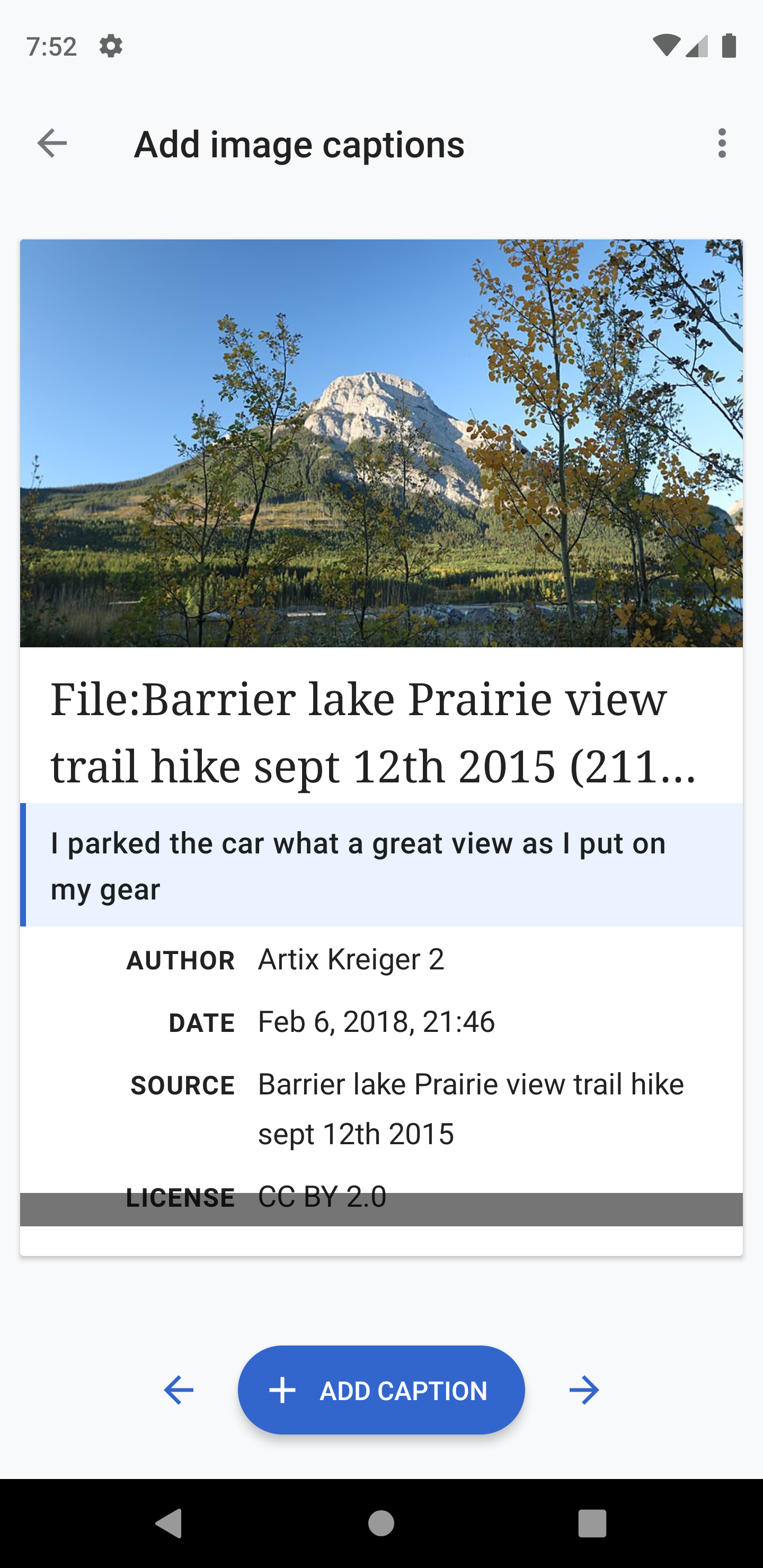
Card with truncated text
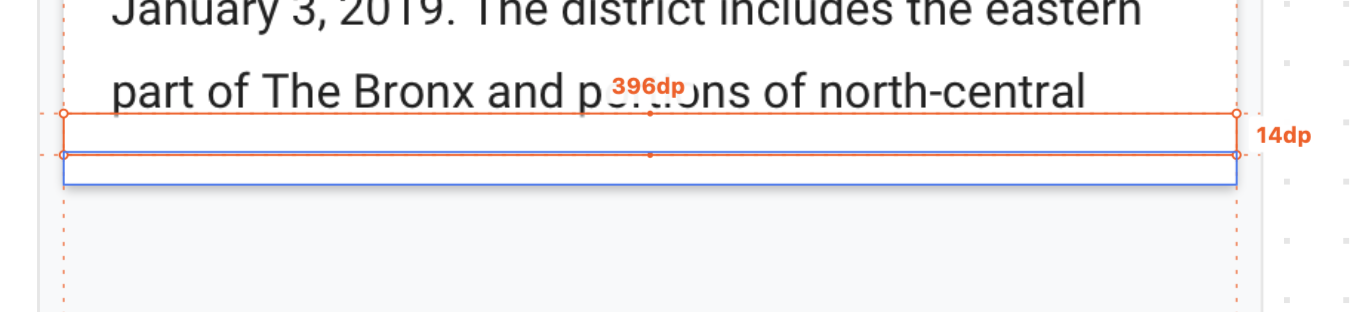
Card with no-truncated text
Hey @cooltey, do I understand correctly that both screenshots show the same gradient overlay in different situations? Is it 48px? If yes, I think it looks fine like that! Thx.
Not exactly 48px since we're using the dp.
The parent view which contains the extra or image summary has a 16dp bottom padding.
And, in the parent view, I insert the gradient view which has 24dp height with -6dp bottom margin so it can overlap the last sentence if the text reaches to the edge.
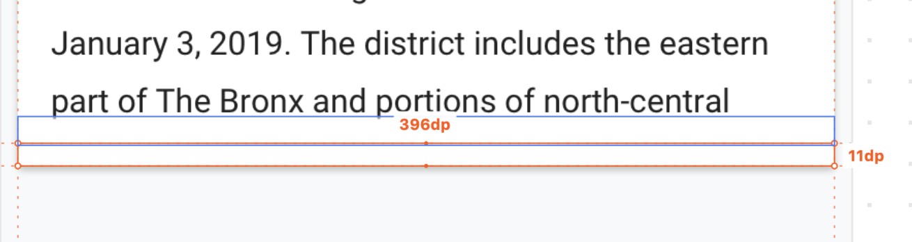
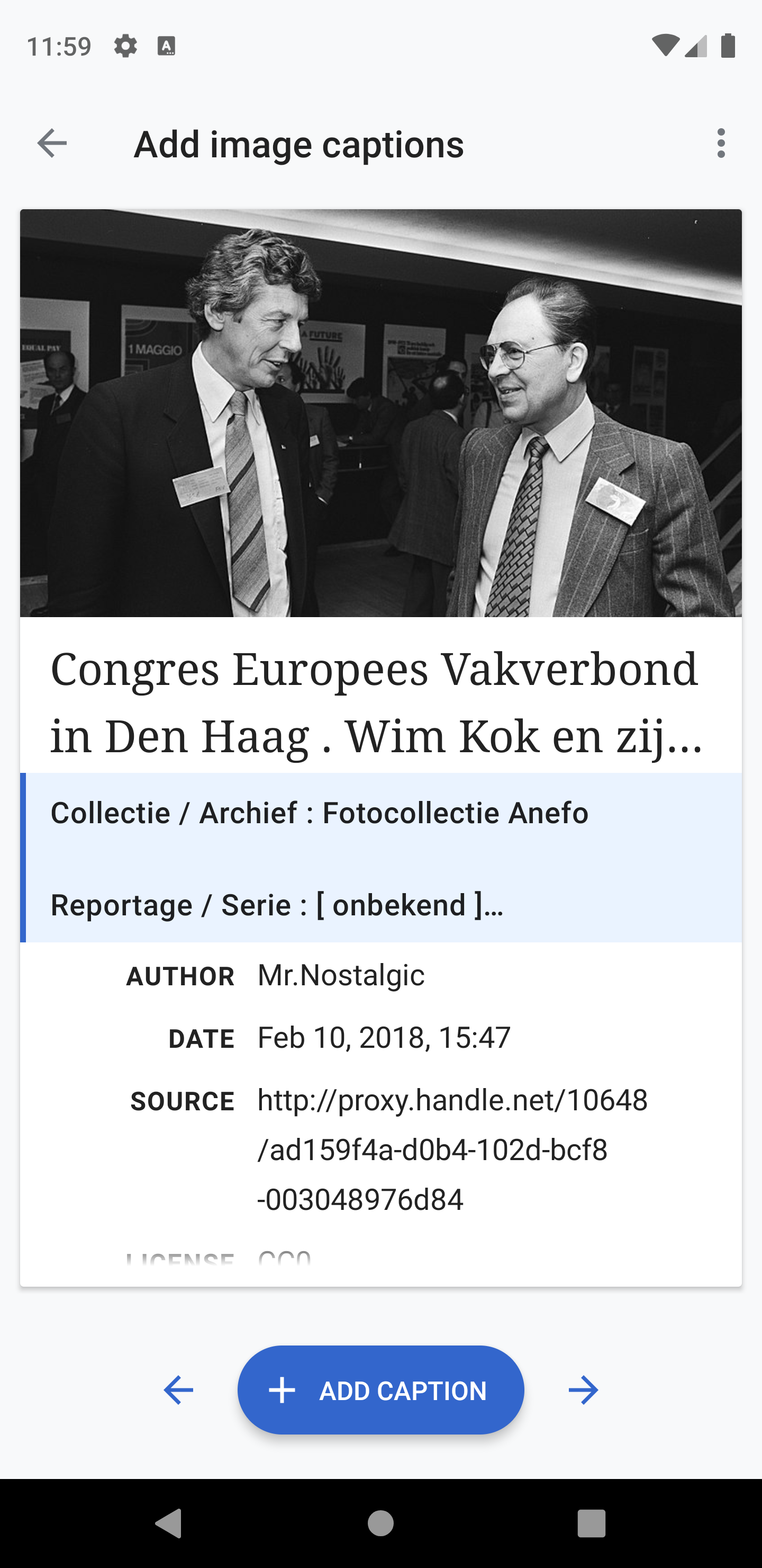
Hey @cooltey, there seems to be a difference in the gradient for labels and text:
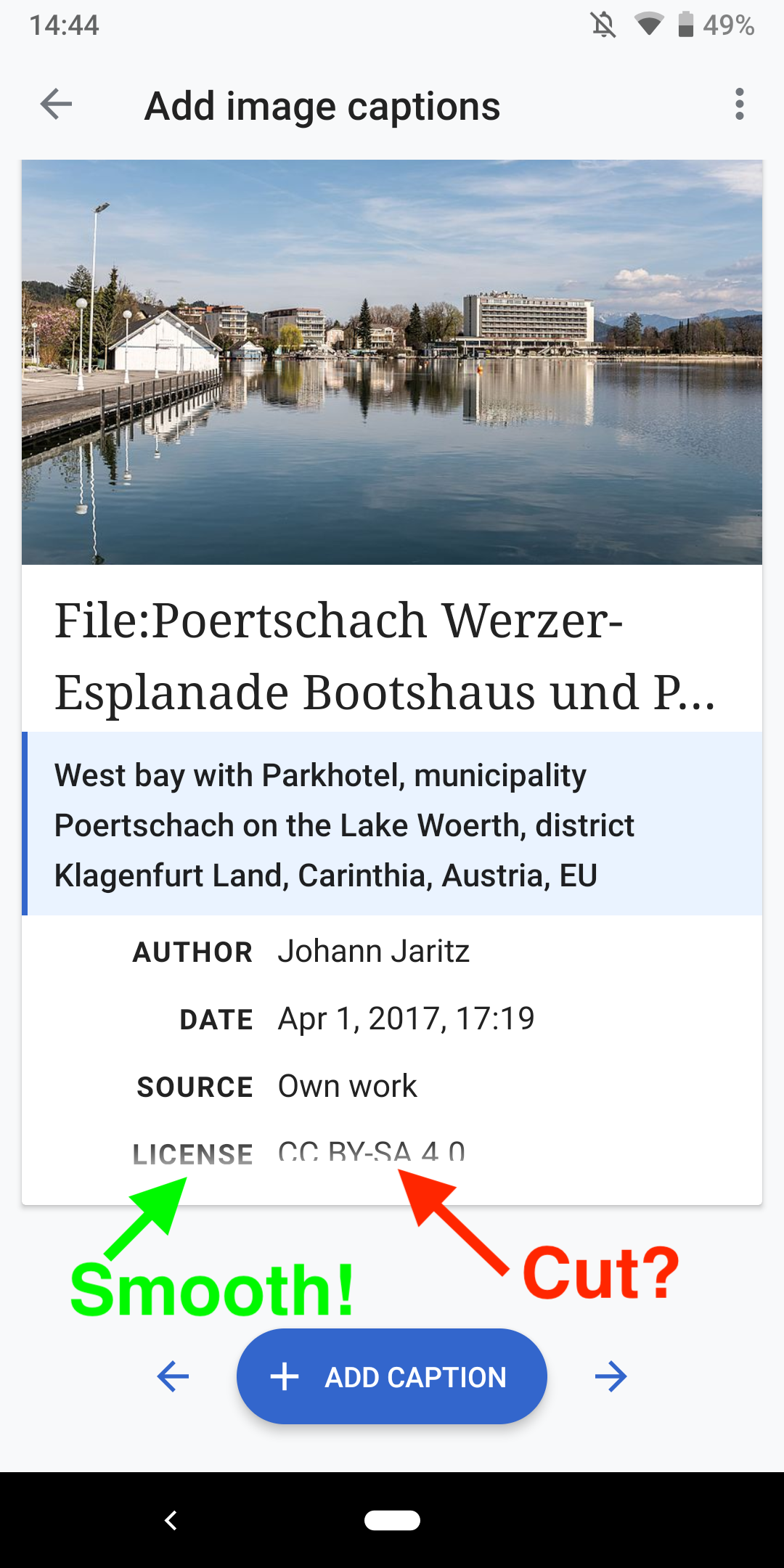
The text on the right is cut off (CC-BY-SA 4.0), whereas LICENSE has a smooth gradient. I like how it’s treated on the left (LICENSE), can you align the gradient so it’s consistent?
Hi @schoenbaechler
I cannot reproduce it. They are having the same gradient view on the bottom, and also the left (license) and right (CC-BY-SA 4.0) label view are in the same view group.
One thing I've noticed is that the lineSpacing for the left and right labels are not equal, maybe it causes the issue.
Will let you verify it again if https://github.com/wikimedia/apps-android-wikipedia/pull/413 gets merged.
Hey @schoenbaechler, the PR has been merged. Please check it again to see if it looks good to you.
Hey @cooltey, can we have a quick session and tweak the gradient together after standup? (sent an invite)
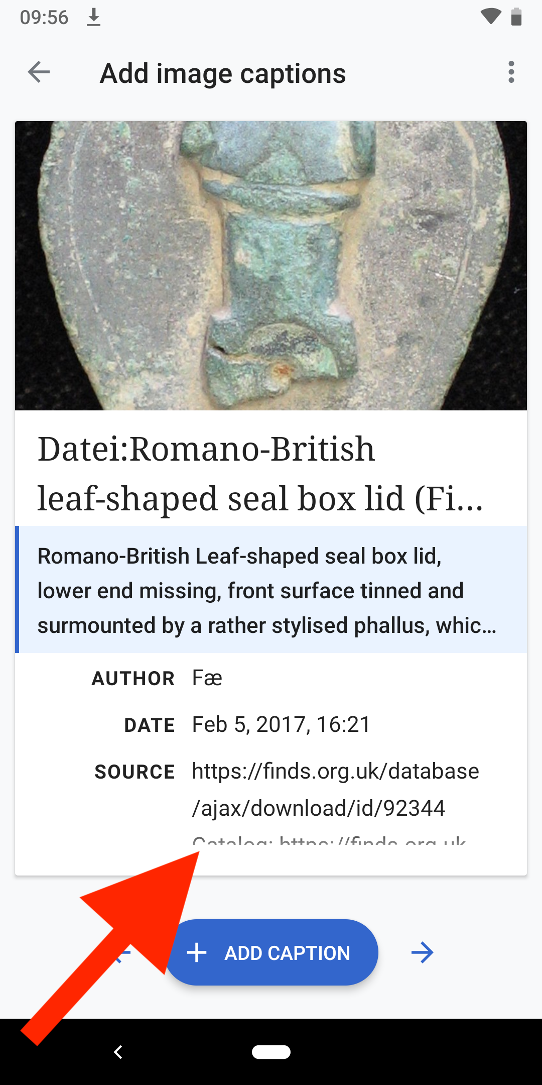
I feel like the text is still cut off too drastically in 2.7.50282-alpha-2019-06-28:
Thanks!
Hi @schoenbaechler.
I found a solution to implement the ScrollView with a great gradient bottom, and also make the ScrollView not be able to scroll. (kind of a hack way)
Please see the screenshots below and to see if they look good to you.

You can see it on the latest alpha once https://github.com/wikimedia/apps-android-wikipedia/pull/427 gets merged.
Hi @schoenbaechler.
The other PR made by @Dbrant has been merged, you now can see it on the latest alpha.
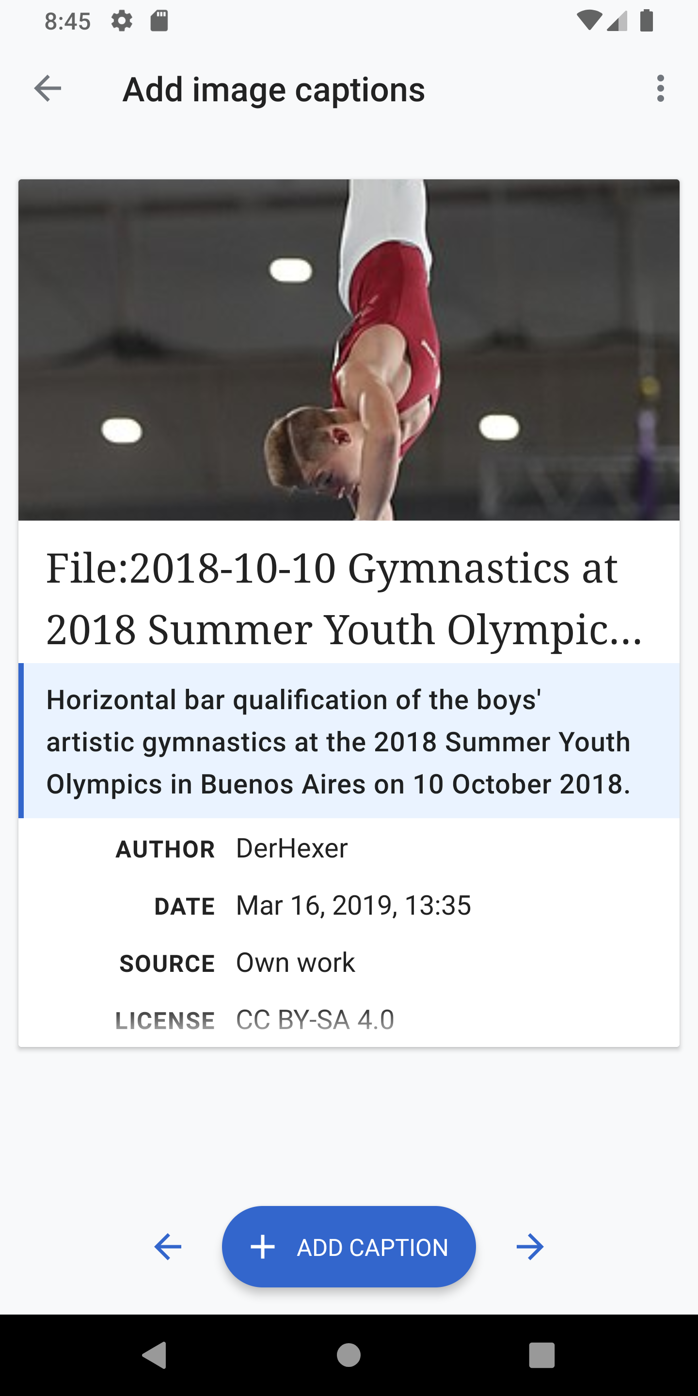
The card will be scrollable if the content is more than its height, and that makes more sense if the gradient bottom shows up.
Hey @cooltey and @Dbrant, you’ve managed to elegantly implement it, I’m impressed! 💯 I’ve just used the feed with the new behavior and it feels perfect! Did we finally crack the code for handling cards with more information? I think so!
May I ask, is this behavior applied in larger viewports (tablets) as well? Especially in landscape view it could be a great relief (https://phabricator.wikimedia.org/T225635#5299612).
Thanks!
@schoenbaechler
Yes, this behavior applied in larger viewports, portrait mode and landscape mode.
Looks good to me on 2.7.50282-alpha-2019-07-08 on tablet and phone, portrait and landscape