Page MenuHomePhabricator

Homepage: mobile start preview word length issues
Closed, ResolvedPublic

Description

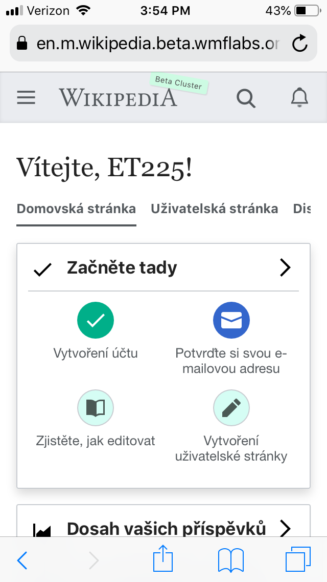
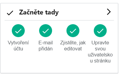
The full language to be displayed is: "Upravte svou uživatelskou stránku".

See screenshot (made in Chrome mobile simulation, with Galaxy S5). The last letter of "uživatelskou" wraps to the next line.

image.png (252×403 px, 20 KB)

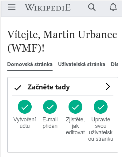
On iPhone 5/SE, it looks even worse:

image.png (511×397 px, 37 KB)

Honestly, not sure about a solution.

Related (from duplicate T225850):

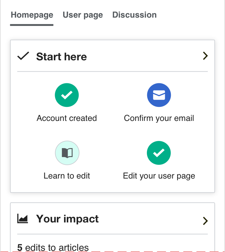
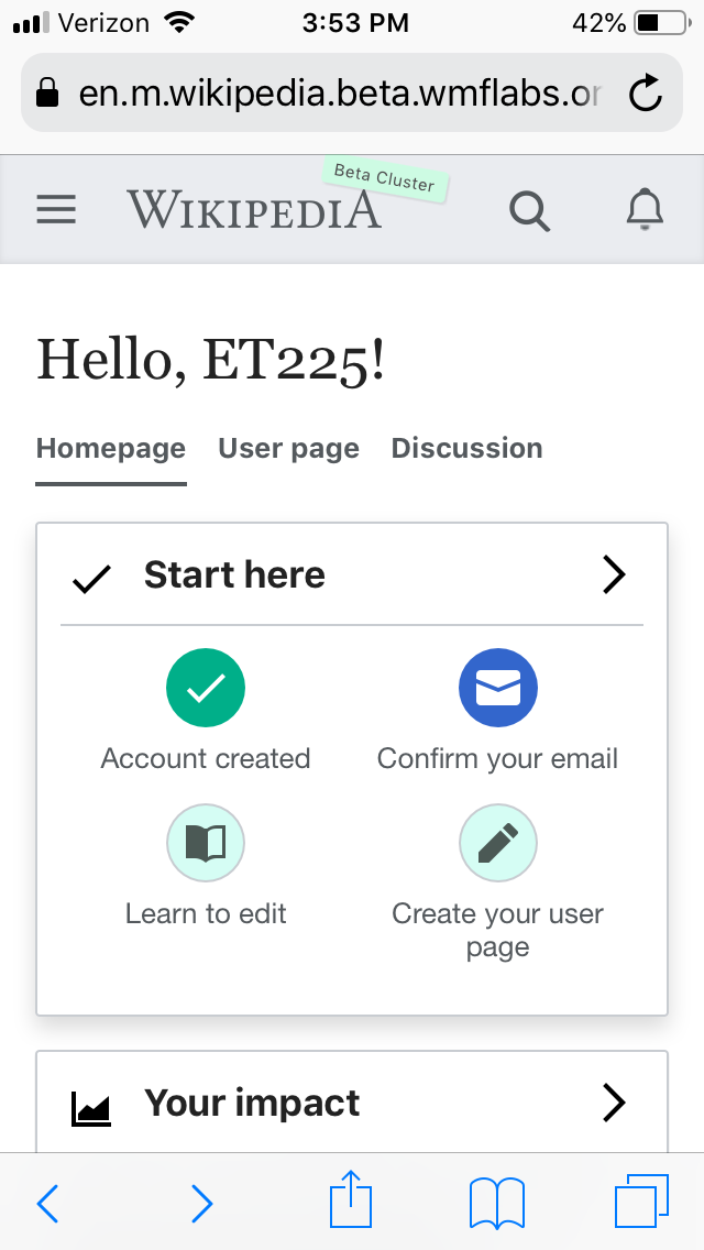
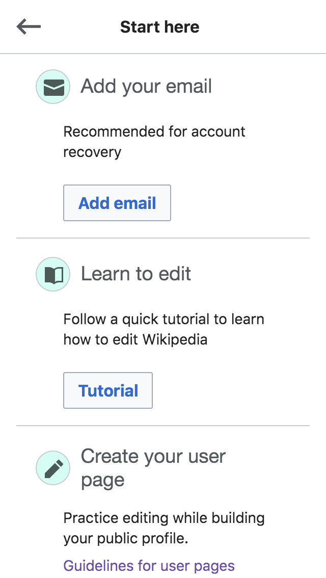
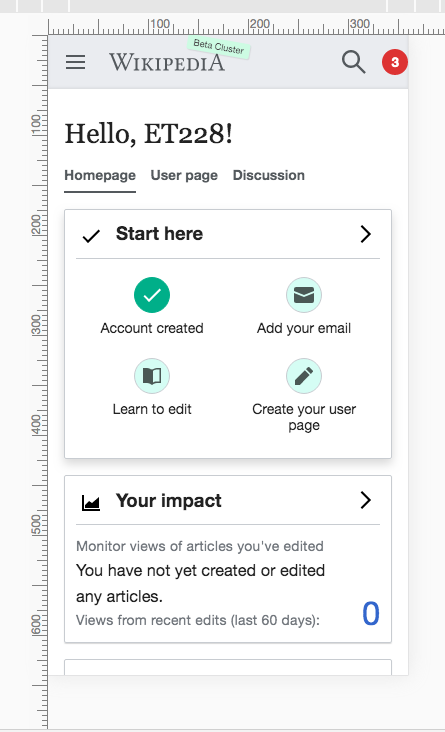
In the screenshot from the mobile homepage below, I see that the text of "Email added" and "Learn to edit" are so close together that they look one phrase.

IMG_7610.jpg (1×750 px, 130 KB)


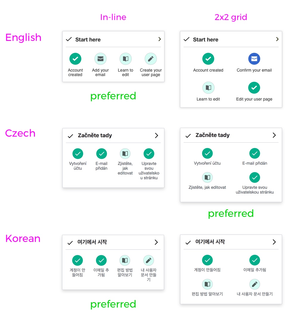
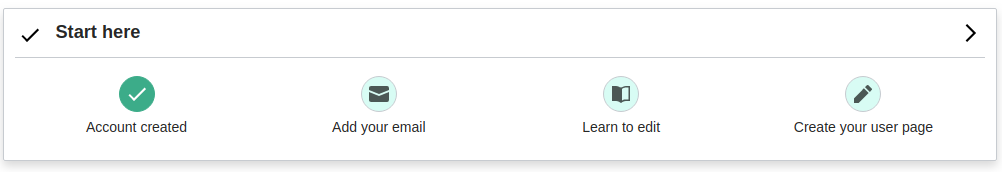
After some discussion we decided to tackle the issue with a layout change and wrap the start here submodules in order to always display a 2x2 grid on mobile homepage.

Screenshot 2019-07-03 13.03.30.png (578×644 px, 57 KB)

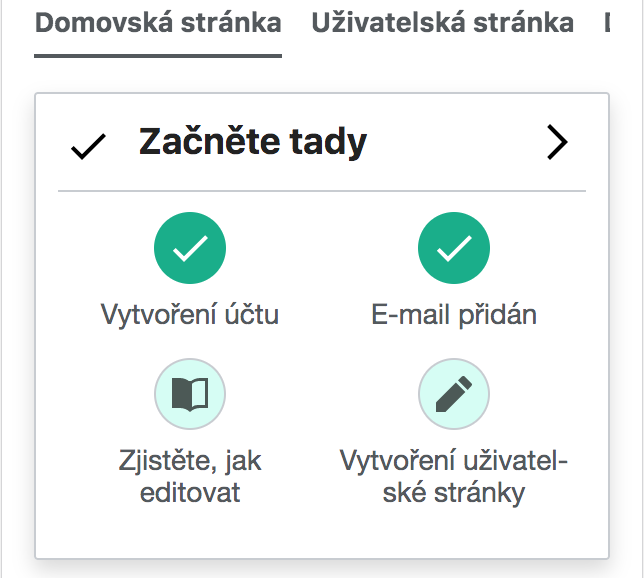
Note: This is not an optimal solution, as the mobile homepage layout doesn't generally benefit from the 2x2 grid design (it partly defeats the purpose of the layout itself, which is to show as much info as possible at first glance -- without scrolling). Nonetheless we think it's a good trade off to support translations.

Specifications

  • The submodules will be wrapped and displayed in a 2x2 grid.

Code proposals have been added in T227109#5303500

For padding and more precise sizing data, please refer to the update mockups in Zeplin.

Event Timeline

Restricted Application added a subscriber: Aklapper. · View Herald Transcript
MMiller_WMF renamed this task from [mobile homepage] One Czech word is too long to fit on one line in Getting started module to Homepage: Czech words too long for mobile start preview.Jul 2 2019, 4:49 PM
MMiller_WMF subscribed.

@Cntlsn -- could you please think about this one? I think we were worried something like this would happen. What do you recommend? I think we should consider this a high priority, though I'm not sure how many devices will have this issue. For instance, my iPhone 6S does not cause any words to wrap.

Personally it baffles me why one would design fixed-width containers when many human languages have compound words...

@Cntlsn -- could you please think about this one? I think we were worried something like this would happen. What do you recommend? I think we should consider this a high priority, though I'm not sure how many devices will have this issue. For instance, my iPhone 6S does not cause any words to wrap.

iPhone 6S is a slightly bigger device than the previous version, IIRC.

I guess on smaller screens, like iPhone 5/SE, we should rely on this previously proposed design:

Screenshot 2019-07-03 12.41.16.png (844×752 px, 71 KB)

@kostajh @SBisson @Catrope Maybe we could achieve that by wrapping the flex for the container, and re-setting the flex-basis with a media query?

.growthexperiments-homepage-module-start > .growthexperiments-homepage-module-body {
    display: flex;
    flex-wrap: wrap;
}
.growthexperiments-homepage-module-start.growthexperiments-homepage-module-mobile-summary > .growthexperiments-homepage-module-section-body .growthexperiments-homepage-module {
    flex-basis: 50%;
}

Also, I think I wrote it somewhere already, but it would be nice to add a bit of horizontal padding to the sub-modules.
Maybe something like:

Non-wrapped flex

.growthexperiments-homepage-module-start.growthexperiments-homepage-module-mobile-summary > .growthexperiments-homepage-module-section-body .growthexperiments-homepage-module {
    padding: 0 5px;
}
.growthexperiments-homepage-module-start.growthexperiments-homepage-module-mobile-summary > .growthexperiments-homepage-module-section-body .growthexperiments-homepage-module:first-of-type {
    padding-left: 0;
}
.growthexperiments-homepage-module-start.growthexperiments-homepage-module-mobile-summary > .growthexperiments-homepage-module-section-body .growthexperiments-homepage-module:last-of-type {
    padding-right: 0;
}

Wrapped flex

.growthexperiments-homepage-module-start.growthexperiments-homepage-module-mobile-summary > .growthexperiments-homepage-module-section-body .growthexperiments-homepage-module {
    padding: 0 5px;
}

Last but not least, while we're here @Urbanecm do you think hyphenating the text could generally help?

Screenshot 2019-07-03 13.03.30.png (578×644 px, 57 KB)

That eventually could be achieved with:

.growthexperiments-homepage-module-start.growthexperiments-homepage-module-mobile-summary > .growthexperiments-homepage-module-section-body .growthexperiments-homepage-module {
    overflow-wrap: break-word;
    word-wrap: break-word;
    hyphens: auto;
}

Hyphenating could be a solution, however, if there's a way how to make it displayed without hyphenating, I'd prefer that. Up to you through :).

MMiller_WMF renamed this task from Homepage: Czech words too long for mobile start preview to Homepage: mobile start preview word length issues.Jul 3 2019, 5:01 PM
MMiller_WMF updated the task description. (Show Details)

@Cntlsn -- if your proposal is to display in a 2x2 and to hyphenate text, that's fine with me.

I think the next thing is for engineers to weigh in? Or perhaps to put specifications in the description of the task.

Thanks @MMiller_WMF for your input.
@Catrope @kostajh @SBisson, before adding specs to the task description I'd love to hear your thoughts about what would be the best way to set a breakpoint to wrap the flex container. Specifically I'm wondering if we should just wrap when below a certain screen size, or if we can instead have a more sophisticated way to detect when it would be better to wrap (eg. longer words hyphenating). The reason I'm asking is that the issue would come up under certain conditions (==for certain languages), but not for others, whereas the 2x2 grid layout would actually not be the preferred option.

See for instance the difference in iPhone6 between english, czech and korean (unless we're also breaking korean words in the example below...):

Artboard.jpg (1×1 px, 148 KB)

I'm not aware of a (good) way to do what you're asking for, I think we'd just have to do a media query based on screen size. We could try to detect that the hyphenation is going to happen in JS (by briefly disabling word wrapping and measuring if that makes any of the labels overflow) and toggle the 2x2 grid based on that, but I think that's a bit excessive.

Thanks @Catrope for your input. I also couldn't come up with any good idea about it, but I wanted to ask just in case ;)

Alright, then I think that to be on the safe side we're gonna change our layout to 2x2 grid for all "mobile" sized devices.

Note: I have decided to avoid hyphenating as it is not used anywhere on wiki. The new layout adds double the space for each submodule, which should cover most translation cases. This decision could be revised in the future.

I will update the task description accordingly.

Change 520949 had a related patch set uploaded (by Catrope; owner: Catrope):
[mediawiki/extensions/GrowthExperiments@master] Homepage: Use 2x2 grid for mobile summary of start module

https://gerrit.wikimedia.org/r/520949

The attached patch creates a 2x2 grid using flex-basis (thanks for teaching me about that property, @Cntlsn) and adds 0.5em (=7px) of horizontal padding on both sides of each of the 4 grid squares.

@Cntlsn There's a lot of empty space if you rotate your phone horizontally or are viewing this on a larger screen "mobile" device (iPad etc); if that doesn't matter, we can merge @Catrope's patch.

@Cntlsn There's a lot of empty space if you rotate your phone horizontally or are viewing this on a larger screen "mobile" device (iPad etc); if that doesn't matter, we can merge @Catrope's patch.

Thanks @kostajh for your comment. Yes, sorry for not specifying this should be applied to portrait only. Landscape should always have enough real state for the submodules to be shown in the same row.

OK, so what should the viewport width threshold be? Do we have existing media queries to use as precedent?

@Catrope I didn't indicate any specific media queries because I'm not sure if and eventually which ones we are using at the moment.
My rule of thumb would be that all devices that load the *.m.wikipedia.org version of the site should get the 2x2 grid when on portrait mode. But actually I just noticed that also my iPad loads the *.m.wikipedia.org site (with some weird layout results...)

So, I would say that what falls below the iPhone6+/7+/8+/XS+ (portrait) breakpoint should get the 2x2 grid. This should also cover most Android devices as well (up to Pixel 2 XL tested on chrome simulator).
The media query could then be something like:

@media only screen and (max-width: 414px) and (orientation : portrait) {
  /* Styles */
}

All the devices within this screen size in landscape mode, and bigger devices in both portrait and landscape mode, should have enough real estate to display the submodules in one row, as pointed out by @kostajh above.

Edit: I have explicitly made the media query target max-width and not max-device-width as it seems it will be soon deprecated according to https://drafts.csswg.org/mediaqueries-4/#mf-deprecated

Change 520949 merged by jenkins-bot:
[mediawiki/extensions/GrowthExperiments@master] Homepage: Use 2x2 grid for mobile summary of start module

https://gerrit.wikimedia.org/r/520949

The screenshots are from iPhone 6S:

IMG_7985.PNG (1×640 px, 76 KB)
IMG_7986.PNG (1×640 px, 84 KB)

@Cntlsn just a note: with 2x2 grid on mobile homepage, the icons are spaced enough, so it's worth considering different links for each icons, i.e. clicking on 'Create your user page` should link to the exact place of 'User page' module, not at the top of the page.

Thanks @Etonkovidova, I think yours is a good point, as the new 2x2 layout makes the links to submodules look more "independent".

The reason why we didn't initially link to submodules is two-folded, on one hand it keeps consistency with the kind of interaction all other module previews are currently featuring, on the other hand the issue of tapping on "Create your user page" to land on the start module details and having to scroll to see the 'User page' module only happens on smaller screens (iPhone5 and similar sizes).

I think anchoring the links could be a good idea, but it would need a bit more thinking about the design of the module detailed view, to avoid situations like this:

Screenshot 2019-07-11 14.57.27.png (1×640 px, 95 KB)

(link is anchored to the 'Email' submodule, and it's hard to understand that there is another submodule above, unless the user scrolls up)

@MMiller_WMF If I remember correctly we have instrumented taps on submodules of the start module preview, so I would wait to get data about them before moving ahead with this enhancement.

@Cntlsn -- we have not instrumented which part of the start preview the user taps on, so we won't have that data. But I agree that it is probably a good enhancement. Could you please make a task for it, but not start to work on it? Just so we don't forget.

What's the outcome from your Design Review on this 2x2 work? Is it ready for PM Review?

@MMiller_WMF I will create a task for this. But also thinking that it would probably be worth it to try to get that data, or at least make a task about it in the next user testing about mobile homepage.

About reviewing the design, I think it could be worth fixing two small layout issues that currently make the module preview a little less readable and consistent:

  • Submodules should be more spaced out adding a bit of top margin. This would do the job:
.growthexperiments-homepage-module-start > .growthexperiments-homepage-module-body .growthexperiments-homepage-module-header {
    margin-top: .5em;
}
  • Submodule text should be colorGray2

Moving back into "Ready for development".

@Cntlsn Which of these things apply to the 2x2 layout, and which apply to both the 2x2 and 1x4 layouts? My guess is that the margin-top rule is only for 2x2 and the colorGray2 thing is for both both should apply to both, so I'll operate on that assumption, but let me know if that's wrong.

Change 523303 had a related patch set uploaded (by Catrope; owner: Catrope):
[mediawiki/extensions/GrowthExperiments@master] Homepage: Styling tweaks for start module mobile summary

https://gerrit.wikimedia.org/r/523303

This patch adds the top margin and changes the color as you requested, for both the 2x2 and 1x4 layouts.

Screenshot from 2019-07-15 13-44-34.png (172×1 px, 12 KB)

Screenshot from 2019-07-15 13-44-50.png (134×154 px, 7 KB)

@Catrope looks good thanks!

@MMiller_WMF I initially wrongly assumed we didn't display the mobile site to tablet users, but we actually do by default. The mobile homepage doesn't look particularly good on bigger tablets, mostly in landscape mode. Shall we address the issue and make it fit bigger screens?

Change 523303 merged by jenkins-bot:
[mediawiki/extensions/GrowthExperiments@master] Homepage: Styling tweaks for start module mobile summary

https://gerrit.wikimedia.org/r/523303

@Cntlsn -- could you post a screenshot of what it looks like on a tablet?

@MMiller_WMF
iPad (3rd gen) -- portrait

IMG_0121.jpg (2×1 px, 238 KB)

iPad (3rd gen) -- landscape

IMG_0122.jpg (1×2 px, 217 KB)

Thanks for the screenshots, @Cntlsn. I agree that it could look better on tablets, but I don't think it looks bad enough to address it. Since it's usable and since tablets are likely a small amount of traffic, I think we shouldn't worry about it.

@Etonkovidova -- this task is still open for you to verify.

@Cntlsn - if all look satisfactory to you, please move to PM Review column.
Posting the same screenshots (but bigger) as in https://phabricator.wikimedia.org/T227109#5334845 comment:

Screen Shot 2019-07-26 at 2.16.07 PM.png (732×445 px, 64 KB)

Screen Shot 2019-07-26 at 2.16.19 PM.png (693×1 px, 72 KB)

Looks good. Thank you!