This is a task about potentially enhancing the user experience of the start preview module on mobile.
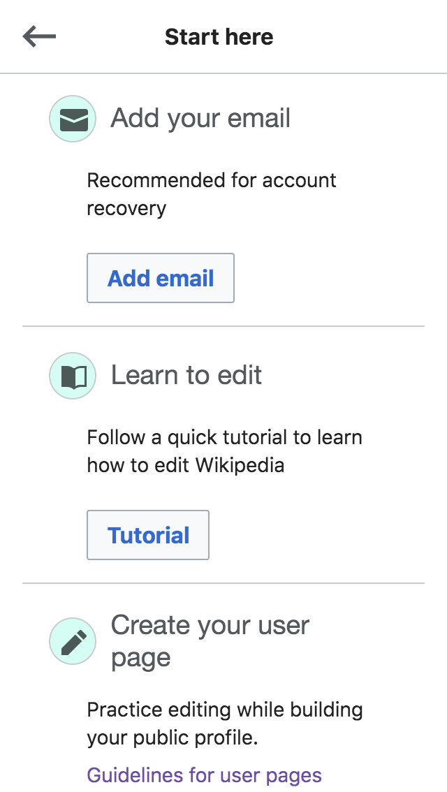
As noted by @Etonkovidova (at T227109#5322860) now that we moved the layout of the mobile start preview to a 2x2 grid, the icons are spaced enough to be tappable (and might look like they should be tappable). Also the links of the different icons should anchor to the respective submodules:
i.e. clicking on 'Create your user page` should link to the exact place of 'User page' module, not at the top of the page.
This behavior would need further design, as per @Cntlsn 's comment (T227109#5324277) this behavior could result in unwanted results:
link opens up the module details dialog anchored to the 'Email' submodule, and it's hard to understand that there is another submodule above, unless the user scrolls up.
It's also important to note:
- no other mobile module preview features separated links, and preview would act like a card linking to the module details screen.
- we are currently not gathering data about users tapping single icons in start module preview, so we can only assume it could be a desired feature.