User story
As a Commons uploader, I want to be able to understand where one Statement begins and one ends, so that I can ensure I'm adding the right metadata in the right place.
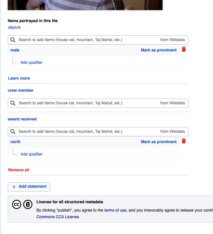
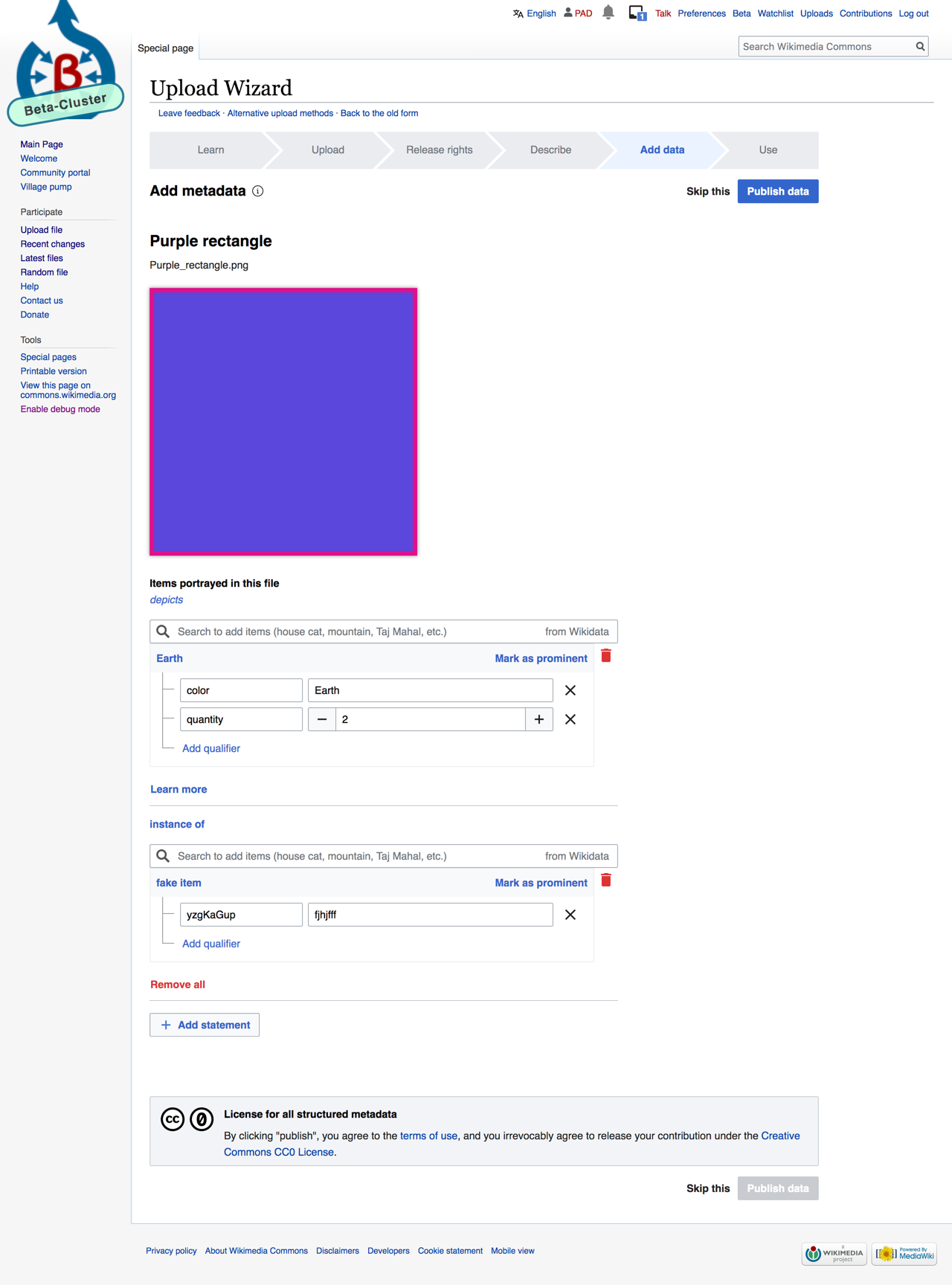
We have this
Currently there is little visual differentiation between each statement, and the "Add statement" button is too close to the CC0 license message.
We want this
There needs to be a 1px horizontal divider (C8CCD1) between each statement on UW to differentiate one statement from the next, and there needs to be more spacing in between the "Add statement" button and the CC0 message. Follow how statements & the "Add statement" button are already laid out on the File Page for guidance:
- 16 px between statements
- 80 px between the "Add statement" button and the category bar

Examples:
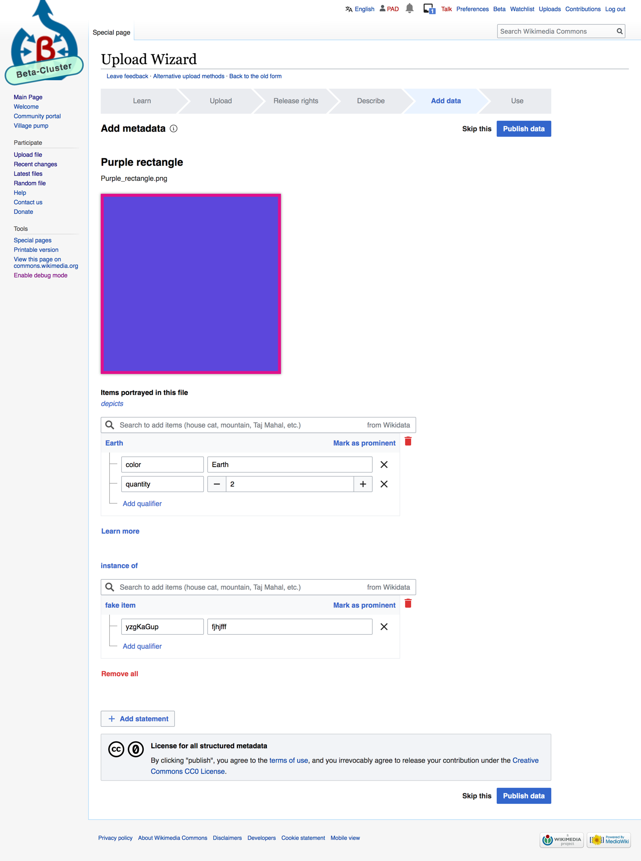
- A horizontal line dividing Depicts and the "Add statement" button:
- Horizontal line between Depicts and the flow for adding a new statement:
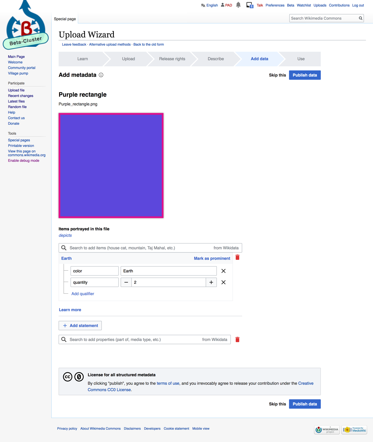
- Horizontal lines dividing statements, as well as the "Add statement" button:
Acceptance Criteria:
- A 1 px horizontal line (C8CCD1) dividing statements, including between statements and the "Add statement" button
- Spacing between statements themselves as well as between the "Add statement" button and the CC0 messaging, should be the same (or similar) as the spacing on FP