Page MenuHomePhabricator

[Bug] iPadOS 13 shows the desktop version of Safari with a broken layout
Closed, ResolvedPublicBUG REPORT

Description

Steps to reproduce

  1. Install iPadOS 13 through the beta program or by installing Xcode 11 beta and running the iPadOS 13 simulator
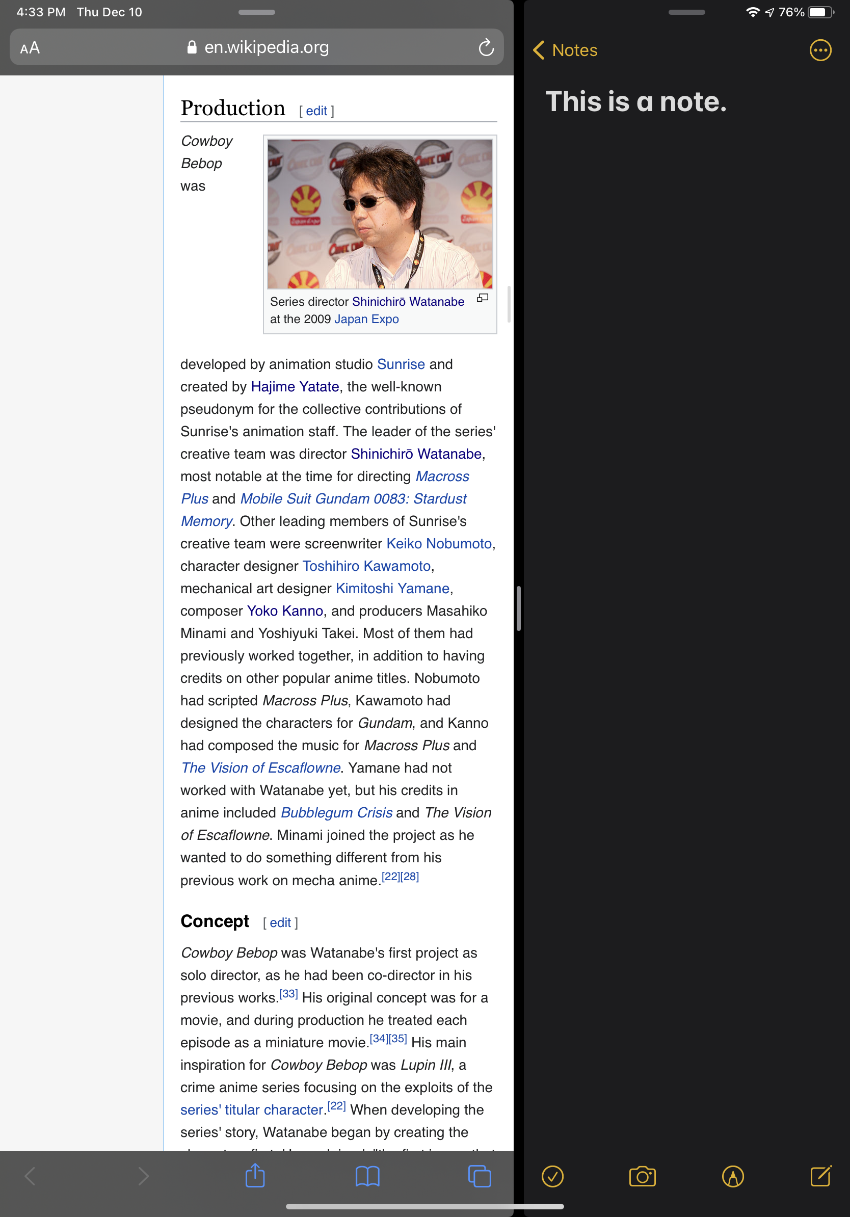
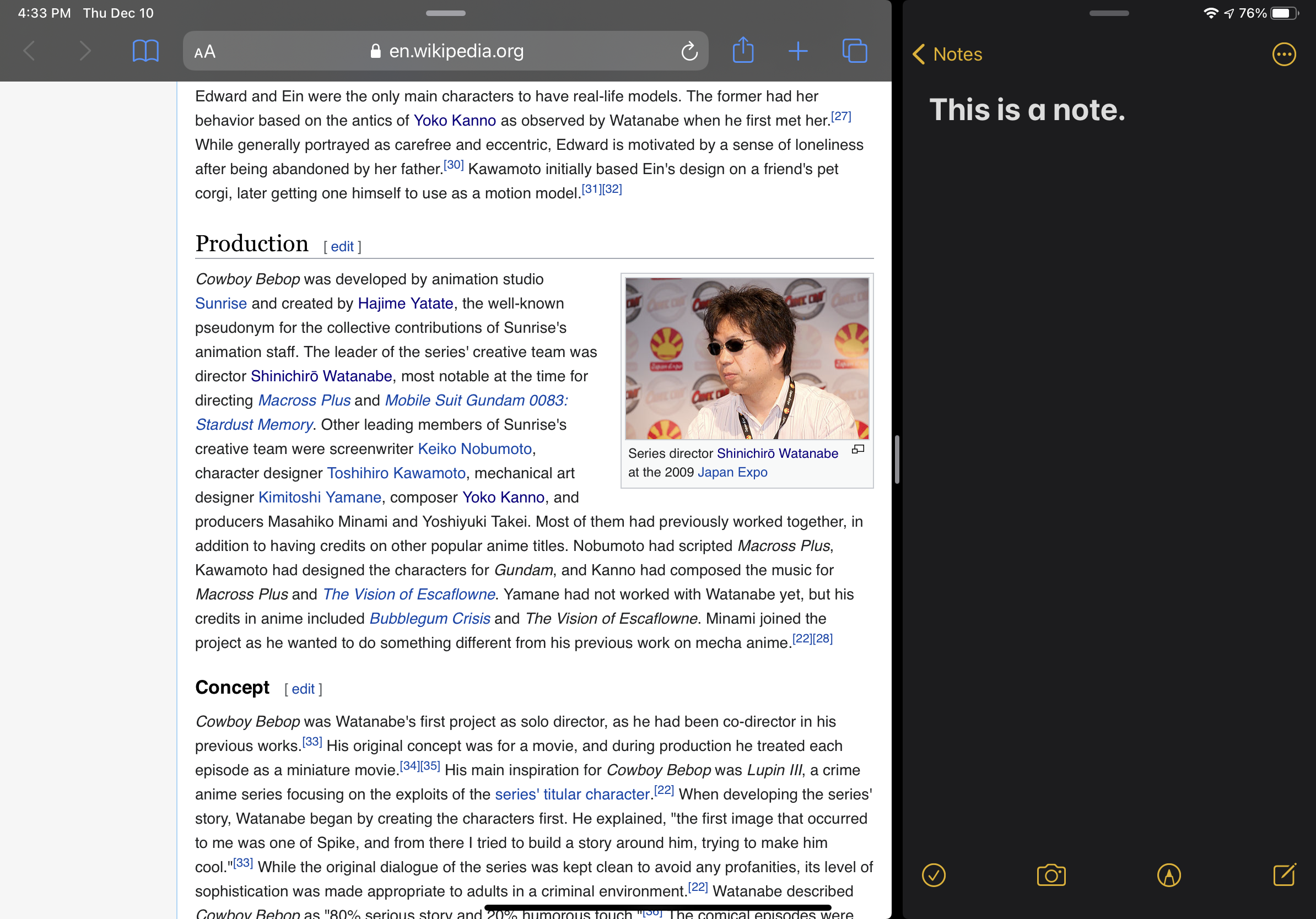
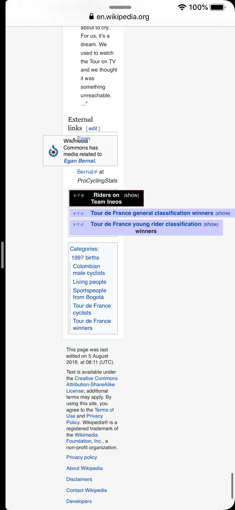
  2. Open any Wikipedia article in Safari
  3. Resize the Safari window by opening another app in split screen

Expected results

TBD (show the mobile site?)

Actual results

The desktop version shows with a broken layout

Simulator Screen Shot - iPad Pro (11-inch) - 2019-08-05 at 14.45.18.png (1×2 px, 1 MB)

Simulator Screen Shot - iPad Pro (11-inch) - 2019-08-05 at 14.42.37.png (1×2 px, 1 MB)

Environments observed

  • OS version: iPadOS 13
  • Device model: iPad (6th generation)
  • Device language: en

Notes

iPadOS now sends Mozilla/5.0 (Macintosh; Intel Mac OS X 10_15) AppleWebKit/605.1.15 (KHTML, like Gecko) Version/13.0 Safari/605.1.15 as the User-Agent from Safari if the page is loaded while the window is wide enough. If the page is loaded with a narrow window, it sends Mozilla/5.0 (iPad; CPU OS 13_0 like Mac OS X) AppleWebKit/605.1.15 (KHTML, like Gecko) Version/13.0 Mobile/15E148 Safari/604.1. The problem occurs when Wikipedia is loaded fullscreen and resized to be narrow.

The width seems to be set by the widest item on the page:

Simulator Screen Shot - iPad Pro (11-inch) - 2019-08-05 at 15.55.00.png (1×768 px, 181 KB)

Adding <meta name="viewport" content="width=device-width, user-scalable=no, initial-scale=1, shrink-to-fit=no"> prevents this scaling. More info: https://developer.apple.com/videos/play/wwdc2019/203/

Event Timeline

ovasileva triaged this task as Medium priority.Aug 5 2019, 11:04 PM
Jdlrobson added a project: Traffic.
Jdlrobson subscribed.

We shouldn't add <meta name="viewport" content="width=device-width, user-scalable=no, initial-scale=1, shrink-to-fit=no"> to Vector. When Monobook did that it annoyed a lot of people and I wouldn't advise it as it seems many users use Vector on their mobile devices exactly because they don't want a responsive layout.

Varnish determines when to show or not show the mobile website and that's purely based on user agent and this is out of the teams expertise and will require syncing with ops. However, the user agent iPadOS sends is not a mobile URL, so if iPadOS wants to be recognised as desktop that's going to be impossible to change.

I'm thus not sure what to do with this ticket. What would you recommend Sam?

Not sure if you or Sam would be best placed to work out what to do with this. Talking to Operations > Traffic and/or Apple would be useful.

We shouldn't add <meta name="viewport" content="width=device-width, user-scalable=no, initial-scale=1, shrink-to-fit=no"> to Vector. When Monobook did that it annoyed a lot of people and I wouldn't advise it as it seems many users use Vector on their mobile devices exactly because they don't want a responsive layout.

Do you have a link and/or do you remember where this annoyance was voiced?

https://de.wikipedia.org/w/index.php?title=Wikipedia:Fragen_zur_Wikipedia&oldid=178125403#Merkw%C3%BCrdige_Seitendarstellung

Varnish determines when to show or not show the mobile website and that's purely based on user agent and this is out of the teams expertise and will require syncing with ops.

Yes and no. The mobile_redirect subroutine is fairly simple (see https://github.com/wikimedia/puppet/blob/dd8b6a8339bdc6b389c794b0e7ad5f4338d30194/modules/varnish/templates/text-frontend.inc.vcl.erb#L27).

However, the user agent iPadOS sends is not a mobile [one], so if iPadOS wants to be recognised as desktop that's going to be impossible to change.

This. Ignoring minor version numbers, that UA is the same as mine (Safari 12.1.2 on macOS Mojave 10.14.6). Unless we want to redirect ALL such UAs to the mobile site, then UA sniffing won't work here.

@ovasileva okay to redirect Safari desktop to mdot?

CC @DStrine @mepps @Ejegg @BBlack

@dr0ptp4kt - I would be more comfortable with making a request to Apple on redirecting iPad OS to Safari mobile. I think redirecting to the mobile domain on Safari desktop would have negative consequences to editors using Safari, which we would like to avoid if possible.

@ovasileva okay to redirect Safari desktop to mdot?

CC @DStrine @mepps @Ejegg @BBlack

@dr0ptp4kt Thanks!!! As far as I can tell, regardless of how this is resolved, there are no significant short- or medium-term implications for CentralNotice or Fundraising.

(The only possible immediate impact, I think, is in the statistics for banner impressions on iPads vs. desktop, but there's nothing we could do about that. And, I guess, banners not showing up properly on a broken layout, if the issue isn't solved and a lot of users experience breakage...)

In the longer term, we do need to think about responsive design for banners, and how CentralNotice and Advancement banners (like the little reminders that follow you around as you scroll) will fit in with the desktop refresh.

In the longer term, we do need to think about responsive design for banners, and how CentralNotice and Advancement banners (like the little reminders that follow you around as you scroll) will fit in with the desktop refresh.

+1 on this. We should discuss once we're a bit further along on the project.

@cchen copying you in for visibility. iPad iOS 13 is a desktop UA, in case that's useful info in other contexts.

Adding a note. in iPadOS 14 the behavior appears to be different from what is described in the description. The content appears to work well in the desktop layout (skinny viewport limitations withstanding). While Apple has not released updated adoption rates since iPadOS 14 was released in September, this report indicates a 70% adoption rate of iPadOS 14.

This is a note.png (1×2 px, 578 KB)

Cowboy Bebop - Wikipedia.png (2×1 px, 915 KB)

Cowboy Bebop - Wikipediaeee.png (1×2 px, 987 KB)

I was able to reproduce the new behavior observed by @Ckoerner on a number of articles on enwiki. Additionally, it seems if one shrinks the Safari window as narrowly as possible the UA is changed so one gets mdot. I was the one who originally reported the bug to Joe. Closing.