Hi, I don't like new icons for notifications on mobile web.
The bell looks very ugly. Previous bell looked better.
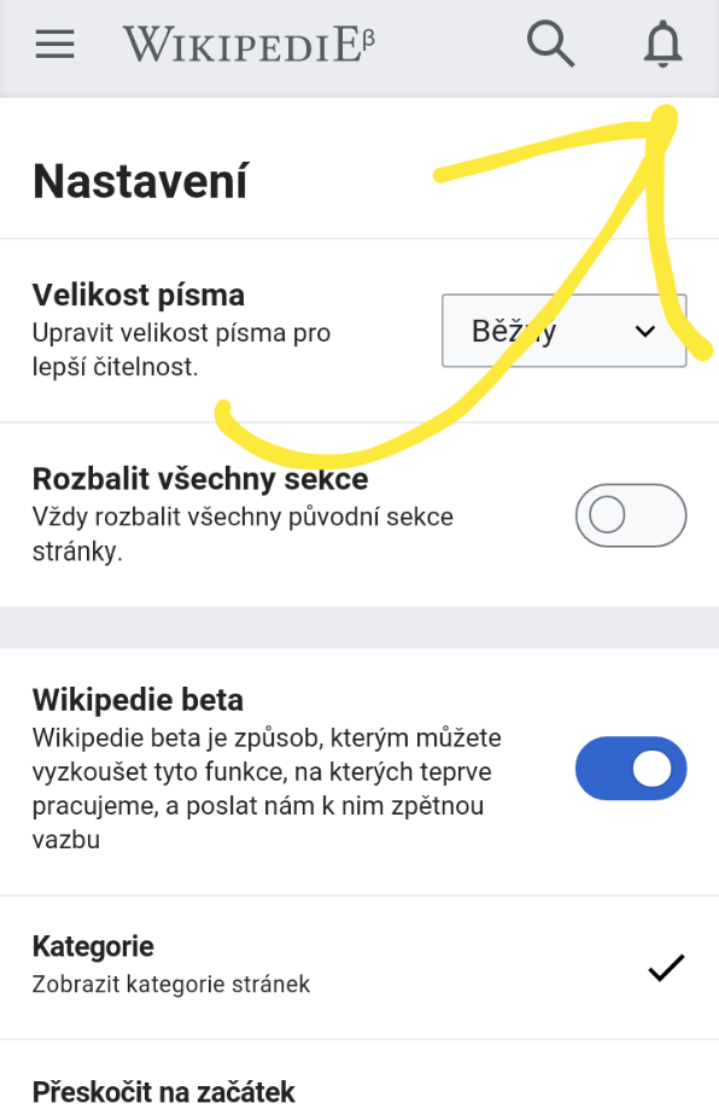
Circle cannot be seen completely. It does not look good.

| Patriccck | |
| Aug 6 2019, 6:48 AM |
| F30117318: IMG_3011.PNG | |
| Aug 26 2019, 2:59 PM |
| F30117319: IMG_3012.PNG | |
| Aug 26 2019, 2:59 PM |
| F30009184: Screenshot_20190812-110434_Chrome.jpg | |
| Aug 12 2019, 6:05 PM |
| F30009185: Screenshot_20190812-110424_Chrome.jpg | |
| Aug 12 2019, 6:05 PM |
| F29974675: 20190806_083712.png | |
| Aug 6 2019, 6:48 AM |
| F29974679: 20190806_083908.png | |
| Aug 6 2019, 6:48 AM |
| F29974677: 20190806_083854.png | |
| Aug 6 2019, 6:48 AM |
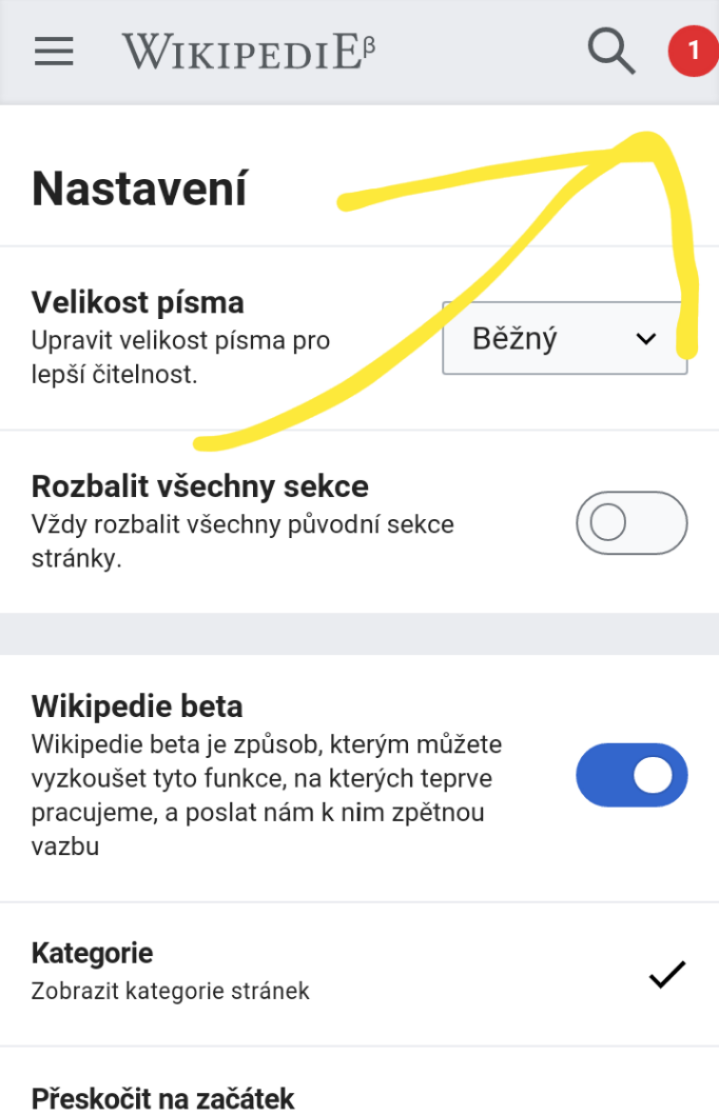
Hi, I don't like new icons for notifications on mobile web.
The bell looks very ugly. Previous bell looked better.
Circle cannot be seen completely. It does not look good.
"I like red better than blue" about the bell icon is not actionable so I've changed the task summary to focus on the non-round circle plus added a code project tag.
Circle cannot be seen completely. It does not look good.
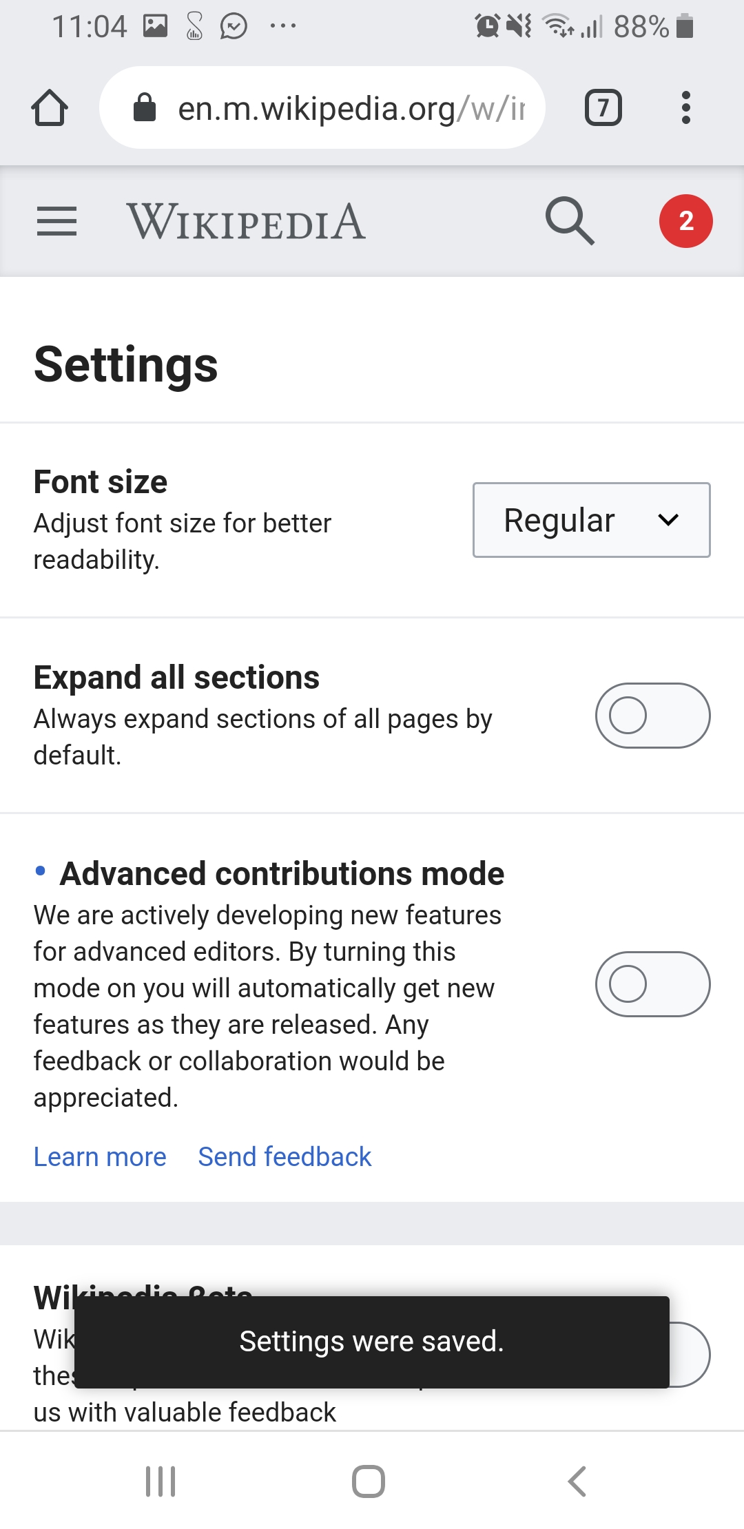
The roundness and the proximity to the screen is fixed on https://en.m.wikipedia.beta.wmflabs.org/wiki/Spain already and will be on all wikis by Thursday.
@alexhollender I think this can be resolved but I wanted to make sure this feedback got to you.
Thank you and sorry for the confusion. The screenshots seemed like the Android app to me. Apologies.
Removing Charlotte as they removed themselves in a couple of posts above (T229902#5395537).
@Jdlrobson thanks for the ping. Did we QA this on beta? Can you provide a screenshot to confirm it's fixed?