ON 2.7.50287-alpha-2019-08-13
Steps:
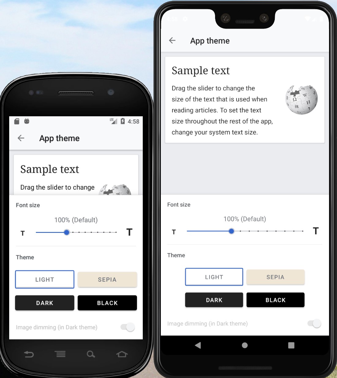
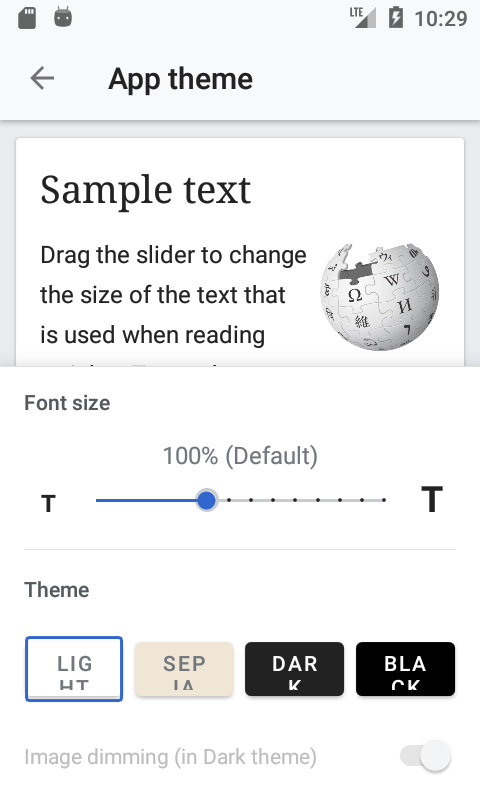
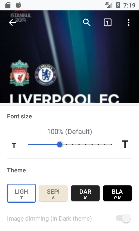
- Go to settings, App theme
Expected:
Buttons appear normally
Actual:
The text does not fit on one line
Note - Tested on Pixel on Android 9 and Vive on Android 6
| ABorbaWMF | |
| Aug 13 2019, 7:40 PM |
| F30042700: 註解 2019-08-16 095906.jpg | |
| Aug 16 2019, 5:01 PM |
| F30041084: Screenshot_1565896751.png | |
| Aug 15 2019, 7:38 PM |
| F30041082: Screenshot_1565896765.png | |
| Aug 15 2019, 7:38 PM |
| F30041108: Screenshot_20190815-122630.png | |
| Aug 15 2019, 7:38 PM |
| F30022258: Screenshot_1565735370.png | |
| Aug 13 2019, 10:30 PM |
| F30020265: Screenshot_20190813-122724.png | |
| Aug 13 2019, 7:40 PM |
| F30020264: Screenshot_20190813-121857.png | |
| Aug 13 2019, 7:40 PM |
ON 2.7.50287-alpha-2019-08-13
Steps:
Expected:
Buttons appear normally
Actual:
The text does not fit on one line
Note - Tested on Pixel on Android 9 and Vive on Android 6
Oh dear. The naive solution - scaling the button text to match the available area - might not actually make these more readable on small screens. @schoenbaechler, have a think - perhaps we want to stack the buttons on small screens, for example.
Yes @Charlotte, let’s arrange them in a 2x2 grid when space is not sufficient (e.g. below a viewport width of 360px):
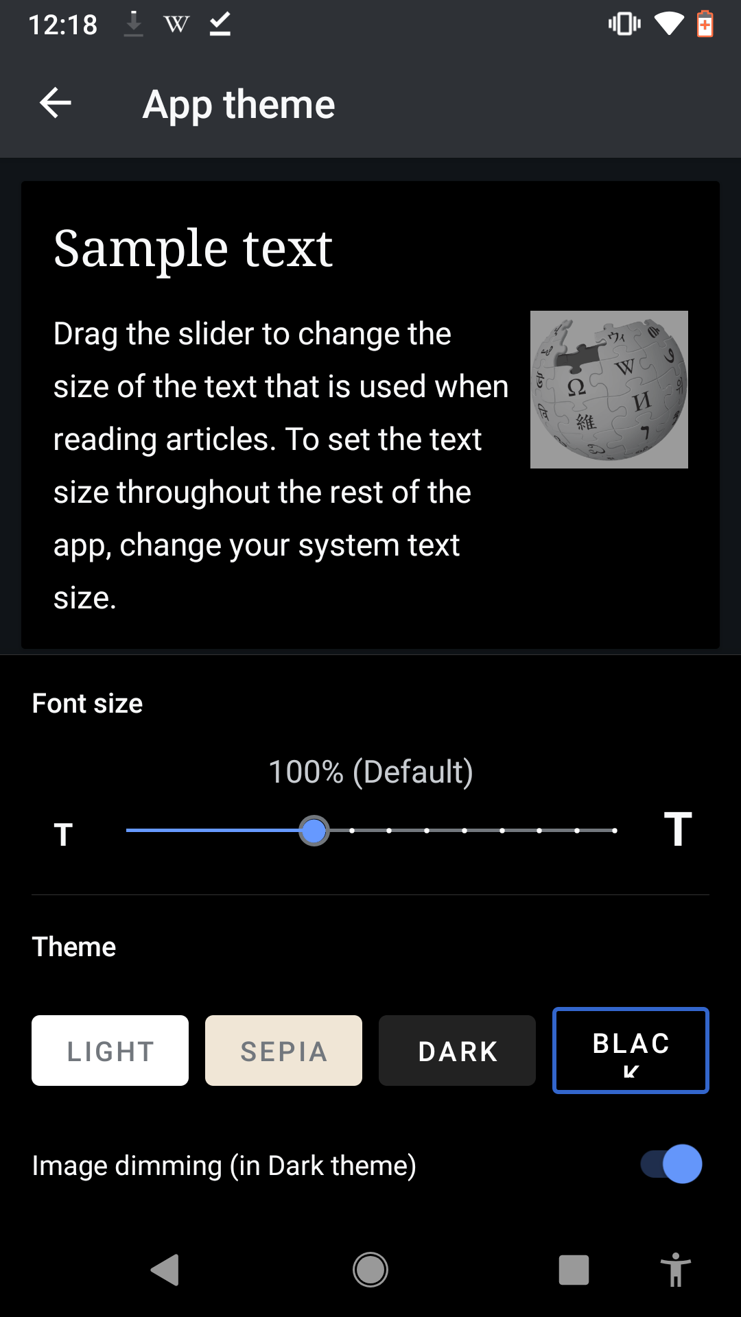
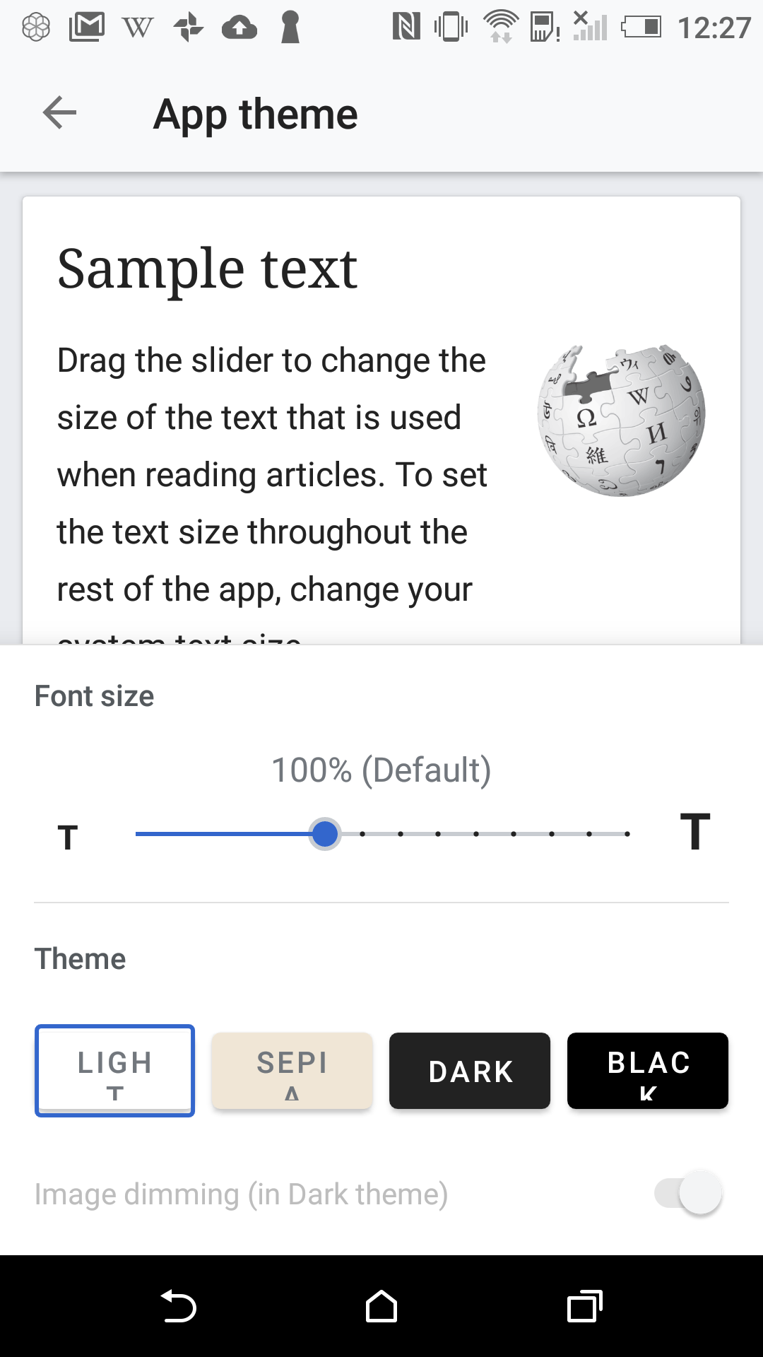
| LIGHT | SEPIA |
| DARK | BLACK |
Thanks @cooltey
Hi @Charlotte and @schoenbaechler
Yes @Charlotte, let’s arrange them in a 2x2 grid when space is not sufficient (e.g. below a viewport width of 360px):
I am not sure about the 2x2 grid that bases on the device's resolution since it requires another layout to do it. (and maybe a little code to check it)
Since the 480x800 is a pretty old resolution device (~5 years ago), and I think that would be a low usage for now.
This is the screenshot of the previous version that uses the old app button component and shows the same results as now.
Here's the screenshot that I think it might be a solution for this if the device has a low resolution.

and, we can change the font size to 12sp and it would solve the issue that Anthony found.

Hi @cooltey, reducing font size to 12sp below a certain resolution is a passable way to solve this. At which resolution (breakpoint) would you apply it? I estimate that we should apply 12sp below 360dp. In CSS, that would look like this:
// default font-size
.button {
	font-size: 14sp;
}

// size on smaller screens
@media screen and (max-width: 360dp) {
	.button {
		font-size: 12sp;
	}
}
Not sure if you can apply something like that? I don’t recommend to globally use 12sp for these buttons as it’s too hard to read (too small). In regards to truncating it, not the best solution but if we’re applying 12sp then it’s ok as this would only occur on tiny device widths.
Hi @schoenbaechler
As we discussed on Slack, we will use 2x2 grid buttons with a 300dp width each row globally, for now.
And, here is the screenshot of how it looks at 480x800 and 1440x2960 emulators: