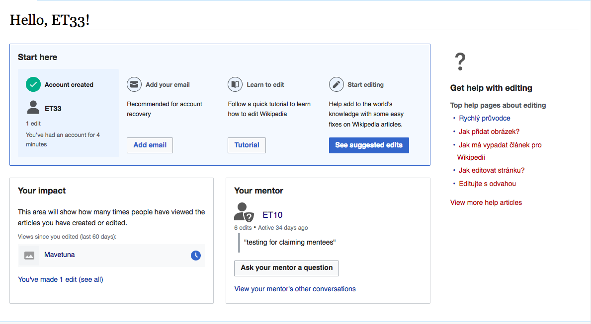
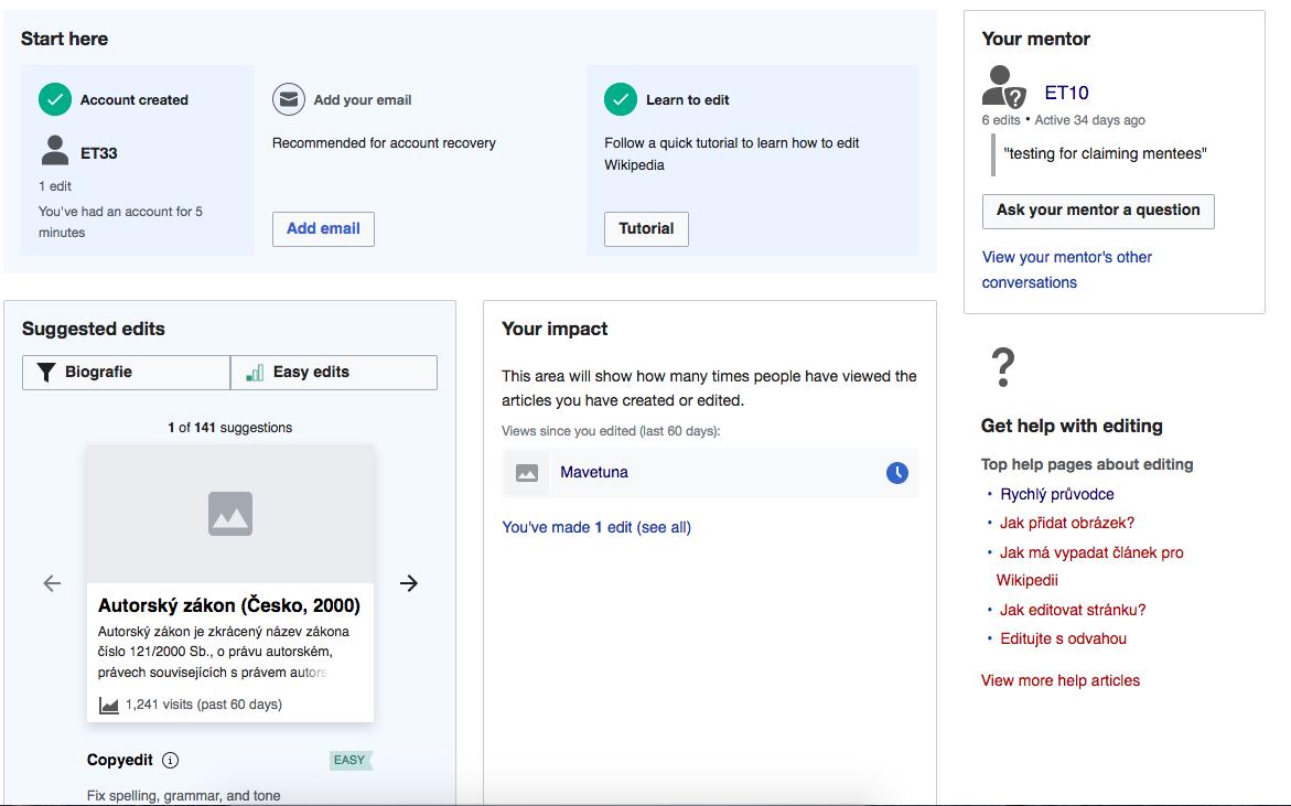
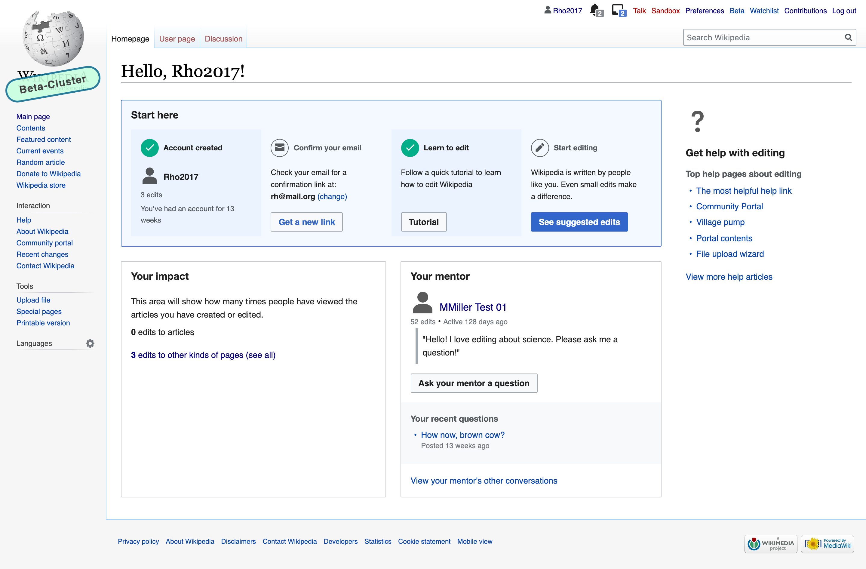
In mockups for the newcomer tasks project, we started exploring some changes to the styling of homepage modules. That is shown in this mockup and in the image below.
Before SE added 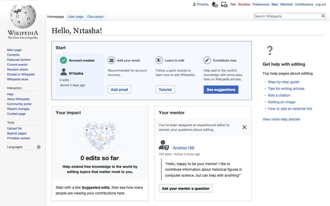 | After SE added: 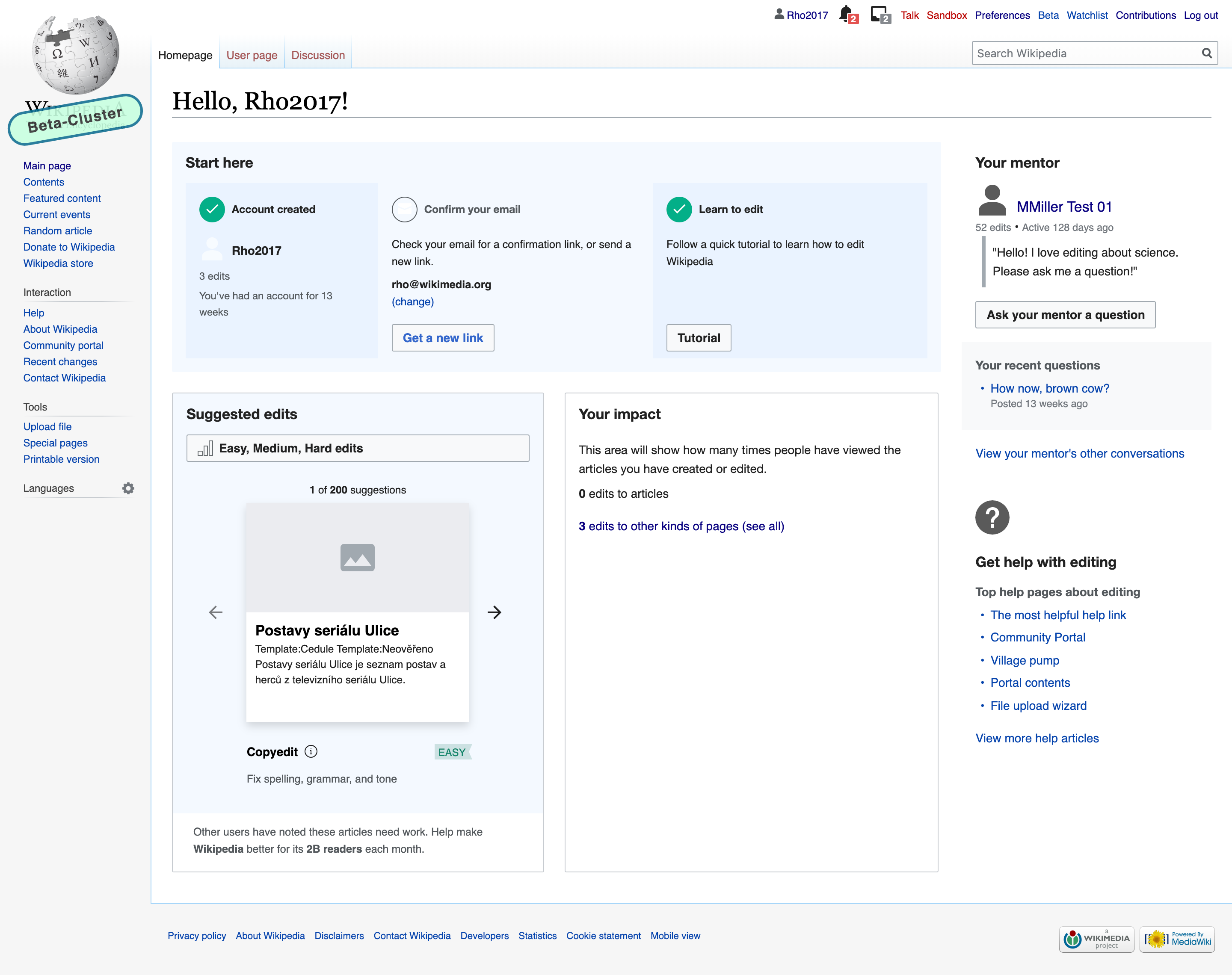 |
This task details the styling changes for Desktop, not including the more comprehensive/structural design updates to the collapsible Start module or the Impact module, which will be tackled in T232896, T223219, and T223221 respectively.
Style updates and respective proposed CSS changes:
By making the following CSS changes to the existing version of the Desktop newcomer homepage should update it to look like this:
1. Homepage layout updates
.growthexperiments-homepage-module-footer {
margin-top:16px; /*change from 1.4em */
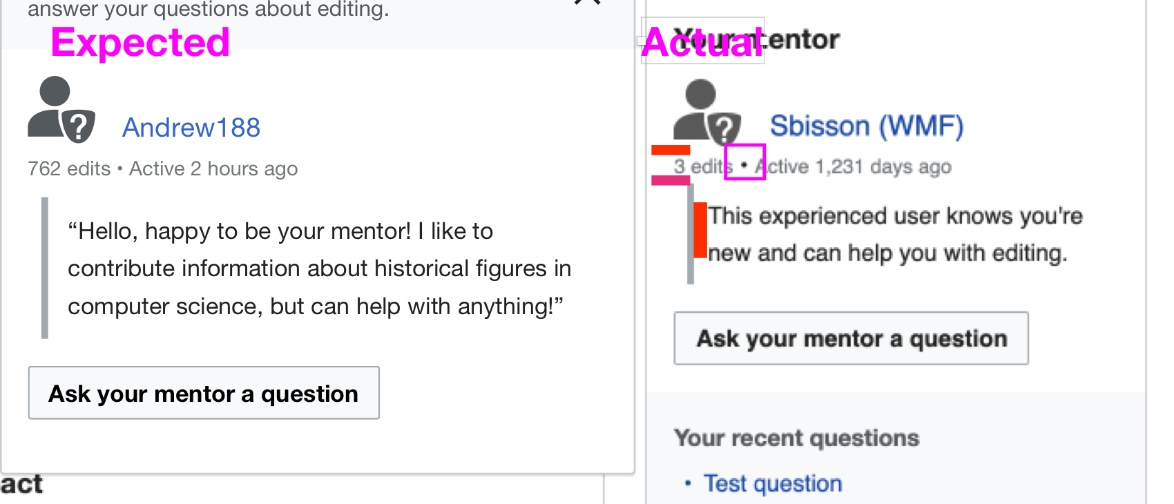
}> **3. Mentor module
3.1 - The mentor module should not have the border when it is on the RHS column**
Expected: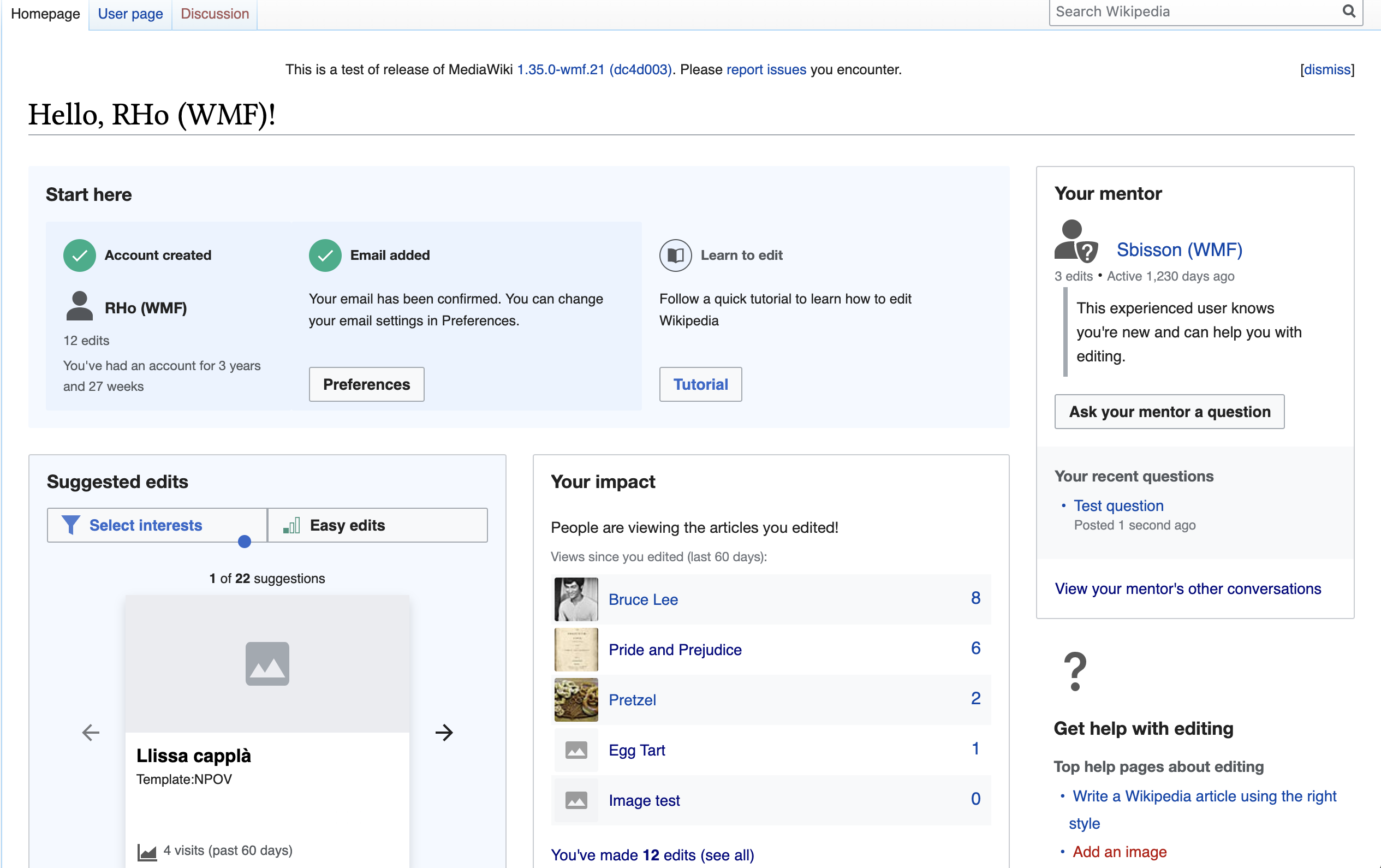 | Actual: 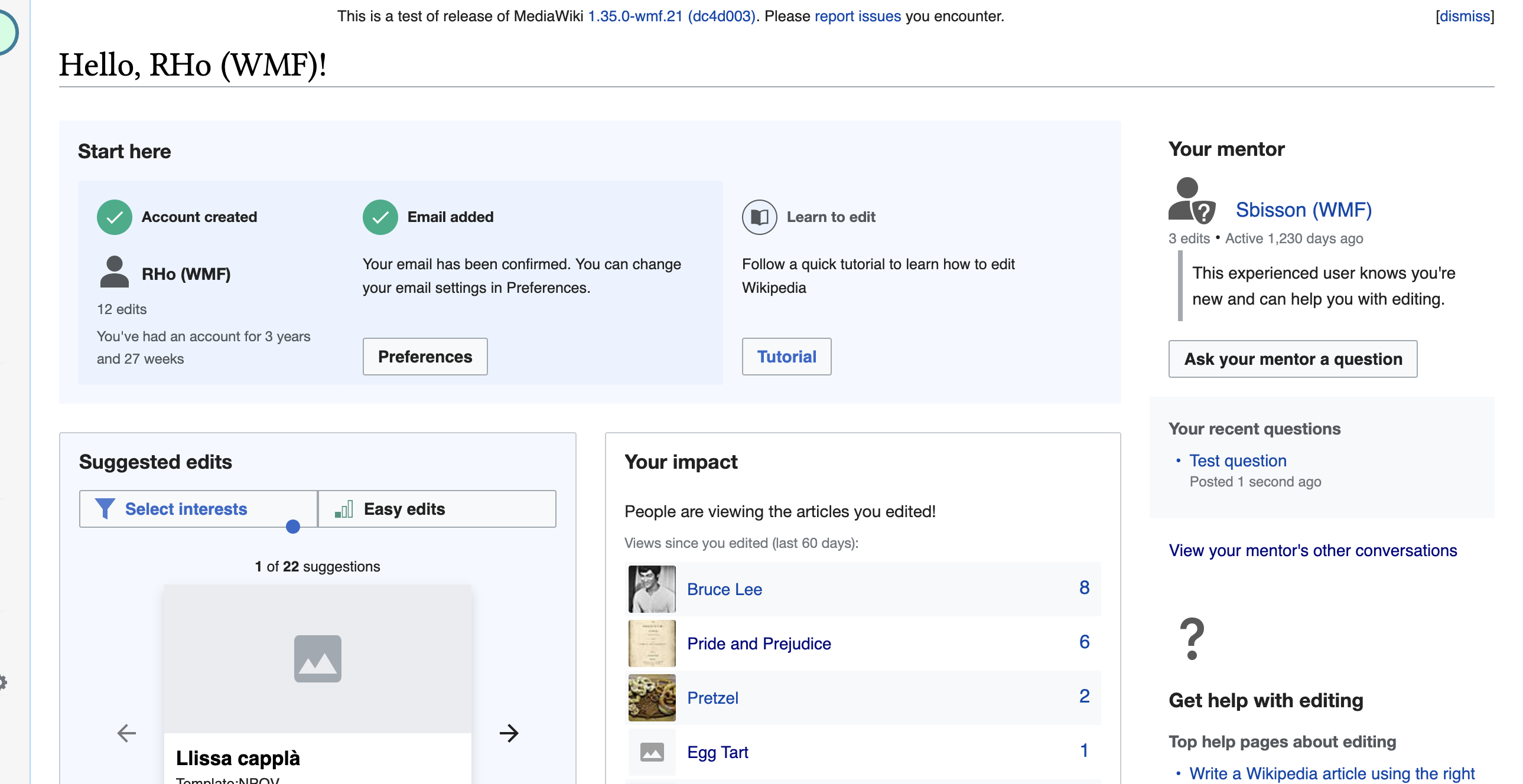 |
3.2 Minor styling tweaks
a. the bullet " • " separating the mentor edit count and last active date should be the same color and font-size as the two pieces of text.
b. There should be an extra ~4px gap between the mentor icon and the edit count/last active text block
c. There should be an extra ~8px gap between the mentor edit count/last active text block
d. There should be an extra ~4px gap between the grey vertical bar and the mentor message.