Rationale
T233443 contains the overarching rationale for why this feature is prioritized.
V2.0 – is intended to enhance the user experience of the basic reply functionality to make it easier and intuitive for Junior Contributors to draft and publish their comments.
User stories
As a contributor I can...
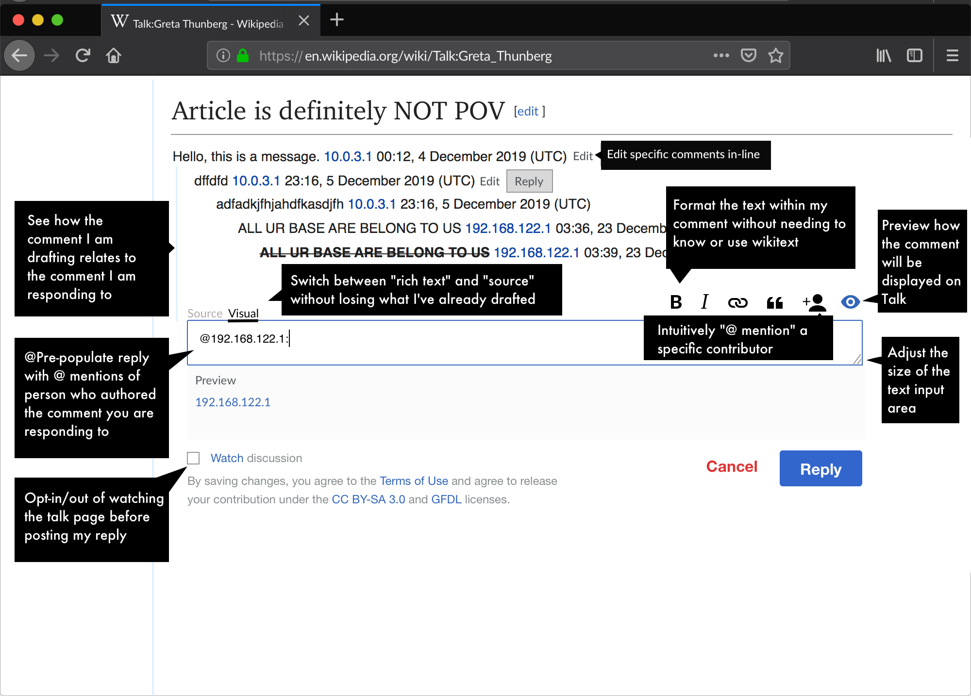
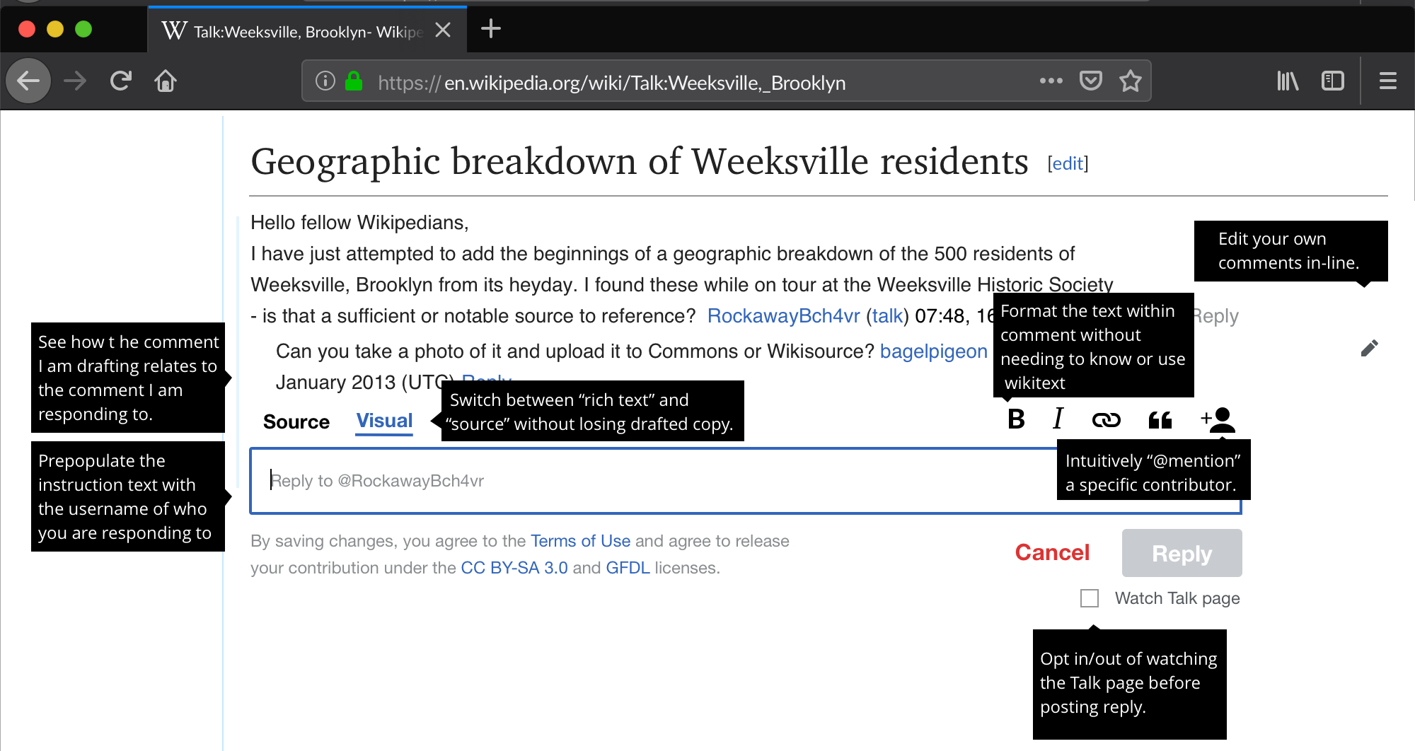
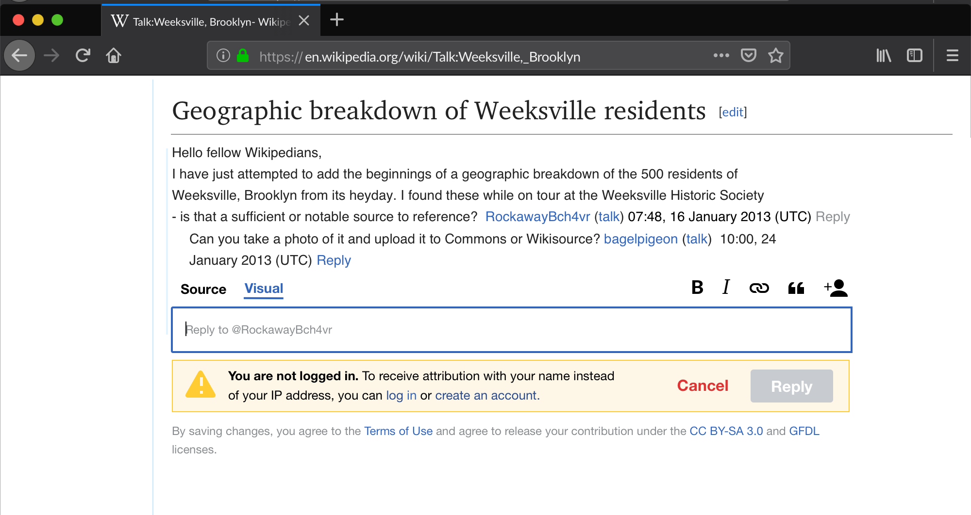
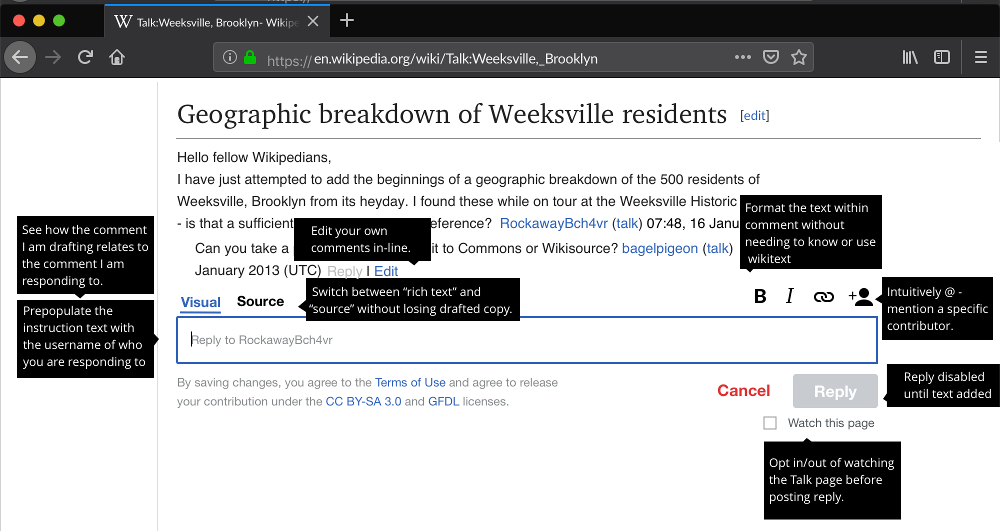
Adjust the size of the text input area- Opt-in/out of watching the talk page before posting my reply (T245222)
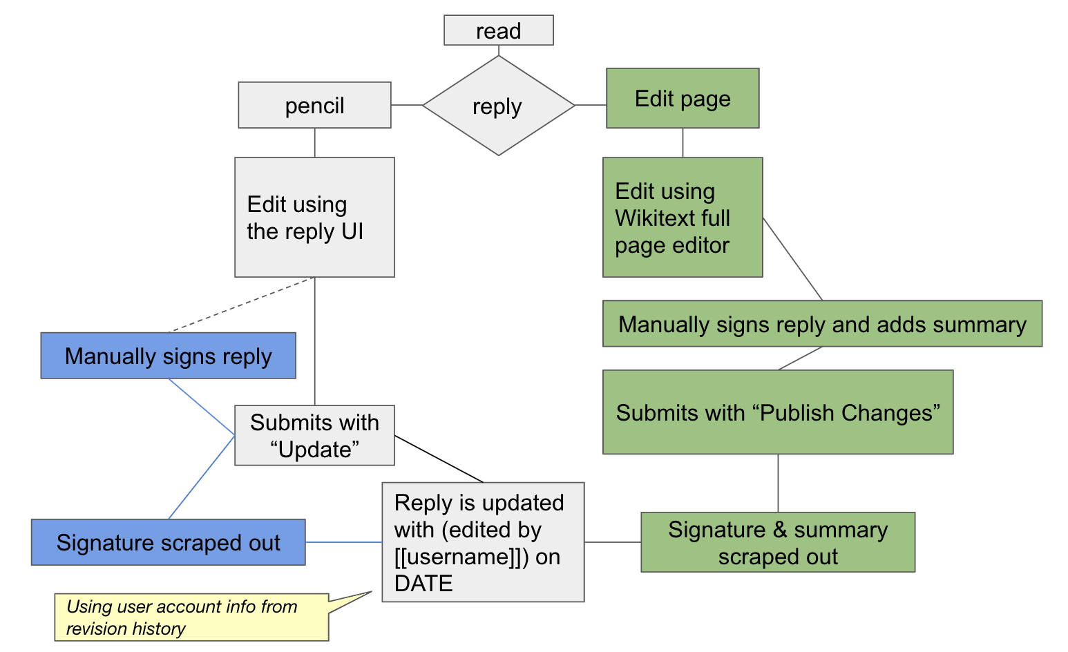
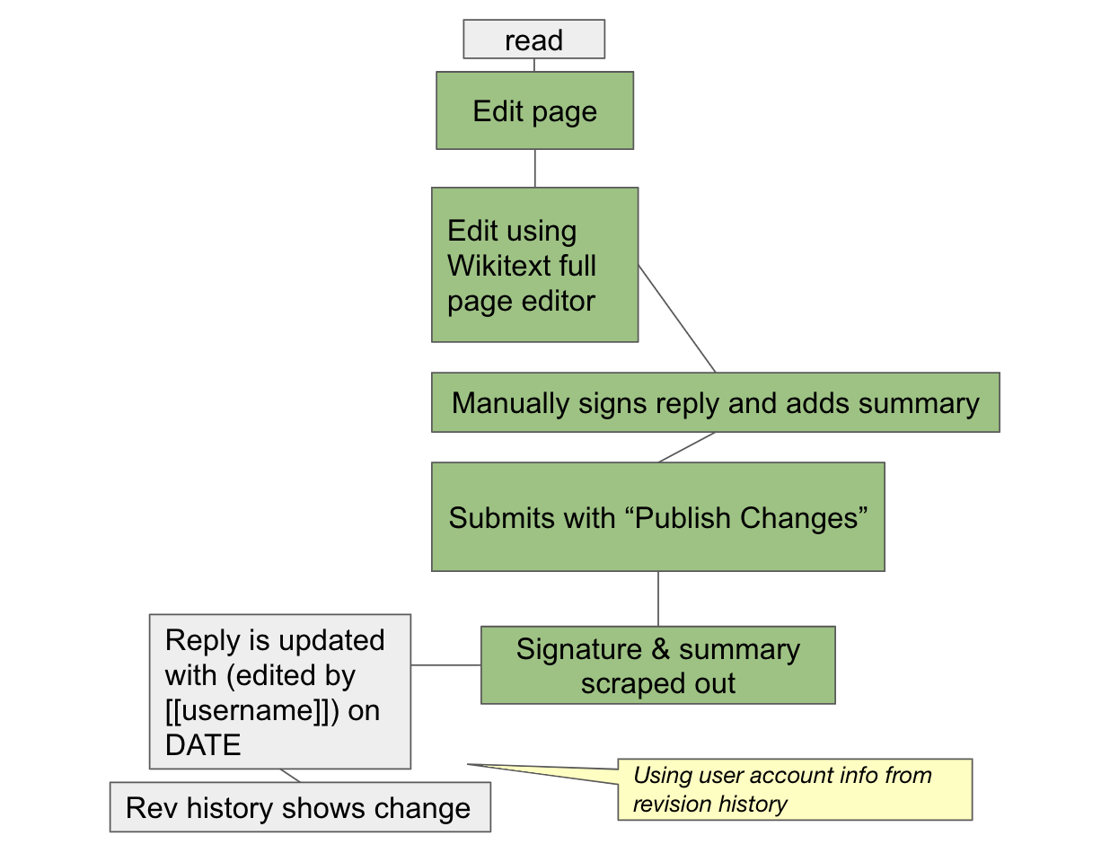
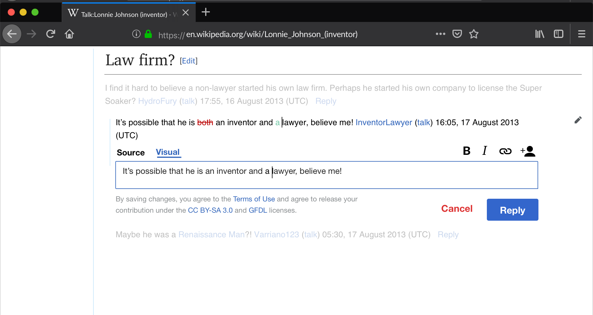
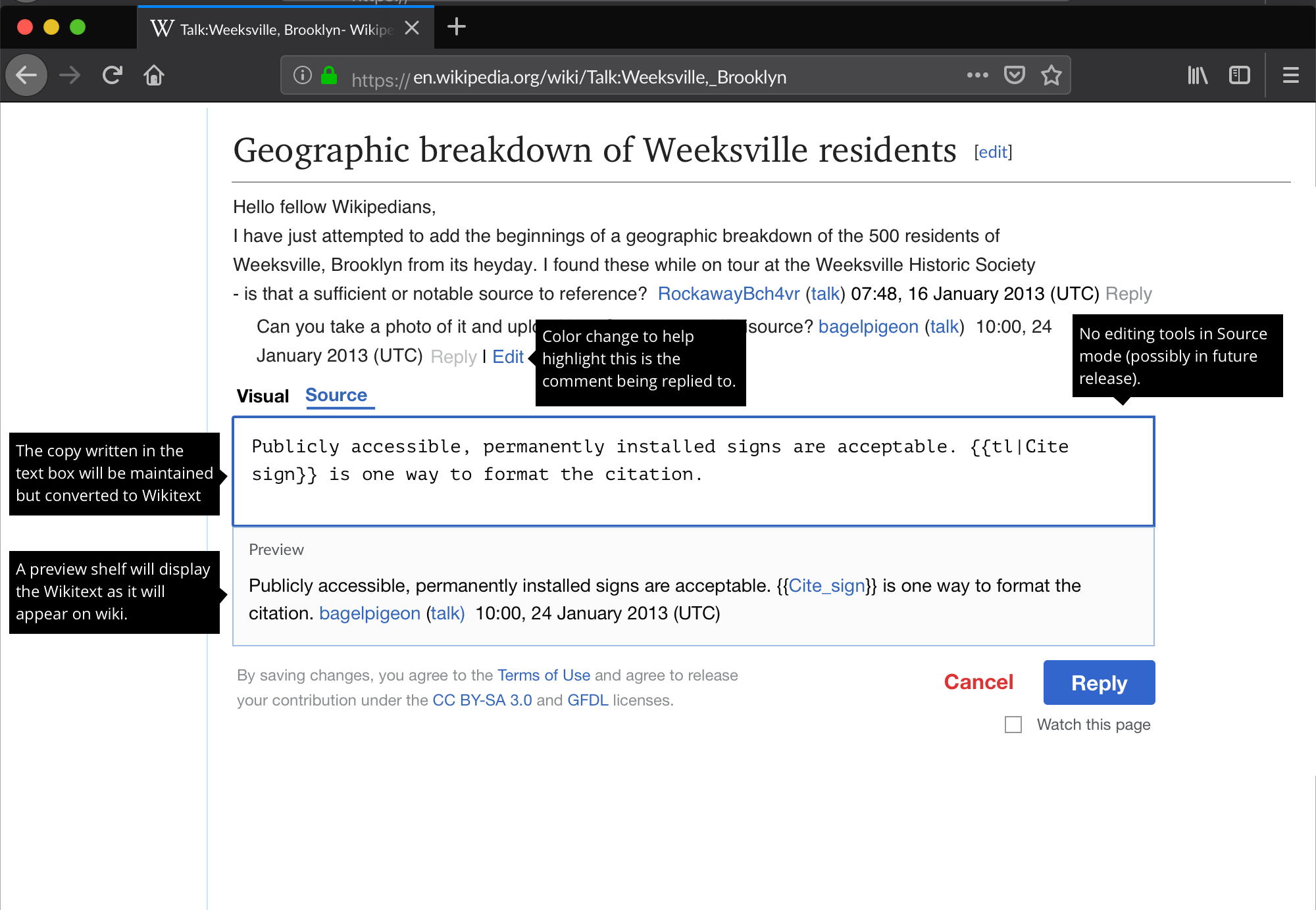
- Edit a reply I've posted without having to navigate to a separate view (T245225)
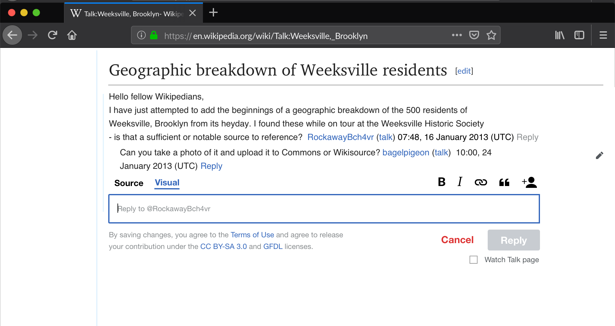
Pre-populate reply with @ mentions of person who authored the comment you are responding to- Changed to: Include helper text in reply input (T245227)
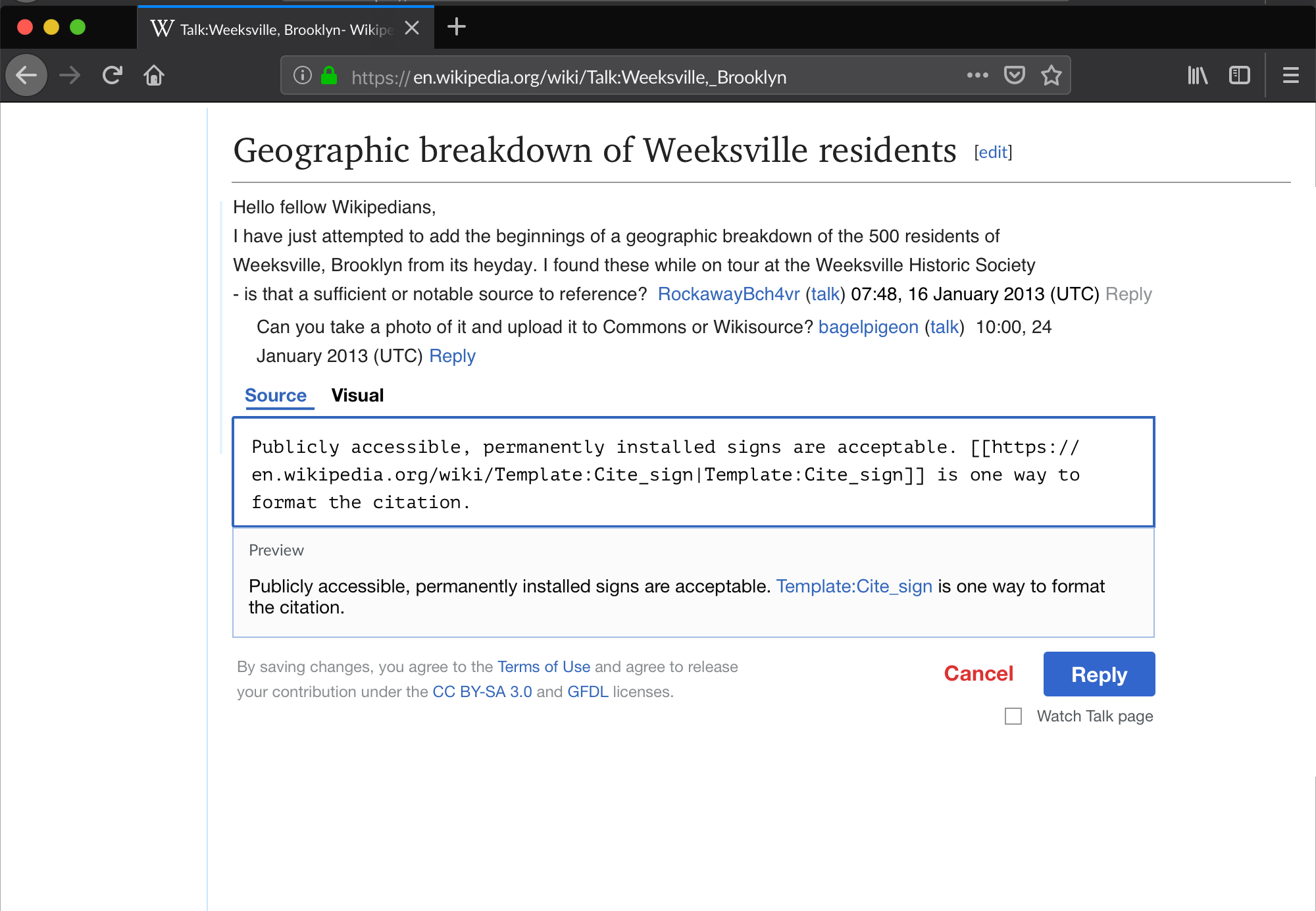
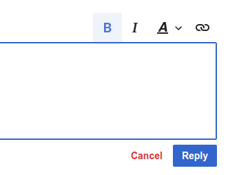
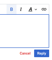
- Format the text within my comment without needing to know about or use wikitext (T234403)
- Switch between "rich text" and "source" writing modes without losing any of what I've already drafted (T234403)
- Preview how the comment I am writing will be displayed once it is published on the talk page
- Intuitively "@ mention" a specific contributor (T232601)
- See how the comment I am drafting relates to the comment I am responding to
Open questions
- What should our initial approach for the "editing specific comments" UX be? See: T235593#5882098
- How should the preview behave? Context: T235593#5878188
- In source mode, people will see a live preview of their comment beneath the area where they are drafting their comment. The preview will not be visible to people drafting and/or viewing their comment in visual mode.
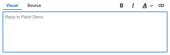
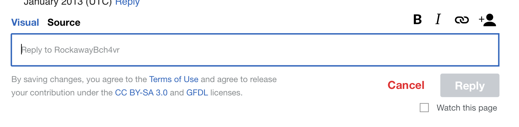
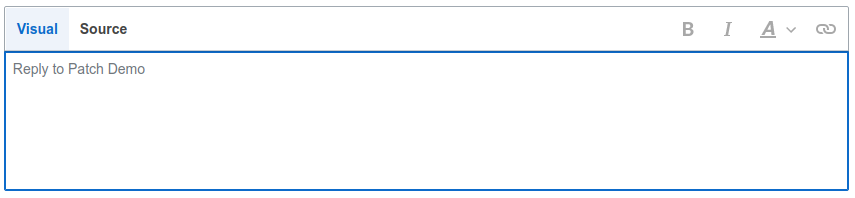
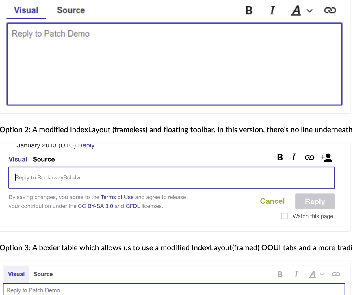
- How should the editing toolbar in the visual mode be treated/appear? This includes the visual and source mode indicators. See T235593#6071404 for more context.
Details
- Platform(s): mobile web + desktop
- Namespaces: all talk namespaces
"Done"
- Mockups are created for the entire Replying to a specific comment... workflows for the platforms listed in the "Details" section above.