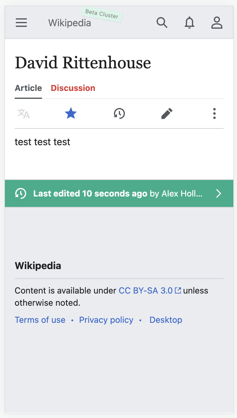
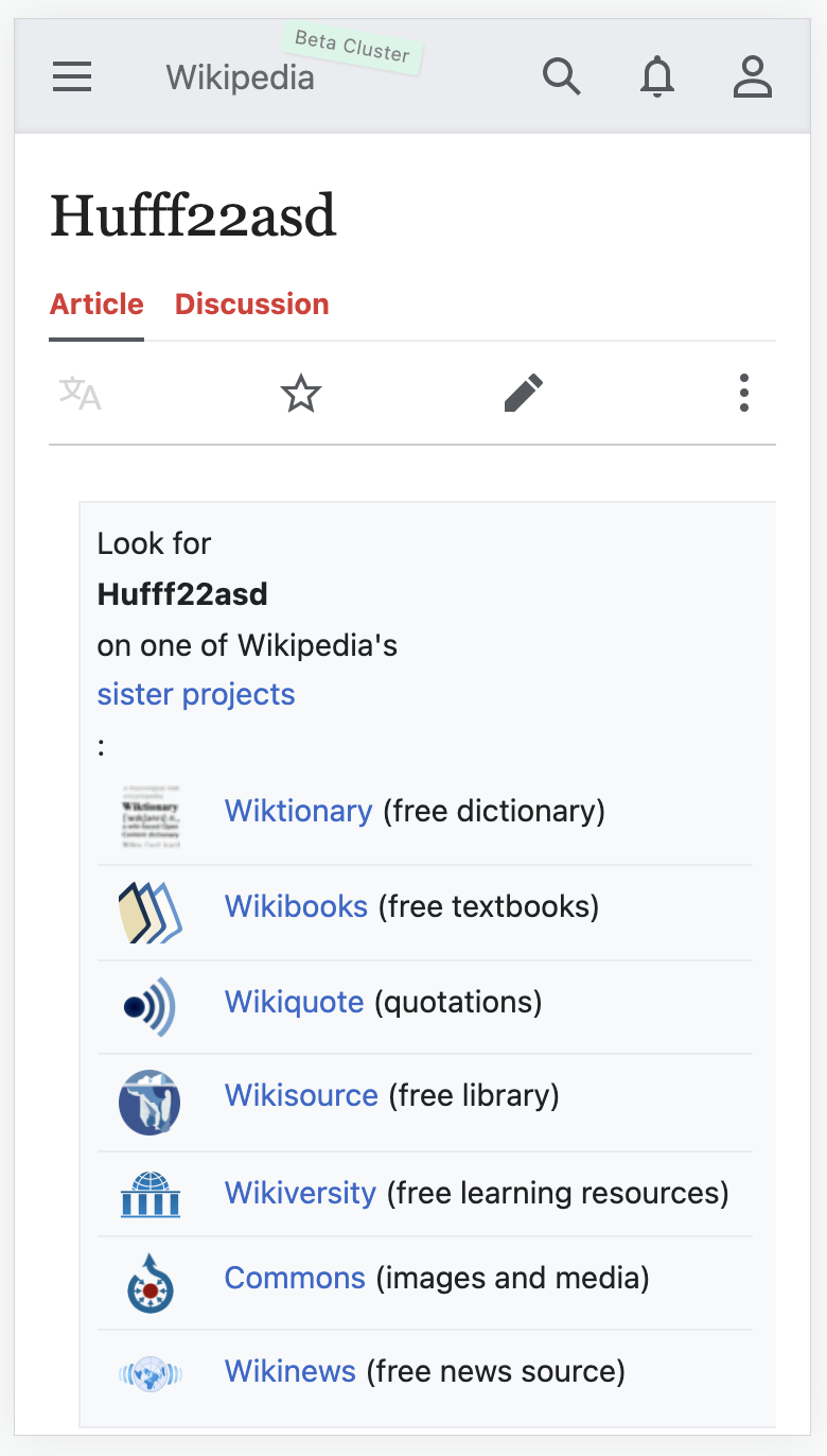
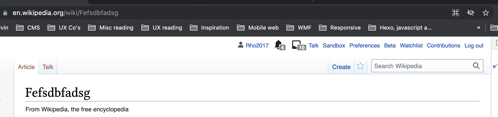
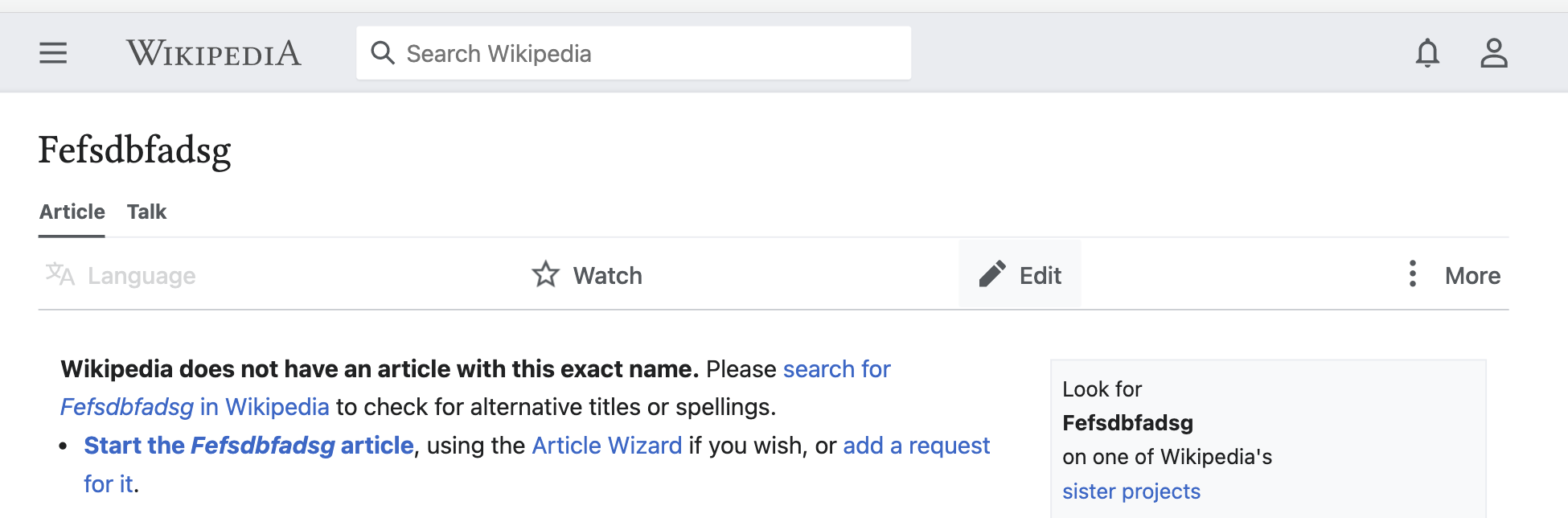
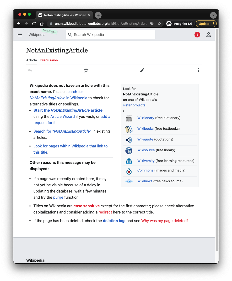
Currently the color of links in MinervaTalkAtTop tab in AMC mode is black. On other skins links look different. Non-existent pages are marked as darkish red. This helps users to identify whether the associated page exists or not. Minerva should have the same design.
Screenshots
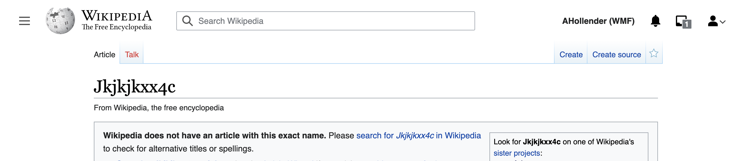
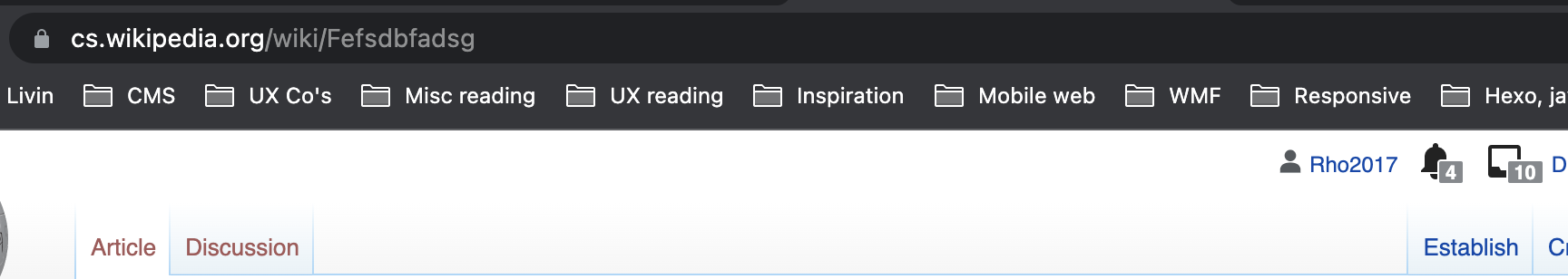
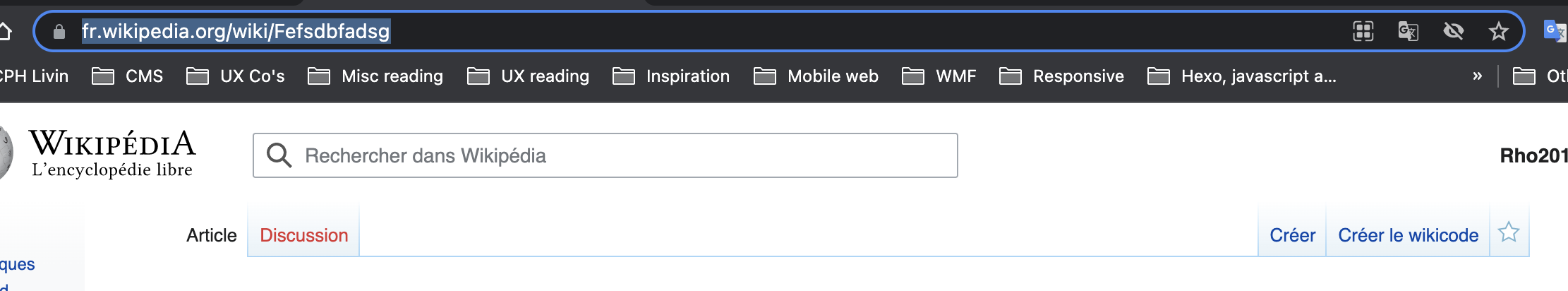
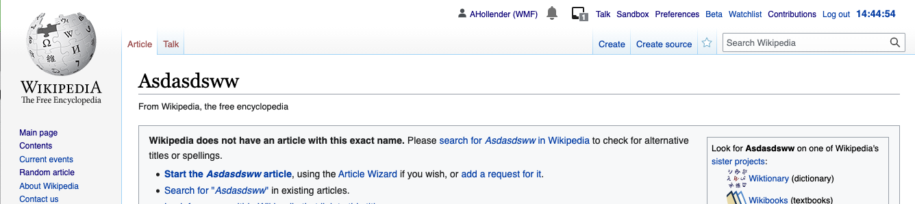
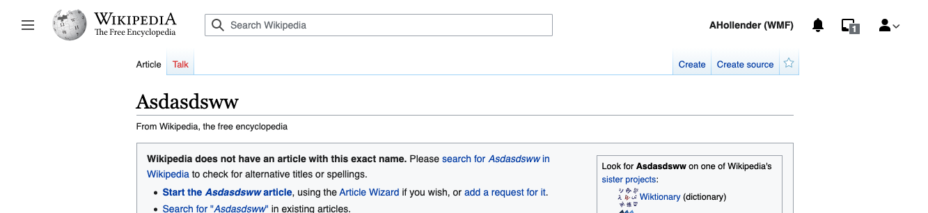
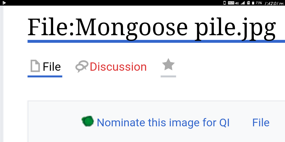
Where the associated page doesn't exist
In Timeless skin, the tab looks like this
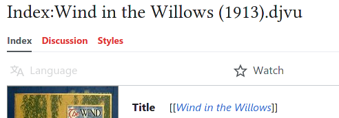
In vector
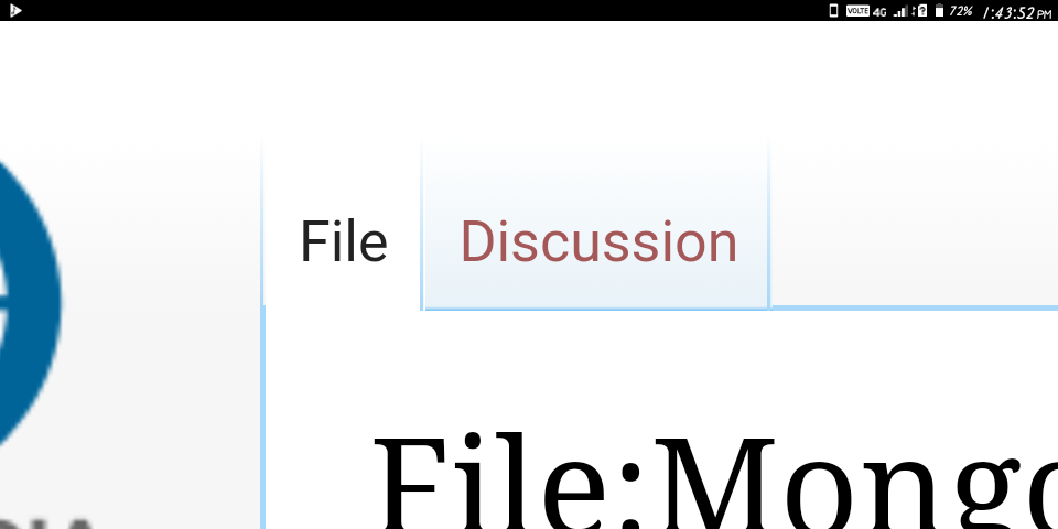
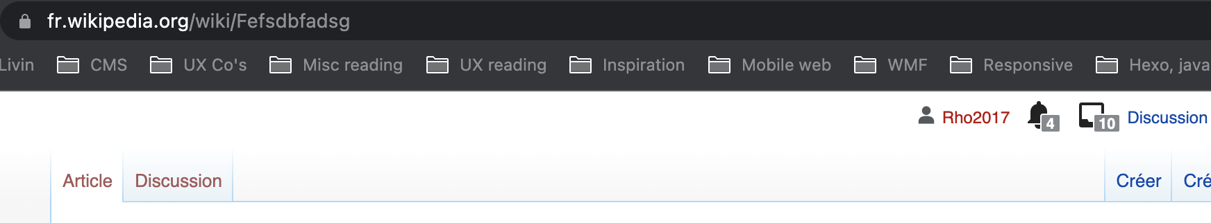
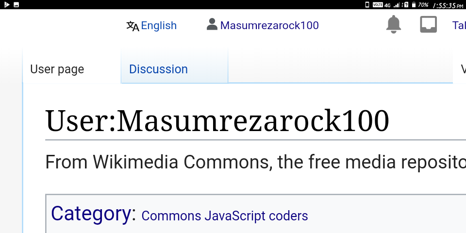
Where the associated page exists
In Timeless skin
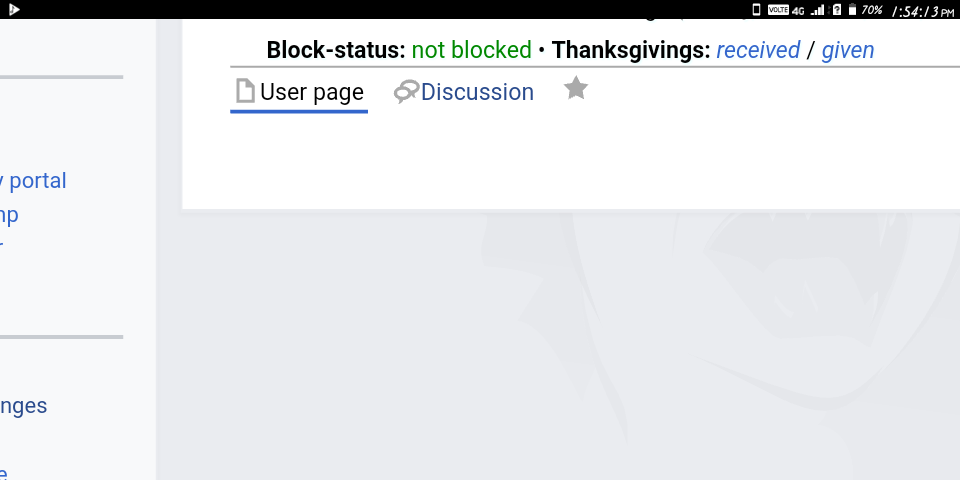
In Vector
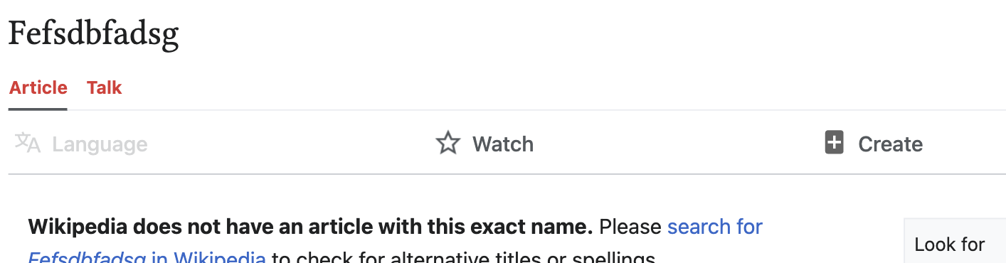
Current design in Minerva

QA Results - Beta
| AC | Status | Details |
|---|---|---|
| 1 | ✅ | T236608#7487913 |
QA Results - Prod
| AC | Status | Details |
|---|---|---|
| 1 | ✅ | T236608#7487916 |