Page MenuHomePhabricator

Spacing between icons and labels is too large in tablet mode
Closed, ResolvedPublic3 Estimated Story Points

Assigned To
Authored By
Esanders
Oct 31 2019, 2:30 PM
Referenced Files
F31632279: Screen Shot 2020-02-26 at 10.36.01 AM.png
Feb 26 2020, 8:10 PM
F31632278: Screen Shot 2020-02-26 at 10.35.57 AM.png
Feb 26 2020, 8:10 PM
F31613944: image.png
Feb 13 2020, 6:27 AM
F31608626: image.png
Feb 11 2020, 6:12 PM
F31608624: image.png
Feb 11 2020, 6:12 PM
F31514337: image.png
Jan 16 2020, 1:45 PM
F31514339: image.png
Jan 16 2020, 1:45 PM
F31514328: image.png
Jan 16 2020, 1:32 PM

Description

Description

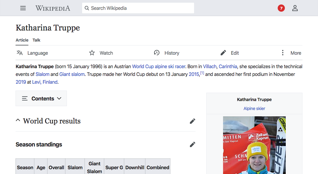
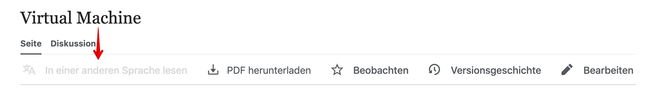
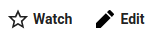
Currently the edit pencil is almost as close the the word 'Edit' as it is to 'Watch':

image.png (74×246 px, 3 KB)

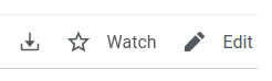
This could also read as 5 separate actions.

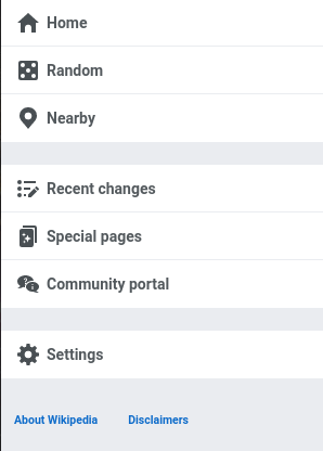
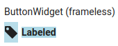
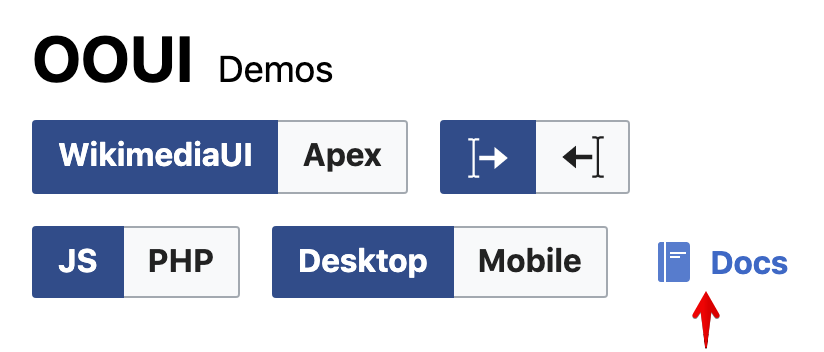
Compare to OOUI buttons, which keep the icons and labels much closer:

image.png (43×158 px, 1 KB)

To do

Decrease the spacing between the icon and related text.

The padding (0.75em) should be converted to 7px (or equivalent ems). This may have impacts on other things, so when estimating let's make sure we get a @Jdrewniak perspective!

Event Timeline

I just noticed that the font-weight on the labels is a bit light. According to OOUI we should be using 700, though that looks a bit heavy. Would 500 be an acceptable alternative here @Volker_E?

current (400)500700
400.png (582×1 px, 199 KB)
500.png (653×1 px, 250 KB)
700.png (553×1 px, 175 KB)

@alexhollender Not fully convinced if the tabs need more boldness, we have already the article headline, the “article” and “talk” link boldened. My first reaction is, do all the interaction elements be bold? There's some kind of imbalance between those three groups of elements, boldening should be the last resort IMO.
Content is king.

If bolder, in another conversation T237786 I've proposed adding 600 for high font-sizes.

Change 558884 had a related patch set uploaded (by VolkerE; owner: VolkerE):
[mediawiki/skins/MinervaNeue@master] Use font-weight: 500 for page action buttons

https://gerrit.wikimedia.org/r/558884

@alexhollender and myself have agreed, that 500 would be useful for now, but the whole interaction element group needs to be revisited to be improved later.

Change 558884 merged by jenkins-bot:
[mediawiki/skins/MinervaNeue@master] Use font-weight: 500 for page action buttons

https://gerrit.wikimedia.org/r/558884

@alexhollender should this apply to all icons? The icon margin is the same for the page actions as the menu items for example under the hamburger - do these need to change too or are we saying that we want label specific behaviour for the page actions?

ovasileva set the point value for this task to 3.Dec 18 2019, 5:25 PM

Hamburger menu with 7px spacing:

image.png (416×298 px, 15 KB)

looks good to me...

We don't do uneven px distances in our interfaces, but try to orient on an 8px base (4px is ok, 6px should be the absolute exception).
Therefore 8px looks like a viable candidate for the side hamburger-initiiated menu.

A problem on the new buttons for any CSS-only approach is the amount of whitespace that has to be taken into account on top of the margin. @Jdlrobson, you've once explained to me why we've got such a massive output of it here…

@alexhollender While we're on this, let's please also care about the wrong opacity on disabled elements:

image.png (300×2 px, 52 KB)

There's a weird separate treatment of normal, active, visited colors in this bar derived from our standard treatment, that results in news kinds of Accessibility issues.
The disabled color should normally be Base70 #72777d, which clearly doesn't set itself enough apart from the #54595d visited links.

Recommendation: Leaving the standard interaction colors for the bar buttons and rely on #72777d for disabled elements.

@alexhollender should this apply to all icons? The icon margin is the same for the page actions as the menu items for example under the hamburger - do these need to change too or are we saying that we want label specific behaviour for the page actions?

I wonder if the navigation menu might be thought of the exception here. These are not standard buttons, and since they are presented in a vertical list I find the reduced spacing between the icon and the text to feel a bit tight. I'm not sure if we've explored the readability implications of lists with icon + text in any formal way, @Volker_E?

@alexhollender While we're on this, let's please also care about the wrong opacity on disabled elements:

Great point. I think it would make sense to open a separate task for that.

In the vertical menu the horizontal spacing is less of an issue, but I wouldn't say it looks too cramped, it's probably just a case of what you are used to. I think the benefit of having a consistent guide for others to follow outweighs that preference, for example we use the same spacing in all other OOUI components:

image.png (350×515 px, 13 KB)

We don't do uneven px distances in our interfaces, but try to orient on an 8px base (4px is ok, 6px should be the absolute exception).

Currently the icon<>text spacing on an OOUI button is 7px framed, 5px unframed...

image.png (43×90 px, 871 B)

image.png (67×170 px, 3 KB)

Change 565272 had a related patch set uploaded (by Esanders; owner: Esanders):
[mediawiki/skins/MinervaNeue@master] PageActionsMenu: Reduce spacing between icons and text in tablet mode

https://gerrit.wikimedia.org/r/565272

My apologies for the long delay on reviewing this.

The first part of this looks good:

image.png (602×1 px, 155 KB)

The second part of this doesn't seem to be showing on staging:

image.png (1×862 px, 160 KB)

@alexhollender To clarify, the current patch only applies to class .mw-ui-icon-with-label-desktop and only over breakpoint desktop, so it's for icons like page action ones.

Currently the icon<>text spacing on an OOUI button is 7px framed, 5px unframed...

Ok, true. That's to harmonize text sizes with distances at 14px which is a stupid default font-size anyways.
If you look at mobile OOUI and amend icon size to 20x20 (in demos we're set on ems and therefore icons are 22.84x22.84px), the distance is >8px:

image.png (352×824 px, 29 KB)

From my perspective, 8px would be a good compromise here.

Captured the navigation proposal in patch below.

Change 571867 had a related patch set uploaded (by VolkerE; owner: VolkerE):
[mediawiki/skins/MinervaNeue@master] Reduce margin in icon and label combination

https://gerrit.wikimedia.org/r/571867

From my perspective, 8px would be a good compromise here.

Captured the navigation proposal in patch below.

Ok great, where can I review the patch?

Change 565272 merged by jenkins-bot:
[mediawiki/skins/MinervaNeue@master] PageActionsMenu: Reduce spacing between icons and text in tablet mode

https://gerrit.wikimedia.org/r/565272

Change 571867 merged by jenkins-bot:
[mediawiki/skins/MinervaNeue@master] Reduce margin in icon and label combination

https://gerrit.wikimedia.org/r/571867

Showed @alexhollender before and after and have merged. This is ready for sign off. Alex's design review should be sufficient QA here.

Screen Shot 2020-02-26 at 10.35.57 AM.png (812×1 px, 167 KB)

Screen Shot 2020-02-26 at 10.36.01 AM.png (862×1 px, 198 KB)

sounds good, resolving