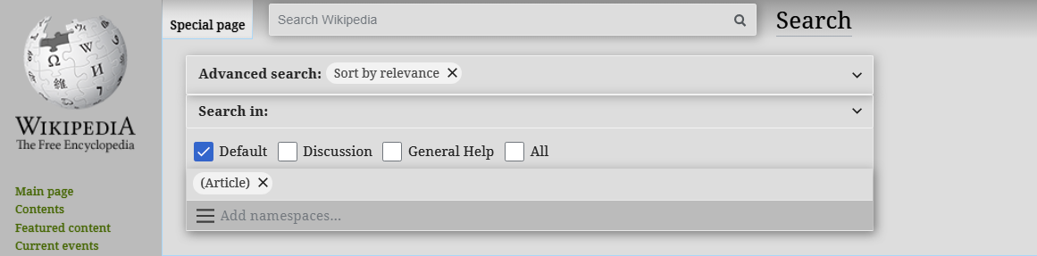
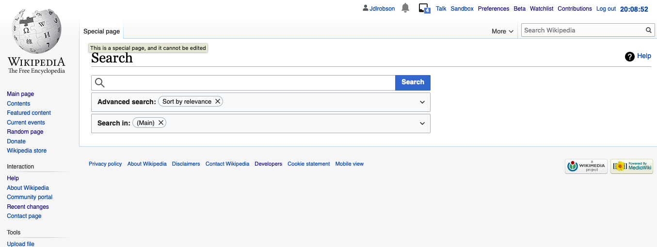
On mobile and desktop when you visit the search page https://en.wikipedia.org/wiki/Special:Search we offer not one but TWO ways to search! Both with different autocomplete features.
Is this by design? Is this problematic?
| Jdlrobson | |
| Oct 31 2019, 8:09 PM |
| F31517677: vector-search-compact-2.png | |
| Jan 20 2020, 6:06 AM |
| F30939379: Screenshot 2019-10-31 at 1.06.47 PM.png | |
| Oct 31 2019, 8:09 PM |
| F30939387: Screenshot 2019-10-31 at 1.08.53 PM.png | |
| Oct 31 2019, 8:09 PM |
| F30939378: Screenshot 2019-10-31 at 1.05.58 PM.png | |
| Oct 31 2019, 8:09 PM |
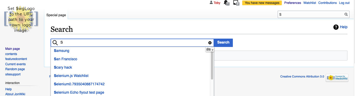
On mobile and desktop when you visit the search page https://en.wikipedia.org/wiki/Special:Search we offer not one but TWO ways to search! Both with different autocomplete features.
Is this by design? Is this problematic?
There has been somewhat related discussions to make “normal” Vector search's a) OOUI b) autocomplete more useful. This got stopped AFAIK with search team priority changes. Advanced Search was developed by WMDE and integrated a few of the newer experience features, that were discussed, but Vector search is still lacking.
Right now it seems this task is touching too many things to be workable. @Jdlrobson Do you think that
The normal user flow is either requesting Advanced Search by location or via click, in both paths, the main search input receives focus and the Advanced Search input is in the center and more prominent. So the user focus should be guided successfully here.
I don't really know what's best here @Volker_E but having 2 search bars seems a little odd to me. Do other sites follow this pattern?
Would we ideally just show one of them at a time (e.g. hide Vector's search when advanced search is open) or is clear justification for 2? Having autocomplete on the input on Special:Search seems gratuitous and confusing when the page already has the function and has shipped bytes of JS/CSS to provide that function. I would expect typing in that box to autocomplete full text search results or nothing. Does the autocomplete add value given the reason the user has likely gone to this page is because they /couldn't/ find what they were looking for?
"Other sites:"
So double search bars do happen. However, it would be nice to have only one.
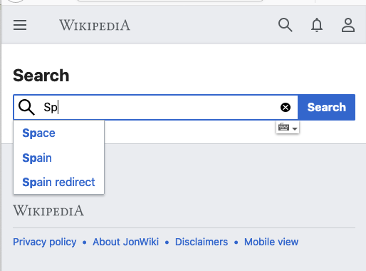
If Vector's search bar would be repositioned, It could look something like this: