Page MenuHomePhabricator

Confusing sub-sectioning of Components?
Closed, ResolvedPublic

Assigned To
Authored By
Volker_E
Nov 8 2019, 11:01 PM
Referenced Files
F31457565: image.png
Dec 5 2019, 11:15 AM
F31456603: image.png
Dec 4 2019, 4:34 PM
F31455859: image.png
Dec 4 2019, 12:42 AM
F31063489: Screen Shot 2019-11-12 at 5.55.11 PM.png
Nov 12 2019, 10:56 PM
F31059485: image.png
Nov 8 2019, 11:12 PM
F31059469: image.png
Nov 8 2019, 11:01 PM

Description

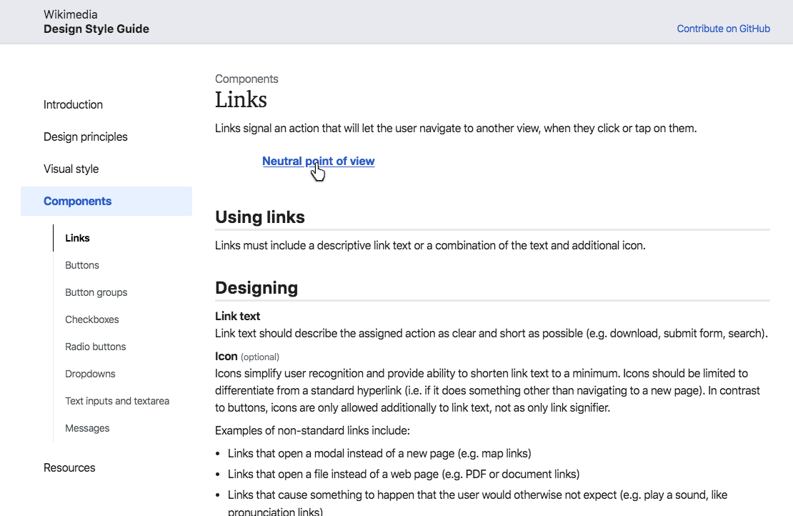
In current state when navigating through “Components” section, the sub-sections for the components seems to make it harder to navigate the different components.

This hasn't been only my impression, it has also been shared by other design folks testing to grasp and navigate which section a component is part of. The toughest example seems to be “Messages” so far.

@alexhollender and myself discussed how to get around this issue and mused about expanding all the subsections, exemplified:

Proposal 1: sub-sections stay, but always expandedProposal 2: flat hierarchy
image.png (662×291 px, 30 KB)
image.png (1×550 px, 66 KB)

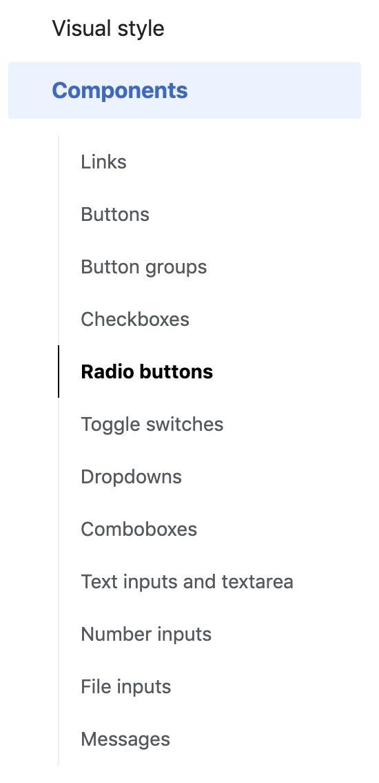
Proposal 1 doesn't seem to resolve the issue, it's more adding an extra layer without clear value.
Proposal 2 is similar to other style guides.

Comparing other style guides, a flat navigation structure seems to dominate:

Specifically if we don't provide a search functionality either clarification seems necessary.

Event Timeline

Volker_E renamed this task from Confusing sub-sectioning of Components to Confusing sub-sectioning of Components?.Nov 11 2019, 6:30 AM

@Volker_E I had imagined something like this (perhaps with the list items rearranged):

Screen Shot 2019-11-12 at 5.55.11 PM.png (722×1 px, 137 KB)

Thanks @alexhollender for clarification. In case I've been unclear in the task description I see a flat hierarchy currently as best option too – because we're installing a level that we barely explain in the components itself, nor is it usually used in context of applying our components. But the expanded variant seemed to be my understanding of our conversation as alternative option as well.

+1 to flat hierarchy and directly showcasing what we have. And since LukeW, we all know that obvious always wins. In regards to sorting the list items, how about an A-Z approach like this:

image.png (1×2 px, 538 KB)

  • I suggest to use singular not plural for components, it’s easier to scan/read (if that’s been discussed/decided/discarded before: ignore this comment).
  • For the future, have we thought about including a basic search filter for nav items? I find it extremely helpful when looking for a component.

@schoenbaechler Singular vs plural is an interesting question. Guess it came out of a) using plurals for many fo the “Visual Style” subsections and b) because “Buttons” stand for various types of buttons? But I'm open for majority vote here, will put this into a task of its own though. Captured in T239971.
Search goes alongside a non-static website, which was once started in T164449, but ran into technical cost-benefit issues. It's currently not possible and we have to rely on our SEO being so good, that we can lean back and let “Wikimedia UI dropdown” be googled for us.

Volker_E claimed this task.

With above, I close this task as successfully “resolved”.