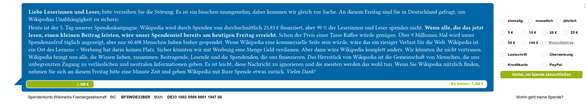
Page MenuHomePhabricator

πŸ› UX Bug | Fix contrast issues, hover states for buttons and font sizes
Open, MediumPublic

Description

🎨 Asana Task

Changes

  • "Spende abschließen"/Call-to-action button
    • has more contrast: #97b313 β†’ #849d0e
    • has hover color: #97b313 (the old background color)
  • "X"/closing button has hover color:
    • #747474
  • Progress bar fill area has more contrast: #97b313 β†’ #849d0e
  • Wunschbetrag has fontsize: 12px (to improve contrast)
  • Form fontsize is 13px to improve legibility
  • Form button labels have fontsize 13px
  • Text in progress bar has fontsize 13px
  • Footer text has fontsize 13px
  • Main text (#WMDE_Banner .infobox__text) has fontsize 18px (a bit smaller but better rendered font size)

Screen Shot 2019-11-15 at 10.09.25.png (336Γ—1 px, 86 KB)
Screen Shot 2019-11-15 at 10.08.52.png (334Γ—1 px, 87 KB)

Related Objects

Event Timeline

Restricted Application added a subscriber: Aklapper. Β· View Herald Transcript

@Jan_Dittrich I did not properly get the hover colors. Should all of them share the same hover color?

Also: Is there anything view-port dependent? From what I got we do change the font-sizes dependent on view port?

@kai.nissen I chose to make this a prequisite of desktop-de-14 instead of an earlier test simply because our pipeline is quite full this week and Jan is also quite busy with user tests. This is a generic improvement of the blue/green desktop design, so we need to make sure this is being changed in all future variants of the blue/green design.

@Jan_Dittrich I did not properly get the hover colors. Should all of them share the same hover color?

The hover-able elements imho are the x-button and the call to action. Both have now hover colors defined. I guess there are no other elements where I would find hover essential (But please point out if I oversaw something!)

Also: Is there anything view-port dependent?

Not that I am aware of. If it affects the changes it would be about the font sizes in the form, but the size of it seems to stay constant.

@Jan_Dittrich
Sorry for reviving this again, but there are some issues with the hover effects on the close button:

  • The usual color for this is #808080, the opacity is set to 50%. Hovering over it now changes the color to #747474, leaving the opacity as is. If you don't know that there is a hover effect, you just don't see it.
  • In viewports widths below 1090px, the close button is inside the blue banner text area. Its color changes to white, the opacity is set to 80%. Hovering over it changes the color to #747474.
viewport widthno hoverhover
>= 1090px
screenshot-de.wikipedia.org-2019.12.09-17-15-22.png (28Γ—21 px, 374 B)
screenshot-de.wikipedia.org-2019.12.09-17-15-38.png (28Γ—21 px, 374 B)
< 1090px
screenshot-de.wikipedia.org-2019.12.09-17-09-37.png (79Γ—120 px, 2 KB)
screenshot-de.wikipedia.org-2019.12.09-17-11-58.png (80Γ—120 px, 2 KB)

The usual color for this is #808080, the opacity is set to 50%. Hovering over it now changes the color to #747474, leaving the opacity as is. If you don't know that there is a hover effect, you just don't see it.

What I defined should be the resulting color on a white background: 75% transparent black in normal state, 45% transparent black in hover.

Abstractly said, it should be 25-30% darker on hover.

Currently, we should have a light thing on the dark background and a dark thing on the white background, and if you want to use the same color, you are in a tough place: 3 colors are closely bound to each other now.

So I would suggest, having the behavior I descried on the white, and for the x on the blue, via a media query, the equivalent would be: 25% transparent white, 55% transparent white on hover. OR never let the x be on a blue background anyway.