Page MenuHomePhabricator

Display previous edit summaries
Closed, ResolvedPublic4 Estimated Story PointsFeature

Assigned To
Authored By
Pols12
Dec 10 2019, 6:27 PM
Referenced Files
F35172699: image.png
May 24 2022, 11:38 AM
F35147211: image.png
May 17 2022, 4:50 AM
F35144589: image.png
May 16 2022, 7:35 AM
F35144586: image.png
May 16 2022, 7:35 AM
F35071379: image.png
Apr 28 2022, 4:26 AM
F35071350: image.png
Apr 28 2022, 3:56 AM
F35069082: Screenshot 2022-04-26 at 23-04-36 Translate.png
Apr 26 2022, 9:10 PM
F35069081: Screenshot 2022-04-26 at 23-05-35 Translate.png
Apr 26 2022, 9:10 PM
Tokens
"Like" token, awarded by abi_.

Description

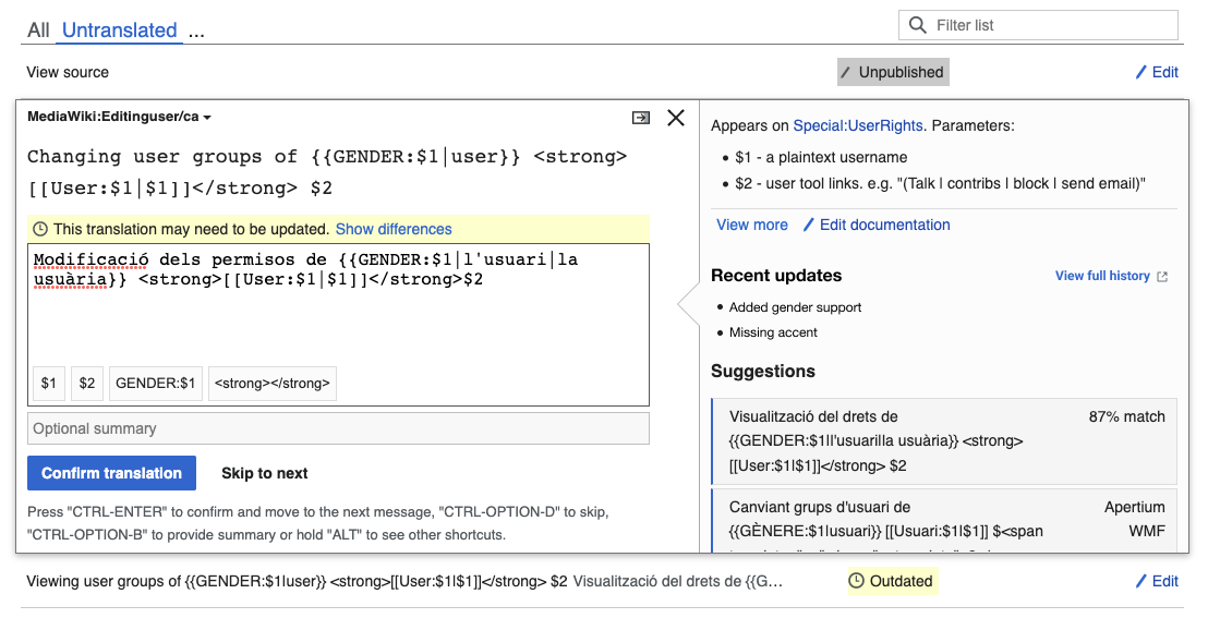
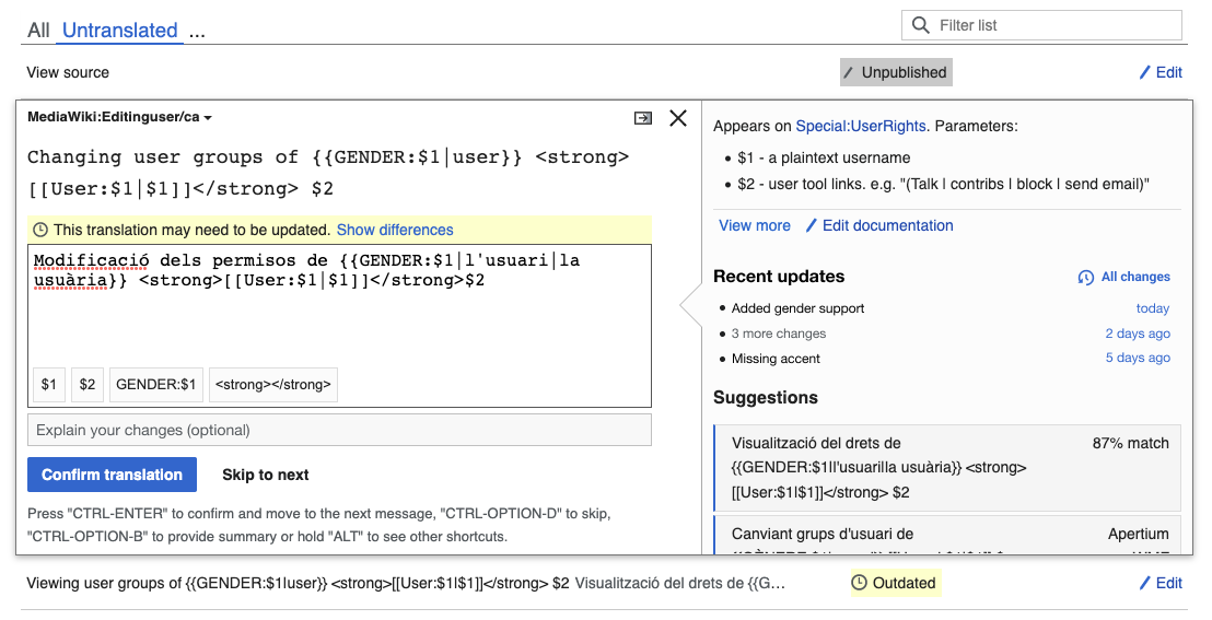
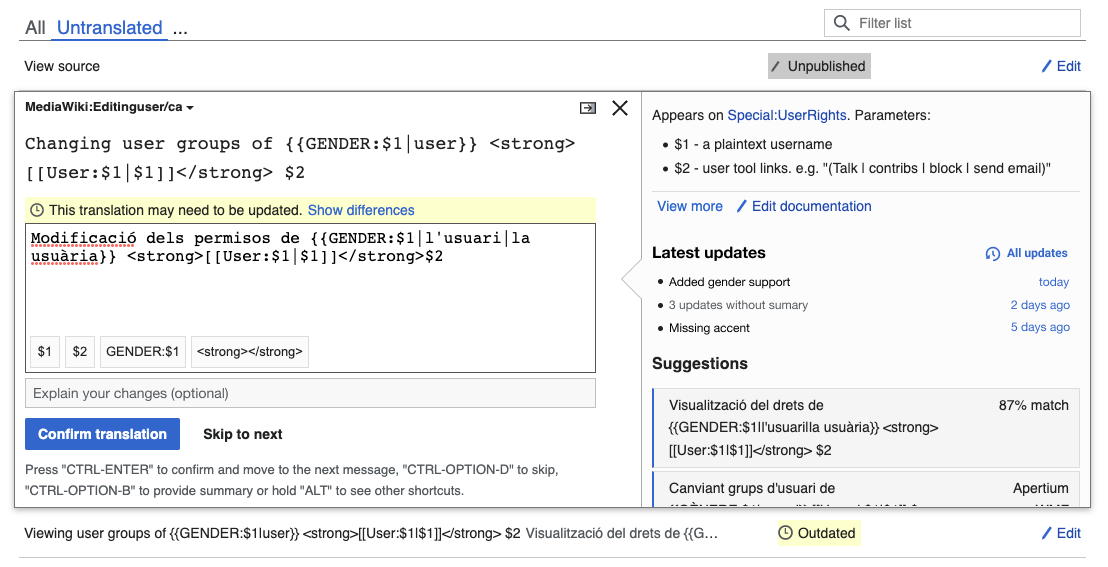
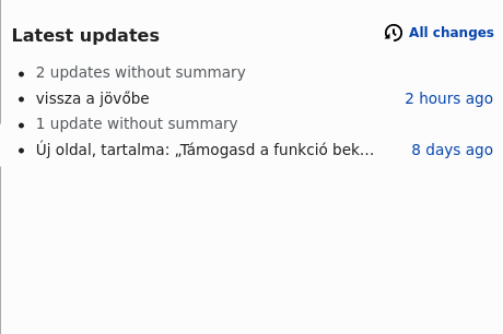
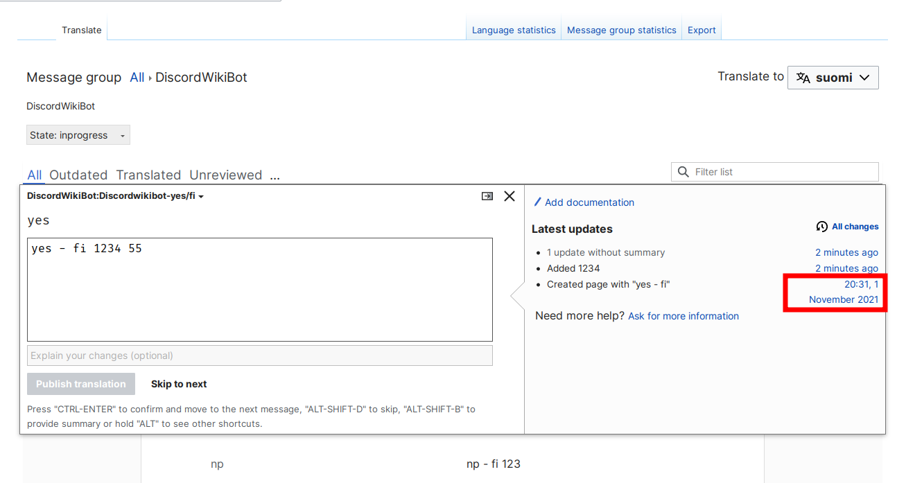
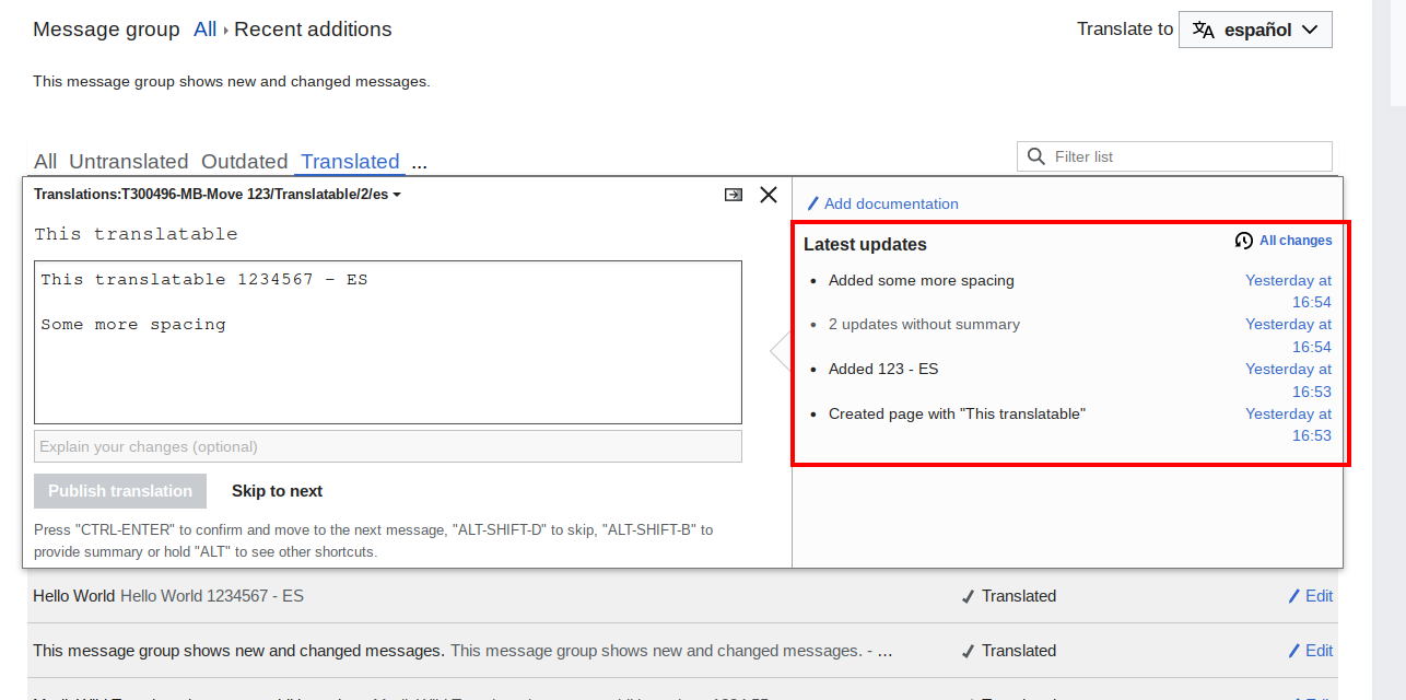
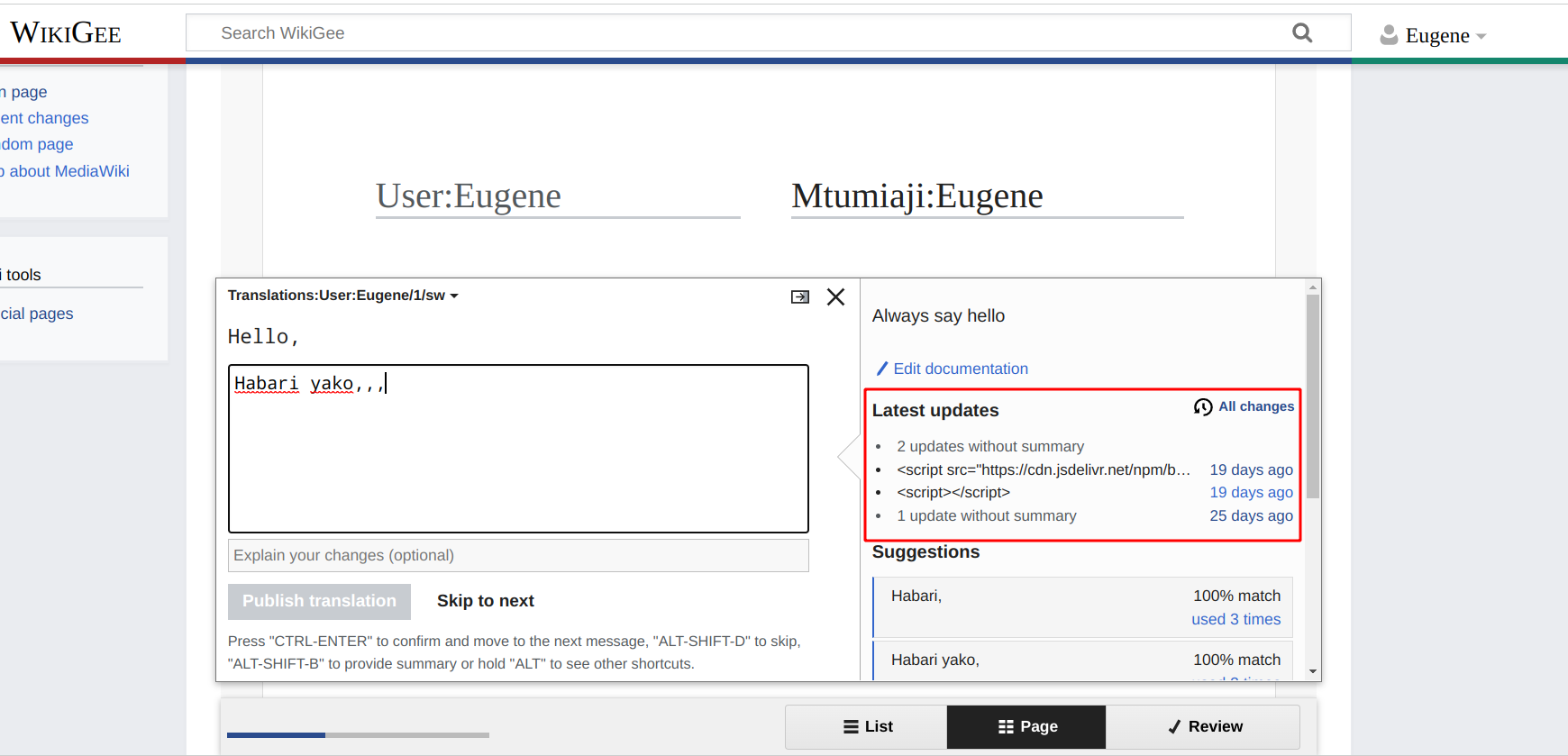
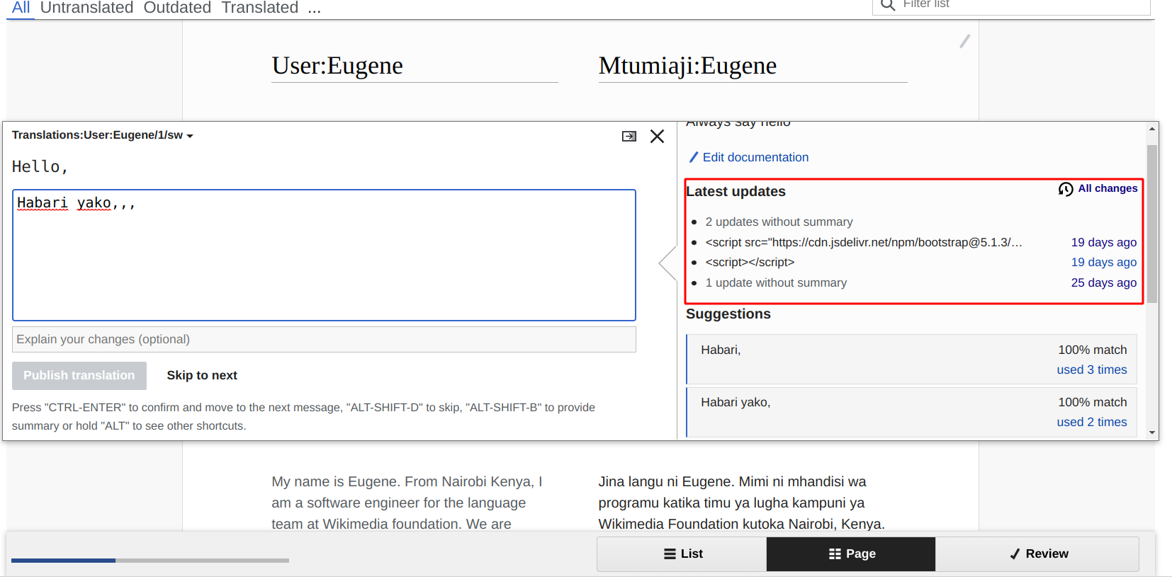
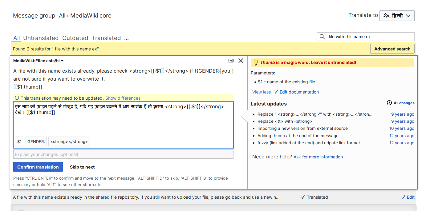
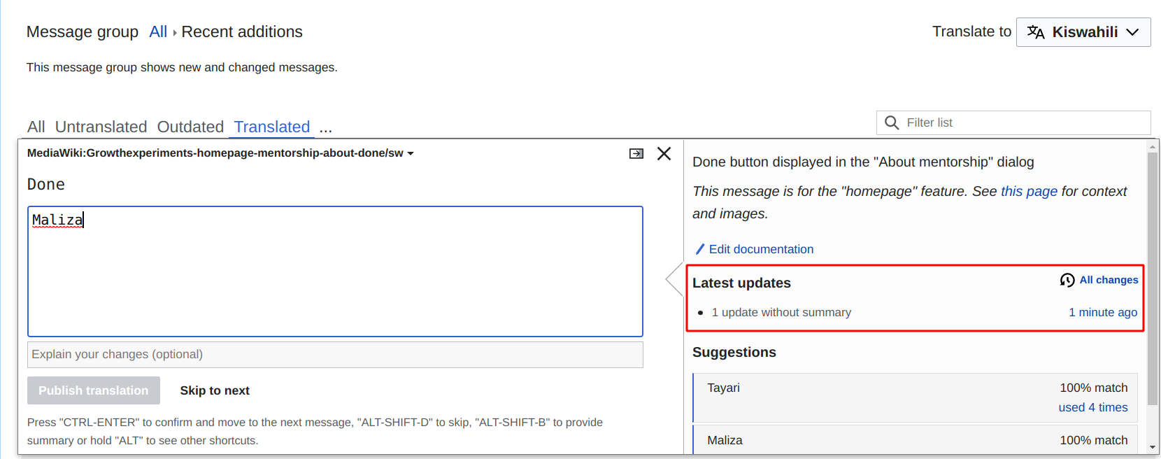
To avoid involuntary edit wars, it would be nice to display edit summaries of previous edits in translation interface (TUX mainly).

Currently edit summaries are not used very often. If we display the edit summaries in the tux window, there is a possibility that this would be used more.

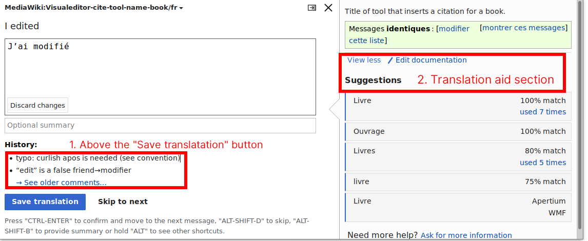
Two options are being discussed on where to display this:

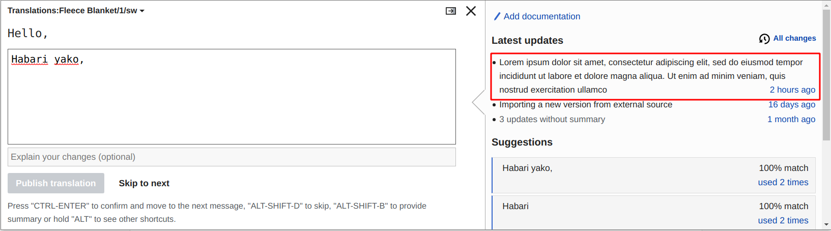
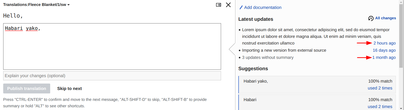
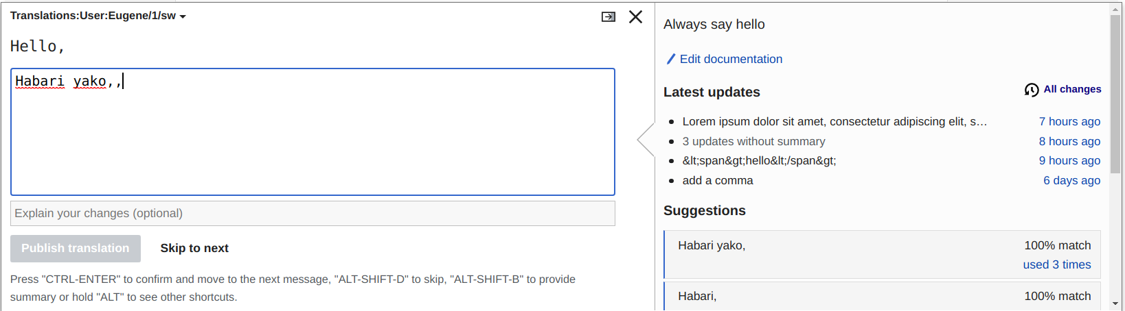
  1. Above the save translation button - This increases the height of the translation editor a bit but makes the edit summary more visible, and displays it right below the "optional summary" textbox.
  2. In the translation aids section - Along with the other translation aids where it makes more sense for this to go but this section can already be "busy", so it would be easy to miss.

In addition to the optional change summary we could also add a link to the diff of the change.

image.png (470×1 px, 64 KB)

Event Timeline

Maybe… I don’t know what is the best design.

I have suggested to add it before submit button to increase the probability it is seen ; but without any guaranty.

Nikerabbit changed the subtype of this task from "Task" to "Feature Request".Dec 7 2020, 3:11 PM
Nikerabbit set the point value for this task to 4.Mar 1 2022, 8:20 AM

The translation aids column is intended to provide context for the translation. So I think it makes more sense to show this information in the aids column.

I think a natural sequence for the information could be to show the documentation for general context, previous messages for specific observations on previous translations, and suggestions. This can provide a good balance: I'd expect that MT suggestions would be less relevant for messages previously translated, so it is not a problem if those are pushed down a bit in such case.

In general, as more pieces of information are added to the aids column, we may want to establish some limits. for example, limit the number of MT suggestions shown initially (with a "View X more" option to show the rest, etc.

Surfacing useful information can encourage users to provide it too. In addition, there are other aspects that can be considered to encourage users to provide the optional edit summary. Discovery may be. a factor, but understanding the usefulness is also an important one. If we think that providing a summary is more relevant when a translation is modified (as opposed to providing it for the first time), a different treatment could be given in that case that clarifies its purpose in such context. For example, the placeholder text could explicitly ask ("Optional summary: Why was the translation changed?"). This could make it more clear the purpose of the summary.

In general, as more pieces of information are added to the aids column, we may want to establish some limits. for example, limit the number of MT suggestions shown initially (with a "View X more" option to show the rest, etc.

The documentation already has a limited height, the rest appears on hover and can be toggled with a link below it (see the View less link on the screenshot in the description). Probably if there’s a limit for the edit summaries, it should work the same way, also for the sake of consistency.

I created a mockup to illustrate some initial ideas:

  • Showing the recent edit summaries in the aids section.
  • Show the two most recent changes with edit summaries.
  • Provide an action to access the full history. This allows to access not only the rest of the descriptions for the changes but also the additional links and actions associated with them. I think in this context it makes more sense to access a new tab/window rather than trying to provide the information in place.

Frame 2.png (567×1 px, 119 KB)

Feedback is welcome!

What you describe makes sense Pginer and the mockup seems me good. 🙂

I just would like to stress that edits without summary should be displayed anyway in Recent updates, so these later stay logical and understandable. Maybe as (edit without summary) or something like that.

Adding some more thoughts:

  • Would it be useful to have information about the time and author of the change?
  • Would it be useful to add a link to view the diff to see what changed?

According to me:

  • Time and especially author are secondary information: they could be displayed while hovering (as a tooltip), but it seems me useless to display them permanently.
  • A link to view the diff can be helpful, indeed.

Thanks for the input @Pols12 and @abi_. In order to decide which information and actions we surface, I think it is good to make explicit the purpose and goals. Some of the aspects I had in mind (feel free to comment if you have a different understanding):

  • Avoid repeated mistakes. By surfacing how the translations have been improved, users can avoid making a change that was considered before.
  • Encourage the addition of edit summaries. When a translation gets fixed, documenting the improvement makes the intent explicit and provides context for other translators.
  • Keep it minimal. This is a UI for a repetitive activity where user performance is important. A translator wants to have the useful context to do the job, but avoid unnecessary distractions that may slow them down.

Given the above, I'll share my perspective on the different suggestions:

  • Time and author. I don't think they are very relevant to provide context about the content. If a message is changed for a reason, that reason is what matters for the user to keep in mind as they are translating. In this context, previous summaries act in a similar way as the documentation section where it is less relevant to know who created it or when it was created (and it is not displayed). It may add some value to identify if some of the changes were done by the same user, but having an option to access the whole history supports deeper analysis.
  • Edits without summary. Edits without summary do not add much context, but I can see how skipping them completely may become misleading (e.g., listing two identical summaries because there was an edit without summary in between undoing the previous one). We may consider ways to keep those in a way that add as little noise as possible. For example, compacting them could be a good approach (e.g., "4 additional undocumented changes").
  • Link to diff. Viewing what exactly was changes may help to better understand what is described in the summary. So a direct link would save the user from having to find again the edit in the full history view. An aspect to explore is what should be the linked element, since making it the whole message to be a link could be too noisy and adding another element also increases the complexity.

Base on the above, I plan to explore options to add diff links and show unsummarized edits in a compact way, but feel free to share any other thoughts meanhwile.

! In T240364#7759663, @Pginer-WMF wrote:
For example, the placeholder text could explicitly ask ("Optional summary: Why was the translation changed?"). This could make it more clear the purpose of the summary.

If we are aiming for edit summaries to be used, I think the wording for the placeholder matters. Instead of asking "Optional summary: Why was the translation changed?" the placeholder could say "Explain your changes (optional)". That, in my opinion, creates two effects:

  1. It borders on the psychological aspect that filling out forms requires them to read an instruction; and it has to be an instruction for them to know what to fill in.
  2. Making it optional gives control back to the user to decide if it's worth their time to explain why they are making modifications to the translation.
abi_ changed the task status from Open to In Progress.Apr 5 2022, 5:51 AM
abi_ claimed this task.
abi_ added a subscriber: Wangombe.

Working on a mock script to fetch the revision comments.

Change 777194 had a related patch set uploaded (by Abijeet Patro; author: Abijeet Patro):

[mediawiki/extensions/Translate@master] Add a script to fetch page revision comments

https://gerrit.wikimedia.org/r/777194

Based on the feedback above, I considered the following changes:

  • Adding time of the change as a way to (a) link to the diff and (b) confirm the chronological order. The later is something I had not considered initially, but I think it can be useful to make it explicit that the most recent change is on top.
  • Represented the changes without edit summary, grouping them in one line ("3 more changes") using grey to distinguish them from other summaries. We may need to think about limiting the total of lines and whether to show the whole module if there are only changes without a summary.
  • I also included the proposed wording for the edit summary input field to have a better sense of how would look like in context.

Frame 3.png (567×1 px, 120 KB)

Working on a mock script to fetch the revision comments.

I've submitted a patch for fetching edit summaries. Reassigning to @Wangombe to integrate that logic and complete the remaining work.

  • Represented the changes without edit summary, grouping them in one line ("3 more changes") using grey to distinguish them from other summaries. We may need to think about limiting the total of lines and whether to show the whole module if there are only changes without a summary.

What about the following? (The emphasized – non-italic – items would be grey, italic or marked in some other way.)

  • Added gender support
  • 3 changes without summary
  • Missing accent
  • 5 more changes

where n more changes are the changes that are cut off because of the too many revisions, and so they may or may not have summaries.

Those make sense. Adding the "without summary" part makes sense to make more explicit why those are (presented) differently.
Regarding the item at the bottom, the "Recent updates" heading may already help to set the expectation that the items shown may not be the only ones. However an explicit confirmation may help to set the expectations about whether you'll find more contents or not when accessing the "all changes" option to reach the edit history.

Thinking about it, Recent updates may not be the best heading. It suggests that the listed changes are somewhat recent, which is actually quite often not the case. Looking at some of my edits on translatewiki.net from the last months, sp-contributions-blocked-notice was last changed 14 months before my edit, watchlistfor2 almost 11 years ago, and I was the first to edit wikieditor-toolbar-tool-link-int-target-status-notexists since its initial import in 2009.

Also, looking at these edit histories, we should make sure that the result looks good even if there hasn’t been a single edit summary ever: it’s the case for two out of these three pages, only FuzzyBot used an edit summary.

Change 779829 had a related patch set uploaded (by Wangombe; author: Wangombe):

[mediawiki/extensions/Translate@master] Display previous edit summaries

https://gerrit.wikimedia.org/r/779829

Change 777194 abandoned by Abijeet Patro:

[mediawiki/extensions/Translate@master] DNM: Add a script to fetch page revision comments

Reason:

Replicated in I472fdbccf02303531d0884a6aef458ff2a706c38

https://gerrit.wikimedia.org/r/777194

Change 780684 had a related patch set uploaded (by Wangombe; author: Wangombe):

[mediawiki/extensions/Translate@master] Add UI for TranslationAid when fetching edit summaries

https://gerrit.wikimedia.org/r/780684

Change 784079 had a related patch set uploaded (by Wangombe; author: Wangombe):

[mediawiki/extensions/Translate@master] Merge branch 'master' of ssh://gerrit.wikimedia.org:29418/mediawiki/extensions/Translate into review/wangombe/bug/T240364 Change-Id: Ie4d66deddc4c372000f4e56b87cbd8cfcb0b00e3

https://gerrit.wikimedia.org/r/784079

Change 784079 abandoned by Wangombe:

[mediawiki/extensions/Translate@master] Merge branch 'master' of ssh://gerrit.wikimedia.org:29418/mediawiki/extensions/Translate into review/wangombe/bug/T240364 Change-Id: Ie4d66deddc4c372000f4e56b87cbd8cfcb0b00e3

Reason:

https://gerrit.wikimedia.org/r/784079

Thinking about it, Recent updates may not be the best heading. It suggests that the listed changes are somewhat recent, which is actually quite often not the case. Looking at some of my edits on translatewiki.net from the last months, sp-contributions-blocked-notice was last changed 14 months before my edit, watchlistfor2 almost 11 years ago, and I was the first to edit wikieditor-toolbar-tool-link-int-target-status-notexists since its initial import in 2009.

Also, looking at these edit histories, we should make sure that the result looks good even if there hasn’t been a single edit summary ever: it’s the case for two out of these three pages, only FuzzyBot used an edit summary.

For cases where the message has not been modified, I think the whole section can be hidden.
I can see how "recent' can be interpreted in different ways, but I think that showing a time reference next to the change (as in T240364#7835099) will help to clarify. For example, seeing that the most recent change is from more than a year ago communicates well that there has been no activity since.

If there is an alternative that conveys that we are looking to the "recent" part of the history without it being necessarily "recent", we can consider it. But I'd avoid presenting this in a more general way (just "changes", "updates" or "history") since it may imply that the data shown is the compete history (which can be more misleading).

I would say "latest updates" or "most recent updates" per https://en.wiktionary.org/wiki/latest. "Recent updates" is also fine in my opinion, but it could make me giggle if the most recent changes are many years ago.

I would say "latest updates" or "most recent updates" per https://en.wiktionary.org/wiki/latest. "Recent updates" is also fine in my opinion, but it could make me giggle if the most recent changes are many years ago.

"Latest updates" sounds good to me. I was not aware of the nuance, but if it makes the label more aligned with the intended meaning, the better.

Based on the above feedback. Here it is an updated version of the mockup:

  • Using "updates" consistently (before "update" or "change" terms were mixed)
  • Section is labelled as "Latest updates" to avoid creating n expectation of changes being recent.
  • Collapsed updates state explicitly they are "without summary"

Frame 6.png (567×1 px, 121 KB)

After some testing, there are some items that we found that need some discussion.

  1. As you can see from the image below, there might be an instance where summary may be long. The text wraps well but I propose we truncate it and add ellipsis.
    image.png (454×1 px, 88 KB)
  2. In grouping of the summaries without a message, the image below is what I came up with. Which diffLink should be attached for the grouped messages? At the moment, I am using the diffLink of the last summary without a message (just by sequentially looping through the list of summaries that came from the API).
    image.png (445×1 px, 88 KB)

Here are the results of previous comment.

image.png (454×1 px, 93 KB)

After some testing, there are some items that we found that need some discussion.

  1. As you can see from the image below, there might be an instance where summary may be long. The text wraps well but I propose we truncate it and add ellipsis.
    image.png (454×1 px, 88 KB)

Truncating it makes sense. In any case it would be good to check which is the frequent length of the summaries.

  1. In grouping of the summaries without a message, the image below is what I came up with. Which diffLink should be attached for the grouped messages? At the moment, I am using the diffLink of the last summary without a message (just by sequentially looping through the list of summaries that came from the API).
    image.png (445×1 px, 88 KB)

Linking to the most recent summary from the combined group makes sense too.

  • Section is labelled as "Latest updates" to avoid creating n expectation of changes being recent.

Thanks, that sounds good to me as well.

  1. In grouping of the summaries without a message, the image below is what I came up with. Which diffLink should be attached for the grouped messages? At the moment, I am using the diffLink of the last summary without a message (just by sequentially looping through the list of summaries that came from the API).
    image.png (445×1 px, 88 KB)

Linking to the most recent summary from the combined group makes sense too.

What makes sense in my opinion is either a link showing all the commentless changes at once (e.g. if revision 12345 has a comment, revisions 12346..12348 don’t, and revision 12349 again has, the link of the grouped commentless changes should be oldid=12348&diff=12345 instead of oldid=12346&diff=12345), or no link at all. If the first is chosen, the link text needs to be thought over as well; I think either the most recent of the n timestamps should be used, or a range in the format leastRecentmostRecent (currently “last” actually means the least recent, as the revisions are in reverse chronological order).

What makes sense in my opinion is either a link showing all the commentless changes at once (e.g. if revision 12345 has a comment, revisions 12346..12348 don’t, and revision 12349 again has, the link of the grouped commentless changes should be oldid=12348&diff=12345 instead of oldid=12346&diff=12345), or no link at all. If the first is chosen, the link text needs to be thought over as well; I think either the most recent of the n timestamps should be used, or a range in the format leastRecentmostRecent (currently “last” actually means the least recent, as the revisions are in reverse chronological order).

What I think may be a little challenging is getting the URL right with the current implementation of grouping summaries without messages. At the moment, they are grouped in such a manner that there is only one group that appears on the UI, not multiple groups. These empty messages may not appear in the middle of the array. They could be randomly distributed e.g 1st, 2nd & 4th item. This introduces different computation to get link oldid=12348&diff=12345 that I think is susceptible to bugs.

We could link the grouped items to the 'All changes' link. Thoughts are welcome.

The page history link is also confusing IMO. Why not just drop those links? Edits without summaries aren’t important here anyway.

Links for each entryLinks only for entries of actual edit summaries
Screenshot 2022-04-26 at 23-04-36 Translate.png (306×460 px, 24 KB)
Screenshot 2022-04-26 at 23-05-35 Translate.png (306×460 px, 21 KB)

The page history link is also confusing IMO. Why not just drop those links? Edits without summaries aren’t important here anyway.

It looks strange. I suggest we add a greyed out text in it's place

The page history link is also confusing IMO. Why not just drop those links? Edits without summaries aren’t important here anyway.

It looks strange. I suggest we add a greyed out text in it's place

I think the time reference can be useful. So I think it makes sense to include it even if we decide not to make it a link.

We can make it a link on cases where the item represents only one edit (documented or not), and use a non-interactive label when there is a group of undocumented messages (more than one). In such case it is understandable that there is no access to see each of them from a single link, but the "view all changes" option can be used if needed.

It doesn’t look strange for me (otherwise I wouldn’t have proposed it 🙂). Skipping just the links (i.e. not the link texts) may also be an option, however it’s still not trivial: what should the text be? If there are three consecutive edits without summaries, one from a year ago, one from yesterday, and one from ten minutes ago, what should appear? If we pick any one timestamp, it’d be inaccurate, if we display the whole range (e.g. “1 year ago – 10 minutes ago”), it’d break the layout, which expects the timestamp to be relatively short.

My thoughts:

  • I think for the sake of accuracy we should drop the time if there are more than 1 undocumented changes.
  • If there is a single undocumented change, we can show the duration and the link to the diff along with it.

I also noticed another minor issue with longer dates. Firefox (99.0.1) on Linux on a 1920x1080 screen.

Vector:

image.png (697×1 px, 77 KB)

Timeless:

image.png (640×1 px, 82 KB)

I think we should not bother showing the time in this case.

Pending list of things to do on this task:

We can finish the last item after we deploy the initial set of changes.

A few side notes:

  • the old manual CSS grid is not very flexible here: either the times wrap or we reserve too much space for them and truncate long comments too early. A modern grid/flexbox might allow using a flexible width for the times without wasted space.
  • It would be nice to be able to test these patches somewhere. Is patchdemo supported? Can we cherry-pick this to translatewiki.net and get some early feedback?

I also noticed another minor issue with longer dates. Firefox (99.0.1) on Linux on a 1920x1080 screen.

Actually this is already an improved situation. 🙂 See my comment a week ago.

  • It would be nice to be able to test these patches somewhere. Is patchdemo supported? Can we cherry-pick this to translatewiki.net and get some early feedback?

Yes, Patch Demo is supported, see for example https://patchdemo.wmflabs.org/wikis/e26b32870e/wiki/Special:Translate. Translations: namespace can be edited only by translators (see config), of which none exist by default, but the admin (Patch Demo) can assign this group to someone. And Tux loads for non-translators as well, they just can’t edit, so no login is required to review the UI after an example has been created.

Pending list of things to do on this task:

This screenshot is from Timeless theme

image.png (839×1 px, 127 KB)

This screenshot if from Vector theme
image.png (818×1 px, 150 KB)

Change 779829 merged by jenkins-bot:

[mediawiki/extensions/Translate@master] Add TranslationAid to fetch a translation's edit summaries

https://gerrit.wikimedia.org/r/779829

Change 780684 merged by jenkins-bot:

[mediawiki/extensions/Translate@master] Add UI for TranslationAid when fetching edit summaries

https://gerrit.wikimedia.org/r/780684

This is deployed on translatewiki.net:

image.png (686×1 px, 128 KB)

Leaving in recheck after deployment for a few days to gather any feedback that people may have.

Many thanks for this amazing work!

A minor issue: with French localization, relative timestamps overflow to a second line.

I have checked how Facebook is doing to keep timestamps as short as possible: the “ago” word is removed (implicit) and time units (“minutes”, “hours”, “years”…) are abbreviated (“m”, “h”, “y”…).
This would require a “short mode” for Language::getHumanTimestamp().

Thanks for your input! We are aware of this and we will continue working on it through T308720. Another related subtask under this is T308719.

image.png (656×1 px, 118 KB)