What is the problem?
There are some inconsistencies in the way WWT looks on MonoBook compared to Vector.
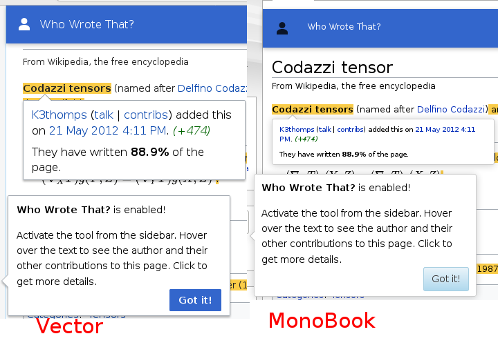
Including:
- Font size in the infobar and revision popup
- Icon is black instead of white
| dom_walden | |
| Dec 20 2019, 4:56 PM |
| F31484164: vector_monobook_comparison.png | |
| Dec 20 2019, 4:56 PM |
There are some inconsistencies in the way WWT looks on MonoBook compared to Vector.
Including:
Is this the expected behavior for MonoBook? In other words, does MonoBook naturally have a different look (so it doesn't need to mirror Vector), or do we strive for a strong similarity when implementing new features/tools? I'm pinging @Prtksxna to get his input. Thanks!
Thanks for tagging me @ifried :)
It is ok to keep the smaller font size and the button designs since they are part of Monobook's design.
- Icon is black instead of white
We should make this white since that is part of our design elements and isn't re-using any Monobook elements.
Unfortunately, Apex (ooui theme that monobook uses) doesn't support inverted ooui icons, which the info bar icon uses. That's why it's black in monobook while white in vector.
We can probably try to find some hacks to bypass this, but it might also be a good opportunity to upstream this in general, and have apex understand inverted icons.