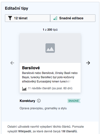
Description
Description
Details
Details
Customize query in gerrit
| Status | Subtype | Assigned | Task | ||
|---|---|---|---|---|---|
| Resolved | MMiller_WMF | T227728 [EPIC] Growth: Newcomer tasks 1.0 | |||
| Resolved | kostajh | T232423 Newcomer tasks: suggested edits module | |||
| Resolved | kostajh | T238280 Newcomer tasks: mobile module styling issues | |||
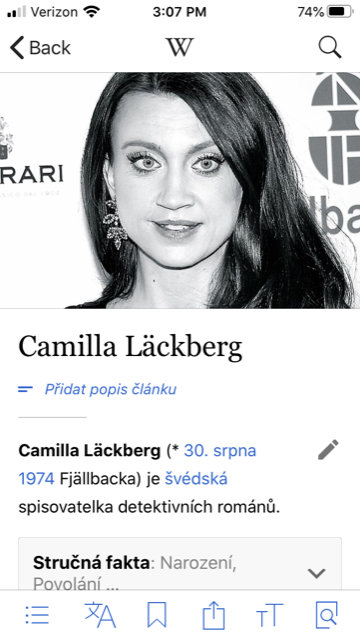
| Resolved | BUG REPORT | Tgr | T244210 Newcomer tasks: Suggested article image should be repeated when image width is less than card width |
Event Timeline
Comment Actions
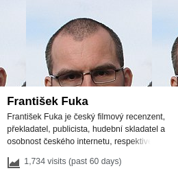
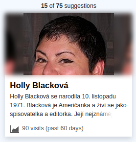
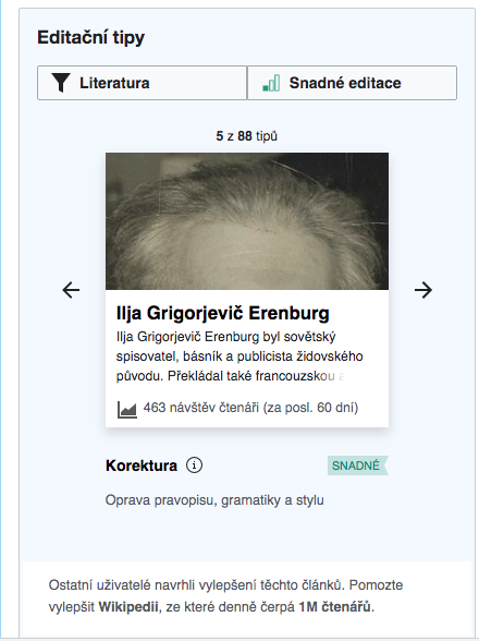
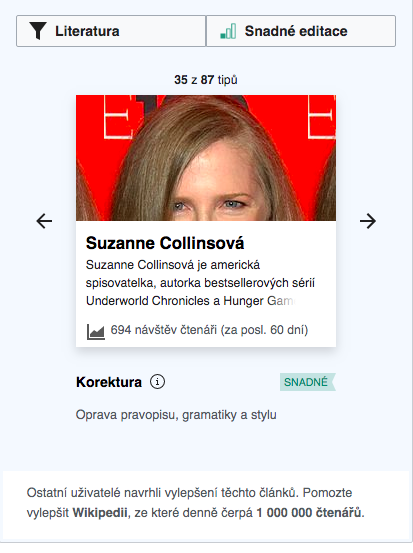
I actually find not repeating the image and having the white gaps looks more weird and broken. We already had agreed to implement the repeat-x image on T238282 which is also why this is filed as a regression bug. While this example of a person's face being shown is not that common and looks admittedly a bit off, it is preferable in terms of it occurring occasionally, vs having the white gaps appear all the times the image doesn't fill card width.
HOWEVER, I would be really interested if we could slightly tweak the implementation so that a slight blur to the repeated side images:
Option 1: Blur added to the repeated images 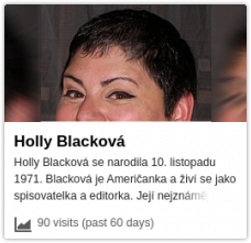 | Option 2: Same image covering the background and blurred 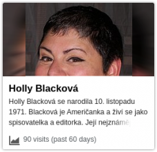 |
The second option is the standard when mobile portrait video is shown in a landscape video player (eg mobile videos on YouTube).
Comment Actions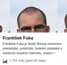
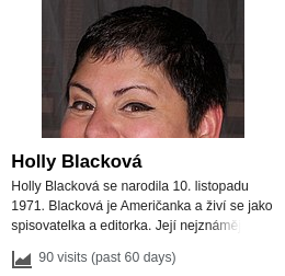
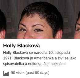
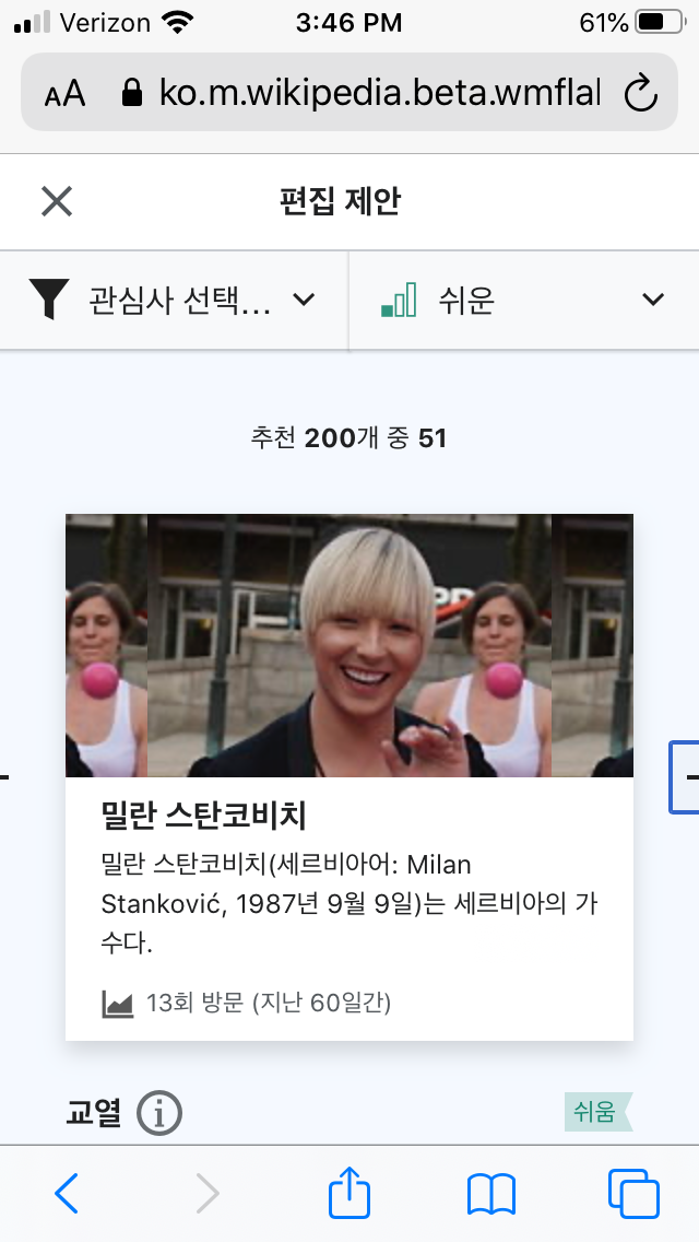
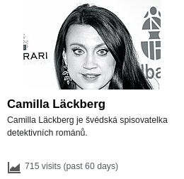
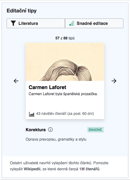
Paging through a random topic, about half the non-fullwidth images where headshots where a part of the head got repeated, so I don't think it's that rare. And it's even more apparent when the background has a different color:
AFAIK there isn't any straightforward way to blur parts of the image only, but we could probably display a blurred version of the image with repeat-x or stretch, and then another unblurred instance on top of it. IE does not support CSS filters so the side images would appear unblurred, but I imagine we can live with that.
Comment Actions
Yes I found this stackoverflow post which is not so straightforward. +1 to this tweak with the option to blur the *stretched width* background image). Also, yes to using CSS filter: blur and living without it on IE.
Comment Actions
I wonder if it's possible to repeat + flip horizontally. That would make the edges line up nicely.
Comment Actions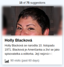
Can probably be fixed with SVG blur though, and that even works in IE.
Here's a straightforward attempt, with filter:blur(5px). This looks pretty bad because the blur affects the image edge as well.
Can probably be fixed with SVG blur though, and that even works in IE.
Comment Actions
Thanks for drumming that up so quickly! My pref is stretched blur instead of this repeat since if that may reduce the edge blurring issue, combined with SVG blur.
Comment Actions
This is surprisingly hard to get right:
- As shown above, CSS blur spreads the image outside its original area (could be addressed in a number of ways, overflow:hidden, clip, background-clip...) and more problematically fades the edges out. Or more precisely, assumes the image is on a white background and uses that white color for the convolution when near the edges. SVG has an option to avoid this (edgeMode) but it does not seem to be implemented in any browser. I guess we could scale the background image to extend beyond the card a bit and then clip it, so this would be manageable, although it would add to the weirdness factor.
- Some images have transparent areas, where the blurred background version shows through. I don't really see a way to deal with this. If we add a white background, there will be an edge between that background and the stretched or repeated background image - the same problem this task is trying to solve.
So I'll fall back to adding repeat-x to the original image, which is trivial to do. It will look bad in some cases; but the composition approach would look bad in some others, and has a lot more moving parts that can go wrong.
Comment Actions
Change 597577 had a related patch set uploaded (by Gergő Tisza; owner: Gergő Tisza):
[mediawiki/extensions/GrowthExperiments@master] Make task card images repeat horizontally
Comment Actions
Change 597577 merged by jenkins-bot:
[mediawiki/extensions/GrowthExperiments@master] Make task card images repeat horizontally
Comment Actions
What's was checked: arwiki, cswiki, kowiki, and viwiki betalabs. Also checked IE11, Safari 13, and Edge81 in Saucelabs. Also it was tested on a real mobile device (iPhone 6s).
@RHo for your review:
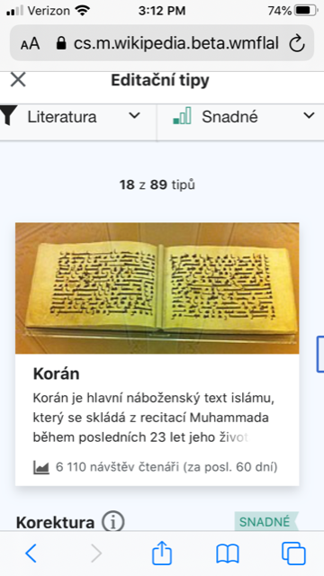
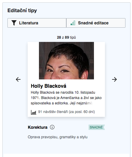
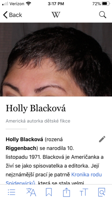
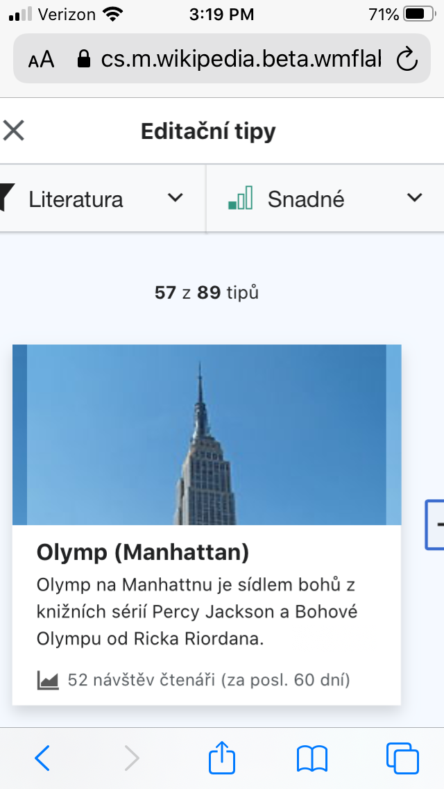
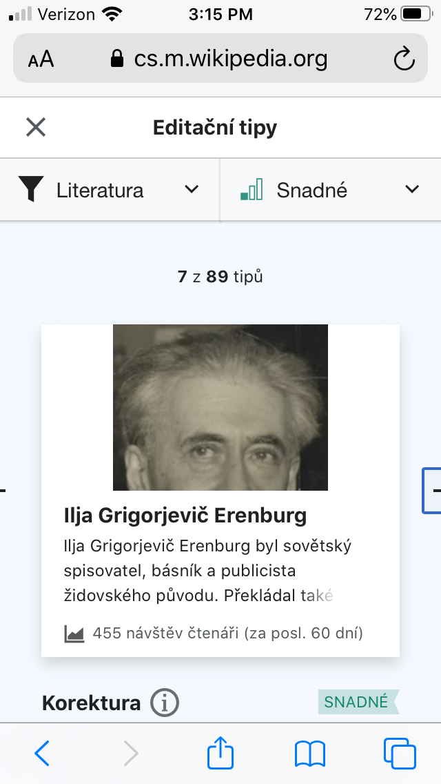
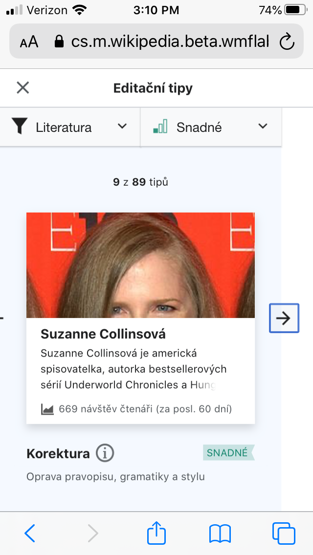
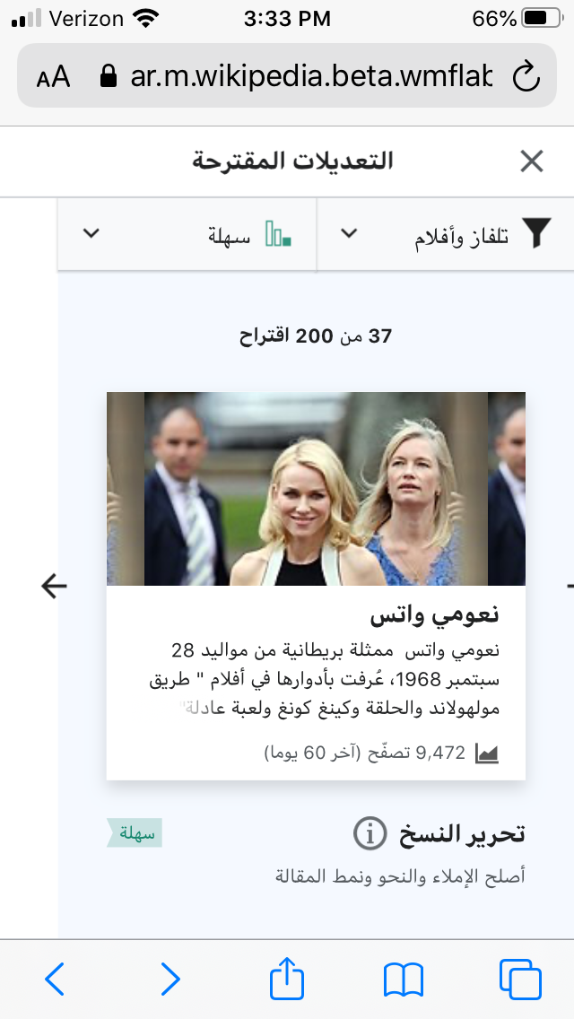
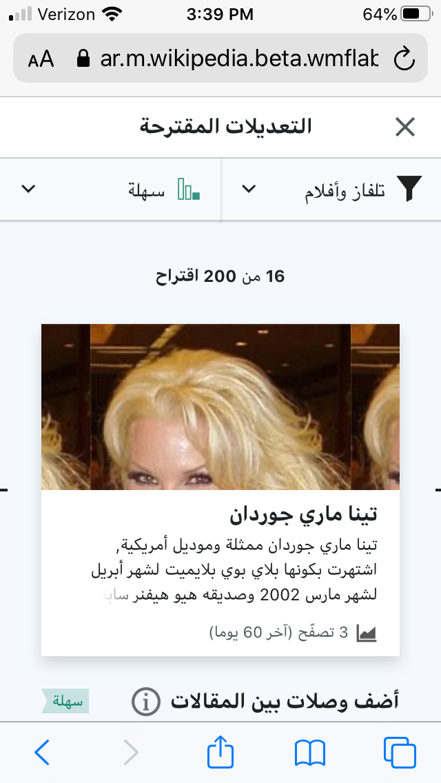
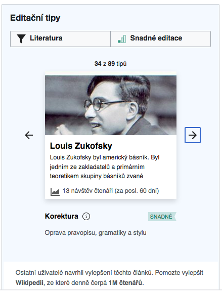
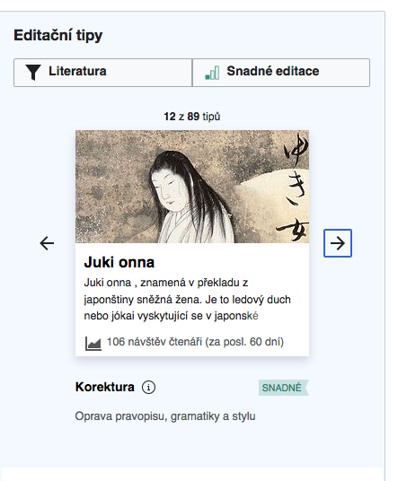
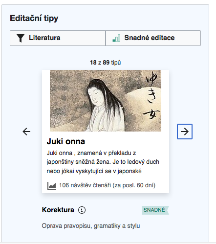
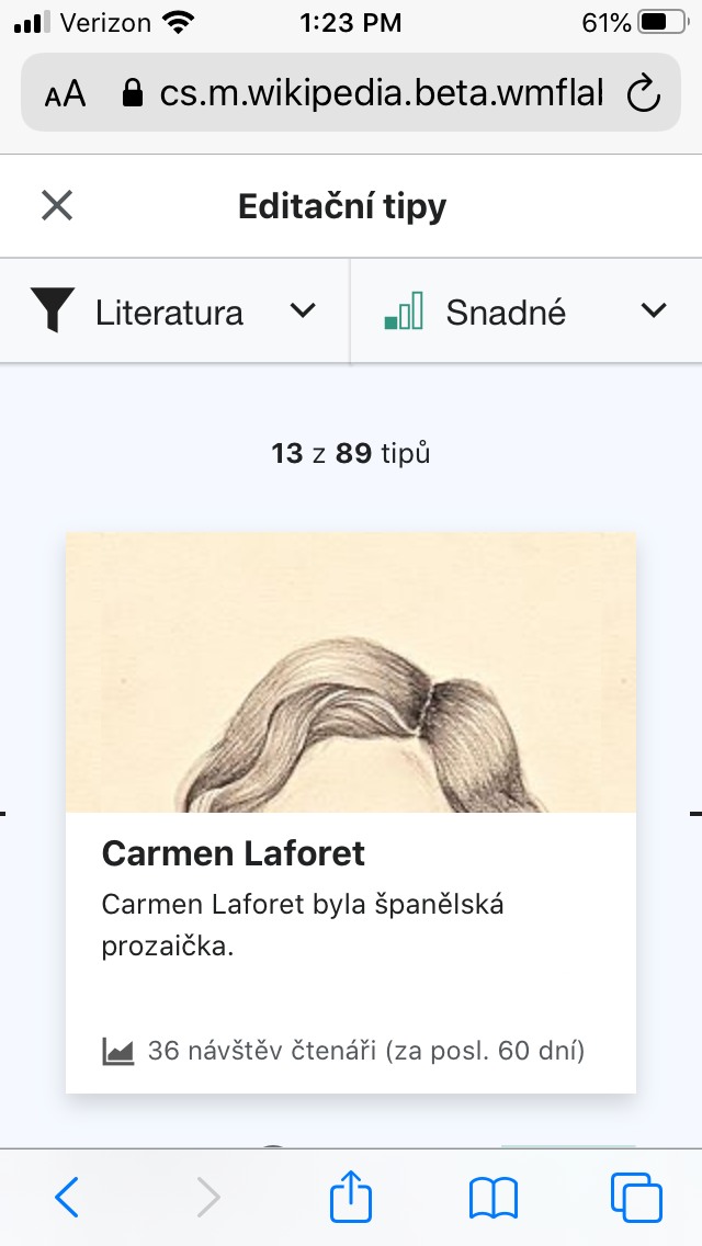
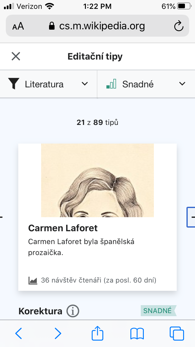
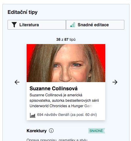
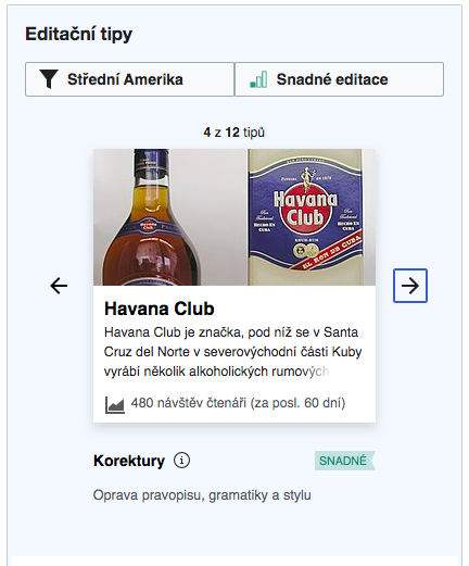
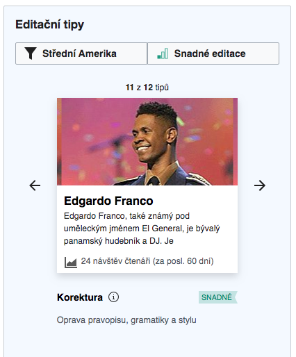
- The number of images where the repeated image feature is noticeable is roughly 10% of all images (by noticeable I mean when an image has those repeated parts and a user may notice them). From those 10% half of the images have somewhat sub optimal image display (see the comparison below).
- In betalabs, the images are cut off horizontally more than in production
(1) Images that are full-width images (seemed to be unaffected by the fix).
| cswiki betalabs | arwiki betalabs | kowiki betalabs |
 | 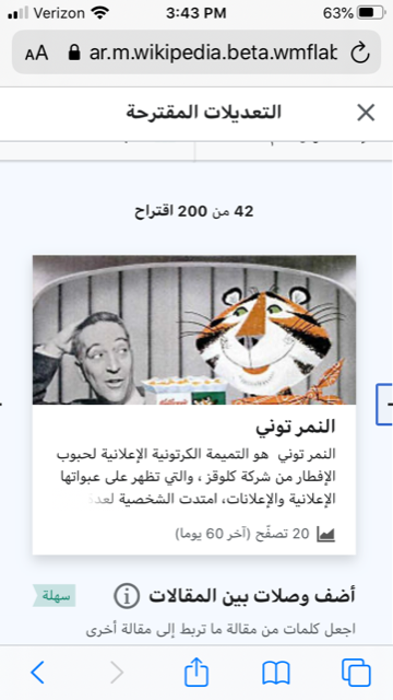 | 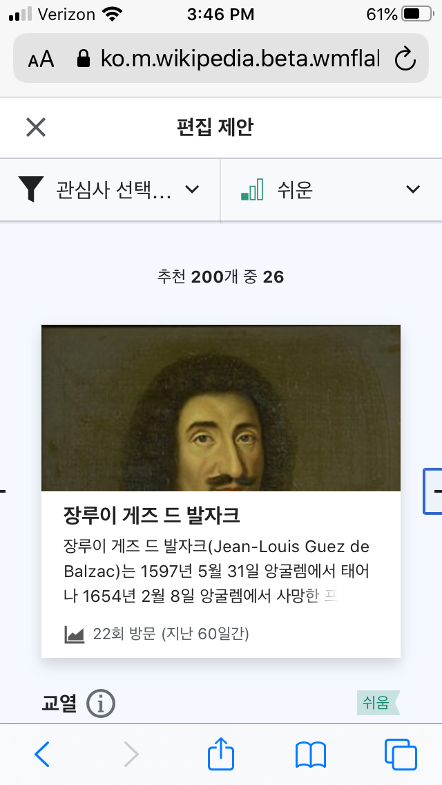 |
(2) Images where the repeated feature is noticeable but looks fine.
Note: In betalabs for Kniha_Mormonova the image from the info box was not used, for some reason.
| cswiki betalabs | cswiki current production | wikipedia app (on iPHone 6s) |
 |  |  |
 |  |  |
 |  |  |
 |  |  |
(3) Problematic images
| cswiki betalabs | cswiki current production | wikipedia app (on iPHone 6s) |
 |  |  |
 |  |  |
 |  |  |
 |  |  |
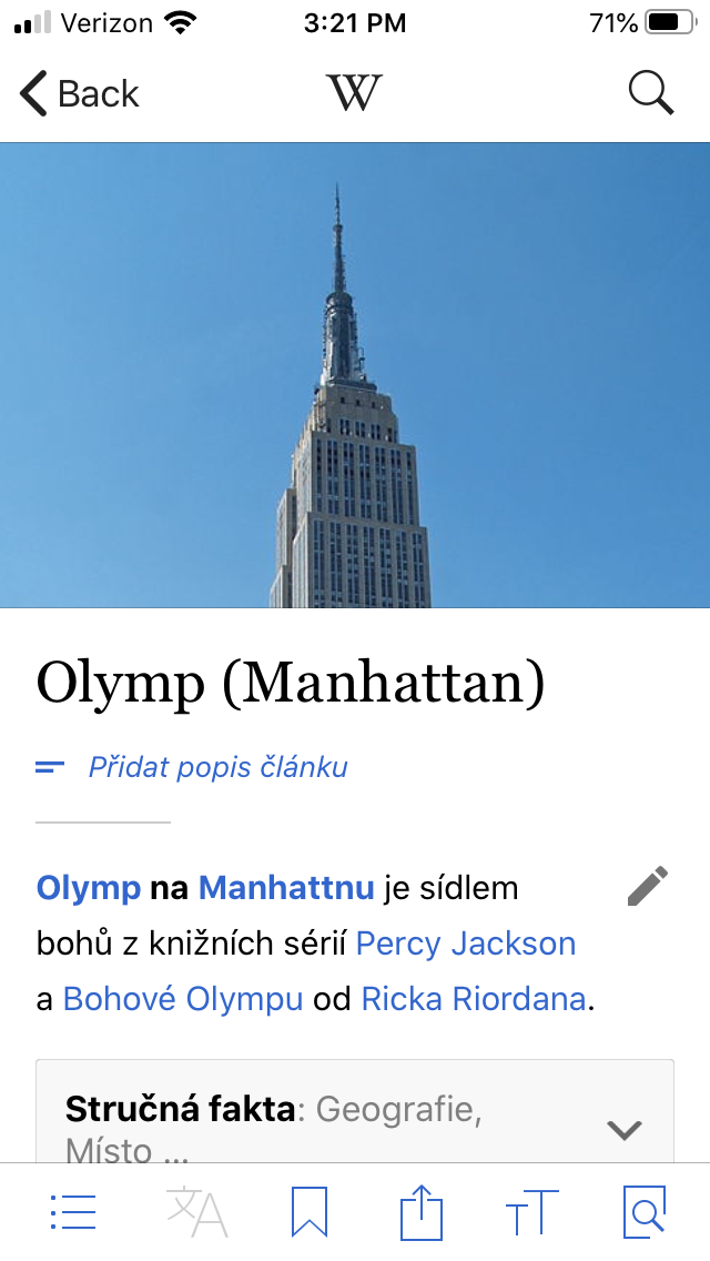
More examples (without comparison pictures)
 |  |  | |
Comment Actions
Thanks @Etonkovidova - I agree it's not the best for this ~5% to be very noticeably repeated-x, but it looks intentional rather than having the white empty spaces which appears imho to look like an error. Moving to PM for final word...
- In betalabs, the images are cut off horizontally more than in production
Yes, this separate issue of not-great face detection is filed in T240034. IIRC the apps generally look better because they have implemented some face-detection on article lead images (though that is also not perfect – see T148926#3126381).
(3) Problematic images
cswiki betalabs cswiki current production wikipedia app (on iPHone 6s)
Comment Actions
I cannot reproduce that, the images have the exact same height for me (on desktop and mobile Chrome). Which is expected, the only thing that was changed is the background-repeat property.
Comment Actions
@RHo looking at the app screenshots made me wonder why we don't just scale our images to full width. I originally assumed this problem occurs when the image is physically not wide enough to fill the card, but the app uses larger sizes so that cannot be the case (and I checked manually and indeed it isn't). So e.g.
| instead of this | like this |
 |  |
Maybe that's just an artifact of what API we are using to get the image URL?
Comment Actions
Hi @Tgr - Yes indeed, this repeat-x is a workaround from the original request to have the image at full-width and centered. However @kostajh commented the following on T238280#5696825 regarding size-limits to thumbnails from RESTBase:
I would be in favour of returning to the full-width solution if we can get larger resolution images from the same place that apps are getting these images! Moving back to Needs More Work since it sounds like this is worth exploring...
Comment Actions
Yeah, we can just replace the size parameter in the URL to get what we want (unless the original image is narrower than 260px which should be very rare). The flip side is that it will load a bit slower as 260px is not a standard image width so the thumbnail is probably not pre-rendered. (Then again, I'm not sure the size offered by RESTBase is any different...)
Comment Actions
The height is is same, yes. I re-checked and realized that describing images in betalabs as "cut off horizontally " was not correct. The images in betalabs are displayed more close-up (and different centering?) than in production (may be there is a better term to describe it). I checked FF and mobile and below is another comparison set (separately for mobile and desktop).
- Desktop (FF)
| betalabs | production |
 |  |
 |  |
- Mobile (iPhone 6s)
| betalabs | production |
 |  |
Comment Actions
Yeah, we are talking about the same thing, I just can't reproduce it happening.
Looking at your first example, it doesn't even seem related to the image being narrower than the card.
I imagine this is due to images coming either from the action API or RESTBase, with slightly different resolution.
Comment Actions
Change 598115 had a related patch set uploaded (by Gergő Tisza; owner: Gergő Tisza):
[mediawiki/core@master] Add mw.util.parseImageUrl
Comment Actions
Change 598127 had a related patch set uploaded (by Gergő Tisza; owner: Gergő Tisza):
[mediawiki/core@master] Add URL template to the return data of mw.util.parseImageUrl
Comment Actions
Change 598115 merged by jenkins-bot:
[mediawiki/core@master] mediawiki.util: Add mw.util.parseImageUrl
Comment Actions
Change 598154 had a related patch set uploaded (by Gergő Tisza; owner: Gergő Tisza):
[mediawiki/extensions/GrowthExperiments@master] Resize image card thumbnails to be exactly 260 pixels
Comment Actions
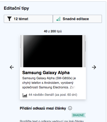
The patches improve thumbnail handling so we show a large enough thumbnail to fill the card whenever possible. Repetition should only be used now for thumbnails where the original, full-sized image is smaller than 260px, which I think in practice only happens for some company logos.
Comment Actions
Change 598127 merged by jenkins-bot:
[mediawiki/core@master] Add URL template to the return data of mw.util.parseImageUrl
Comment Actions
Change 598154 merged by jenkins-bot:
[mediawiki/extensions/GrowthExperiments@master] Resize image card thumbnails to be exactly 260 pixels
Comment Actions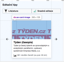
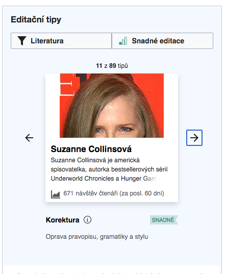
Any image card thumbnails has thumbnailWidth: 260:

Note: It seems that betalabs displays images inherently different than production does (in terms of positioning). The example below from production looked different when they were in betalabs.
| cswiki betalabs | current production |
 |  |
 |  |
Comment Actions
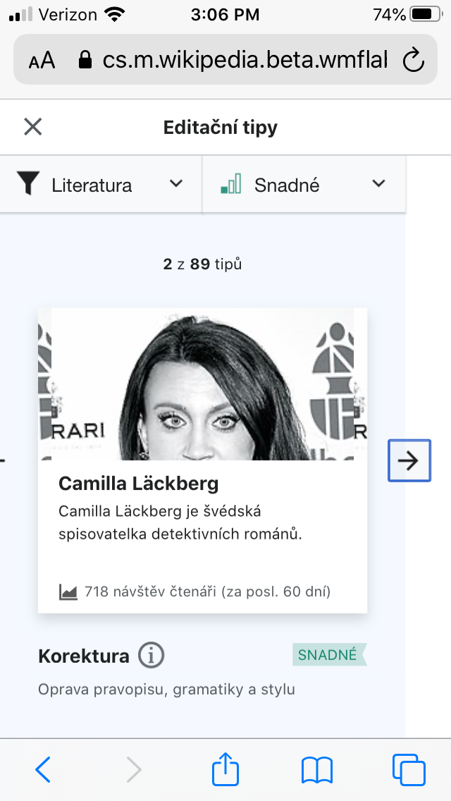
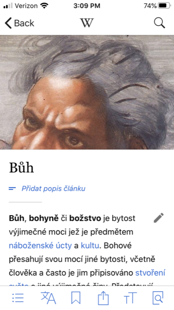
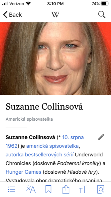
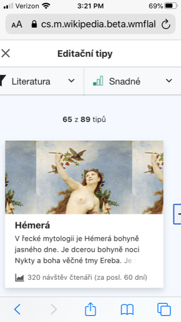
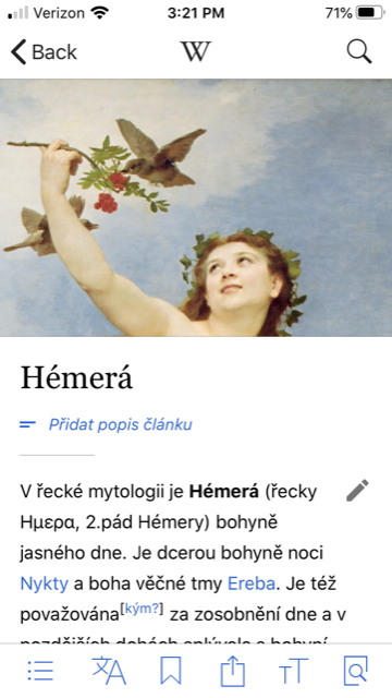
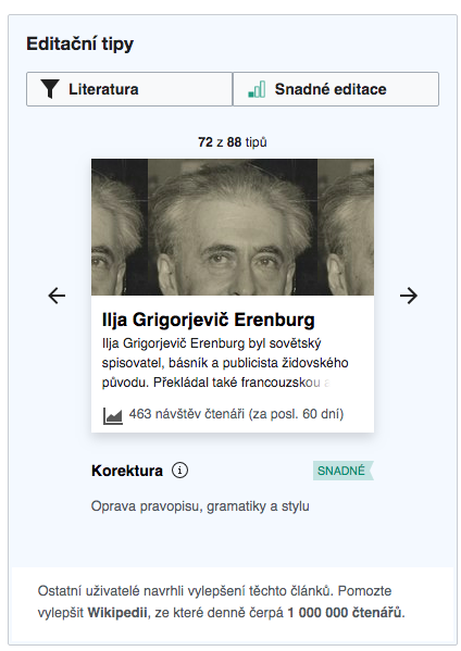
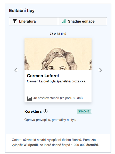
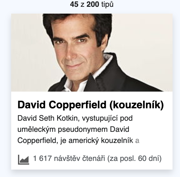
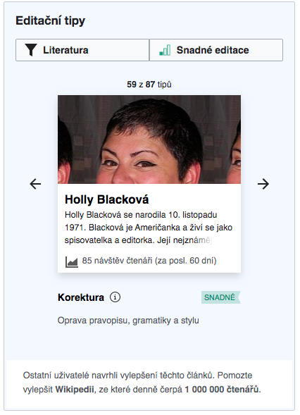
I've posted on T240034 about ways to improve faces being cut off, but in the interim can we consider making the image be positioned at background-position-y: 25% instead? This seems to prevent people's faces from being cut off at the forehead (when the image is vertically positioned at top) and also reduces the heads being cut off entire when the image is vertically centered.
A few examples in CS beta:
| top | background-position-y: 25%; |
 |  |
 |  |
 |  |
 |  |
 |  |
 |  |
Making this update will mean also ensuring the image icon positioning when there is no thumbnail needs to be updated
 |  |
Comment Actions
Change 601807 had a related patch set uploaded (by Gergő Tisza; owner: Gergő Tisza):
[mediawiki/extensions/GrowthExperiments@master] Improve suggested edits card image positioning
Comment Actions
Change 601807 merged by jenkins-bot:
[mediawiki/extensions/GrowthExperiments@master] Improve suggested edits card image positioning
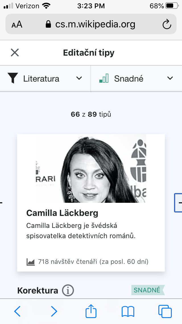
Comment Actions
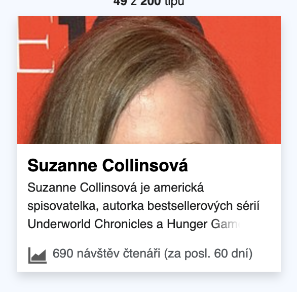
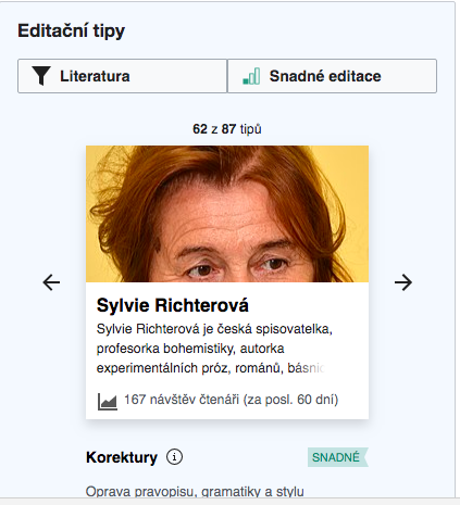
Checked in betalabs and compared with production -the display seems to be really improved:
| betalabs | production |
 |  |
 |  |
 |  |
 |  |
 |  |
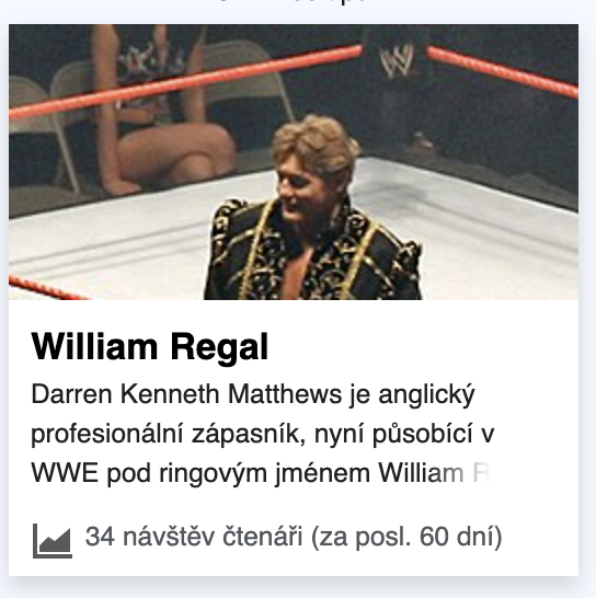
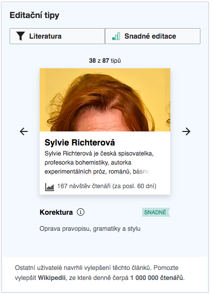
Here are some examples when the new positioning made the image display not so optimal, but such cases are really rare and the images are still displayed ok.
| betalabs | production |
 |  |
 |  |
Comment Actions

Checked - the position of the thumbnail in betalabs is like on the first of your screenshots: