Page MenuHomePhabricator

Citation text in popups on mobile web includes unexpected text (uses wrong styling)
Closed, ResolvedPublic

Assigned To
Authored By
matmarex
Feb 6 2020, 5:58 PM
Referenced Files
F31615030: image.png
Feb 13 2020, 9:41 PM
F31615032: image.png
Feb 13 2020, 9:41 PM
F31553090: Screen Shot 2020-02-07 at 11.30.18 AM.png
Feb 7 2020, 3:33 AM
F31552451: image.png
Feb 6 2020, 5:58 PM
F31552448: image.png
Feb 6 2020, 5:58 PM
F31551705: article.png
Feb 6 2020, 5:58 PM

Description

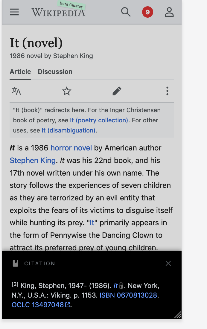
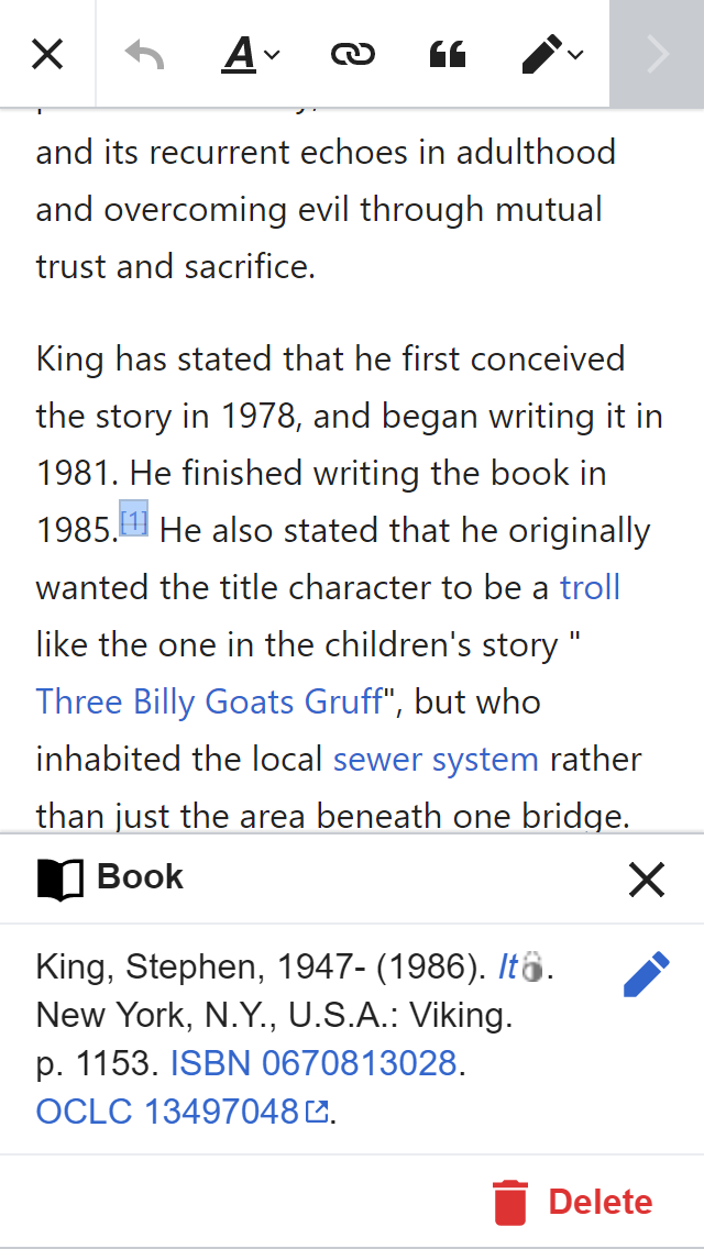
Citation text in popups on mobile web read mode includes unexpected text (uses wrong styling). I noticed this in the screenshot on T244443:

article.png (800×480 px, 147 KB)

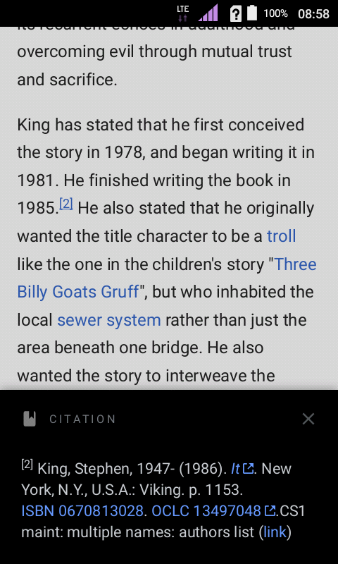
Compared to the same citation in mobile VE, or on desktop read mode:
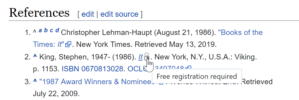
image.png (1×640 px, 116 KB)
image.png (335×999 px, 59 KB)
  • The "It" link doesn't have the little icon indicating that the target site requires registration.

Event Timeline

Change 570688 had a related patch set uploaded (by Bartosz Dziewoński; owner: Bartosz Dziewoński):
[mediawiki/extensions/MobileFrontend@master] Add .mw-parser-output to citation drawer so that TemplateStyles apply

https://gerrit.wikimedia.org/r/570688

Change 570688 merged by jenkins-bot:
[mediawiki/extensions/MobileFrontend@master] Add .mw-parser-output to citation drawer so that TemplateStyles apply

https://gerrit.wikimedia.org/r/570688

I'm not sure this was the right solution. It was never intended for the reference drawer to display styleable HTML.

In this particular case it's displaying an icon with a non-accessible contrast (grey icon on black background) and on a touch device there's no indication what that icon even means (there is no such thing as a tooltip on mobile). I think the new experience is evening more confusing than the old experience as now I have no idea what that icon reads and I can barely make it out. This also opens us up to issues where inline styles may create layouts that are incompatible with the reference drawer and its black background (e.g. assume a white background).

Screen Shot 2020-02-07 at 11.30.18 AM.png (1×692 px, 167 KB)

cc @Volker_E @alexhollender (click the reference on [2] on https://en.m.wikipedia.beta.wmflabs.org/wiki/It_(novel) )

Are we open to reverting this change and exploring it some more?

The icon is unimportant, but not displaying the maintenance text *is* important, and they come as a package deal, since they're both defined in the article's content.

@Jdlrobson @matmarex it's unclear to me what is the before & after screens to compare here?

https://en.m.wikipedia.org/wiki/It_(novel)

BeforeAfter
image.png (1×640 px, 133 KB)
image.png (1×640 px, 131 KB)

After the change, styles defined in the wikitext are respected – the error message is hidden, and the external link icon is replaced by a different one.

(By the way, I've already proposed a change on-wiki to improve the icon: https://en.wikipedia.org/wiki/Help_talk:Citation_Style_1#Use_high-resolution_icons)

This was already the case in mobile visual editor, and on desktop:

image.png (1×640 px, 116 KB)
image.png (335×999 px, 59 KB)

Bringing what's shown in the mobile preview closer to the wikitext sounds like a good idea to me in general. I'm fine with displaying the broken-ish icons, assuming that it will lead to things getting fixed so they work better on mobile eventually.

Cool! Thanks for checking in with your 2 cents!

Per above – thanks for reviewing!