Page MenuHomePhabricator

Card input for 3DS appears off-centered on Desktop views
Closed, ResolvedPublic1 Estimated Story Points

Assigned To
Authored By
jbolorinos-ctr
Feb 7 2020, 5:10 PM
Referenced Files
F31608574: image.png
Feb 11 2020, 5:29 PM
F31608577: image.png
Feb 11 2020, 5:29 PM
F31608551: phone1.png
Feb 11 2020, 5:29 PM
F31608432: Screenshot from 2020-02-11 11-37-53.png
Feb 11 2020, 4:38 PM
F31554040: image.png
Feb 7 2020, 5:10 PM
Tokens
"Burninate" token, awarded by spatton.

Description

Summary:
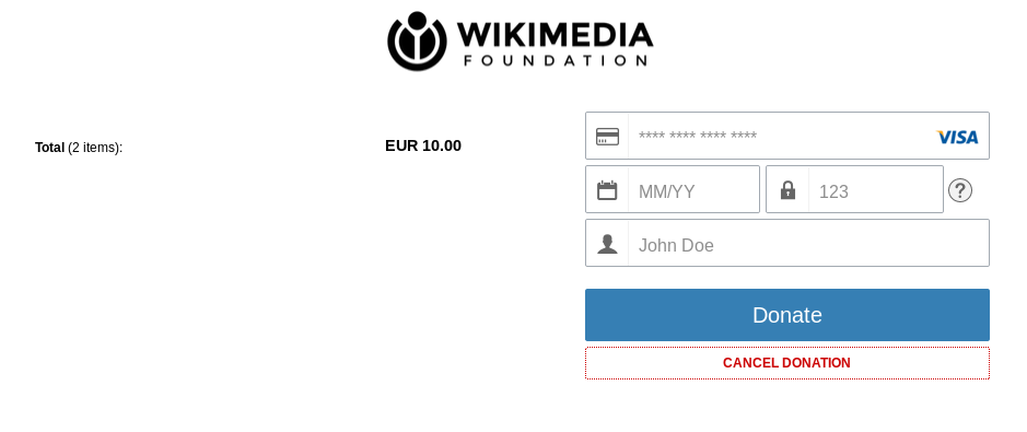
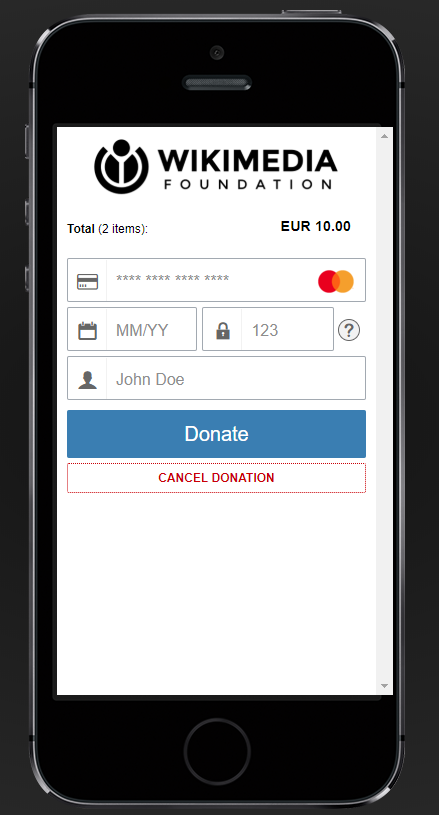
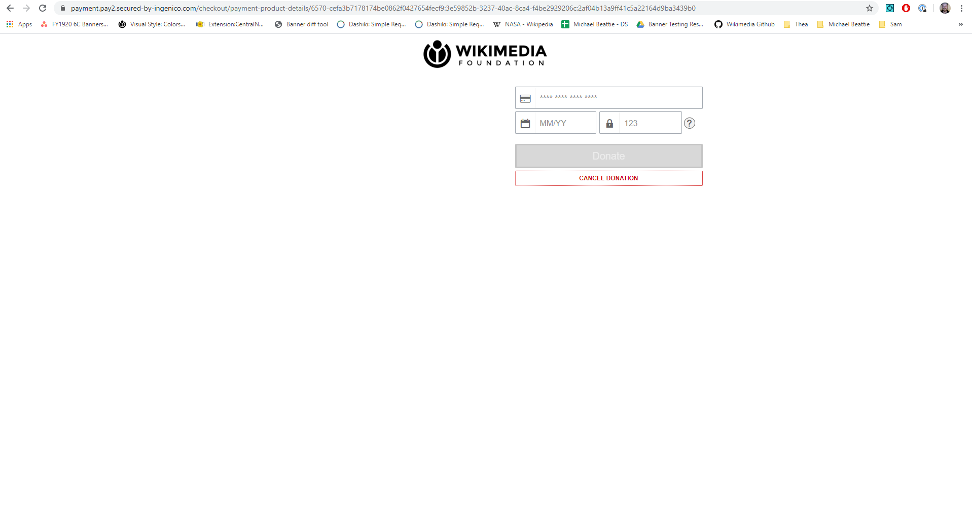
It was noticed during testing that the credit card input form for the 3DS payment service is not centered. Observe attached screenshot below.

image.png (1×1 px, 77 KB)

Steps to Reproduce:

  1. Open https://donate.wikimedia.org/w/index.php?title=Special:LandingPage&country=SE&uselang=en&utm_medium=spontaneous&utm_source=fr-redir&utm_campaign=internal_test on a desktop computer
  2. Select any donation amount
  3. Select Yes or No in the "Can we stay in touch?" section
  4. Click on the Credit Card payment option
  5. Enter any name in "First name" and "Last name" fields
  6. Enter a valid email in the "Email address" input
  7. Select "Visa"

Actual Results:
After selecting Visa the user is redirected to a card input page where the inputs appear off-centered

Expected Results:
We would expect the credit card input to appear centered on the page.

Event Timeline

I thought this was supposed to load in the iframe. If it is supposed to be a separate page, we'll have to adjust this.

XenoRyet moved this task from Backlog to Doing on the Fundraising Sprint CAPS LOCK CULTS board.
XenoRyet set the point value for this task to 1.

We're limited in our ability to change this page. They let us hide certain elements, but to hide the 'shopping cart' (list of items and prices) we had to set the text to white on white. Here's an example of what it would look like to change it back to black text on white:

Screenshot from 2020-02-11 11-37-53.png (395×939 px, 28 KB)

Does that look better?

The title of the page is 'Cards', which we should probably change too. It seems to be set in the language pack's gc.general.paymentProductGroups.cards.name

That key makes it appear that the same string is used for the title of that page and the link to indicate paying with a card in the payment product selection page. We are currently skipping the selection page and going straight to the card number input. If we are sure we will always do that, we can safely change that string to "Make your donation now" to be consistent with the title of the page on payments-wiki.

If we do add the shopping cart text back in, that will affect what it looks like on mobile as well. Here's what that would look like:

phone1.png (815×440 px, 130 KB)

Another option, which would be fiddly and need much more testing to be sure it's displaying right on all devices, is that we can put a background image in the shopping cart container. Here's a quick mockup of that. Obviously we won't want just the logo again, and the fiddly bit is it has to have the right amount of whitespace to look right.

On Desktop:

image.png (473×1 px, 42 KB)

And Mobile:

image.png (813×430 px, 158 KB)

What about adding some legal text in the section on the left? Just another thought on how to fill that space...

In the fr-tech office hours meeting @Ppena also suggested the "Total: (2 items)" text be changed to "Total: ", without the items text

@XenoRyet and @Ejegg let's go with @Ejegg 's version and call it a day. Thanks all!

Yep, I just checked (by highlighting the white-on-white text) and it does indeed just say Total 30.00 SEK (since we don't send an itemization).

XenoRyet moved this task from Doing to Done on the Fundraising Sprint CAPS LOCK CULTS board.