Page MenuHomePhabricator

[L] Add UI elements with the description for better differentiation of suggested tags for identical labels
Closed, ResolvedPublic

Description

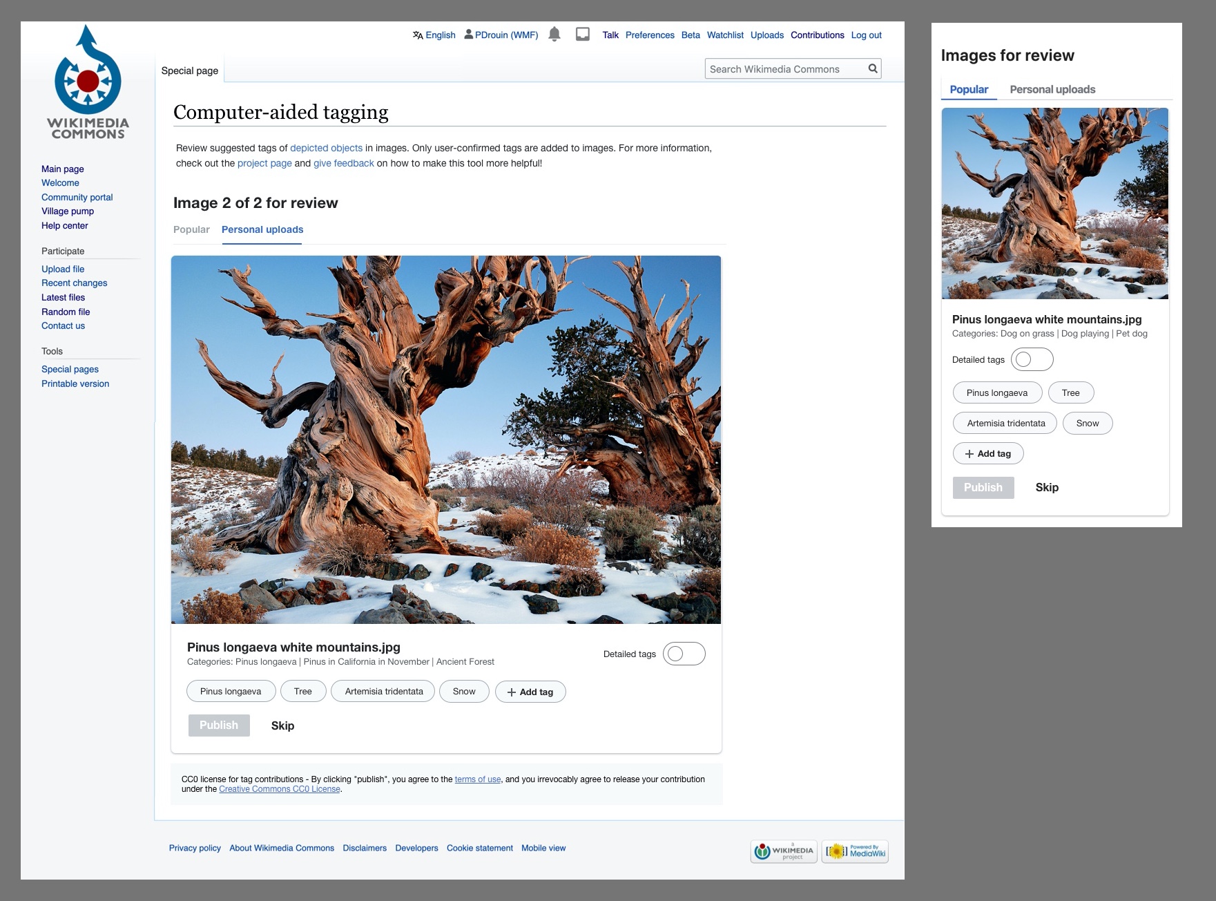
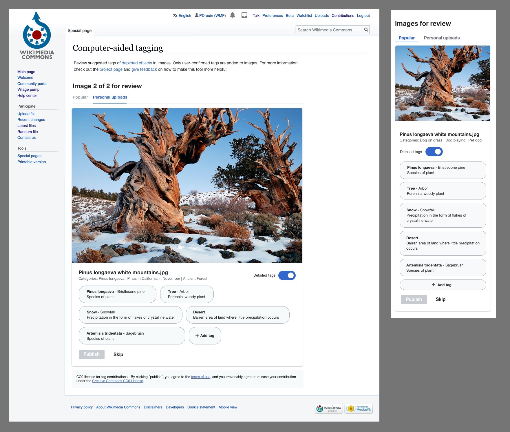
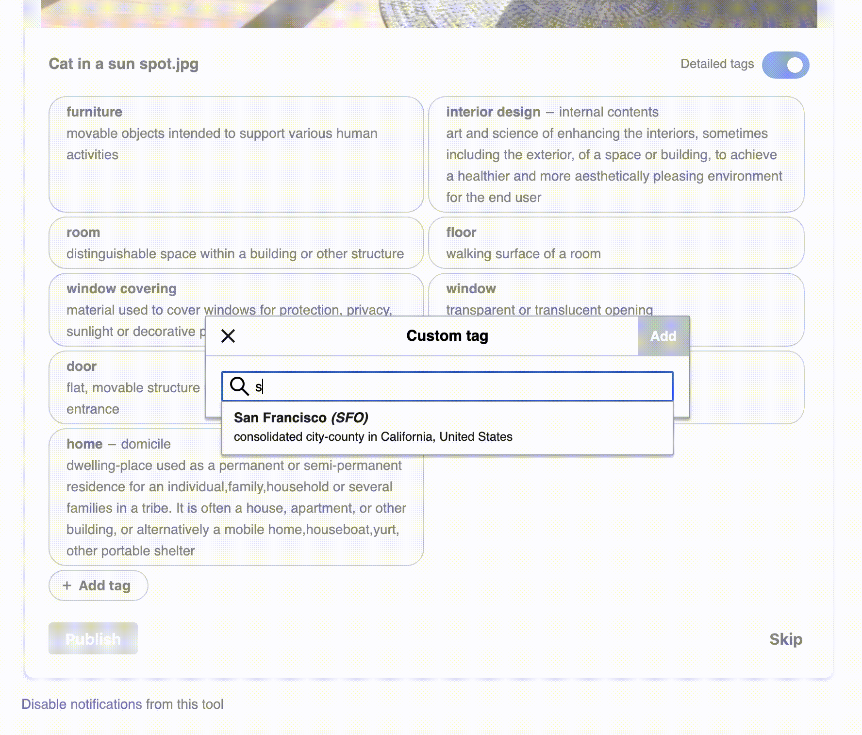
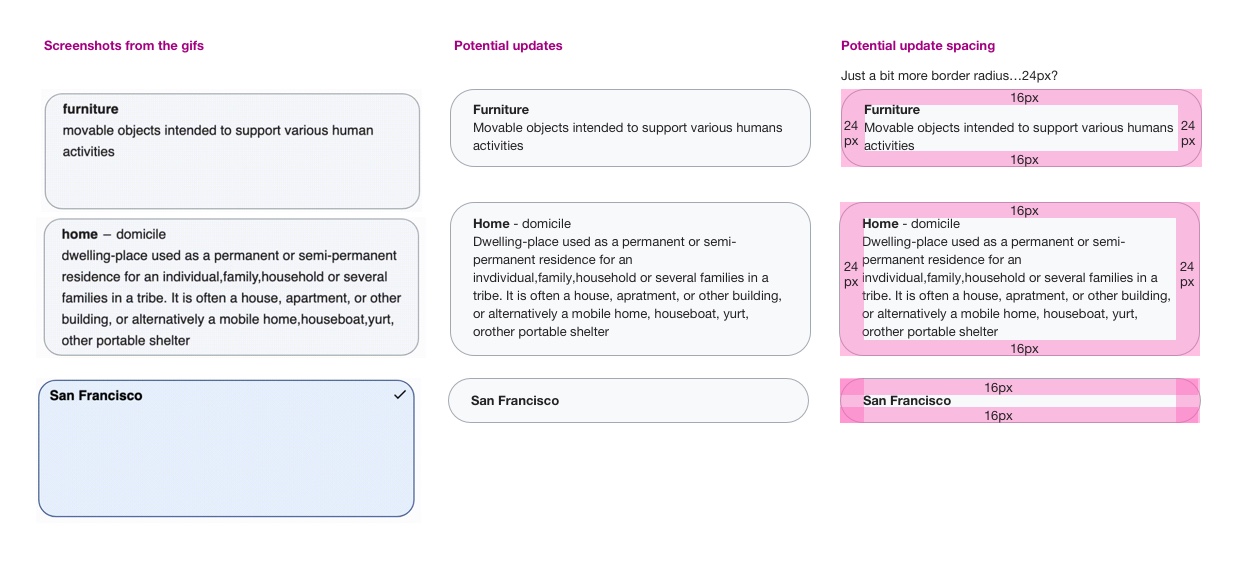
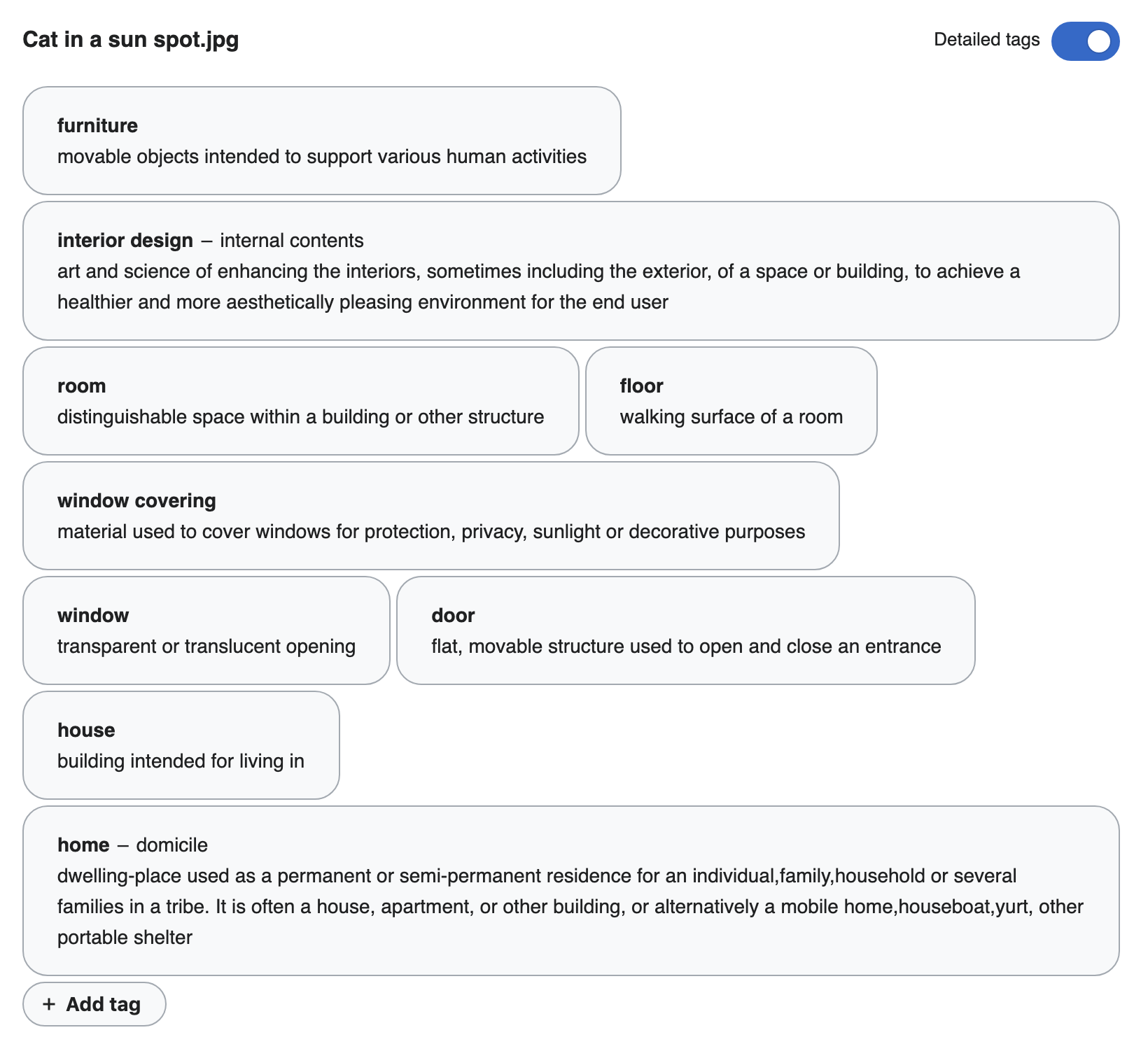
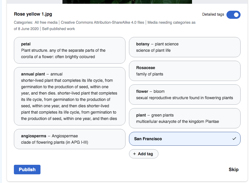
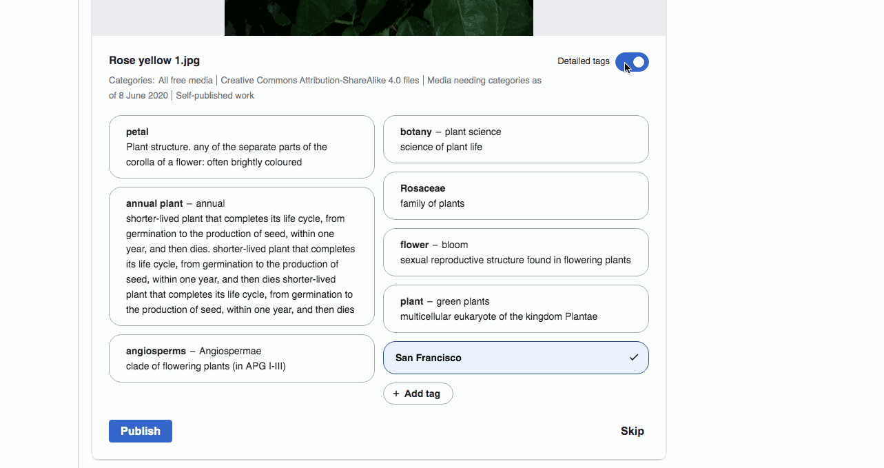
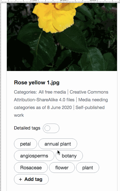
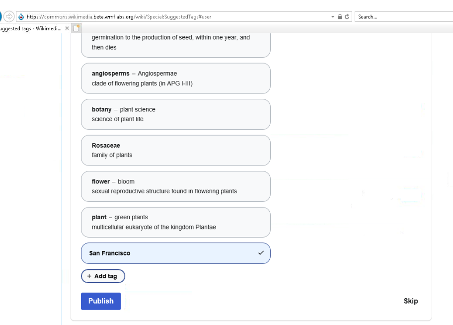
Add tooltips with the description for better differentiation of suggested tags in case of identica labels.

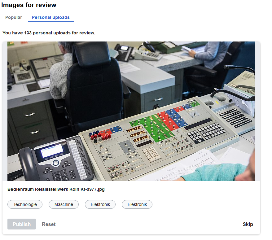
Today I saw this suggestion with twice "Elektronik" in German. I was unable to decide which tag could be a good tag.

grafik.png (775×878 px, 880 KB)

Acceptance Criteria:

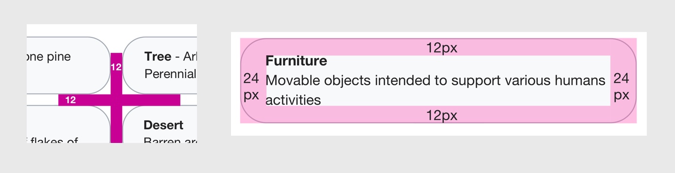
  • Update UI to match new design in comments
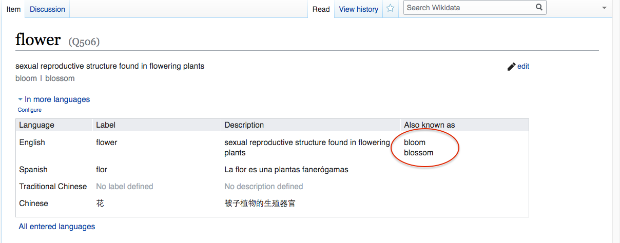
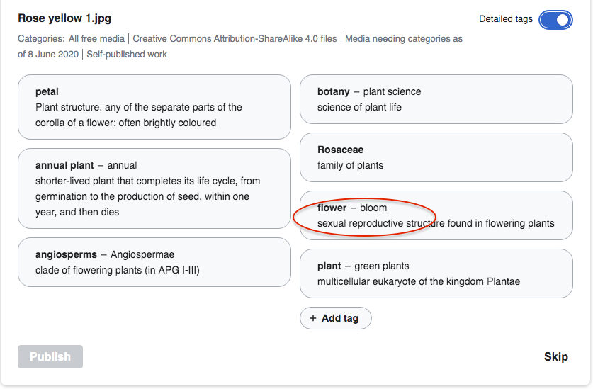
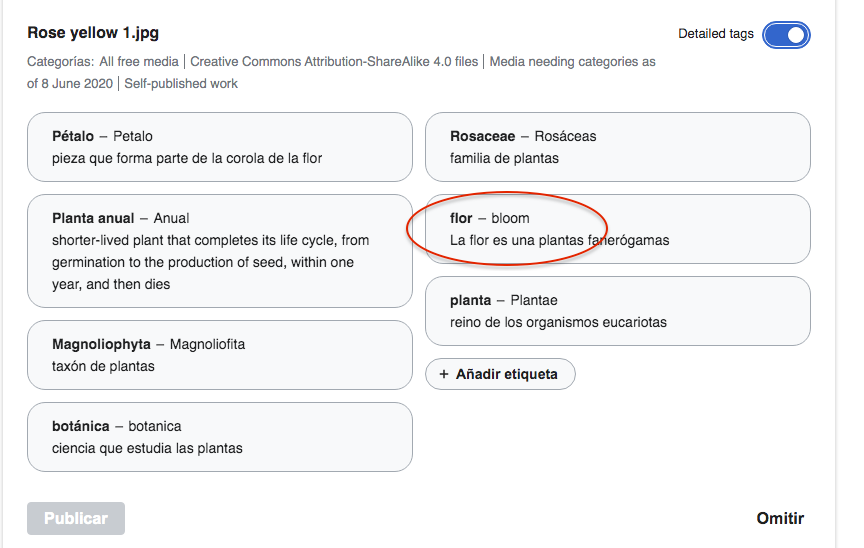
  • Use the first alias from Wikidata
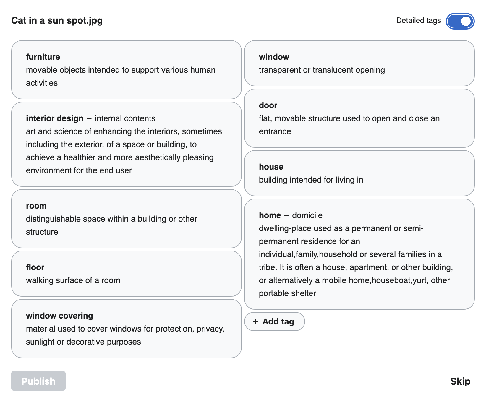
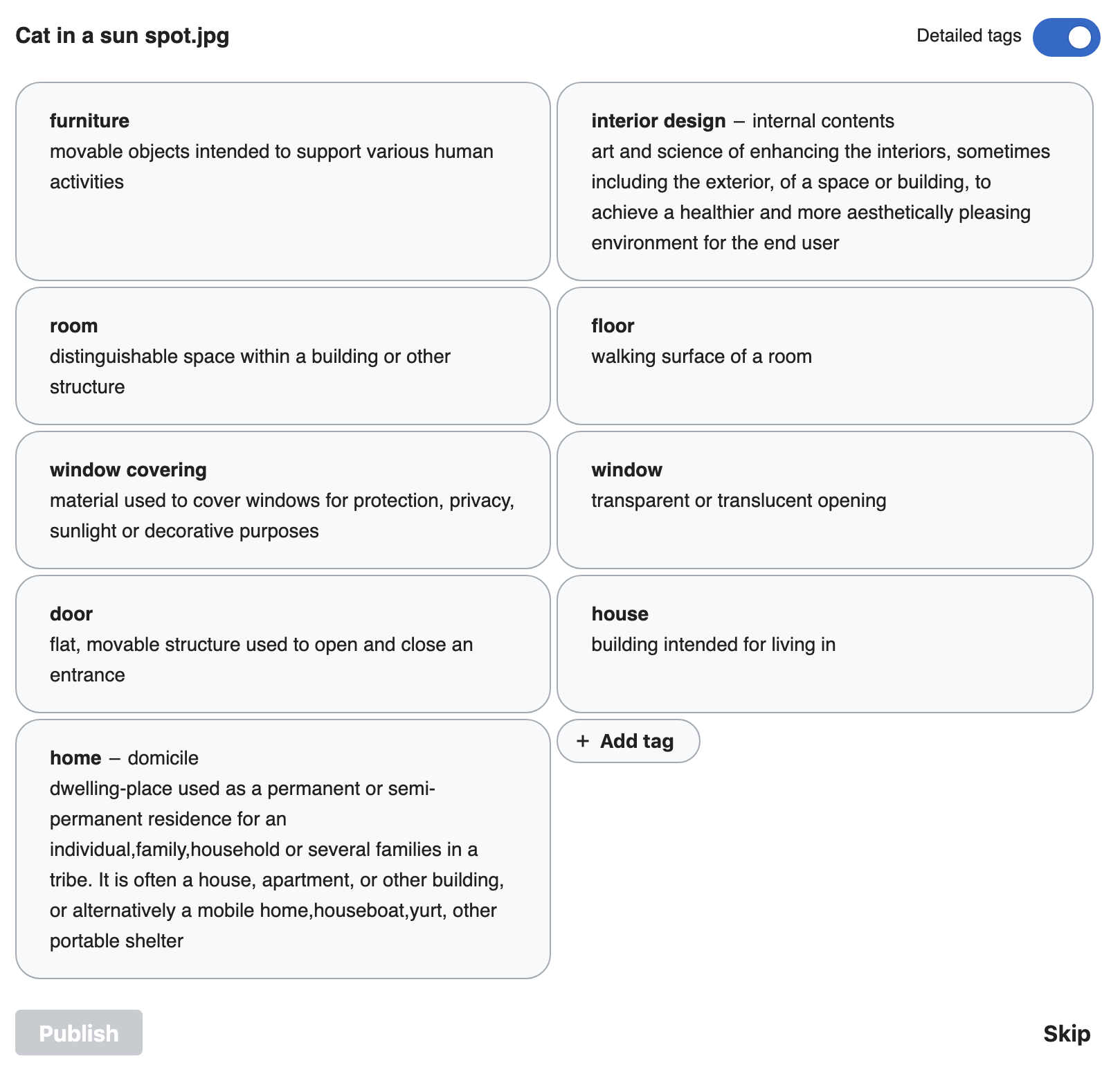
  • Labels and descriptions should follow language fallback chains
  • Aliases should only display if there is one in the current language
  • The whole description should be shown, and the tag should wrap
    1. This may change in design QA to determine a character limit for truncation
  • This change will need Design QA

COVID-19 Deployment Criteria

  • Can you roll back this change without lasting impact?
    1. A recovery plan is required as this will help identify our capacity for recovering from the failure
    2. THIS IS A KEY QUESTION, if you can’t answer it, you shouldn’t deploy
  • Is specialized knowledge required to support this change in production? If so, are there multiple people with this knowledge?
  • Is there a way to increase confidence about the correctness of this change?
    1. Reviews (Design, Code, etc)
    2. Testing coverage (unit tests, integration tests)
    3. Manual testing (e.g. Beta, vagrant, docker)

Event Timeline

Restricted Application added a subscriber: Aklapper. · View Herald Transcript

This needs design/methodology that will also work on mobile web and the Android itself, where we don't have mouseovers.

Ramsey-WMF renamed this task from Add tooltips with the description for better differentiation of suggested tags for identical labels to Add UI elements with the description for better differentiation of suggested tags for identical labels.Feb 19 2020, 6:25 PM

Questions that came up during estimation:

-How will we differentiate the tags? What information do we need to show? Descriptions?
-Maybe we could add a link that lets the user click it to see additional information, rather than add a lot of information to the screen, but the current click action already does something.

  • Yes, descriptions is most likely
  • Yes, talked with Matthew about this and discussed it perhaps being a toggle link/button. He's working on design for this.

Questions that came up during estimation:

-How will we differentiate the tags? What information do we need to show? Descriptions?
-Maybe we could add a link that lets the user click it to see additional information, rather than add a lot of information to the screen, but the current click action already does something.

The current idea is to have a toggle that allows users to see more detailed tags. This includes the Wikidata Description and Wikidata Alias, which should help empower users to make accurate tagging choices along with solving the homonym scenario. Attached are screenshots of both desktop and mobile web with the toggle on and the toggle off.

Toggle off

toggle_off.jpg (1×1 px, 566 KB)

Toggle on

toggle_on.jpg (1×1 px, 635 KB)

CBogen renamed this task from Add UI elements with the description for better differentiation of suggested tags for identical labels to [L] Add UI elements with the description for better differentiation of suggested tags for identical labels.Mar 31 2020, 4:27 PM
CBogen updated the task description. (Show Details)

The new designs will require some additional data (mainly: descriptions/aliases for each tag being displayed). We've also just added the ability to display the categories a File belongs to, which required a new API request from the client.

I'm a little concerned that continuing to add new API requests on the client-side to support these new features will start to degrade the perceived performance of this tool.

Before we start building out this new design, it might be worth having a discussion about whether we can shift any of these additional API requests back to the server side – either by modifying one of the existing endpoints or by adding a new one. For example, if the API endpoint that provides the suggestions could also provide their aliases and descriptions at the same time, that could save us from making an additional request after each image loads. Same thing for image and image categories.

An advantage of doing this would be that if we end up porting the front-end over to Vue, we won't have to re-create this functionality because we could continue to use the same API endpoints.

If we do decide to add some new capabilities to the existing endpoints, I'd say that we should create a new ticket for that task which would block this one. @Mholloway any thoughts whether this is feasible and/or worth doing?

Yes, we're already looking up the Wikidata items to retrieve their labels in the LabelResolver class, so it should be relatively simple to update that class to gather the description and aliases as well.

BTW, sorry I haven't been keeping tabs on the MachineVision patches lately, but the categories for a file page can be retrieved as part of the main imagelabels query rather than making a separate query, e.g.:

https://commons.wikimedia.org/w/api.php?action=query&generator=unreviewedimagelabels&prop=imagelabels|categories&guillimit=10&cllimit=500&clshow=!hidden

Now that a patch for T249133 is complete, this should be ready for development.

Probably makes the most sense to wait for this until we know what we're going to do with moving the CAT front-end to Vue.js

@mwilliams I've been doing a lot of experimentation on the design and animation of this feature (and thanks to @egardner for his helpful feedback). Some notes:

  • I initially intended to create a move transition and you can see the outcome of that in the last gif. It's still buggy and, ultimately, I think it's too distracting. The fade animation is much less complex and, hopefully, just helps the reader's eyes adjust to the new layout and content. If we really want to pursue the move transition I'll have to spend more time getting it right, but I think the fade transition is better.
  • Some of the descriptions are quite long which leads to tall tags and weird empty spaces for neighbor tags with shorter/no descriptions. For example, see the second gif below. I add a new custom tag, for which we do not have aliases or descriptions, and the empty space in the new tag is awkward.
  • Limiting the tags on large screens to 50% width (essentially creating 2 columns) makes the expanded tag UI look more orderly and easy to read. You can see tags of varying widths in the last gif.

I'd love to hear your feedback and can make changes to these!

Fade transition:

expanded tags fade demo.gif (1×1 px, 3 MB)

Add custom tag weirdness:

expanded tags custom tag demo.gif (1×1 px, 985 KB)

Move transition (with varying tag widths):

expanded tag move demo.gif (1×1 px, 3 MB)

@AnneT Awesome work! This is getting much closer and it's really nice to see some of the limitations/issues in a working prototype like this.

  • I agree that the move transition is too much, just the fade should do the trick.
  • Only having two columns could totally work and was a front-runner during a lot of this process. Would it be difficult to see what it looks like when we don't set the width (with the fade instead of the move) just to see the difference?
  • There are a few spacing adjustments I'd be interested in making, mostly trivial (increase padding around the text) but the biggest one would be to investigate if we can not have set heights so that it adjusts to the content. An example would be that the "furniture", "house", and custom "San Francisco" tag only take up as much height as needed (space underneath is removed).
  • I think it could look nicer and feel more legible if we could capitalize the first word of each section but text transform either capitalizes every word or all letters if I'm not mistaken? And it might be a bad monolingual approach

Screenshot of some of these ideas and potential changes

cat_pill_updates.jpg (576×1 px, 158 KB)

Thanks for the feedback!

Only having two columns could totally work and was a front-runner during a lot of this process. Would it be difficult to see what it looks like when we don't set the width (with the fade instead of the move) just to see the difference?

Here's an example using that image that has a tag with a super long description (first one's a gif):

expanded tags no width limit.gif (2×1 px, 2 MB)

Screen Shot 2020-05-29 at 3.39.08 PM.png (1×1 px, 275 KB)

There are a few spacing adjustments I'd be interested in making, mostly trivial (increase padding around the text) but the biggest one would be to investigate if we can not have set heights so that it adjusts to the content. An example would be that the "furniture", "house", and custom "San Francisco" tag only take up as much height as needed (space underneath is removed).

This is possible using a CSS technique that's not covered by all browsers, but I think we could use it for browsers that do support it and have a fallback style for other browsers. Otherwise, we'd need to implement some JS to achieve the layout, which I think we should avoid.

Screen Shot 2020-05-29 at 3.37.02 PM.png (1×1 px, 302 KB)

For reference, here's how it looks with the increased padding if we don't collapse tags with less text...

Screen Shot 2020-05-29 at 3.42.06 PM.png (1×1 px, 294 KB)

I think it could look nicer and feel more legible if we could capitalize the first word of each section but text transform either capitalizes every word or all letters if I'm not mistaken? And it might be a bad monolingual approach

There is a CSS selector for the first letter of text within an element that has decent browser support, but I want to look into whether or not it's usable in all languages (I might ping some other front-end people on Not-Silent Monday).

  • Sounds like the collapsing will work for all modern browsers and leaving it as is for older browsers to not use JS seems like a good idea to me.
  • Looks like you updated the spacing and I made a mistake 😬 Lets update top and bottom padding within the pill to 12px. Can we also update the margin in between the pills to 12px so they aren't so close together? (Screenshot attached)
  • Two columns seems much better currently. We might be able to get the other layout working with a lot of fussing but I'm fine passing on that for now. @Ramsey-WMF any concerns about that?

Other than that, I'd love to play with this live / in browser at some point before releasing to production!

01.jpg (357×1 px, 65 KB)

Great, I'll make those updates! We can screenshare early next week to get this one wrapped up.

Change 601400 had a related patch set uploaded (by Anne Tomasevich; owner: Anne Tomasevich):
[mediawiki/extensions/MachineVision@master] Add expanded tags UI with suggestion aliases and descriptions

https://gerrit.wikimedia.org/r/601400

Change 601400 merged by jenkins-bot:
[mediawiki/extensions/MachineVision@master] Add expanded tags UI with suggestion aliases and descriptions

https://gerrit.wikimedia.org/r/601400

Ready to test on Beta (but should hit production this week)

@mwilliams -please take a look - it seems that all UI adjustments are in place

Testing in beta
(1) two-column design is nicely maintained with short tags with no description and with tags with a long description.

Screen Shot 2020-06-08 at 5.45.22 PM.png (633×868 px, 137 KB)

(2) The transition looks smooth and non-intrusive (click on the animated gifs below)

transition_CAT.gif (679×1 px, 479 KB)

mobile transition:

mobile_transition_CAT.gif (643×404 px, 1 MB)

(3) Checked in IE11/Edge
Edge is ok; IE11 doesn't display two-column layout, otherwise it's ok too:
Screen Shot 2020-06-08 at 6.00.23 PM.png (654×912 px, 94 KB)

Some additional notes:
(1)

Aliases should only display if there is one in the current language

If an alias is missing in one language, the default language alias will be displayed.
Example is from betalabs:

  • flower label has descriptions in English and Spanish; no aliases in Spanish and two alisases in English:

Screen Shot 2020-06-08 at 6.23.52 PM.png (474×1 px, 88 KB)

user language is Englishuser language is Spanish
Screen Shot 2020-06-08 at 6.31.47 PM.png (549×837 px, 107 KB)
Screen Shot 2020-06-08 at 6.24.12 PM.png (548×864 px, 101 KB)

(2) for non-javascript users the toggle won't work, of course - as intended.

AnneT added a subscriber: Etonkovidova.

Thanks for the thorough review @Etonkovidova! I'll fix the alias issue...

This is looking good to me based on these screenshots and the one image I have uploaded to my Beta account that I can test with!

Change 604152 had a related patch set uploaded (by Anne Tomasevich; owner: Anne Tomasevich):
[mediawiki/extensions/MachineVision@master] Use strict mode for language fallbacks

https://gerrit.wikimedia.org/r/604152

Change 604152 merged by jenkins-bot:
[mediawiki/extensions/MachineVision@master] Use strict mode for language fallbacks

https://gerrit.wikimedia.org/r/604152

I've tested this and as far as I can tell it works as intended, but I'd like an additional pair of eyes to check the language fallback stuff 👀

Checked for Russian and Arabic - seems to be ok.