Page MenuHomePhabricator

Neither column of a conflict should be selected by default
Closed, ResolvedPublic2 Estimated Story Points

Description

We currently default to the "other" revision for each conflicting chunk, because the radio buttons load with the checked attribute set on the left side. Get rid of this default, we want the page to load with neither column selected.

We're leaving the non-JS behavior for a later ticket.
Event Timeline

@Hanna_Petruschat_WMDE What should we do if the form is submitted before the user has selected a side for each two-column chunk? Should we show an error dialog? Should we draw a red error box around the incomplete radio groups?

awight moved this task from Doing to Sprint Backlog on the WMDE-QWERTY-Sprint-2020-02-04 board.

@Erdinc_Ciftci_WMDE Did you say that you already have a prototype for this feature?

Change 572842 had a related patch set uploaded (by Awight; owner: Awight):
[mediawiki/extensions/TwoColConflict@master] [WIP] Default to not selecting either side

https://gerrit.wikimedia.org/r/572842

awight changed the task status from Open to Stalled.Feb 18 2020, 11:48 AM

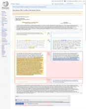
We already designed a version for that when we planned the whole new UI. Here is a mock up

MVP 2.2-neu.jpg (1×1 px, 1 MB)

The flow should be:
A user enters the resolution page, then does not select one version in a conflicting paragraph. When hitting "Save Changes" the screen should jump to the not selected version – if there are multiple not selected ones, to the one which is the highest up on the page. There should also be a warning below the Save button as shown in the mock.

@awight Feel free to hit me up, if there is more to be defined.

awight set the point value for this task to 8.Feb 18 2020, 1:12 PM

Note: edit pencils and text box highlighting should also be unselected, however first see decisions made in T209702: Edit icon in new two column edit conflict design appears active when it can't be edited.

Thanks a lot for sharing the prototype @Hanna_Petruschat_WMDE I am also at the office today can help if there are further iterations needed.

@Hanna_Petruschat_WMDE @Erdinc_Ciftci_WMDE I have another design question, showing both columns translucent really takes away from the diff coloring. In general, fading the diff coloring seems problematic because there's so much less visual contrast, and the use case involves identifying changed text and copying, so we know people will want to see diffs.

Here's what it looks like now,

image.png (201×1 px, 20 KB)

Note to self, I'm going to tweak the row div so that it includes the "Please select a version" text, which currently comes before the row. Layout should be unchanged when there's no error, but when the error is present, 5px or so margins will appear on every side.

Change 573328 had a related patch set uploaded (by Awight; owner: Awight):
[mediawiki/extensions/TwoColConflict@master] [WIP] Validate that a selection is made for every chunk

https://gerrit.wikimedia.org/r/573328

awight changed the task status from Stalled to Open.Feb 20 2020, 10:20 AM

Change 573547 had a related patch set uploaded (by Awight; owner: Awight):
[mediawiki/extensions/TwoColConflict@master] [WIP] Put selection label inside of the row

https://gerrit.wikimedia.org/r/573547

Change 573555 had a related patch set uploaded (by Awight; owner: Awight):
[mediawiki/extensions/TwoColConflict@master] Error style for conflict rows

https://gerrit.wikimedia.org/r/573555

@Hanna_Petruschat_WMDE @Erdinc_Ciftci_WMDE
Minor layout question. For technical reasons, I found it was easier to pull the label down into the row. That happens to match the prototype better, but changes rendering. Please share your opinions:

image.png (261×595 px, 12 KB)

With errors:

image.png (212×827 px, 10 KB)

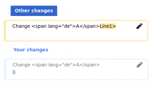
Another divergence from the mockup: the drawing has a "Please select a version" line for each row, and apparently dynamic text for "Your version" and "Other version" depending on the selection, but we only display once at the top.

image.png (399×1 px, 46 KB)

image.png (287×1 px, 23 KB)

Change 573328 abandoned by Awight:
[WIP] Validate that a selection is made for every chunk

Reason:
squashed

https://gerrit.wikimedia.org/r/573328

Change 573570 had a related patch set uploaded (by Awight; owner: Awight):
[mediawiki/extensions/TwoColConflict@master] Handle conflict column without a selection

https://gerrit.wikimedia.org/r/573570

Change 573571 had a related patch set uploaded (by Awight; owner: Awight):
[mediawiki/extensions/TwoColConflict@master] [DNM] Open the conflict form with no columns selected

https://gerrit.wikimedia.org/r/573571

Everything is a no-op until the final one-line patch, which is marked "DNM". Actually unselecting the radio buttons by default depends on server-side validation for safety.

... but we only display once at the top.

@awight Why do we only show it once? Because we are talking about non-js at some point (and dynamic text is not possible there)? As far as I got it this ticket is related to the js use case, isn't it?
It will be a necessary text to be shown in place otherwise the user is confronted with a red box and no call to action to follow.

It would be fine for me if you'd pull the label down into the row.

... but we only display once at the top.

@awight Why do we only show it once? Because we are talking about non-js at some point (and dynamic text is not possible there)? As far as I got it this ticket is related to the js use case, isn't it?
It will be a necessary text to be shown in place otherwise the user is confronted with a red box and no call to action to follow.

That makes sense, thanks! I'll be sure to show the text in case of an error. I'll also split the dynamic text question into a new task: T245736: Show dynamic label text depending on conflict column selection

Pulling back into "Doing" to restore this label text.

@Hanna_Petruschat_WMDE, the patch https://gerrit.wikimedia.org/r/573547 includes a design change. Personally, I'm not sure if I like it. Independent from how I feel, I wonder how it should look like from the UX's team perspective?

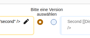
As of now:

Screenshot from 2020-02-21 12-43-05.png (131×305 px, 8 KB)

What the patch proposes:

Screenshot from 2020-02-21 12-43-12.png (161×279 px, 7 KB)

Note that this change does make the middle column wider, leaving less room for the yellow and blue boxes left and right.

Unfortunately the mock here in this ticket contains both versions. Which one should we use?

Change 573555 merged by jenkins-bot:
[mediawiki/extensions/TwoColConflict@master] Error style for conflict rows

https://gerrit.wikimedia.org/r/573555

[...] the patch https://gerrit.wikimedia.org/r/573547 includes a design change. Personally, I'm not sure if I like it. Independent from how I feel, I wonder how it should look like from the UX's team perspective?

In my last conversation with her, Hanna said it basically doesn't matter. If we see further problems we can adjust, of course.

The functional difference in this design change is that every row includes a description, not only the first line. It's worth noting that if we choose the "above" layout, following rows' labels should presumably use the same layout.

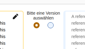
Mobile layout should be considered as well. The elements flow awkwardly, even as is:

image.png (250×490 px, 23 KB)

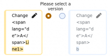
I could see the selection fieldset floating above in a preceding line, and each text box flowing vertically:
image.png (366×618 px, 21 KB)

The mocks in the tickets show both options in terms of something above and all the text in between but the middle column is always the same width. I understand the concern of having a wider middle column but this will also allow for potential longer words in other languages without needing hyphenates.

I think it is definitely worht looking at mobile. We haven't taken a closer look into that so far... But it's also not our main use case.

@Hanna_Petruschat_WMDE, here is a screenshot of how it currently looks. I can not spot a difference to the mock.

Screenshot from 2020-02-24 11-53-39.png (144×1 px, 18 KB)

One minor question though: Do you think we should use rounded corners for the red rectangles? The OOUI style guide suggests to use very subtle (2px only) rounded corners, I believe.

Nice!! Thanks Thiemo. And yes, you're eagle eyes are absolutely correct about the 2px radius. The box shall have it too

Change 574418 had a related patch set uploaded (by Thiemo Kreuz (WMDE); owner: Thiemo Kreuz (WMDE)):
[mediawiki/extensions/TwoColConflict@master] Add OOUI conforming border-radius to red error box

https://gerrit.wikimedia.org/r/574418

Change 573547 merged by jenkins-bot:
[mediawiki/extensions/TwoColConflict@master] Put selection label inside of the row

https://gerrit.wikimedia.org/r/573547

Change 573570 merged by jenkins-bot:
[mediawiki/extensions/TwoColConflict@master] Handle conflict column without a selection

https://gerrit.wikimedia.org/r/573570

Change 572842 merged by jenkins-bot:
[mediawiki/extensions/TwoColConflict@master] Validate that all chunks have a selection

https://gerrit.wikimedia.org/r/572842

Change 574418 merged by jenkins-bot:
[mediawiki/extensions/TwoColConflict@master] Add OOUI conforming border-radius to red error box

https://gerrit.wikimedia.org/r/574418

Change 573571 merged by jenkins-bot:
[mediawiki/extensions/TwoColConflict@master] Make sure a side is selected in all browser tests

https://gerrit.wikimedia.org/r/573571

Change 574799 had a related patch set uploaded (by Thiemo Kreuz (WMDE); owner: Thiemo Kreuz (WMDE)):
[mediawiki/extensions/TwoColConflict@master] Don't pre-select a side, and full non-JS validation support

https://gerrit.wikimedia.org/r/574799

Change 576006 had a related patch set uploaded (by Thiemo Kreuz (WMDE); owner: Thiemo Kreuz (WMDE)):
[mediawiki/extensions/TwoColConflict@master] Show "please select a side" on all rows, not only the first

https://gerrit.wikimedia.org/r/576006

Change 576010 had a related patch set uploaded (by Thiemo Kreuz (WMDE); owner: Thiemo Kreuz (WMDE)):
[mediawiki/extensions/TwoColConflict@master] Browser tests: Check if no side is selected by default

https://gerrit.wikimedia.org/r/576010

Change 576006 merged by jenkins-bot:
[mediawiki/extensions/TwoColConflict@master] Show "please select a side" on all rows, not only the first

https://gerrit.wikimedia.org/r/576006

awight changed the point value for this task from 8 to 2.Mar 4 2020, 10:41 AM
awight moved this task from Review to Done on the WMDE-QWERTY-Sprint-2020-03-04 board.
awight moved this task from Done to Review on the WMDE-QWERTY-Sprint-2020-03-04 board.
awight moved this task from Review to Demo on the WMDE-QWERTY-Sprint-2020-03-04 board.

Change 576671 had a related patch set uploaded (by WMDE-Fisch; owner: WMDE-Fisch):
[mediawiki/extensions/TwoColConflict@master] Don't pre-select a column when JS is used

https://gerrit.wikimedia.org/r/576671

Change 576671 merged by jenkins-bot:
[mediawiki/extensions/TwoColConflict@master] Don't pre-select a column when JS is used

https://gerrit.wikimedia.org/r/576671

Change 576010 merged by jenkins-bot:
[mediawiki/extensions/TwoColConflict@master] Browser tests: Check if no side is selected by default

https://gerrit.wikimedia.org/r/576010

thiemowmde moved this task from Demo to Done on the WMDE-QWERTY-Sprint-2020-03-04 board.