Page MenuHomePhabricator

[Epic] Iterate on the design of highlighting for Special:Investigate
Closed, ResolvedPublic

Description

This task is to evaluate the design of Special:Investigate and fix resulting design problems:

  • T249252: Pin buttons behavior [Med]
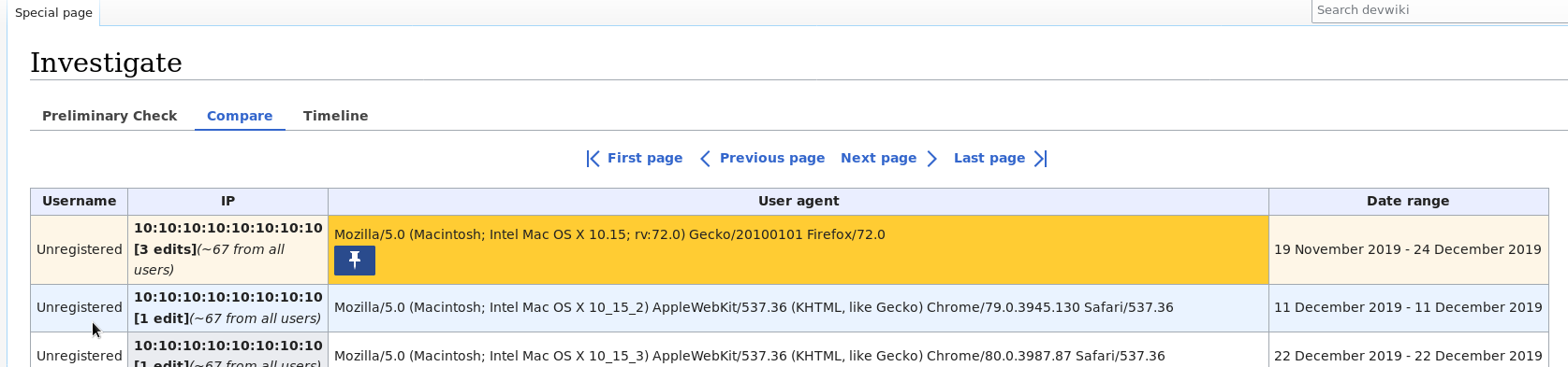
    • pin buttons should only be visible for the cell being hovered on, and should disappear again on mouseout (including when a highlight is pinned) - MEDIUM
    • When hovering over a row, the pin button should show up only on that row (and not on all the matching/highlighted ones).
    • Once an item is pinned, the pin button should not be visible if the highlighted row is not being hovered on. -
  • T249254: Message for no results in compare tab [Small]
  • When there are no results in the Compare tab: - SMALL
    • Don't show the Filters box
    • Update the message from "There are no results." to "There are no result: there have been no edits from these users or IPs in the last 90 days".
    • The above message should be in a box:
.thebox {
  background: #fef6e7;
  border: 1px solid #ac6600;
  border-radius: 2px;
  padding: 16px;
}
  • T249255: Minor design fixes for Special:Investigate [5*XSmall]
    • Match the spacing of the "New investigation / Logs" buttons to the prototype (Chrome). - XSMALL
    • Filter button should be quiet and progressive. - XSMALL
    • Reduce UA's font size to 12px - XSMALL
      • Use a variable
    • Table headers background should be #EBECF0, with a 2px border at the bottom - XSMALL
    • Date range text should be right-aligned - XSMALL

Related Objects

Event Timeline

Copying over something that @dom_walden noticed in T237299#5923827:

Currently, highlighting is based on cells matching exactly. For example, on Preliminary Check the "Date attached" is to the nearest second, so normally only one cell highlights at a time. Similarly UA strings need to match exactly.

Do we need to rethink this - particularly the timestamp being to the nearest second?

@Tchanders Anything here that @Prtksxna should weigh in on before we can talk about it in Estimation?

Copying over something that @dom_walden noticed in T237299#5923827:

Currently, highlighting is based on cells matching exactly. For example, on Preliminary Check the "Date attached" is to the nearest second, so normally only one cell highlights at a time. Similarly UA strings need to match exactly.

Do we need to rethink this - particularly the timestamp being to the nearest second?

I think it makes sense to highlight if the date is the same, ignoring the timestamp. Is that feasible?

I think parsing the date string should be OK. Not sure how that might work with localization though. Maybe moment.js has some helpers for this? I think it's already available in MW?

As for the UA and such, we could do something like a levenshtein comparison or use some other kind of fuzzy matching. Those are generally inexpensive on short enough strings.

From the description:

changing row heights when pin buttons appear and disappear

As we discussed, the buttons should appear only on the row currently being hovered. This will change the height of that row but will keep the overall height of the table the same as the user hovers over different rows.

@Tchanders Anything here that @Prtksxna should weigh in on before we can talk about it in Estimation?

Yep, please let me know. I am happy to get on another call to see the behavior.

As for the UA and such, we could do something like a levenshtein comparison or use some other kind of fuzzy matching. Those are generally inexpensive on short enough strings.

This is great idea! A few users mentioned this in the usability tests too. They didn't particularly request full parsing, but just that close by version numbers could be highlighted together. With something like levenshtein we could set a low threshold (~5) to just pick up minor version changes. (See experiment using levenshtein)

I think parsing the date string should be OK. Not sure how that might work with localization though. Maybe moment.js has some helpers for this? I think it's already available in MW?

Yes, we can do this in MW, and choose whether to localise (we currently do). So, questions for @Prtksxna and @Niharika:

  • Should we only display the date in the PreliminaryCheck results (not the time), as the mock-up does?
  • Should we highlight cells together if they are the same date (never mind the time)?

If so, let's add those to the task description.

From the description:

changing row heights when pin buttons appear and disappear

As we discussed, the buttons should appear only on the row currently being hovered. This will change the height of that row but will keep the overall height of the table the same as the user hovers over different rows.

@Prtksxna OK. I'll remove the bullet point about changing row heights from the task description, since it is addressed by the point about only showing pins on hover.


Re: fuzzy matching for the UA strings, could we make another task for that? I think there are more things to discuss. (Some things that spring to mind: matching thresholds; highlights covering different sets of rows (e.g. hovering on row1 might highlight row1 and row2, but hovering on row2 might highlight row1, row2, row3, row4, etc); whether Levenshtein distance is the best measure (e.g. things like 11.99999 being closer to 19.99999 than 12.00000, etc).)

Should we only display the date in the PreliminaryCheck results (not the time), as the mock-up does?

I think there's value in showing both the date and time. I talked to Prateek about this and he concurs.

Should we highlight cells together if they are the same date (never mind the time)?

Yes. Will add to the ticket.

Re: fuzzy matching for the UA strings, could we make another task for that? I think there are more things to discuss. (Some things that spring to mind: matching thresholds; highlights covering different sets of rows (e.g. hovering on row1 might highlight row1 and row2, but hovering on row2 might highlight row1, row2, row3, row4, etc); whether Levenshtein distance is the best measure (e.g. things like 11.99999 being closer to 19.99999 than 12.00000, etc).)

Yep, I'll make a follow-up task for that. I think it's a bit low priority for now. The logging and Timeline work needs to be done first.

Some more things to review after T240530: CU 2.0: Filtering from the data table in Compare tab:

  • Are some of the table cells too cluttered now that they have up to 3 buttons?
  • Is it confusing to see a mixture of enabled/disabled buttons on hover?
  • Should the filter button be a different colour?

Some more things to review after T240530: CU 2.0: Filtering from the data table in Compare tab:

  • Are some of the table cells too cluttered now that they have up to 3 buttons?

Yeah, things are looking a bit cluttered. Are there any cells that have 3 buttons at the moment, or will it only happen once we add the filter button?

  • Is it confusing to see a mixture of enabled/disabled buttons on hover?

This would be the case for the IP columns, right?

  • Should the filter button be a different colour?

The original idea (T240530) was for it to be red. But the interface is looking a bit bulky with the OOUI elements so we might need to revisit this.


Some things to consider:

  • Should we stop showing wikis that are attached but have 0 edits? @cwylo could there be a case where someone would want to see this?
  • Should we make "Show all IPs" and "Show all users" links instead of buttons so they don't look as heavy?
Niharika renamed this task from Iterate on the design of highlighting for Special:Investigate to [Epic] Iterate on the design of highlighting for Special:Investigate .Apr 2 2020, 5:33 PM
Niharika triaged this task as Medium priority.
Niharika added a project: Epic.

@Prtksxna In the Compare results table, after removing the blue highlight on hover (T249251), there may not be enough contrast between the background colour of the target's cell and the colour of the disabled "show all IPs/users" button:

image.png (123×434 px, 9 KB)

@Prtksxna In the Compare results table, after removing the blue highlight on hover (T249251), there may not be enough contrast between the background colour of the target's cell and the colour of the disabled "show all IPs/users" button:

image.png (123×434 px, 9 KB)

You're right, the contrast has reduced:

BackgroundForegroundRatio
With blue highlight#EBF3FF#C8CCD21.44
Without blue highlight#EBECF0#C8CCD21.36

But since this is a disabled element I think we should be alright. I am considering making this cell's background white as well (after seeing T249255). What do you think?

Some things to consider:

  • Should we stop showing wikis that are attached but have 0 edits?

What does attached even mean? That they visited that wiki while logged in?
Is this useful information for CheckUsers?

What does attached even mean? That they visited that wiki while logged in?
Is this useful information for CheckUsers?

Right, it's wikis you have "logged into" as you can see from:
https://meta.wikimedia.org/wiki/Special:CentralAuth
Effectively, it's wikis where a "local account" exists for your CentralAuth username.

I think Wikimedia has this configured in such a way that just visiting another wiki when logged into another one will auto log you into that wiki.

It may be more useful to only show attached wikis that have an edit count greater than zero, but I'm not sure on that. :)

Niharika claimed this task.