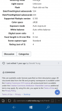
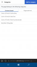
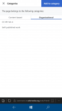
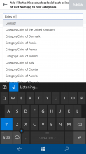
Categories are currently filtered out of the anonymous page views. This task captures discussion for enabling them to anonymous users.
Description
Details
- Reference
- bz22660
| Subject | Repo | Branch | Lines +/- | |
|---|---|---|---|---|
| Move Category button to beta | mediawiki/extensions/MobileFrontend | master | +33 -30 |
Event Timeline
There are several subtasks associated with this task that outline the perceived blockers.
None of these are really necessary though. Unless there is a plan to do it within X months in the developers' preferred way, it would be appropriate to do it immediately in the users' preferred way (i.e. the simple one).
Ideally, categories should be collapsible, and could be displayed from the lateral navigation menu (where you should also find the edit link or other actions on the page, i.e. everything we already have in the side navigation bar or top action bar on the desktrop edition), so that there's NO need of smaller fonts (difficult to read when their title will change on every visited page) as they won't use any space within the rendered page.
I really think that the central page is too much crowded with unneeded features. Even the links to edit sections can be removed (place the list of sections in the lateral pane, and make this pane with collapsible groups to ease its use without having to scroll it too much
Even if I work on some of the subtasks, I don't feel responsible (anymore) for this epic to bring it to production, unfortunately :(
(Marked Regression for lack of a better way to tag important shortages of MobileFrontend which go counter feature parity.)
What are the technical limitations why this can't be implemented? As this ticket 🎫 has been open for a couple of years now. Why is the Mobile frontend so inferior?
Technically it is already supported as beta, and can be rolled out by changing settings, though this is only simple support and may not give good user experience. (category pages doesn't look well in mobile - T142124 )
Some people ( @Nemo_bis ) argue it is good enough to roll out as-is so users will at least be able to access categories, while other users ( @Jdlrobson ) believe it isn't mature enough and blocked by other sub-tasks. (please correct me if I didn't summarize it correctly).
To get it done:
I never understood the need to severely handicap the mobile experience on Wikimedia, I use categories on mobile all the time but tend to only use the desktop version for things like HotCat and Cat-a-lot. On most other websites the mobile version of the website is just a miniature version with a hamburger menu, but on Wikimedia the mobile version just seems to be "Wikimedia Lite". The inability to see categories severely limits the navigability of the website.
Sometimes the mobile website comes off as a social experiment rather than an alternative view, also for browsing.
I find Commons completely unusable on mobile due to the heavy use of categories for navigation. I can't even work out how to leave an image page without switching to the desktop site.
What makes the mobile category pages so bad that it's better to make people switch to the desktop site until the mobile ones are improved? They seem to work fine for me, I just can't navigate to them.
Yeah, I meant to add how I navigate as an addendum to the above comment but was distracted by something IRL.
Anyhow I usually even have to check the categories in desktop mode to see if I added something in Mobile was redlink or not. If this has been technically possible for years, then why wasn't this presented as an optional feature then? "Related articles" should continue to exist at the bottom, but what benefits does hiding categories and navigational templates have over displaying them if they're not perfect 👌🏻? Maybe a user with the technical skills to improve it would want to offer their time in making it better if they saw the categories at the bottom, but right now all it does is deliberately handicap Mobile devices for no apparent reason.
It is presented as optional feature. Menu (top left button) => Settings => Wikipedia Beta (check it) => Categories
what benefits does hiding categories and navigational templates have over displaying them if they're not perfect
This isn't just because they aren't perfect - there are trade-offs between showing everything, and showing only what is important. Benefits could be better performance and or better usability.(though I'm not sure this is the case for this issue, as categories are hidden under some Categories button)
Thanks, it worked. Though the categories aren't immediately visible, it is better than nothing.
FWIW, regardless of the approach taken, this still needs somebody to actually do the work involved and that's the main source of blocking here. The technical team for the UI side of things is small - 5 paid people managing the frontend of Vector and Minerva and categories have never been made a priority. The most helpful thing to do at this point is to use avenues such as the talk page of https://www.mediawiki.org/wiki/Reading/Web/Advanced_mobile_contributions to highlight this as a thing of importance in particular focusing on the workflows you are unable to do due to its absence.
Just FYI, this topic recently came up again (in the context of Commons) in the Wikimedia Clinic 002 online meeting on June 17th 2020.
WTF is going on here? WMF not able to add one line of code to show the categories for last 10 years since this bug was filled? This really pisses me off...
This is indeed very easy now, though it wasn't back in the day. Fortunately, I'm pretty sure this skin is no longer avoiding all core skin classes like the plague like it was at the start, so it should be as simple as just do the getCategories function (or whatever the mustache version of that is) in the footer area before the related articles section, and just manually style it appropriately.
Unfortunately, there seem to be some hangups about actally doing that. From what I've read it's gone something like this:
- Categories are a bit of a giant mess on a lot of wikis, with their output more resembling literal soup than something necessarily useful to most people. Way too much stuff, don't really want that for most users, need something smarter to actually make things a tad less messy.
- Turns out making a likely-relevant-categories sorter for automatic display is Hard. Timeless did this via a bunch of direct db queries back in the day in order to show a useful subset in the sidebar, with a full list in the footer, but that implementation wasn't exactly scalable for large projects like wikipedia, so was ultimately just removed.
- Putting all the categories behind a button can cover for this, both in terms of allowing only doing any likely-relevant-categories sorting on demand instead of all the time, and also avoiding showing all users the giant mess when only some of them need it.
I think folks are overthinking this, frankly. We don't need a button here, we need a better implementation of the likely-relevant-categories sorter in core, that all skins can use. And yeah, that's Hard. But in the meantime, we have a much simpler short-term solution that appears to have been overlooked, for whatever reason: Output the full list normally, and just display all the categories (per user preferences regarding hidden etc) under a collapsed-by-default header or something, same as content sections and junk, but at the bottom of the page where categories normally are anyway. One or two lines of code, some css to cover for not being able to use the core categories css/categories being a slightly odd thing to have in the footer, and tag it collapsible.
I'd submit a patch, but unfortunately I'm still so overwhelmed by all the recent skinning changes that I'm nowhere near up to speed maintaining even my own skins at this point.
I think @Isarra captured some of the main concerns we have as well. The current state of categories is not suitable for logged-out people who have little experience in editing and might find the categorization confusing. For logged-in users, there a couple of options:
- First, I want to note that categories are already available in Advanced mode on mobile (to turn on, go to setting and select Advanced Mode). Advanced mode also provides full versions of the history page, recent changes, talk tabs at the top and other more advanced editing functionality
- We can also look into providing the full list as mentioned and will discuss whether we think that's appropriate for all logged-in folks
While I don't support @Kozuch's writing style above, I agree with the essence: Categories should be more accessible.
I agree with some of @Isarra's points, but I disagree with two important ones:
- Categories on articles are not a mess. The category tree, as much as you can even call it a "tree", is indeed a mess, although by now that is a feature. But we are not talking about the category tree here! Here we're talking about displaying categories on articles. On articles, they are curated very well by the editors, and they are usually relevant and helpful. How can we even talk about the question of their usefulness to logged-out readers if we never tried to show them to these people? Also, if they are such a mess, why do we show them on the desktop? (And please don't interpret this as a suggestion to hide them on the desktop. God forbid.)
- The suggestion to implement a likely-relevant-categories sorter. That would be overthinking. This will take time, and no matter how clever the result is, guessing won't be perfect.
As a first step, let's just enable the Categories button by default for everyone. It's disabled on Wikimedia sites by default, and it costs almost nothing to enable it. What damage can it cause? More bandwidth? Probably not, because most of it is lazy-loaded (correct me if I'm wrong). User confusion? It's in an area of the screen that not a lot of people use anyway, so I cannot think of any disaster in this area. If anyone can think of a metric of potential damage, please bring it up.
As a further step—yes, perhaps we can think of a way to guess the most useful categories and show a "More" button, similarly to what we have with interlanguage links. But this requires non-trivial design and development. Till then, let's just make what we have more accessible. The already-existing button is a fine compromise. Enable it on twenty wikis as an experiment, and if it doesn't cause any trouble, just deploy it everywhere after a couple of months.
I don't have any opinions on the showing to logged in users VS showing to anonymous users VS showing to AMC users (which includes desktop).
Implementation-wise at this point I would recommend throwing out all the associated JavaScript given the fact it has not seen development in many years and has many bug and simply adding {{{html-categories}}} to includes/Skins/skin.mustache - gadgets can be used for adding categories (although many of them will likely need to be improved for mobile usagE)
For now, let's go ahead with T152199: Display categories for logged-in users on mobile web stable. This will show the list to all logged-in users.


