Page MenuHomePhabricator

Adapt styles for text input fields
Closed, ResolvedPublic1 Estimated Story Points

Assigned To
Authored By
scblr
Mar 4 2020, 2:24 PM
Referenced Files
F31686778: Screenshot_20200317-120814.png
Mar 17 2020, 11:18 AM
F31672858: Screenshot_20200309-145300.png
Mar 9 2020, 2:15 PM
F31672864: Screenshot_20200306-141037.png
Mar 9 2020, 2:15 PM
F31672872: Screenshot_20200309-144811.png
Mar 9 2020, 2:15 PM
F31672880: Screenshot_20200309-150035.png
Mar 9 2020, 2:15 PM
F31672897: Screenshot_20200309-151320.png
Mar 9 2020, 2:15 PM
F31661977: sev4-38-input-empty.png
Mar 4 2020, 2:24 PM
F31661983: sev4-38-input-filled.png
Mar 4 2020, 2:24 PM

Description

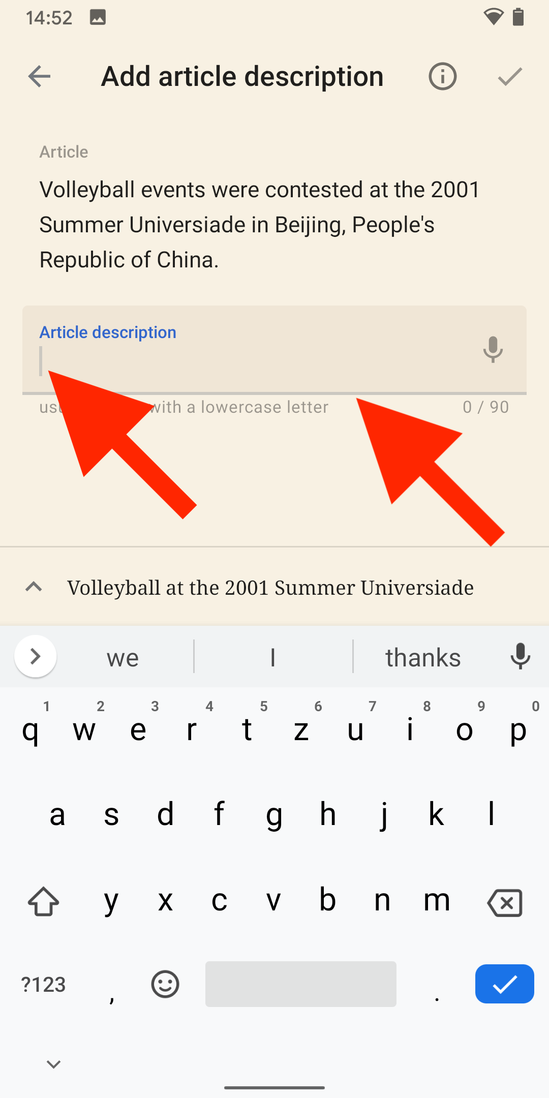
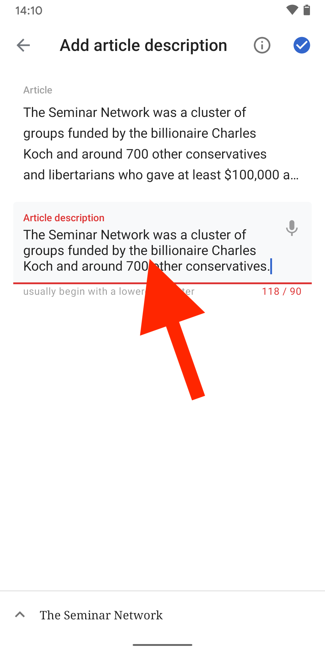
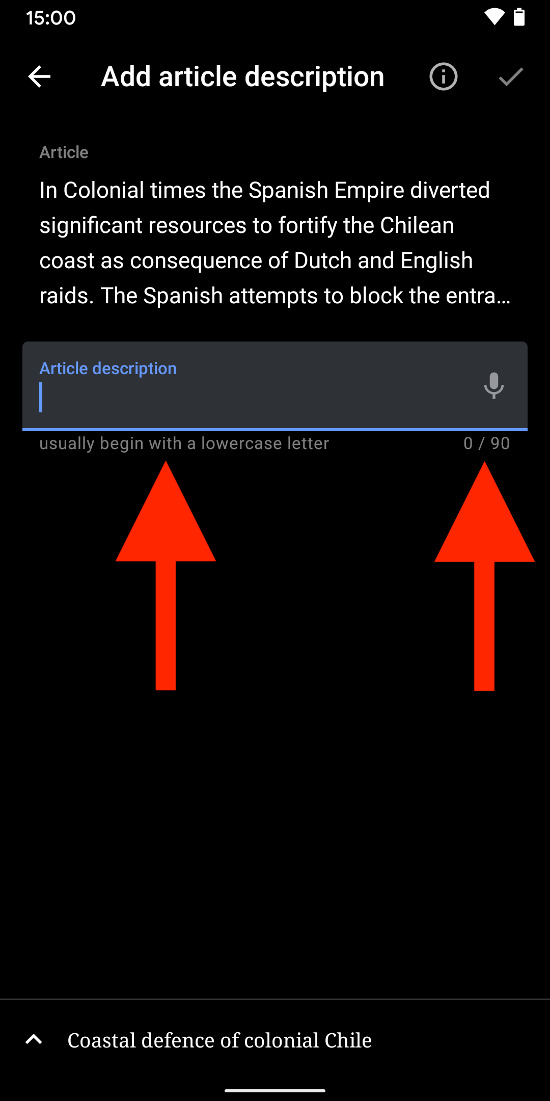
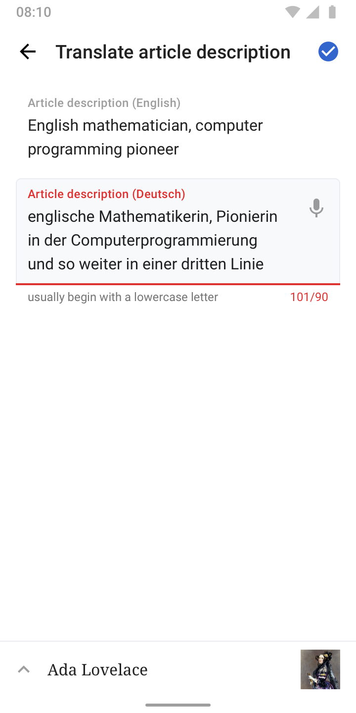
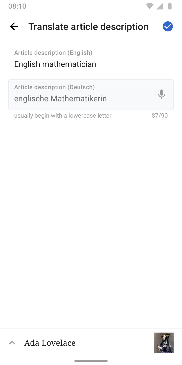
@Dbrant recently informed us on Slack, that Material Design rolled out new default styles for input fields (Blog post).

I reviewed the current inputs in the Android app and defined new styles for it.

EmptyFocusFilledErrorDisabled
sev4-38-input-empty.png (1×720 px, 79 KB)
sev4-38-input-focus.png (1×720 px, 138 KB)
sev4-38-input-filled.png (1×720 px, 87 KB)
sev4-38-error-two-lines.png (1×720 px, 105 KB)
sev4-38-input-disabled.png (1×720 px, 85 KB)

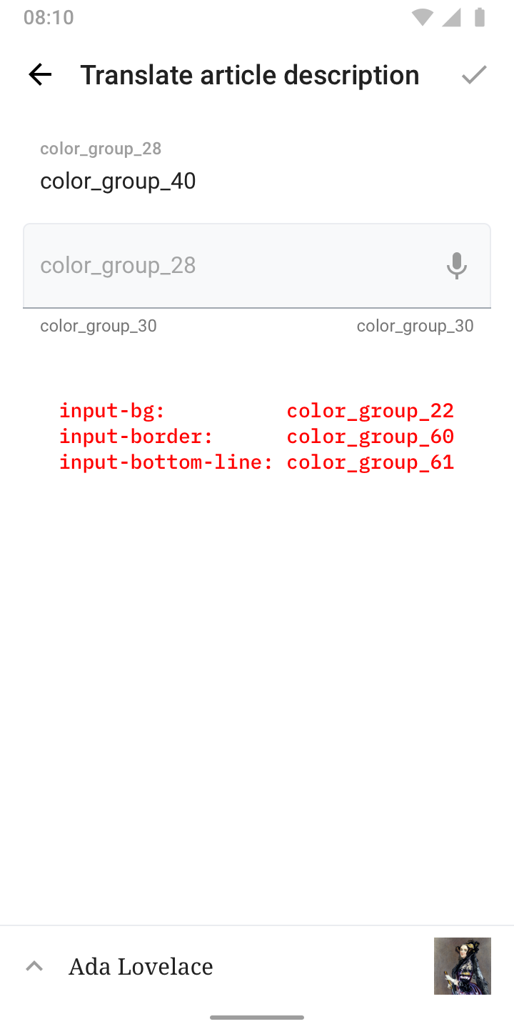
👉 Check out these color_group definitions or Zeplin for details:

sev4-38-input-with-color-definitions.png (1×720 px, 87 KB)

👋 ... and since you’re here, could you please adapt left and right margin of all article description and image caption edit screens to 28dp (so it’s in line with the inputs) + apply paper_color / color_group_50 to the entire background?
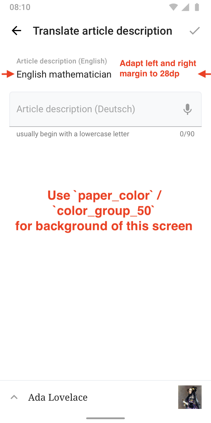
sev4-38-input-empty.png (1×720 px, 122 KB)

Thx!

Related Objects

Event Timeline

Great work @Dbrant and almost there 👇


01) Line and cursor use wrong color in Focus state. Should be color_group_3.

Screenshot_20200309-145300.png (2×1 px, 187 KB)

02) Apply 24sp line-height for input fields (same value as for Article excerpt above it)

Screenshot_20200306-141037.png (2×1 px, 168 KB)

03) Helper text is positioned too close to the input line. Could you please look into giving it some room to breathe, as specified in the designs on Zeplin? I think the spacing is crucial for discoverability/legibility for users and therefore leads to better article descriptions in this case.

Screenshot_20200309-150035.png (2×1 px, 127 KB)

04) Apply color_group_61 for bottom line in Empty and Filled state.

Screenshot_20200309-151320.png (2×1 px, 111 KB)

05) Thanks for spotting the emphasize on the blue tick, really appreciate the attentiveness to detail. The review screen still uses the previous treatment, might be a result of the change. Could you update that screen as well (for article desc and image captions)?

Screenshot_20200309-144811.png (2×1 px, 863 KB)

01) Line and cursor use wrong color in Focus state. Should be color_group_3.

👍

02) Apply 24sp line-height for input fields (same value as for Article excerpt above it)

👍

03) Helper text is positioned too close to the input line. Could you please look into giving it some room to breathe, as specified in the designs on Zeplin? I think the spacing is crucial for discoverability/legibility for users and therefore leads to better article descriptions in this case.

04) Apply color_group_61 for bottom line in Empty and Filled state.

☣ Unfortunately this component does not seem to be modifiable in this way yet. Future versions of the Material library might allow this customization.

05) Thanks for spotting the emphasize on the blue tick, really appreciate the attentiveness to detail. The review screen still uses the previous treatment, might be a result of the change. Could you update that screen as well (for article desc and image captions)?

👍

Thanks @Dbrant, the changes look great! One minor visual imbalance to tweak below, then you can move it to QA signoff:

01) Can you apply the same spacing between “Article” and the excerpt (top) as used for Article description and the user input (bottom)? The exact same proximity of label/text makes it more compact and understandable at first glance.

Screenshot_20200317-120814.png (2×1 px, 130 KB)

01) Can you apply the same spacing between “Article” and the excerpt (top) as used for Article description and the user input (bottom)? The exact same proximity of label/text makes it more compact and understandable at first glance.

👍

Wow, what a difference a small details like this can make 😍Moving it to QA signoff!

@Dbrant, it seems like the background-color changes we applied here are not existent anymore, neither in the Alpha nor Production. Could you look into it please? Thx!