Page MenuHomePhabricator

Add custom tags feature
Closed, ResolvedPublic

Assigned To
Authored By
scblr
Mar 5 2020, 7:49 PM
Referenced Files
F31694095: Screenshot_20200320-183257.png
Mar 20 2020, 5:45 PM
F31694103: sev4-07-light-worst-case.png
Mar 20 2020, 5:45 PM
F31694099: Screenshot_20200320-183051.png
Mar 20 2020, 5:45 PM
F31694112: Screenshot_20200320-184134.png
Mar 20 2020, 5:45 PM
F31693710: sev4-34-back-behavior.png
Mar 20 2020, 10:34 AM
F31693698: Screenshot_20200320-110649.png
Mar 20 2020, 10:12 AM
F31691698: sev4-34-back-behavior.png
Mar 19 2020, 11:32 AM
F31679554: sev4-05-light.png
Mar 13 2020, 2:31 PM

Description

Visuals
01020304050607
sev4-44.png (1×720 px, 148 KB)
sev4-45.png (1×720 px, 97 KB)
sev4-39.png (1×720 px, 744 KB)
sev4-39-search-placeholder.png (1×720 px, 449 KB)
sev4-41-search-filled.png (1×720 px, 126 KB)
sev4-42-search-no-results.png (1×720 px, 389 KB)
sev4-43-added.png (1×720 px, 754 KB)

https://app.zeplin.io/project/57a120b91998d8977642a238/dashboard?seid=5e6157fbd4cbc8126d2e1301


Changelog due to new “Add custom tags“ feature
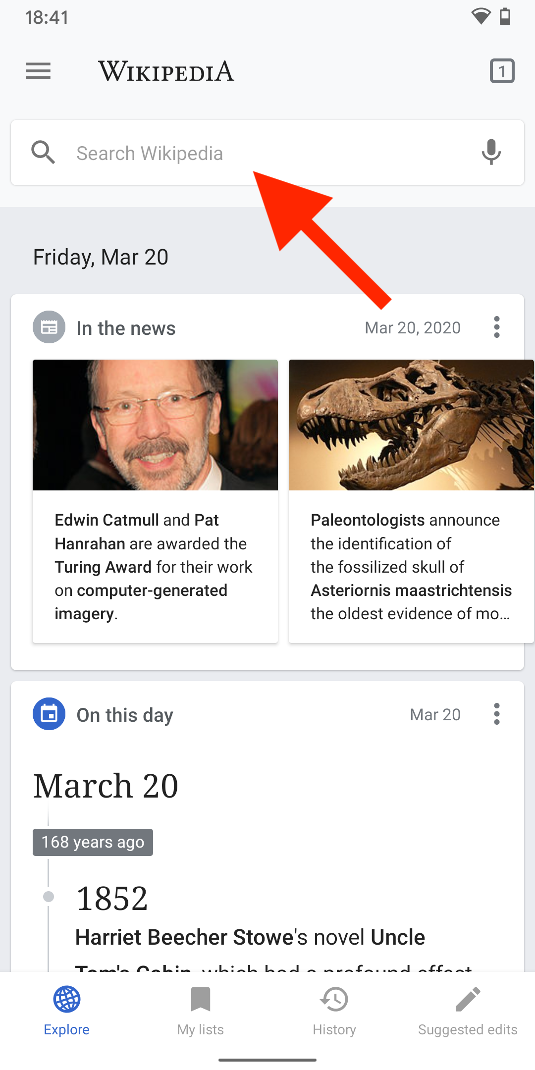
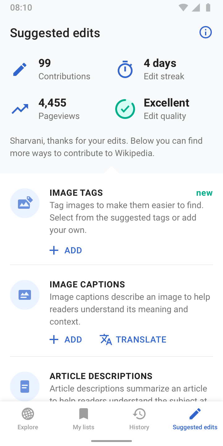
  • 01) Copy changes to task’s description on SE home: Tag images to make them easier to find. Select from the suggested tags or add your own.
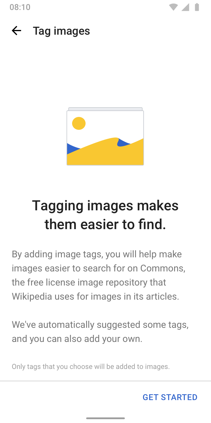
  • 02) Copy changes to onboarding dialog:
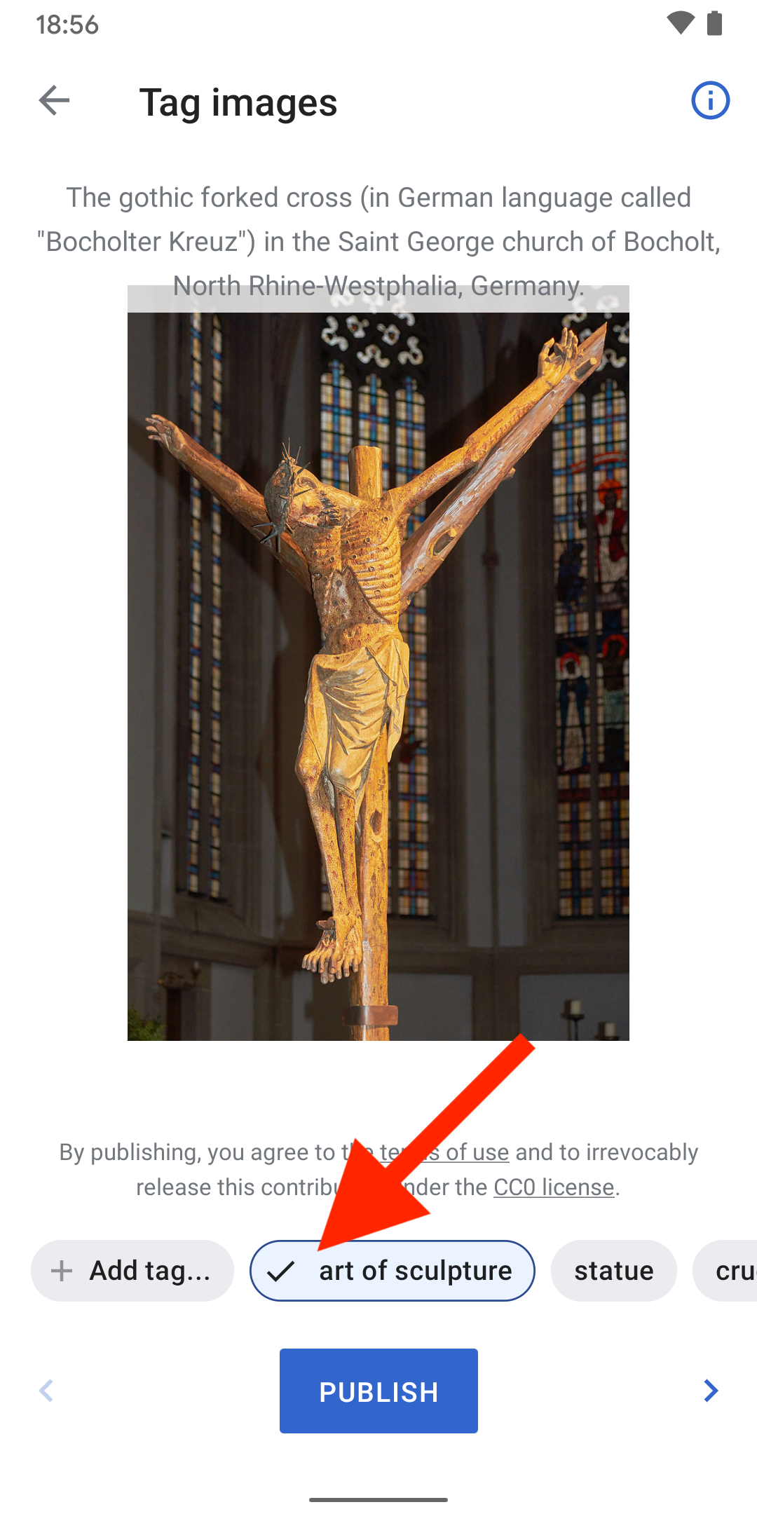
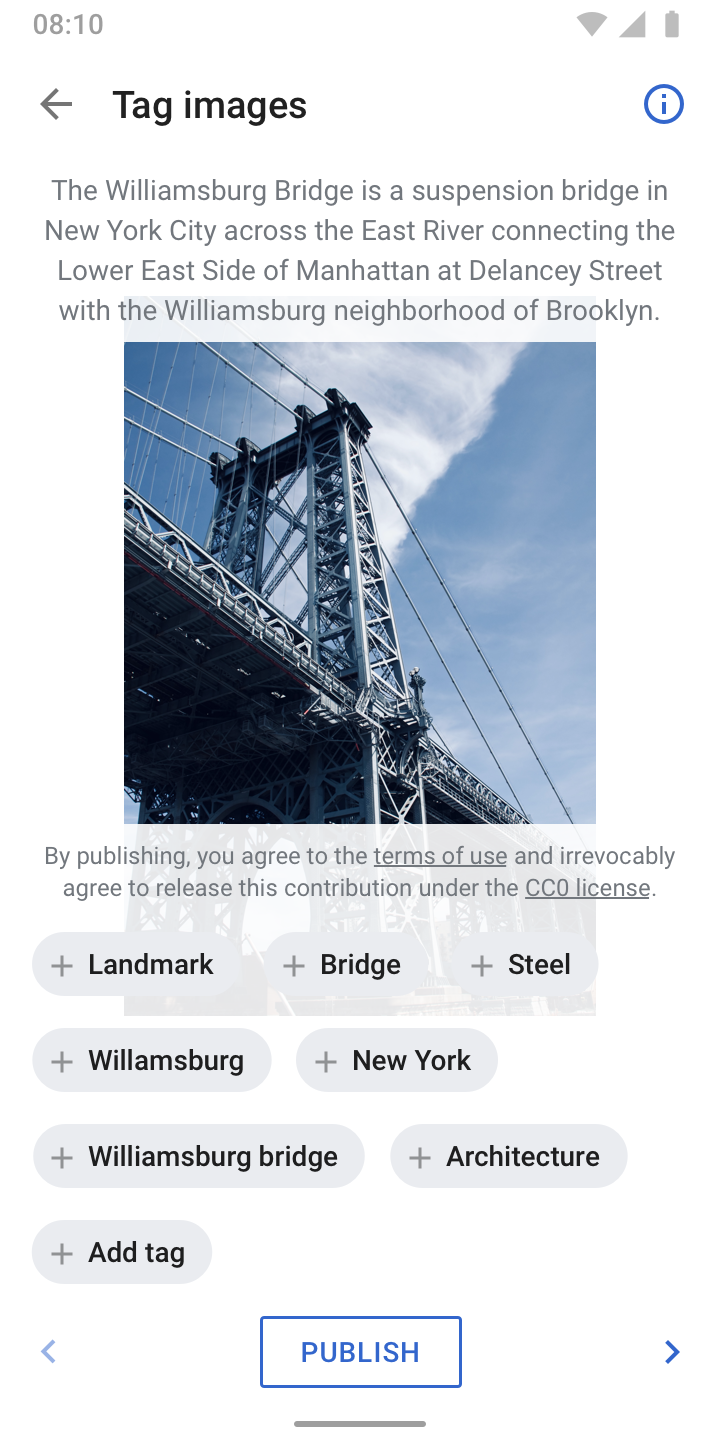
    • By adding image tags, you will help make images easier to search for on Commons, the free license image repository that Wikipedia uses for images in its articles.
    • We've automatically suggested some tags, and you can also add your own.
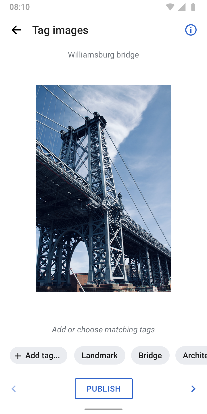
  • 03)
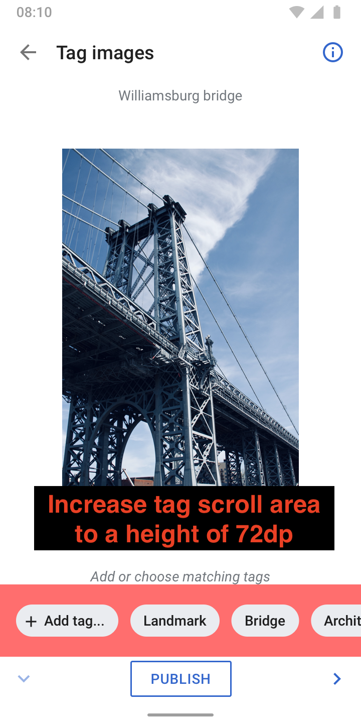
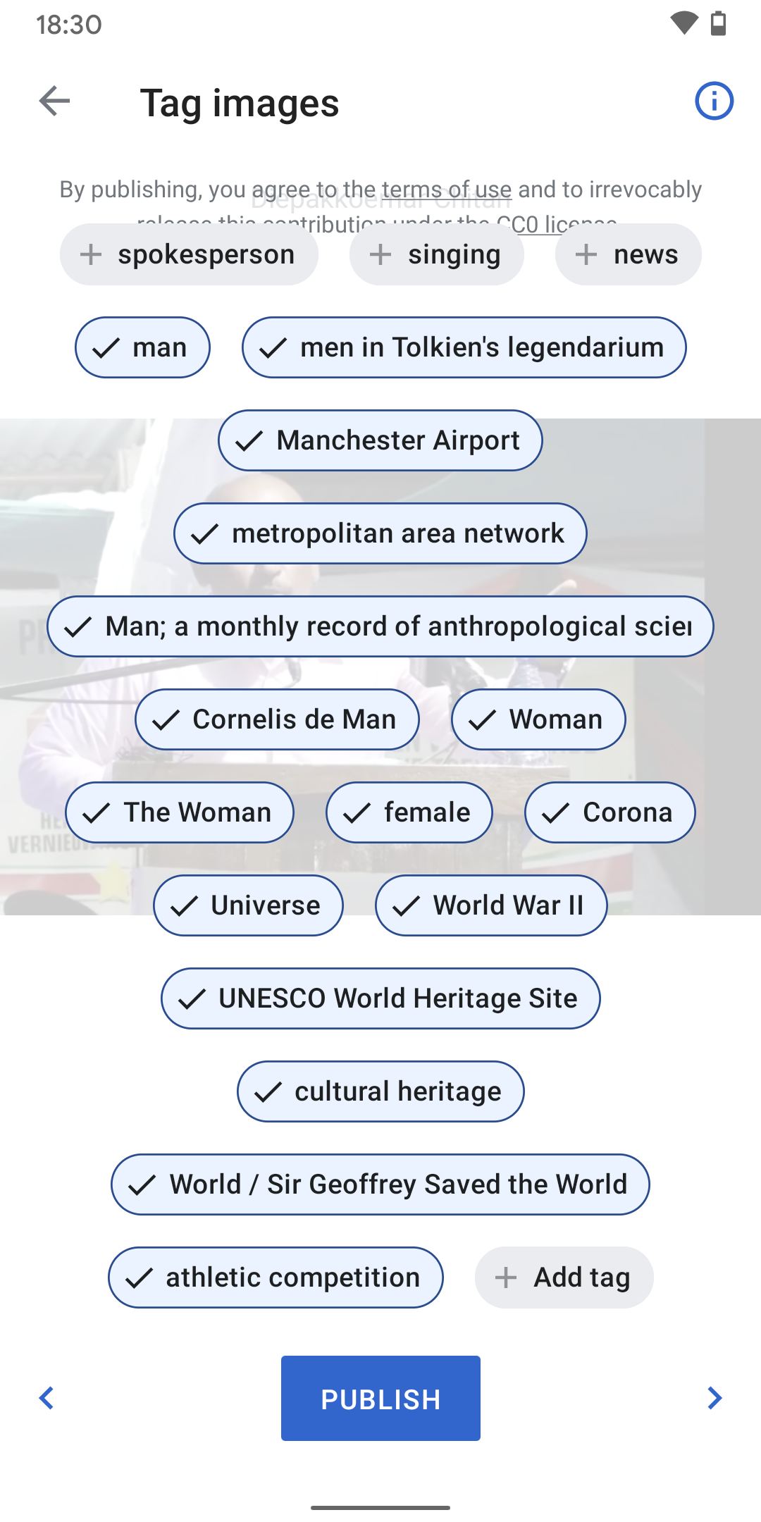
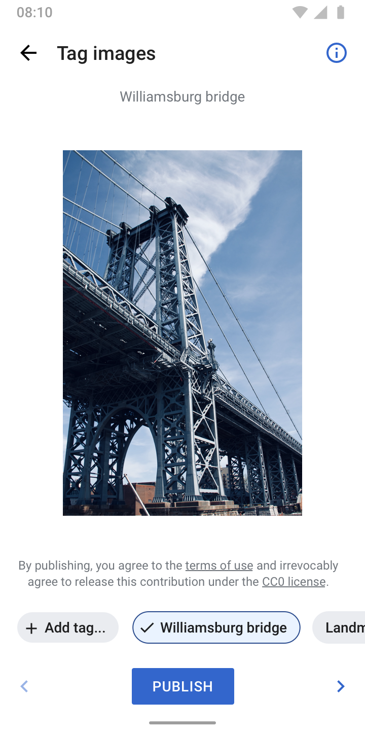
    • Chips now overflow horizontally to avoid stacking when adding custom tags
    • Removed "+" iconography from computer suggested tags as reflowing is not a real issue with horizontal overflow. Less noise, more focus for users.
    • First tag that’s outputted includes “+“ iconography and is called “Add tag...“
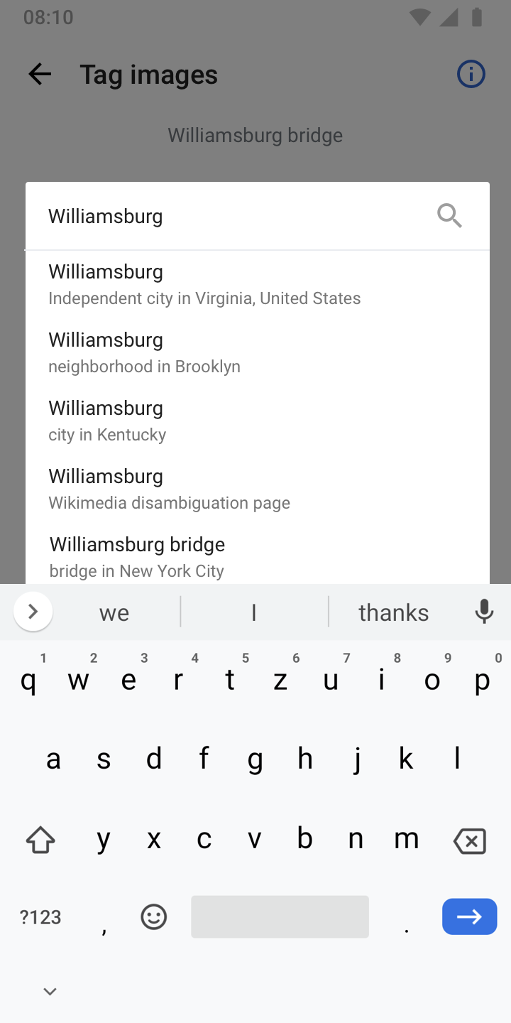
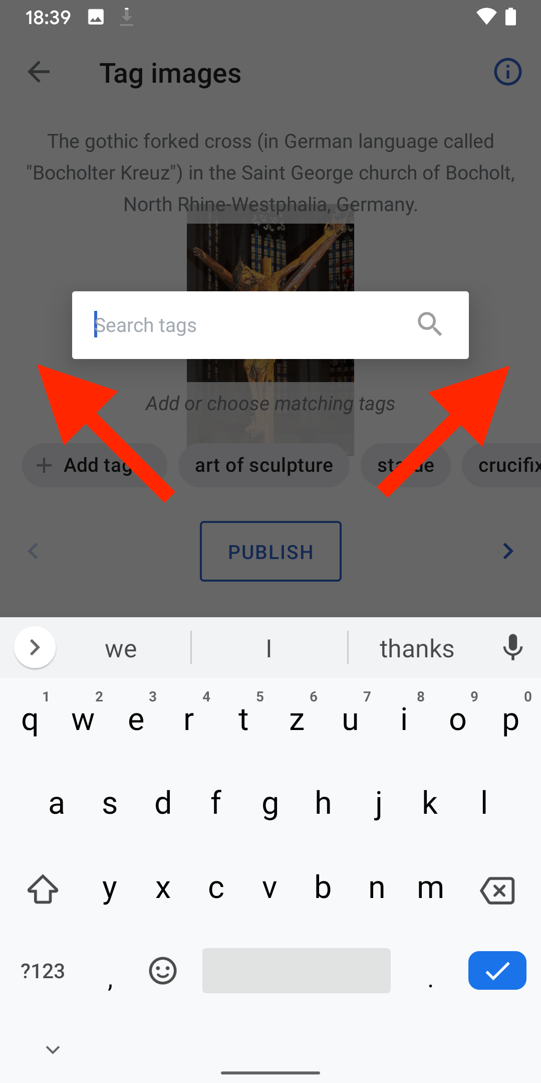
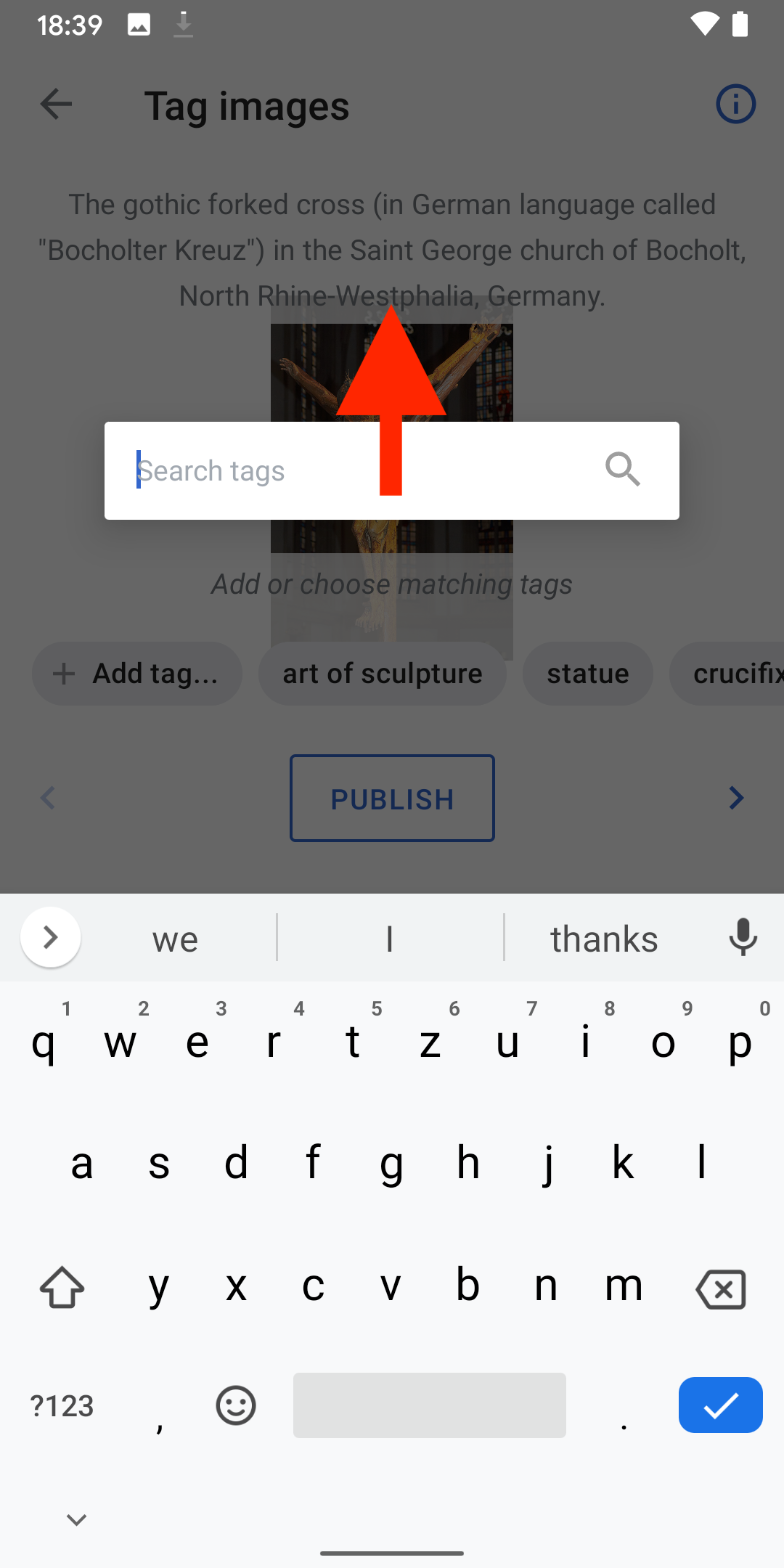
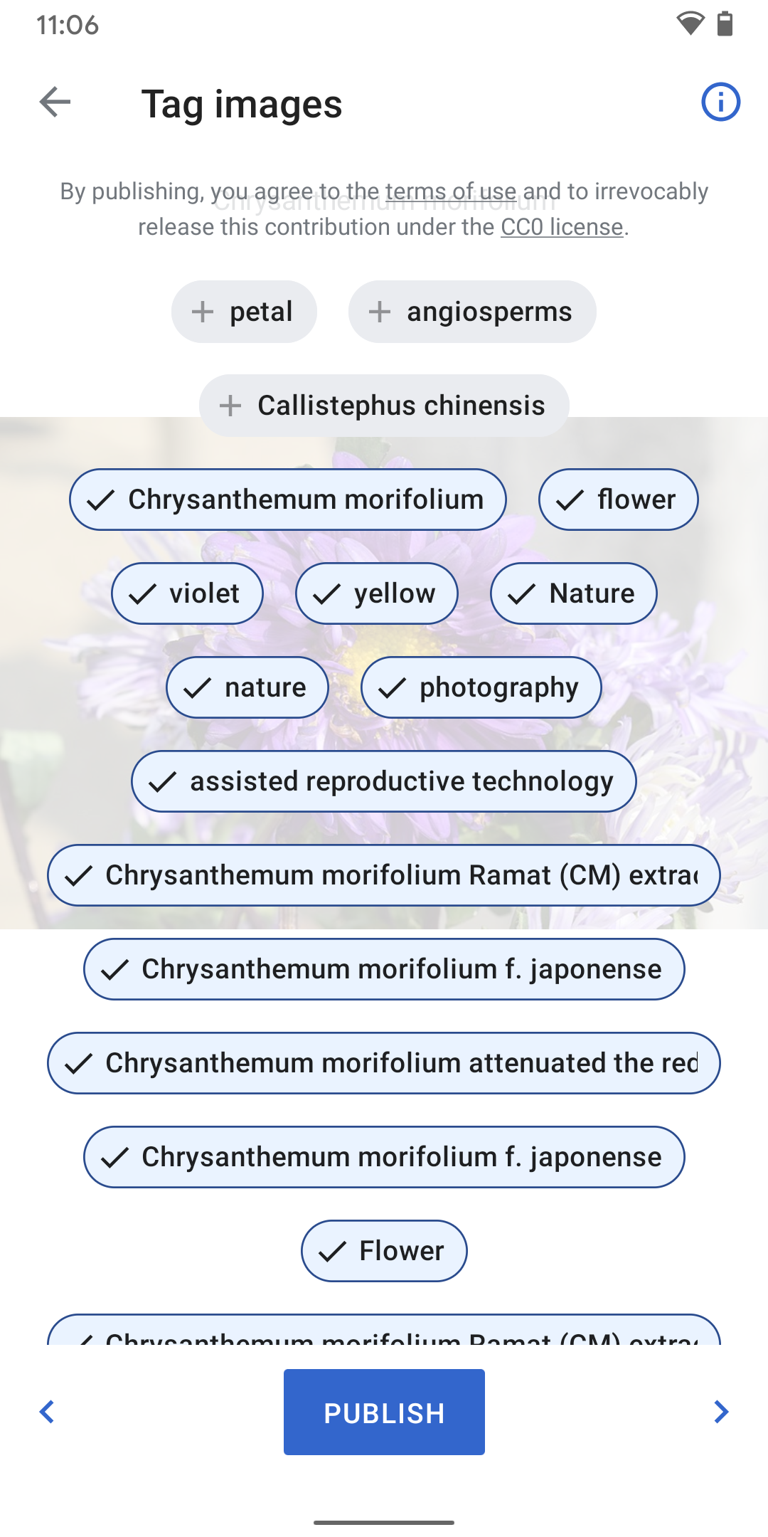
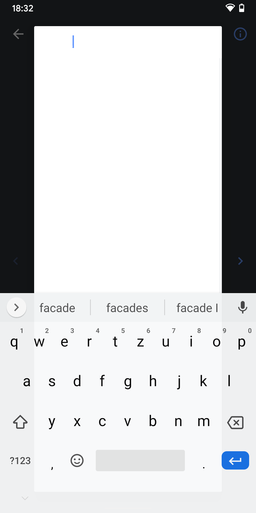
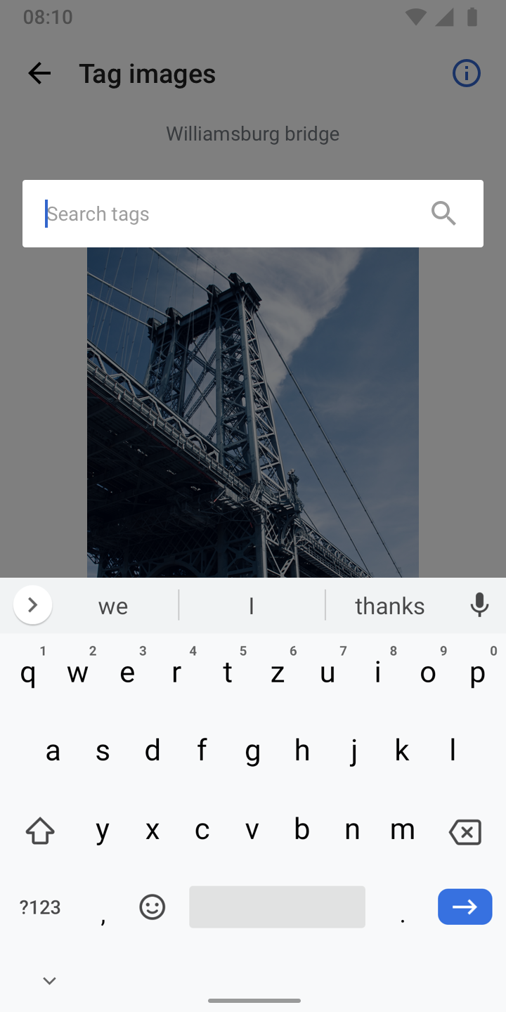
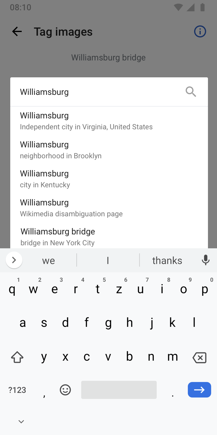
  • 04) “Add tag...“ triggers a search dialog with an active keyboard and lets users search Wikidata items: helper text should be search tags
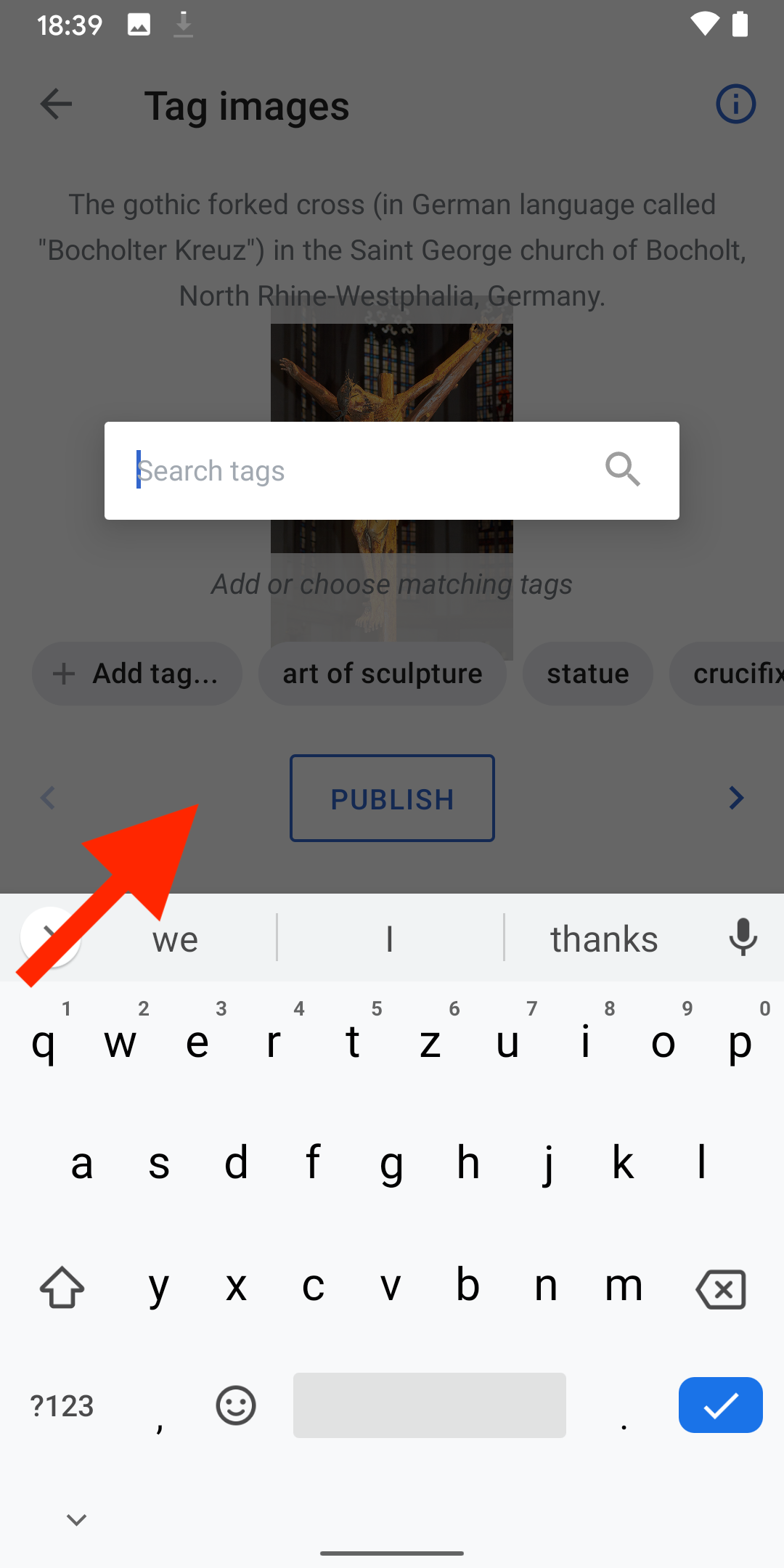
  • 05) Tags refresh while typing and can be selected with a tap. A tap closes the search dialog and adds it to the list of chips (07)
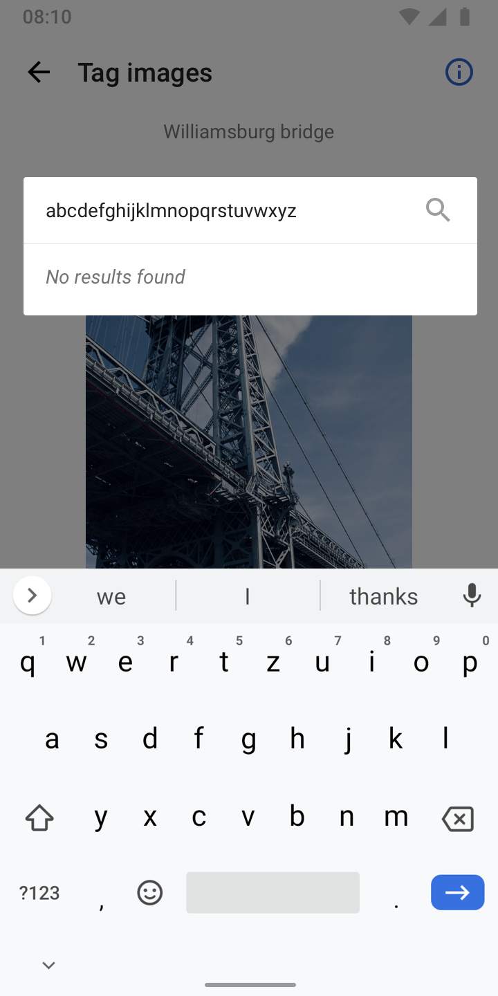
  • 06) “No results found“ design
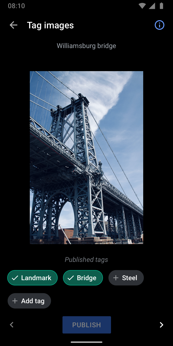
  • 07) As mentioned in 07), tapping an element adds the item to the list of chips/tags and is in enabled state (checkmark, more contrast)

Next steps
  • Implement the design suggestions mentioned in this task
  • Design review in the week of March 9, 2020
  • After design review, Robin will run usability tests to see if the concept is generally understood

Event Timeline

scblr added a subscriber: Charlotte.

Hey @Charlotte, could you review/optimize the copy in 01) and 02) due to the custom tags upgrade? Thx!

Thanks @Dbrant for creating that magnificent concept within a day! 👏

@schoenbaechler The super-rounded corners are not part of the standard Dialog component, and cannot be changed.

Charlotte triaged this task as High priority.EditedMar 5 2020, 10:32 PM
Charlotte updated the task description. (Show Details)

What do you think of the copy @schoenbaechler? I want to steer a bit clear of "computers are taking over our lives" if we can. 😃

Also, can we change the search box text from "search Wikidata" to "search for tags" - we've already mentioned Commons and whatnot... if these tasks are for n00bs they're probably not going to understand what a Wikidata is. Let's not blind them with science.

I want to steer a bit clear of "computers are taking over our lives" if we can.

Agreed, given the quality of suggested tags and the fact that Wikipedia is where it is because of volunteers, it makes sense to emphasize
the “manual aspect“ of the task. It was quite a journey to get to this realization. We are learning!

Also, can we change the search box text from "search Wikidata" to "search for tags"

Agreed, will adapt the visuals.

Whoa, impressed by the clever copy paste logic that you’ve implemented @Dbrant 👏

Only a few areas need some slight tweaks, they’re listed below.


01) Adapt width of the search field to the specs (16px left and right margin). Benefits: less line breaks, better scannability

DesignvsImplementation
sev4-41-search-filled.png (1×720 px, 126 KB)
Screenshot_20200310-183932.png (2×1 px, 358 KB)

02) Search field should always be at the same position. Why?

  • More tap area at the top to dismiss the search dialog. It’s currently tiny on top when the list is long.
  • Less sudden jumps in the interface, better orientation.
  • Implementation suggestion: show it after the description (where the image starts) or set a fix top margin so descriptions are still visible at the top.
DesignvsImplementation
Screenshot_20200310-183932 copy 2.png (2×1 px, 321 KB)
sev4-39-search-placeholder.png (1×720 px, 449 KB)

03) Keyboard should overlap content, not push it up. Not to see the (incomplete list of) tags is fine, users decided to add their own tags at this point.

DesignvsImplementation
sev4-39-search-placeholder.png (1×720 px, 449 KB)
Screenshot_20200310-183932 copy.png (2×1 px, 352 KB)

04) Enabled tags currently have a too big gap between icon and label

DesignvsImplementation
sev4-43-added.png (1×722 px, 755 KB)
Screenshot_20200310-185617.png (2×1 px, 1 MB)

05) Set line-height for both title and description to 16sp

Screenshot_20200310-184133.png (2×1 px, 195 KB)


Thx!

Hey @Dbrant, one more thing that came up in design review yesterday. Please increase the scroll area for tags to a height of 72dp:

sev4-05-light.png (1×720 px, 712 KB)

@Dbrant, as discussed, here are the remaining things to ”optimize”:

  • Stack tags (no more horizontal scrolling)
  • Add “+" iconography to avoid reflowing of tags when selecting
  • Change label to "Add tag“ (without ellipsis)
  • Move “Add tag“ to the end of tag suggestions
  • Add “Published tags“ label when going back 👇
    sev4-34-back-behavior.png (1×720 px, 744 KB)

@Dbrant can we introduce a max height for the chips, e.g. 240dp (5 rows * 48dp) and make it vertically scrollable to avoid a situation like this in which the interface is not usable?

Screenshot_20200320-110649.png (2×1 px, 475 KB)

Also open to other suggestions from your end, thx!

👍 to everything.

err, except the spacing and positioning of the popup dialog, which our libraries are not allowing us to modify.

@Dbrant

01) The component for searching tags is not yet optimized for all themes. Below’s a screenshot from the black theme (text not visible, same in dark theme and sepia just uses the light theme color palette).

Screenshot_20200320-183257.png (2×1 px, 70 KB)

Can you take a stab at adapting the colors? I think they’re similar to the colors used for the search field on Explore.

Screenshot_20200320-184134.png (2×1 px, 624 KB)

02) Stacking of tags is still suboptimal – we need to cap it earlier so it doesn’t overlap with the legal text (as mentioned before, ideally max. 5 rows of tags, e.g. 240dp (5 rows * 48dp).

Screenshot_20200320-183051.png (2×1 px, 355 KB)

03) Please left align all tags:

sev4-07-light-worst-case.png (1×720 px, 649 KB)

01) The component for searching tags is not yet optimized for all themes.

👍 Whoops, missed that somehow. The theming of the dialog should now be correct.
Also, I discovered an undocumented (!) way of making the rounded corners like you wanted originally. Check it out in the Alpha, and let me know what you think.

02) Stacking of tags is still suboptimal – we need to cap it earlier so it doesn’t overlap with the legal text (as mentioned before, ideally max. 5 rows of tags, e.g. 240dp (5 rows * 48dp).

I'm afraid this was the only way to make the list of tags scrollable vertically. Do you think this is perhaps an edge case that's not worth much more of our bandwidth?

03) Please left align all tags:

👍

@Dbrant

Also, I discovered an undocumented (!) way of making the rounded corners like you wanted originally. Check it out in the Alpha, and let me know what you think.

😍

I'm afraid this was the only way to make the list of tags scrollable vertically. Do you think this is perhaps an edge case that's not worth much more of our bandwidth?

Ok!


One last thing, I see this one as crucial since it helps users orient themselves. If the view adapts to the height (with keyboard) after hitting “Add tag“, so much unnecessary movement in the interface is going on. Could you investigate a little more time on how this could be achieved, please? (no refit of content when keyboard is visible)

03) Keyboard should overlap content, not push it up. Not to see the (incomplete list of) tags is fine, users decided to add their own tags at this point.

DesignvsImplementation
sev4-39-search-placeholder.png (1×720 px, 449 KB)
Screenshot_20200310-183932 copy.png (2×1 px, 352 KB)

03) Keyboard should overlap content, not push it up. Not to see the (incomplete list of) tags is fine, users decided to add their own tags at this point.

Thx

One last thing, I see this one as crucial since it helps users orient themselves. If the view adapts to the height (with keyboard) after hitting “Add tag“, so much unnecessary movement in the interface is going on. Could you investigate a little more time on how this could be achieved, please? (no refit of content when keyboard is visible)

This behavior is very deeply hard-coded into the Android dialog component, and unfortunately cannot be modified.