Page MenuHomePhabricator

[Bug] COVID-19 epidemic table not expanding to full-width on large displays
Closed, DuplicatePublicBUG REPORT

Description

Via @Tgr from Doc James:

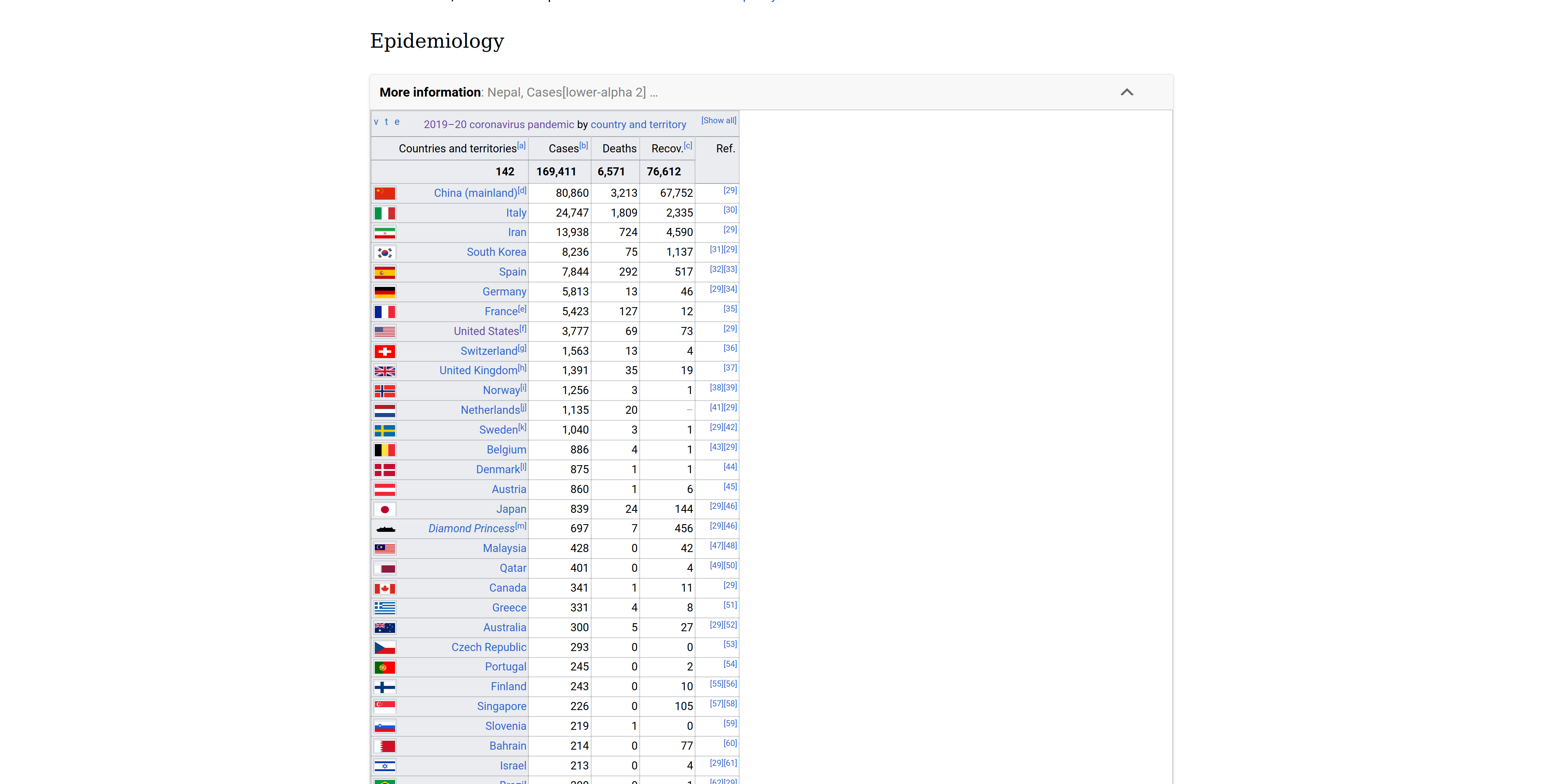
Hey All Our pandemic article is getting more than a million views per day. The issue is that we have this large table of the number of cases in each country (rapidely growing to all countries) but we have so far been unable to figure out how to collapse part of it or add scrolling and still have it format correctly across desktop, mobile and the app. https://en.wikipedia.org/wiki/2019%E2%80%9320_coronavirus_pandemic#Epidemiology

Steps to reproduce

  1. Visit the PCS version of "2019–20 coronavirus pandemic" article on a large screen display.
  2. Scroll to the Epidemiology section, expand it (if not already), and view the "2019–20 coronavirus pandemic by country and territory" table.
  3. Notice that the table shrinks correctly with the available screen space but does not fill correctly:

Screenshot_2020-03-15 2019–20 coronavirus pandemic.png (1×3 px, 291 KB)

Notes

  • Presentation on MinervaNeue appears correct on small and large screens.
  • Presentation on desktop Vector appears correct on small and large screens.
  • Removing the table's three display: block overrides, adding a wrapping a div with overflow-x: auto may fix it. I believe this would require JavaScript and inline CSS changes in CollapseTable.js and CSS changes in related stylesheets.

Expected results

  • Table should fill screen.

Actual results

  • Table does not fill screen on large devices.

Environments observed

  • Browser version: Mozilla Firefox 74.0
  • OS version: Ubuntu v19.10
  • Device model: desktop
  • Device language: English

Event Timeline

Niedzielski renamed this task from [Bug] COVID-19 not showing at full-width on large displays to [Bug] COVID-19 epidemic table not expanding to full-width on large displays.Mar 16 2020, 3:53 AM

I think this is expected behaviour generally. I don't think readability would be improved by essentially adding a large amount of whitespace in the country column.

On desktop, the expected behaviour on large screens is that its a floated element, and text flows around it if the screen is large enough.

p.s. Well playing with the table, i did experience some bizarre behaviour with table formatting on the mobile app on https://en.wikipedia.org/w/index.php?title=User:Bawolff/sandbox/covid&oldid=945734336 which i did not understand (Links became broken)

Given the number of transforms already on mobile, I was thinking we could do something like this:

  • Add a wrapper div around the table that has an overflow-x: auto.
  • Restore the table's display property to table (this is overridden by PCS, if I understand correctly).

The result is that on large screens it makes use of the full-width and on small screen there's no change.

Hmm, that does look a bit better. I tried that. Although i think in the process i broke the collapsibility.