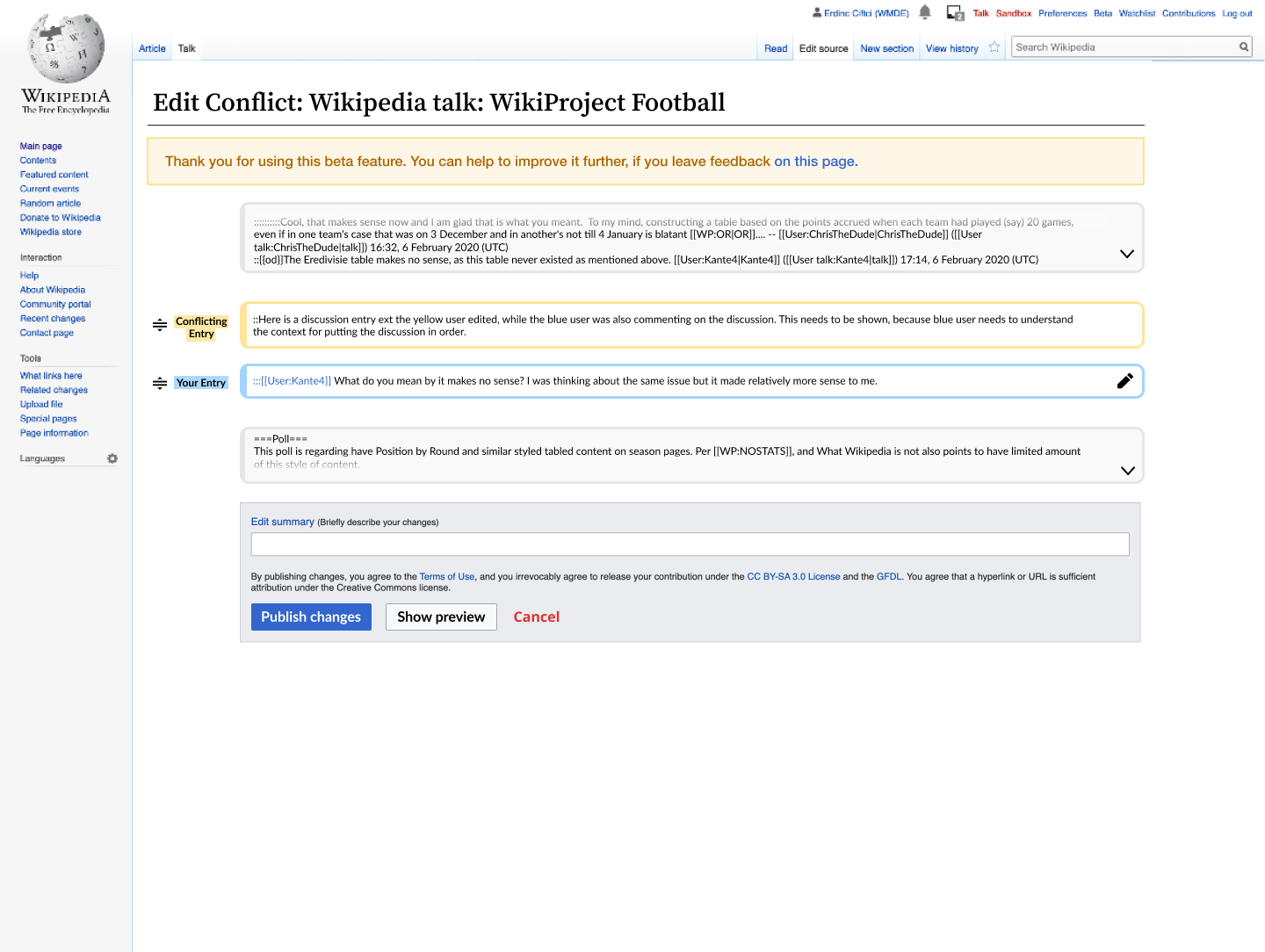
Show popup to inform users about the new interface to resolve talk page conflicts when two users added a comment at the same place.
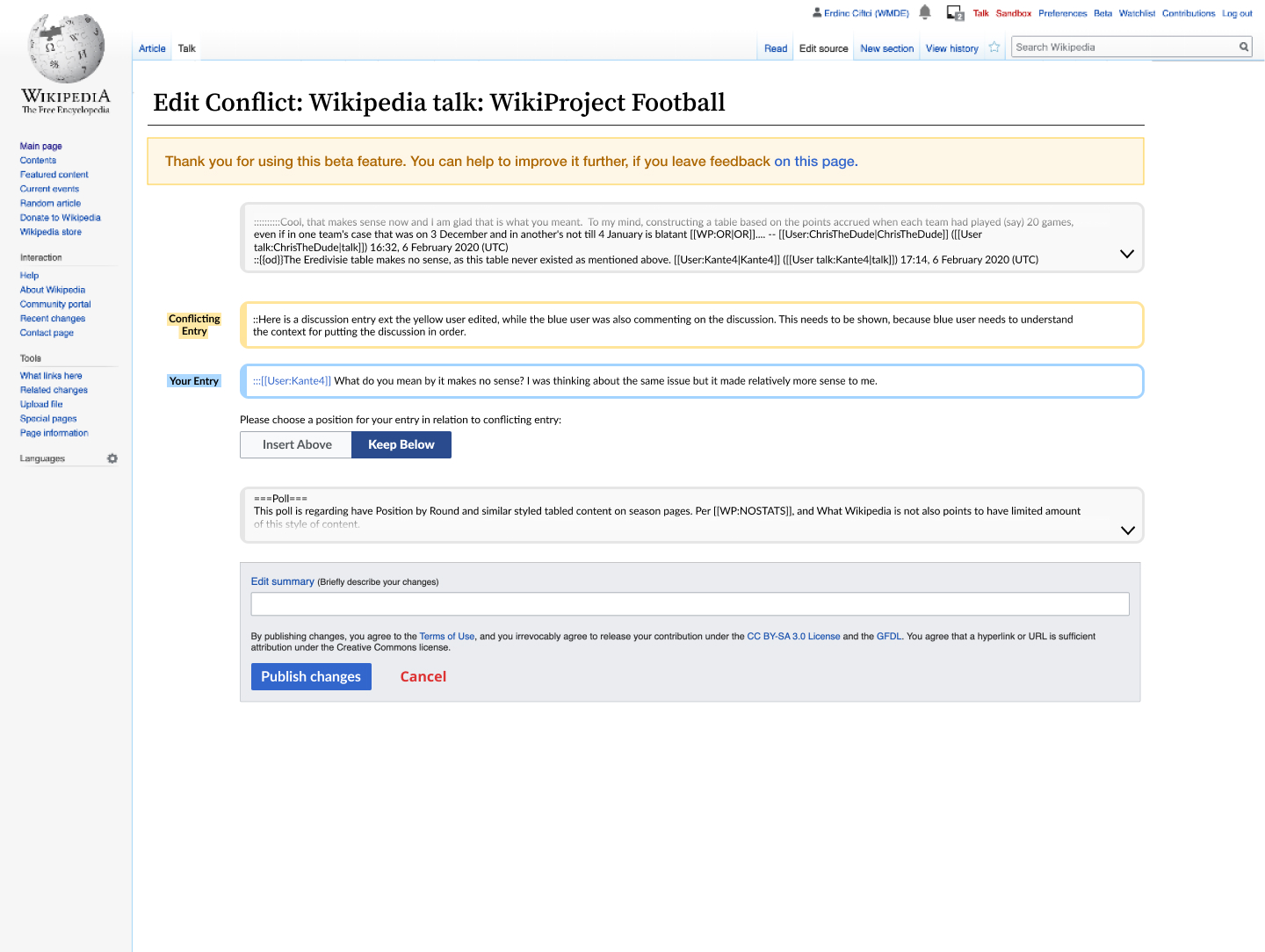
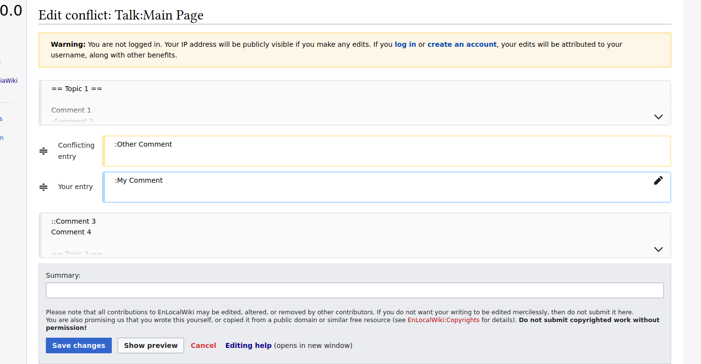
Mock-Up
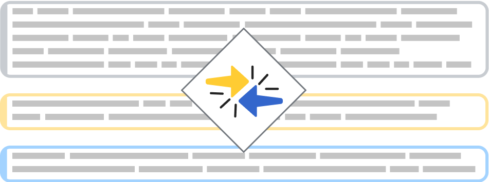
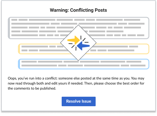
Popup
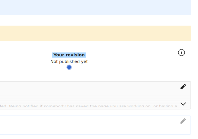
Info icon location
Pop-up high res files
Wording
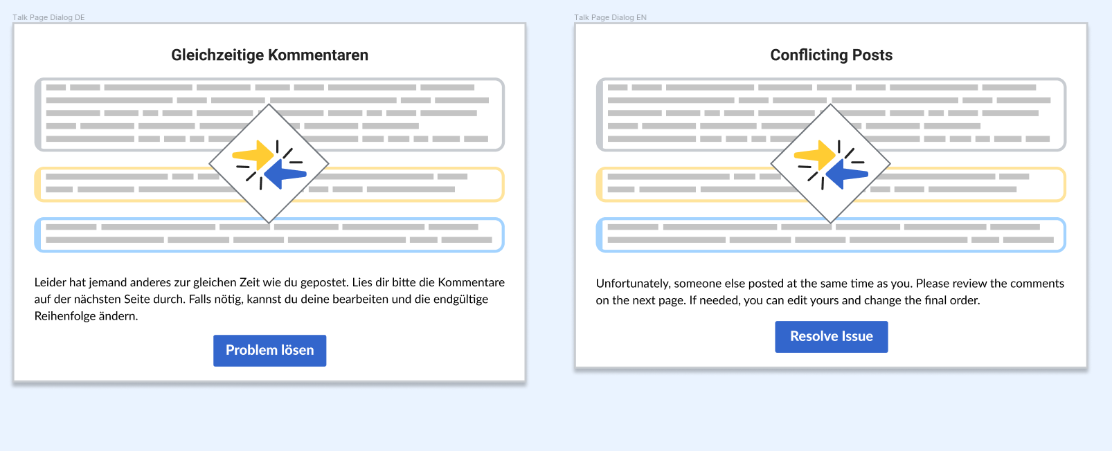
EN
Title: Conflicting Posts
Body: Unfortunately, someone else posted at the same time as you. Please review the comments on the next page. If needed, you can edit yours and change the final order.
Button: Resolve issue
DE
Title: Gleichzeitige Kommentare
Body: Leider hat jemand anderes zur gleichen Zeit wie du gepostet. Lies dir bitte die Kommentare auf der nächsten Seite durch. Falls nötig, kannst du deine Bearbeitungen und die endgültige Reihenfolge ändern.
Button: Problem lösen
The ticket does include
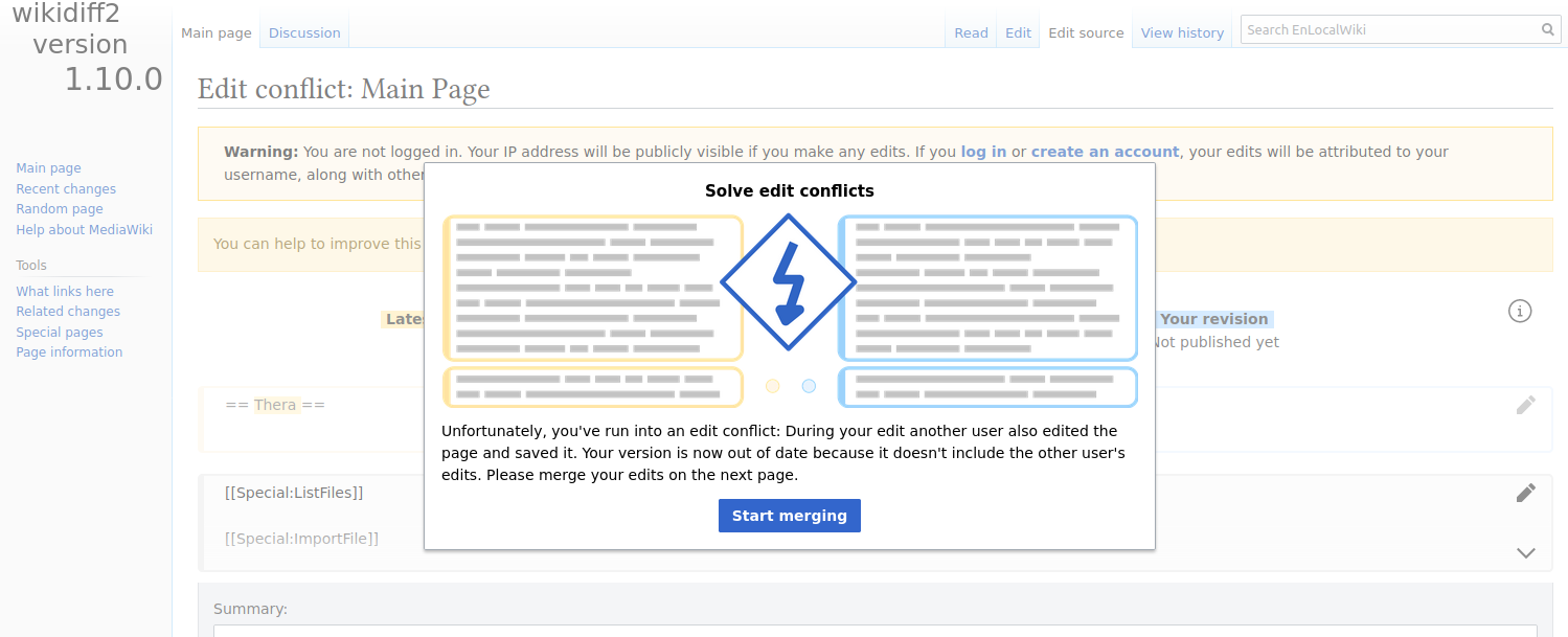
- When the user is getting into that edit conflict for talk pages for the first time, they will be shown a popup explaining the circumstances and how to deal with them (similar to the regular edit conflict).
- This popup to be disabled for future scenarios automatically
- Adding an info icon on the interface where the popup can be shown again
