Page MenuHomePhabricator

Inline error messages in mobile donation banner (instead of alert("…"))
Closed, ResolvedPublic2 Estimated Story Points

Description

User Story:: As a user, I want to see problems with my input so I can correct them
Context of use: The user would be on the mobile banner and tries to enter interval, amount and/or payment method.

Current Problems: Currently, errors are shown via javascript alert()s. This does not map visually with where the problem is, is inconsistent with the desktop banner and the donation page and might be perceived as disruptive, too.

Possible Solution: The UX team suggests to use the same behavior across mobile, desktop and donation page. Thus…

  • an inline validation should be used which is triggered onblur and/or when the submit button is clicked.
  • The viewport should scroll to the first error from the top after the submit button is clicked
  • The inline validation should show a terse text below the header of the button group where the content was (not) entered. The text from the desktop banner can be used for now.
  • To make space for the error messages, the banner should grow slightly when an error is shown and the Wikipedia content should be pushed down accordingly.
  • The font should be red (for the "red banner design" it would be #990000) and the font have the same height as other UI copy in the banner. Since there are several font sizes used, it should be 16px (as the font size from the buttons would be too big)
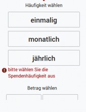
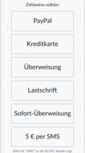
image.png (387×300 px, 17 KB)

Event Timeline

@Jan_Dittrich Thank you for this. There are quite a lot of payment type options, that might use up more space than visible an some smaller screens:

mobile-banner-many-buttons.png (568×320 px, 30 KB)

If the validation fails because of the missing payment type, scrolling up to where the error is displayed would hide some of the payment options and the button group's headline. Scrolling up to the headline of the button group would hide the error message. Do you have a solution for that?

Do you have a solution for that?

We could always put the error on top of the options, thus anything relevant that comes after the error is in the normal scroll direction and e.g. "5€ per SMS" might be not visible initially, but can be quickly scrolled into view.

kai.nissen set the point value for this task to 2.
Aklapper added a subscriber: kai.nissen.

Removing task assignee due to inactivity as this open task has been assigned for more than two years. See the email sent to the task assignee on August 22nd, 2022.
Please assign this task to yourself again if you still realistically [plan to] work on this task - it would be welcome!
If this task has been resolved in the meantime, or should not be worked on ("declined"), please update its task status via "Add Action… 🡒 Change Status".
Also see https://www.mediawiki.org/wiki/Bug_management/Assignee_cleanup for tips how to best manage your individual work in Phabricator. Thanks!