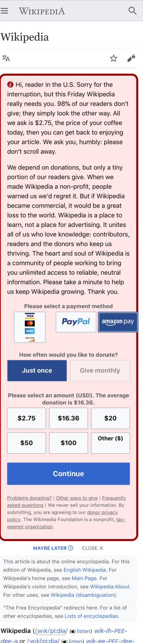
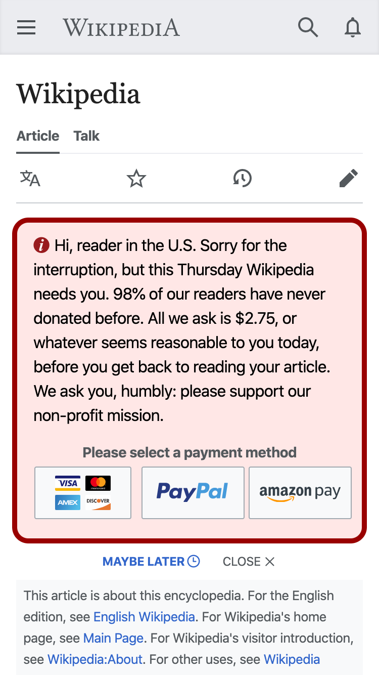
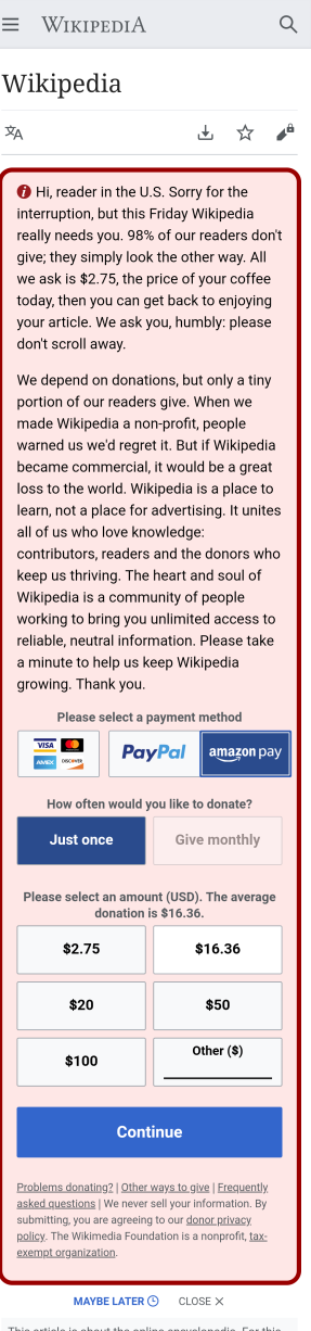
Page MenuHomePhabricator

Button Spacing issue on Payment Options - Mobile Small banner
Closed, ResolvedPublicBUG REPORT

Description

image.png (1×287 px, 148 KB)

Steps to Reproduce:

  1. Open https://en.m.wikipedia.org/wiki/Wikipedia?banner=trilogy_mlWW_m_p2_sm_paymentVisible_v2&country=US
  2. Observe misaligned Amazon Pay button

Actual Results:
Currently the Amazon Pay button appears stuck to the Paypal button

Expected Results:
The buttons should appear with equal separation in between

Event Timeline

@EWilfong_WMF @spatton I created this new task to separate out the other issue mentioned in T249291, since one issue was a misalignment with donation amount buttons, and this task is the misalignment of payment options

Copying over Eric's last comment from there:
@jbolorinos-ctr - Can you provide a screenshot of how this looks on that Swedish URL? Does it not occur on the English version?

I can't recreate the issue on browserstack.com and I don't have a crossbrowsertesting.com account, so I'm a bit at a loss on how to debug this. On browserstack.com, I am seeing the following on a Galaxy S8, Android 7, Chrome Mobile 80:

@EWilfong_WMF to answer your question, the issue listed above does NOT affect the seSE banners since they dont include the Amazon Pay option.

Are you able to recreate this issue using iPhone8? Here's a screenshot from iPhone8-11.0/Safari-11.0 that I got from CBT

image.png (1×288 px, 306 KB)

**Screenshots previously included by Eric for how he's unable to replicate this bug on browserstack

FireShot Screen Capture #130 - 'Dashboard' - live_browserstack_com_dashboard#os=android&os_version=7_0&device=Samsung+Galaxy+S8&device_browser=chrome&.png (1×1 px, 348 KB)

FireShot Screen Capture #129 - 'Dashboard' - live_browserstack_com_dashboard#os=android&os_version=7_0&device=Samsung+Galaxy+S8&device_browser=chrome&.png (1×1 px, 139 KB)

Just in Chrome devtools I do see a slight difference in button spacing for the banner linked in the description, along with a different sizing of the credit card icons.

trilogy.png (1×750 px, 184 KB)

This doesn't appear in the current best banner.

current best.png (1×750 px, 185 KB)

There are some substantial differences in the CSS between these banners, so I can't immediately see what change might be causing it.

I do see that difference in button spacing, @Pcoombe. I'll fix that and maybe it will resolve the issue for all web clients.

jbolorinos-ctr renamed this task from Misaligned Payment Options on Mobile Small banner to Button Spacing issue on Payment Options - Mobile Small banner.Apr 9 2020, 4:49 PM

Alright, I've fixed the button spacing issue that @Pcoombe mentioned. These buttons are adapted from mobile large, so I made sure the styles were in line with that. I also added a new style that allows the PayPal and Amazon SVGs to size down at small widths:

.frb-label > svg {

max-width: 100%;

}

@jbolorinos-ctr - can you run the banner through the screenshots again?

Yup! Just ran it, the results can be viewed here: https://app.crossbrowsertesting.com/public/i15b74a2dc92badb/screenshots/zd6128fbbe96d75cc432

Verified this issue has been fixed on S9/S8/S7/Note3 now:

image.png (4×300 px, 646 KB)

However I've also noticed the payment options are looking wonky on iPhone, so there still might be some missing styles (see screenshot below)

image.png (4×300 px, 770 KB)

Can you give it another pass now, @jbolorinos-ctr? I spent more time ensuring the styles match the mobile large payment buttons. It looks good in my local testing.

jbolorinos-ctr claimed this task.

Confirmed this issue has now been fixed. Closing task as resolved

image.png (5×300 px, 644 KB)