Requirements
- There should be no jump (height change) when the user hovers over a row
- Reduce clutter on table cells
- Tools and actions should be easily accessible
- Following our UI standards
Explorations by @dom_walden and @Tchanders
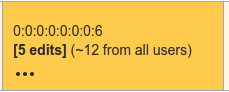
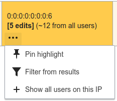
Notes
- Transparent icons don't take up any space and so there is no jump
- Putting items behind the ellipsis menu reduces clutter but increases the number of clicks
Proposal
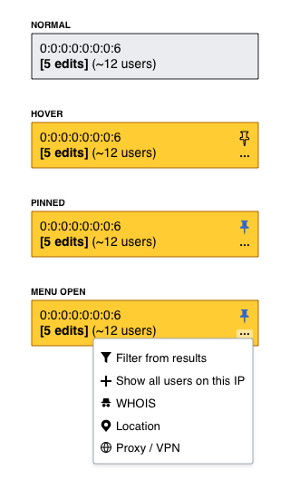
Notes
- Always leave space on the right for icons, even when they aren't visible. Lines should wrap leaving that space empty
- The pin button is always visible, followed by the ellipsis icon (like Flow)
- All other tools and options go inside the menu
- In the case of UAs the only option in the menu would be filter. This is not ideal.
