Page MenuHomePhabricator

Fix the alignment of Japanese Wikipedia wordmark (mobile)
Closed, DuplicatePublic

Assigned To
None
Authored By
whym
May 3 2020, 8:04 AM
Referenced Files
F31812705: ja-wordmark.svg
May 11 2020, 3:53 PM
F31812706: ja-tagline.svg
May 11 2020, 3:53 PM
F31804936: image.png
May 6 2020, 1:18 PM
F31804079: text1923.png
May 5 2020, 11:36 PM
F31804075: path2569-5-3-6-9-1-2-7-0.png
May 5 2020, 11:36 PM
F31803637: image.png
May 5 2020, 4:32 PM
F31793309: rect4526-7-4.png
May 3 2020, 8:04 AM
F31793308: wordmark2.svg
May 3 2020, 8:04 AM

Description

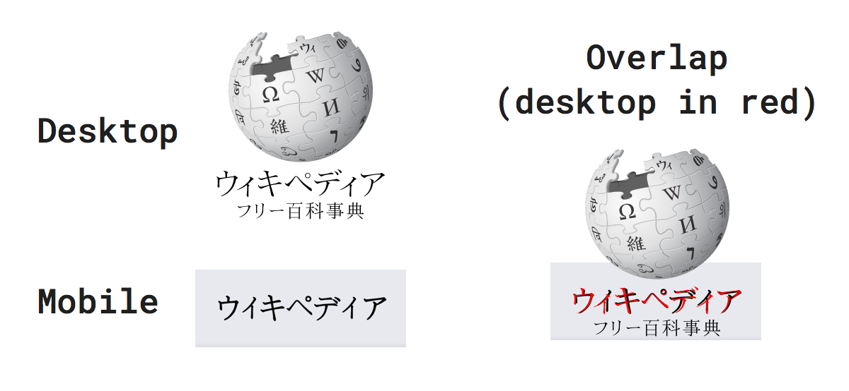
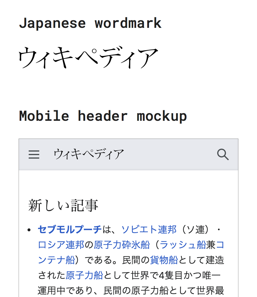
To my eyes, the baseline of the Wikipedia text logo in the Japanese mobile website looks slightly off - not straight enough. The logo is shown at the top of https://ja.m.wikipedia.org/ .

To illustrate the problem, I created a comparison: 1 (current logo, unmodified), 2 (current logo, adjusted by me), 3 (plain render of the same word in Takao Mincho with no adjustment). Notice (the lack of) the gap beneath ィ in particular.

rect4526-7-4.png (1×1 px, 58 KB)

This is not to say that all characters in Japanese must be aligned at the bottom, nor any creative placement is impossible. I'd like to know if there is a specific reason why the characters were placed the way they are, however.

I believe the target file is at operations/mediawiki-config/static/images/mobile/copyright/wikipedia-wordmark-ja.svg .

Event Timeline

Hmm, maybe they were automatically generated? I cannot find them on Commons, so there's that.

@alexhollender can you advise? We haven't updated this wordmark yet so I'm assuming it will be fixed by T246430

ovasileva triaged this task as Medium priority.May 4 2020, 3:21 PM

For some additional context here is a comparison of the Japanese Wikipedia logo from the desktop site and from the mobile site:

image.png (554×1 px, 179 KB)

As far as I can tell they are quite similar. I think the appropriate process here might be to start a discussion on the Talk page of the logo itself? https://commons.wikimedia.org/wiki/File:Wikipedia-logo-v2-ja.svg

In T251693#6109510, @alexhollender wrote:

As far as I can tell they are quite similar. I think the appropriate process here might be to start a discussion on the Talk page of the logo itself? https://commons.wikimedia.org/wiki/File:Wikipedia-logo-v2-ja.svg

I don't think modifying the original logo is the right way to go. The problem I described above is not found in the puzzle logo version (by this I mean the text portion in File:Wikipedia-logo-v2-ja.svg) - the two instances of the small ィ character in it are actually placed lower than the most of the other characters in the puzzle logo version, unlike the mobile version which has ィ higher/centered.

text1923.png (300×1 px, 35 KB)

And the norm is to place them lower, not higher/centered. To quote Requirements for Japanese Text Layout by W3C, "in horizontal writing mode, it [a small kana character] is placed at the horizontal center and below the vertical center." (emphasis is mine)

If I had to guess, the two versions appear to be have been independently designed. The shapes of some peaks in the two typefaces are noticeably different, and they cannot be explained by scaling and alignment. They are rounder in the mobile version. (See below for the comparison.)

path2569-5-3-6-9-1-2-7-0.png (500×627 px, 25 KB)

That said, is there any problem with replacing the mobile word mark with a copy of its counterpart in the puzzle logo? Was there a reason to have two different versions of the word mark in the first place?

In T251693#6109510, @alexhollender wrote:

For some additional context here is a comparison of the Japanese Wikipedia logo from the desktop site and from the mobile site:

image.png (554×1 px, 179 KB)

As far as I can tell they are quite similar. I think the appropriate process here might be to start a discussion on the Talk page of the logo itself? https://commons.wikimedia.org/wiki/File:Wikipedia-logo-v2-ja.svg

Right, they look similar - but that is the same as saying "VVikipeclia" looks similar to "Wikipedia", so we should switch to the former.
In my opinion, the problem of the mobile version is it places "ィ" so awkwardly that it cannot be distinguished from "イ" (the correct one is "ィ" which is smaller and at a relatively lower position than other characters, say "ウ").

This problem is not only from alignment but also from radical uncomprehending about Japanese characters.

A Japanese Wikipedia user found that the mobile wordmark is bad, and asked other users how they feel at the Village pump.

Currently, all commented users say that the wordmark is wrong.
As a simplified conclusion, it’s not written as ウィキペディア but ウイキぺデイア. イ is not small Katakana ィ but half-width イ, and ペ is not Katakana but Hiragana ぺ.

As far as I can tell they are quite similar

If you feel so, you must learn about the Japanese language, otherwise, ask some Japanese professionals and show us the proof of sufficient of the current version.

I agree with Whym's proposal. You should extract the wordmark from the puzzle logo, which is written in correct Japanese.

@whym @patilise @aokomoriuta thank you all for educating me on this matter, and apologies for not being more clear and considerate in my comment!

I am certainly ignorant about the Japanese alphabet and was by no means trying to suggest that this issue is trivial. When I said "As far as I can tell they are quite similar" I suppose what I was trying to communicate/prompt was:

  1. is this problem also occurring in the desktop version of the wordmark? (so that we can establish the scope of the issue, and also help folks like myself understand if the correct version lives somewhere)
  2. I don't really know much about this stuff so please help me understand (which you all have, so thanks again)

My current understanding is that the desktop version of the wordmark is correct. Please let me know if this looks correct to you all and we can proceed to updating the appropriate SVG:

image.png (1×878 px, 108 KB)

Thank you! It looks fine to me too.

@Jdlrobson not sure if we want to do this separately, or as part of the larger logo update. Here is the wordmark and associated tagline: