Starting from T208184 there have been gathered several ideas to make no search results better usable.
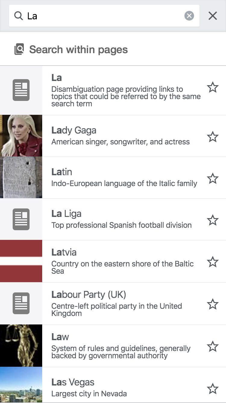
Current look:
 |
- There's misalignment vertically.
- There's interaction color as visual indicator missing.
Proposal by @alexhollender
I think we should anchor on the use case where the search returns results because that's more common. I think it looks better with the proposed icon rather than no icon.
| icon | 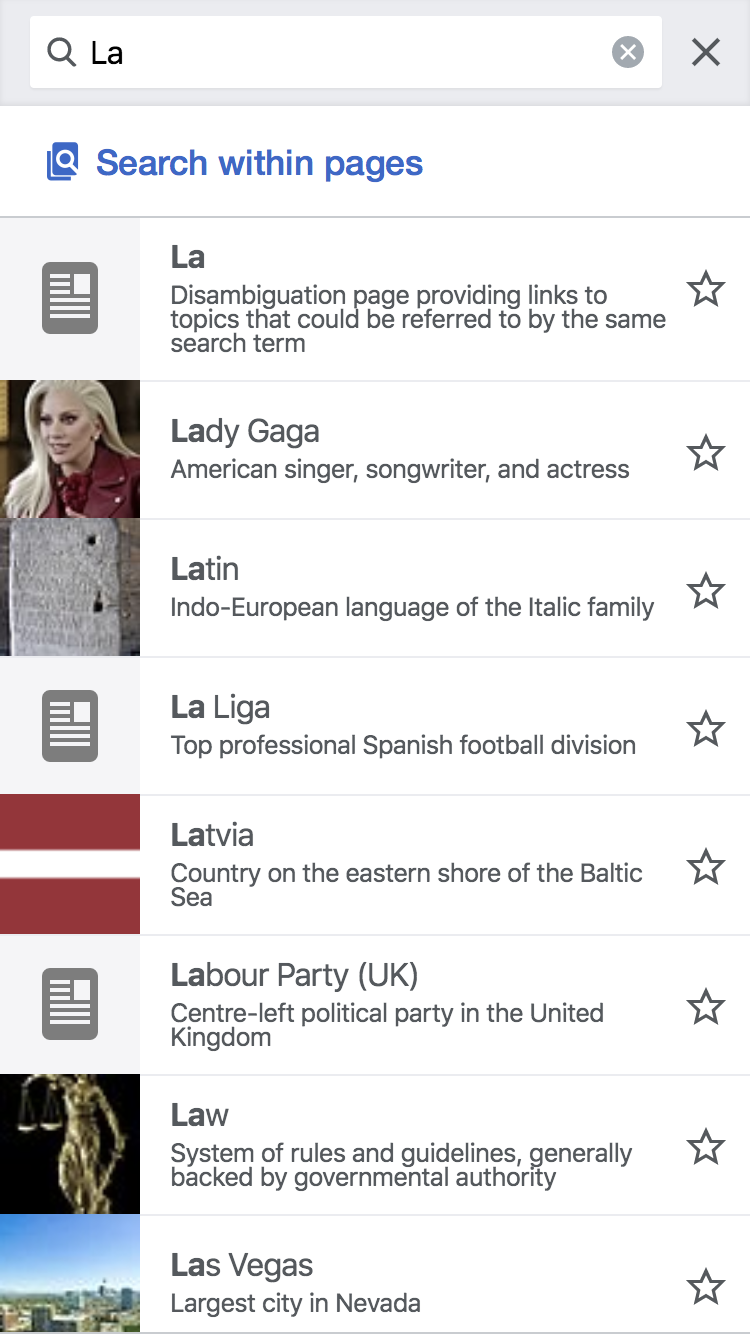 |  |
| no icon |  |  |