With ImageOptim they could be significantly smaller.
As an example, enwiki:
Current production logo

Lossless recompression (14% smaller file weight than original)

Lossy recompression (58% smaller file weight than original)

| • Gilles | |
| May 7 2020, 10:38 AM |
| F32240605: Screenshot 2020-09-01 at 14.24.30.png | |
| Sep 1 2020, 12:29 PM |
| F32240602: itwiki.png | |
| Sep 1 2020, 12:29 PM |
| F32240604: Screenshot 2020-09-01 at 14.24.35.png | |
| Sep 1 2020, 12:29 PM |
| F32240600: chwiki.png | |
| Sep 1 2020, 12:29 PM |
| F31916142: image.png | |
| Jul 3 2020, 5:32 PM |
| F31916140: image.png | |
| Jul 3 2020, 5:32 PM |
| F31911048: sdwiki.png | |
| Jun 29 2020, 6:21 PM |
| F31911051: smwiki.png | |
| Jun 29 2020, 6:21 PM |
With ImageOptim they could be significantly smaller.
As an example, enwiki:
Current production logo
Lossless recompression (14% smaller file weight than original)
Lossy recompression (58% smaller file weight than original)
This was done 3 years ago already: T161999: Make sure all logos are optimalized. I assume that in the meantime the different tools used by ImageOptim have improved, since we can get an extra 14% on lossless recompression. I will try to figure out what tool and settings ImageOptim ends up using to get that gain, so we can easily apply it to all logos at once. We should probably do all PNGs in /static/ for lossless, not just site logos.
I'm going to apply the most conservative version first (no metadata stripping, lossless recompression) because it's a quick win, but I'd like the lossy version to be reviewed, at least for Wikipedia, because the extra gains are very significant.
Change 594943 had a related patch set uploaded (by Gilles; owner: Gilles):
[operations/mediawiki-config@master] Optimise all static PNGs losslessly
Change 594943 merged by jenkins-bot:
[operations/mediawiki-config@master] Optimise all static PNGs losslessly
Mentioned in SAL (#wikimedia-operations) [2020-05-28T07:31:32Z] <gilles@deploy1001> Synchronized static/apple-touch: T252108 Deploying optimised static PNGs (duration: 01m 12s)
Mentioned in SAL (#wikimedia-operations) [2020-05-28T07:33:33Z] <gilles@deploy1001> Synchronized static/images: T252108 Deploying optimised static PNGs (duration: 01m 39s)
Taking another look at lossy optimisation, for the enwiki logo I think that most of the gains are coming from the fact that ImageOptim is converting it to a palette PNG instead of an ARGB one. That's why it's gaining so much (51% smaller than this latest lossless optimisation). Looking at what that means in terms of unique colors, we are indeed going from 3329 different colors to 252.
@alexhollender had validated the lossy version of the enwiki logo in terms of quality already, but I think the new patch I'm going to put together for Wikipedia logos should have a high level of scrutiny in terms of visual quality before it's deployed, as we are essentially reducing color by a factor of 13. Which might be invisible to the naked eye on a mostly black and white image, but is a non-negligible change.
Change 599284 had a related patch set uploaded (by Gilles; owner: Gilles):
[operations/mediawiki-config@master] Lossy optimisation of Wikipedia logos static PNGs
@Gilles where can I find the current 1.5x and 2x versions to compare with the new files you've provided? Also when do we use the 1.5x and 2x?
I don't know if there's an easier way, but the way I did it for the previous change was to download a few from the Gerrit link, like so:
 |  |
 |
@alexhollender we use the 1.5x and 2x variants for displays that haver higher pixel densities and for people who zoom on the page. The main goal is to keep the logo sharp on HiDPI/retina displays.
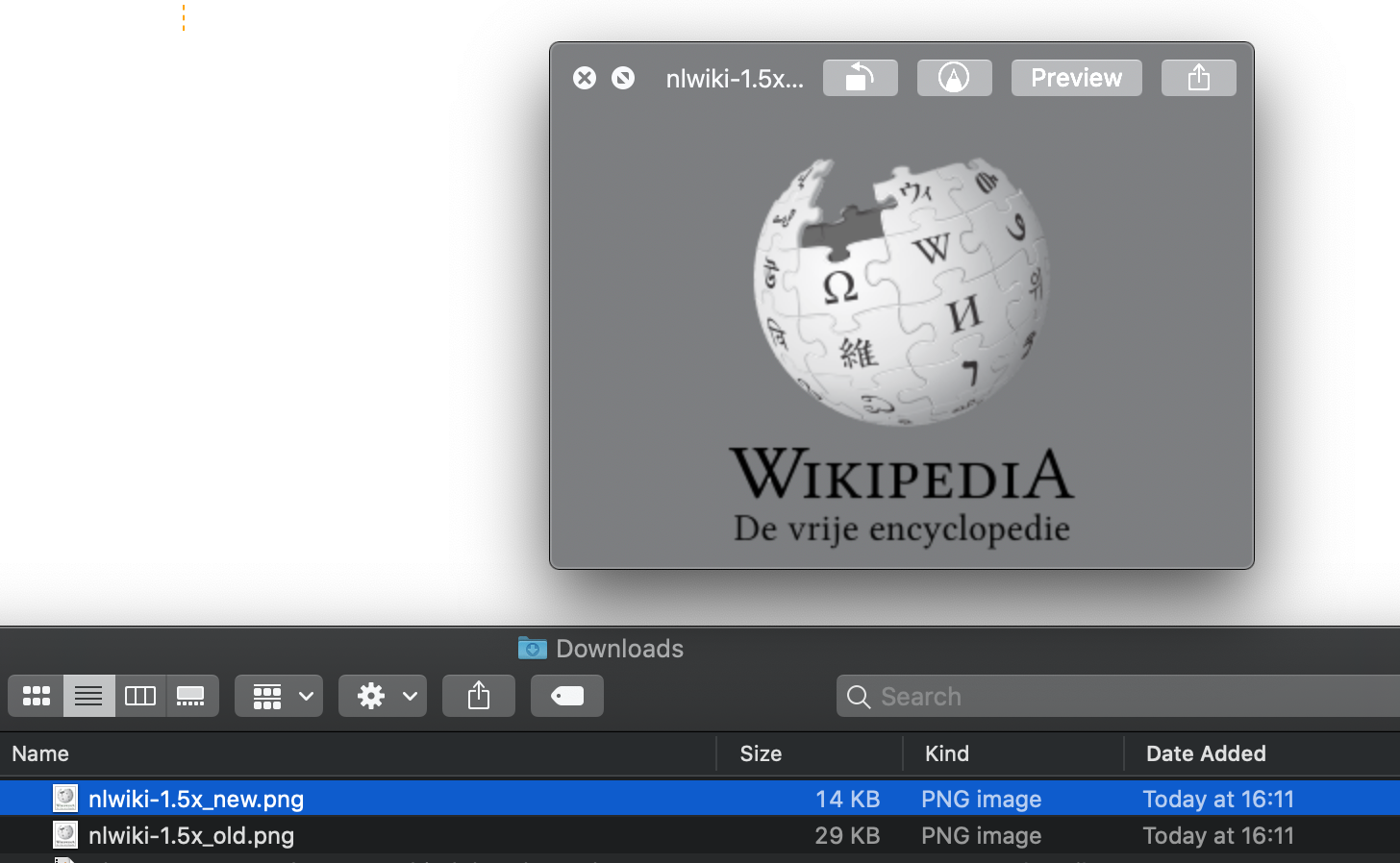
If it helps I can generate a zip archive with all the files before and another one with all the files after, let me know.
@Gilles I've got a zip with all of the new ones. If you could provide a zip with all of the current/old ones that would be helpful. Thanks you
@alexhollender here it is: https://drive.google.com/file/d/1k_JfmtxXQS5OuAiE318hK-B-dqD0RHN9/view?usp=sharing this also includes non-wikipedia logos, but as you see in the change, only the wikipedia ones are getting touched at the moment.
I preferred to stick to wikipedia only for now because all its language logos are black & white, have a similar design and represent the largest amount of traffic.
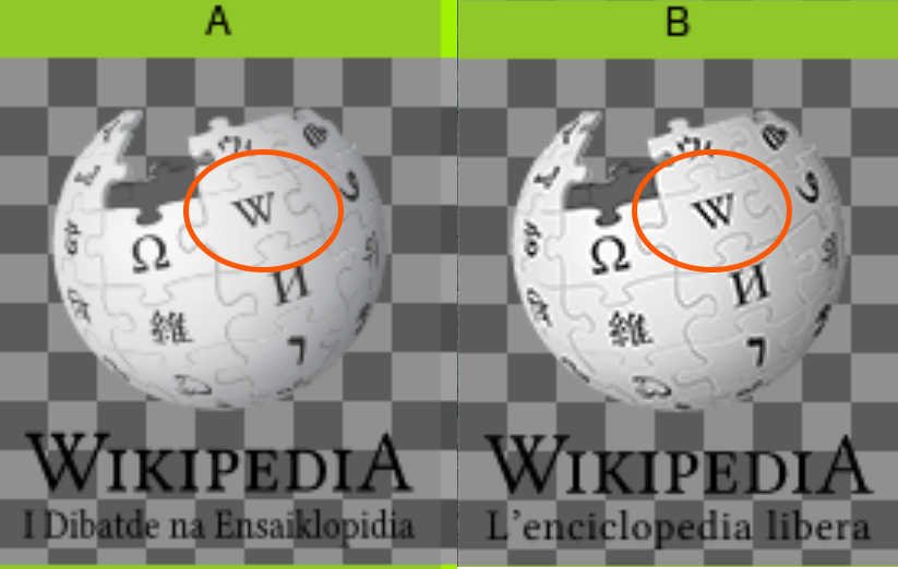
Here's a fun experiment for this patch. I've picked randomly and put processed and unprocessed logos rendered on top of a checkerboard in the same meta-image.
On each of these 2 meta-images, half of the logos are the current production ones and the other half have undergone the lossy compression from the patch currently up for review. The order is completely shuffled. Anybody might want to try and guess which 5 logos in each set have been processed/compressed? State the letter above each one.
1x logos

2x logos

This is how the images in https://gerrit.wikimedia.org/r/599284 (as of patch set 3) appear in Gimp:
This threw me off at first. Luckily it turns out this is a limitation of Gimp (more about this below). The same images look fine in Chrome and Firefox.
I played around with the original PNGs a bit more. My main finding is that they seem to require 4x8 bits/pixel (RGB + alpha channel). Huh? Tools like optipng should reduce them to at least 2x8 bits/pixel (grayscale + alpha) or less, because that's what the Wikipedia logos are: grayscale. Or aren't they? Turns out, no. It appears like these images contain a color shading that's so minor (e.g. a single pixel that is #333334 instead of #333333), it's invisible to the eye. But no tool will reduce something like this to grayscale because this would already be a lossy change.
When I change the images to grayscale first (e.g. with an ImageMagick command line) and then apply optipng, they are all reported as 2x8 bits/pixel with almost the same file size as in the patch. Not exactly the same, because a very different toolchain was used in the patch, but remarkably close. In other words: It turns out the major factor is because these images are not pure grayscale.
The files currently in the patch are all converted to palette-based because that's the only way to reduce them from full RGB to something else without loosing the invisible color information described above. The same time the 8 bit alpha channel is reduced to palette-based transparency. Both changes are why this particular optimization is lossy: Not all 256 palette entries can be used to represent all 256 possible grayscale values, and not all 256 possible alpha values can be preserved either. Some shades of gray must be repeated with different degrees of transparency.
The palette-based transparency is why Gimp fails, because it doesn't fully support this sub-format.
I tested this theory with the dewiki-2x.png file:
The original file contains 1922 colors. Should be 256. It's more because many pixels are not pure gray. When I enhance the saturation to an extreme, this becomes visible (the globe on the left):

When I convert this to grayscale first, it's exactly 256 shades of gray (i.e. all of them), and enhancing the saturation doesn't do anything any more.
The images in the patch still have the same invisible color information (the right globe in the screenshot above), but the compression artefacts and/or the color banding look different because there is actually some information lost. Not visible without an enhancement as extreme as in the screenshot, but still.
I suspect the results will be even better when the original, untouched images are converted to grayscale first, and then the toolchain used in the patch is applied again. Possible benefits:
I suggest to give this a try.
I'm not surprised by this, having inspected the colors before. The goal of my change wasn't to modify the design, however. Without confirmation from the designers of the logo, it's hard to tell if the subtle coloring is deliberate or not.
I don't think we will see a drastic difference in either file size or visual quality with the change you propose, since the optimisation already settled on 252 RGBA values based on what it believes the human eye can discern. Some will merely lose their subtle tint that's invisible to the naked eye, that's all.
Your comment assumes that there are only 256 possible palette colors for a black and white version of this, but that's not true, since this image has transparency. The edges of the content have various transparency levels. There are actually 256*256 possible RGBA grayscale*transparency combinations. Of these 65536 possible RGBA values for a black and white image with transparency, a palette mode PNG will only keep a maximum of 256 values.
I think what's likely to happen if we do what you propose is that the 252 RGBA values in the final palette we have currently will turn into about the same amount of RGBA values where R, G and B are identical, whereas currently they're often not. Visually, without heavy treatment the optimised color and optimised greyscale will very likely remain indistinguishable.
I think the main benefit to what you propose is to potentially reduce the chances of color banding on overly saturated displays. Banding may still appear for a greyscale version on overly contrasted displays, however, since we're reducing the shades of grey from 2000+ to 256 ish.
But the benefits of a greyscale version in that respect need to be verified, you should apply the same saturation increase you did on the color version to one turned into a grayscale palette to see if the banding is really attenuated or not. I suspect it might not be and contrast was increased alongside saturation when you did this, which would make banding appear on a reduced greyscale palette as well.
The banding in extreme rendering scenarios - which I believe would still happen for 256 shades of RGBA grey - might actually be the most compelling argument against this change (the current version as well as your suggestion), as everyone reviewing here tends to have recent, well calibrated displays to view these with.
But some of our users have very different contrast and saturation situations on their displays, sometimes for accessibility reasons, and the old logo is clearly more robust visually in the face of high contrast and saturation. No banding appeared on it even when you applied extreme saturation to it.
As far as I could see, the subtle color is only present in the 1.5x and 2x images. Which makes me believe it's not on purpose.
Your comment assumes […]
No, it doesn't.
you should apply the same saturation increase you did on the color version to one turned into a grayscale palette […]
I did, as I wrote above.
Processing the comparison images from before with increased contrast or saturation using commands like the following:
convert 2x.png -brightness-contrast 0x50 2x-contrast-50.png
convert 2x.png -modulate 100,200 2x-saturation-100.png
And stitching them together, we get:
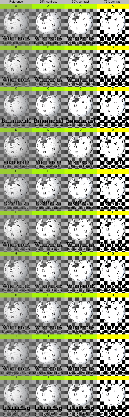
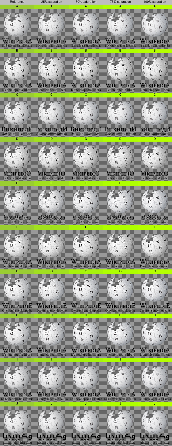
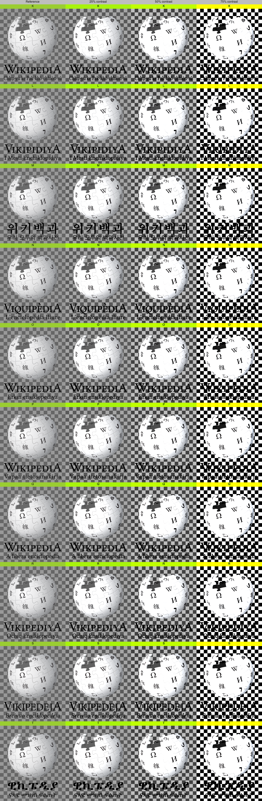
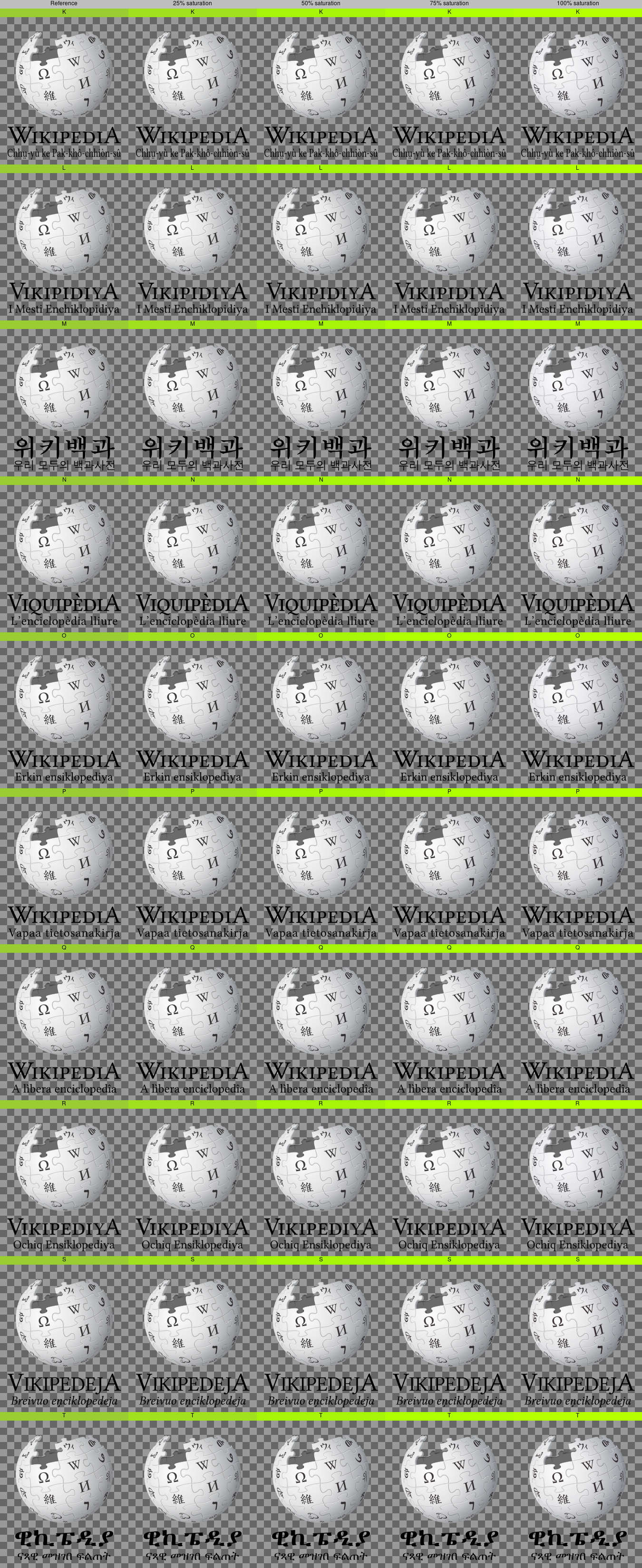
IMHO it's still impossible to tell the difference with the naked eye to the point of picking accurately which 5 images are the processed ones in each set. I can only pick out 2 in one of the sets that seem to have a very tiny loss of detail by looking very closely, but it's quite possible that the same would have happened with the original of the same language. I definitely can't pick the other 3 in that set. More people are welcome to try to pick them out.
All in all it seems like the processed versions, as currently available in the latest patch, have resilient visual quality that resists to increased contrast or saturation, within ranges that seem reasonable for what a display would let one tweak (up to 75% more contrast and 100% more saturation). This also seems like quite a wide range of bad display fidelity that could happen on cheap or badly calibrated displays. If there was major visual information loss, I expect that it would show up when cranking up contrast or saturation by that much.
My guesses of which images are compressed:
Set #1 - A, C, I, J
Set #2 - can't spot any differences
The processed ones were:
B, E, F, I, J
K, L, M, O, R
Here's the "original" for J, where the soft text is also present:

Is that what led you to think that it was processed, or was it something on the globe?
And here's the "original" for I, in case you're curious (where somewhat soft text is also present, it seems):

Anyway, getting 2 out of 5 correct ones and 2 false positives is pretty much the probability you would get from a coin toss, which confirms that it's really challenging to tell them apart.
@Gilles two things I noticed that I thought might be an indication of compression was that:

Change 609584 had a related patch set uploaded (by Thiemo Kreuz (WMDE); owner: Thiemo Kreuz (WMDE)):
[operations/mediawiki-config@master] [POC] Convert all Wikipedia logos to (true) grayscale
My point of view: I'm afraid using ImageOptim is an issue for many site requests volunteers, who manage the site logos on day to day basis. It is a mac-only app, and if we should optimalize logos using this app, it basically makes it impossible for me to update logos, as I don't have a mac.
I understand why this change is being done, but I think depending on a single-platform app should be carefully considered. @Gilles Please comment on that prior your announced deployment date (per gerrit patch, the week of August 24).
Good point. Imageoptim is just a runner for several underlying FLOSS image compressors. In this case the "winning" compressor combination for the logos was almost always either pngquant+PNGOUT or pngquant+Zopfli. Since PNGOUT is lossless, we can run all 3 (which ImageOptim doesn't attempt because it's pointless most of the time). Based on what ImageOptim is doing, we get:
pngquant --skip-if-larger --speed 3 --quality 80-100 enwiki.png --ext .png --force
zopflipng --lossy_transparent -m -y enwiki.png enwiki.png
pngout -y enwiki.png enwiki.png
I'll regenerate the patch based on those commands and add them to the patch description. There will be minor differences because I will be running more recent versions of those tools than ImageOptim was.
@Urbanecm is there on-wiki documentation about the logo updating process where these recommended commands could be added once we're certain the new optimized logos haven't caused any issues?
https://wikitech.wikimedia.org/wiki/Wikimedia_site_requests#Change_the_logo_of_a_Wikimedia_wiki comes to my mind which mentions optipng -o7.
Also, T252580: Document logo creation guidelines in MediaWiki is still open.
I forgot to post this here previously, but for posterity, these differences are present in the original (unprocessed) logos as well. I presume that these PNGs have been generated using different techniques when they were put in the repo.
Here are the current versions of these files in production:


Added instructions to https://wikitech.wikimedia.org/wiki/Wikimedia_site_requests#Change_the_logo_of_a_Wikimedia_wiki for consistency's sake, while the new logos are tried out in production.
Change 599284 merged by jenkins-bot:
[operations/mediawiki-config@master] Lossy optimisation of Wikipedia logos static PNGs
Mentioned in SAL (#wikimedia-operations) [2020-09-03T11:21:48Z] <gilles@deploy1001> Synchronized static/images/project-logos: T252108 Deploying lossily optimised Wikipedia logos (duration: 01m 20s)
@Aklapper please link tasks here if you start getting reports of logo corruption/quality issues. As people's browser caches expire, folks should start seeing the new lossily optimised logos (Wikipedias only for now).
Haven't heard anything, the new files have been served a lot. If there was something really severe, I think we would have heard of it by now.
I'm not going to apply this lossy optimisation to non-Wikipedias logos because there's a lot more diversity and colors in the other logos that would make quality review very time-consuming for little gains, given the traffic they receive. The new commands are recommended on wiki for logo maintainers, which means that people who update or introduce new logos can check the impact at that point.
I did some napkin calculations based on a sample of traffic on a Varnish server and the change that's been deployed saves on the order of terabytes of traffic per day. A drop in the ocean of traffic we serve, but a non-negligible amount of money and energy saved collectively for our users.
Hi @Gilles, while doing this task, you unintentionally rolled back bnwiki's logo to it's old version.
Expectation: Should be no changes. Real results: Position of text changes. The reason is that this https://bn.wikipedia.org/static/images/project-logos/bnwiki-2x.png is old version of the logo (same thing with static/images/project-logos/bnwiki-1.5x.png & static/images/project-logos/bnwiki.png).
If you see this log you will understand what happened. On aug 10 2020, Martin Urbanec merged T259292 & at the same time you were doing this task. Instead of august 10th version, you used 4 months old version and you unintentionally rolled back bnwiki's logo to it's old version.
Please help to fix this.
Change 609584 abandoned by Thiemo Kreuz (WMDE):
[operations/mediawiki-config@master] [POC] Convert all Wikipedia logos to (true) grayscale
Reason: