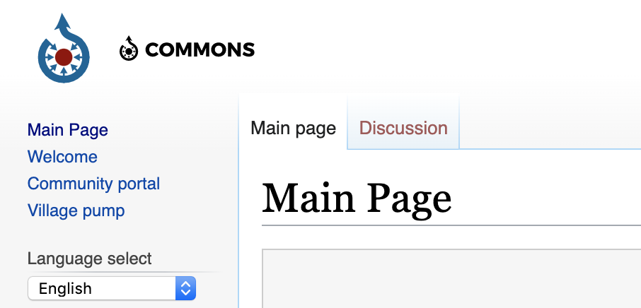
The Beta Wikidata, Beta Wikimedia Commons and Beta English Wikinews logos don’t look good when the desktop improvements are enabled:


The aspect ratio of the logos isn’t right; for Wikidata and Wikinews, the wordmark seems to use my system’s standard sans-serif font (and note that in the real logos, the wordmark is all-caps); for Commons, the wordmark is a small image and repeats the logo again (but this time in black-and-white).
Description
Description
Related Objects
Related Objects
- Mentioned Here
- T252143: Update existing outdated wordmarks
Event Timeline
Comment Actions
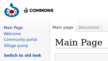
These logos are updated now. The wordmark still need generating. I've tracked that in T252143