On desktop, the help panel is located above the text, overflowing it. This means that you can't have the help panel and all the text displayed at the same time. It can be an issue when you want to work on suggested edits, using guidance and keep the guidance at reach while editing.
This task is to keep in mind this possible issue, knowing that
- not everyone has a large screen,
- the left bar is not used while editing
- mobile help panel is displayed full size
Illustrations:
| Can't edit and read the help panel content (current state) | Can edit and read both at the same time |
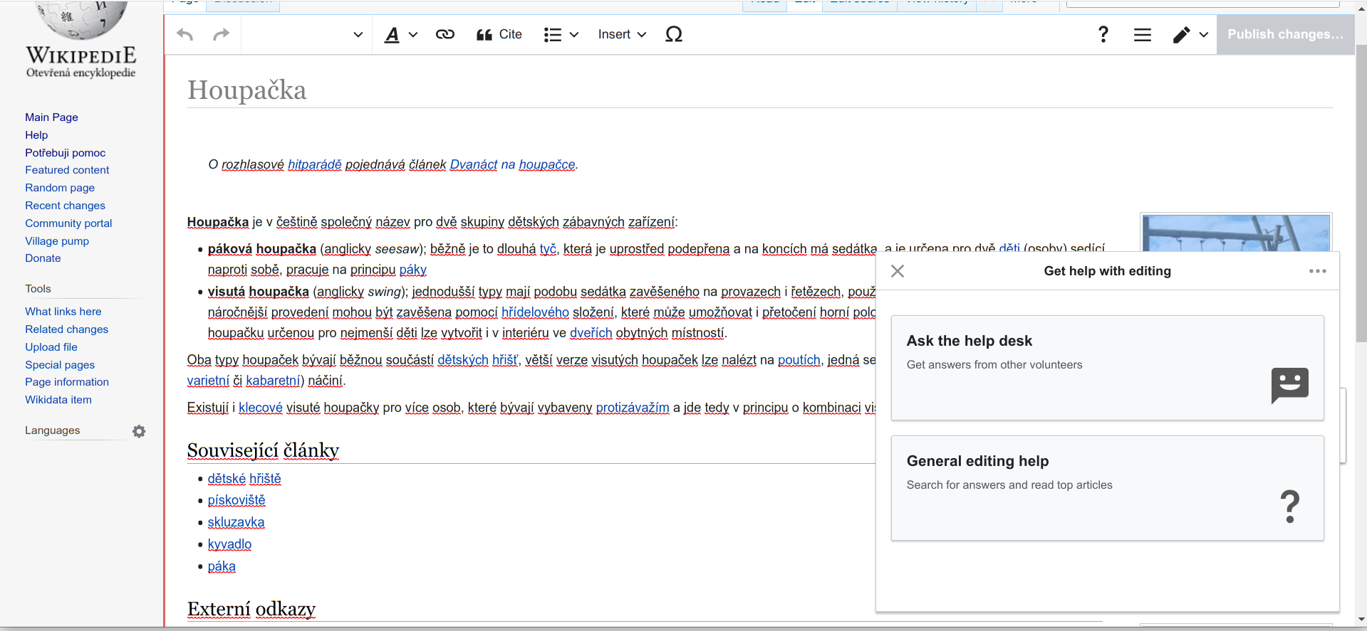 | 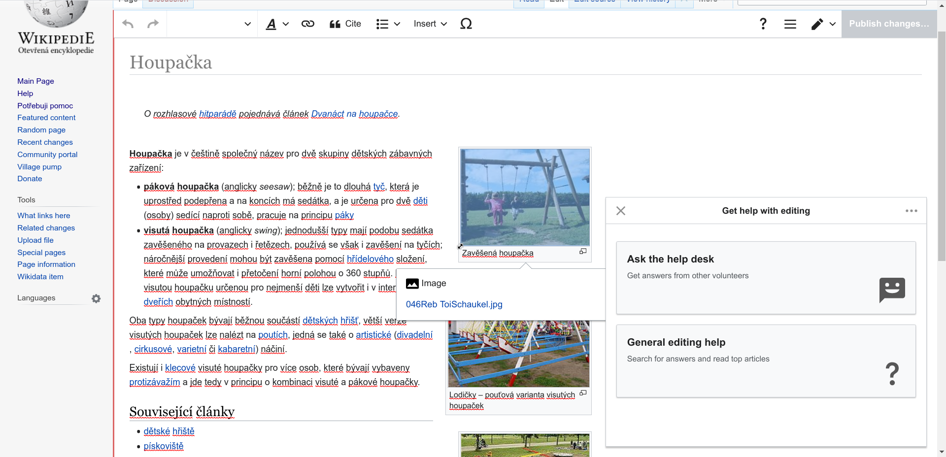 |