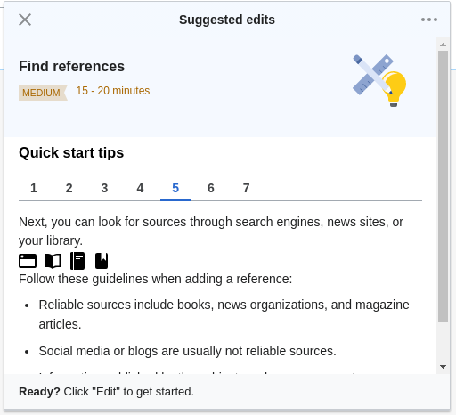
When the guidance content is longer than the default help panel size, it cannot be scrolled to and is obscured by the footer.
Description
Description
Details
Details
Customize query in gerrit
| Status | Subtype | Assigned | Task | ||
|---|---|---|---|---|---|
| Resolved | • Rileych | T239181 [EPIC] Growth: Newcomer tasks 1.2 (guidance) | |||
| Resolved | kostajh | T244431 Newcomer tasks: guidance panel behavior | |||
| Resolved | kostajh | T244541 Newcomer tasks: suggested edit screen in guidance | |||
| Resolved | Catrope | T253678 Help panel suggested edit screen: Allow scrolling contents |
Event Timeline
Comment Actions
@kostajh -- do you think we should consider this a blocker for guidance? Should we have it in Ready for Development?
Comment Actions
Change 598902 had a related patch set uploaded (by Catrope; owner: Catrope):
[mediawiki/extensions/GrowthExperiments@master] Suggested edits: make tips area scrollable without footer overlap
Comment Actions
Change 598902 merged by jenkins-bot:
[mediawiki/extensions/GrowthExperiments@master] Suggested edits: make tips area scrollable without footer overlap
Comment Actions
Change 599108 had a related patch set uploaded (by Catrope; owner: Catrope):
[mediawiki/extensions/GrowthExperiments@master] Guidance: Move scrollability to the tip content itself
Comment Actions
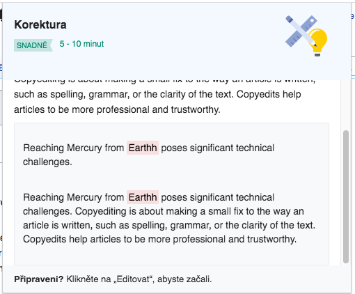
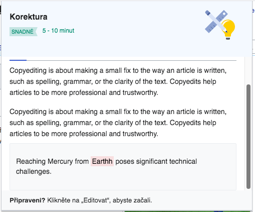
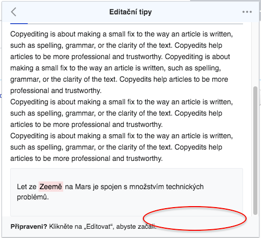
This patch changes what the scrollable container is to something that I think makes more sense, but I'm also interested in @RHo's opinion about this. The easiest way to explain what it does is to show it:
| Before | After | |
|---|---|---|
| Scrolled up | 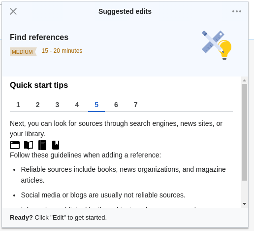 | 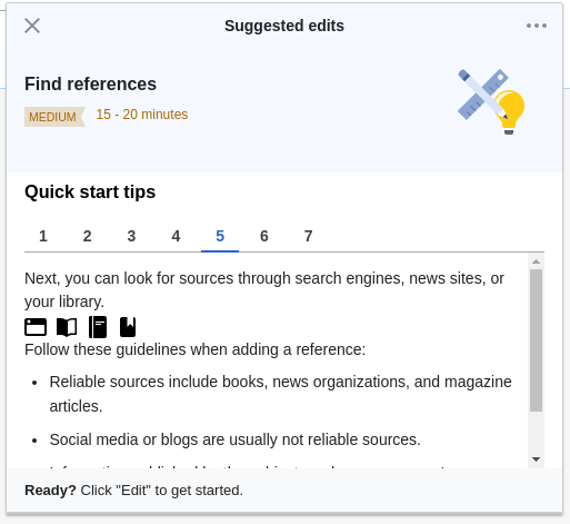 |
| Scrolled down | 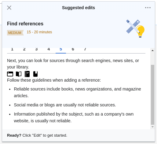 | 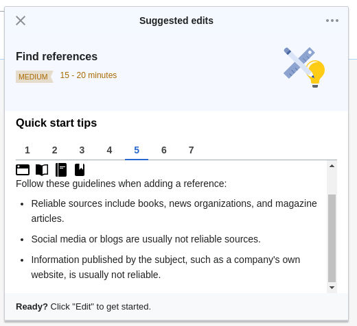 |
Comment Actions
Moving to Design review - the scrolling works fine (checked in mobile too); there are two issues described below. Please review them; they do not seem to be blockers and may be filed as separate issues (if needed).
(1) When
<mark class="negative"> is present, the scrolling will never display the end of the block "growthexperiments-quickstart-tips-tip-example-text" and the white space that is supposed to be displayed after the block:
| additional text in the example | additional text above the example text | present display |
 |  |  |
Note: If some additional text is placed after "growthexperiments-quickstart-tips-tip-example-text" - no scrolling problems are present.
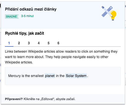
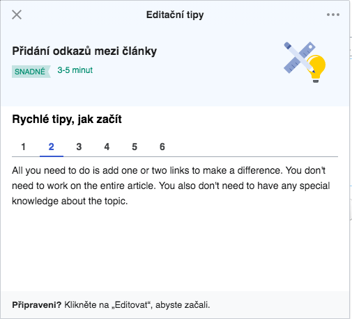
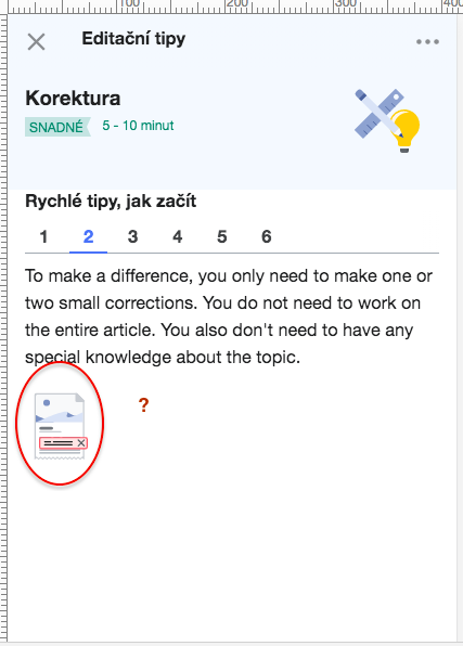
(2) On mobile for Easy difficulty level Step 2 an icon is displayed - <img class="growthexperiments-quickstart-tips-tip growthexperiments-quickstart-tips-tip-graphic" src="/w/extensions/GrowthExperiments/images/intro-typo-ltr.svg" alt="">- that seems out of place and it's not displayed on the Desktop. I checked all others tips steps for all difficulty layers and I did not see any icons.
| Desktop | mobile |
 |  |
(3) Mobile - if the footer has more than one line, the text gets squished - it happens only with English text. The screenshot below is done on a real device - iPhone 6s.
Comment Actions
(2) On mobile for Easy difficulty level Step 2 an icon is displayed - <img class="growthexperiments-quickstart-tips-tip growthexperiments-quickstart-tips-tip-graphic" src="/w/extensions/GrowthExperiments/images/intro-typo-ltr.svg" alt="">- that seems out of place and it's not displayed on the Desktop. I checked all others tips steps for all difficulty layers and I did not see any icons.
Hmm, that's strange. I see it on both mobile and desktop. Are you able to reproduce it reliably?
Comment Actions
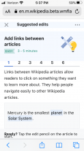
hi @Catrope @kostajh - I actually think the whole inner section of the panel between the header and footer scrollable, ie the magenta highlighted area in the following screenshot:

This would be better particularly on mobile, where especially on smaller screens it would be very hard to see much content in the tips if the header section is not able to be scrolled.
Comment Actions
Yes, I mean that we should not change it to just limit it to be the quick start content area.
Comment Actions
To rephrase what I think @RHo is saying: the entire contents of the panel should be scrollable, not just the tips. Right?
Comment Actions
OK, so the change compared to current master is that the top area (with the task type information on a light blue background) should also be part of the scrollable area. I'll make that change.
Comment Actions
Change 599108 abandoned by Catrope:
Guidance: Move scrollability to the tip content itself
Comment Actions
Change 600414 had a related patch set uploaded (by Catrope; owner: Catrope):
[mediawiki/extensions/GrowthExperiments@master] Suggested edits: Make header+tips scrollable together

Comment Actions
Change 600414 merged by jenkins-bot:
[mediawiki/extensions/GrowthExperiments@master] Suggested edits: Make header+tips scrollable together
Comment Actions
Yes, the image is present on Desktop too. @kostajh - so, the image represents something useful?
Comment Actions
@Etonkovidova it's intentional per row F9 in https://docs.google.com/spreadsheets/d/1qrFFQ1TbNUwn_Efwj9TB4uurv_HyksHKnXn9gH3ppew/edit, it's just a decorative image.
Comment Actions
Note: - @RHo - do you think it needs to be filed as a separate bug?
Interesting that the bug that I mentioned in (1) of this comment is not visible the gif above.
Here is an additional screenshot to illustrate (1) of this comment. The vertical size of the "growthexperiments-quickstart-tips-tip-example-text" will increase.
Checked https://gerrit.wikimedia.org/r/600414 in both desktop and mobile.
Here is an animated gif and a screen recording from mobile:
Note: - @RHo - do you think it needs to be filed as a separate bug?
Interesting that the bug that I mentioned in (1) of this comment is not visible the gif above.
Here is an additional screenshot to illustrate (1) of this comment. The vertical size of the "growthexperiments-quickstart-tips-tip-example-text" will increase.
 | vs | 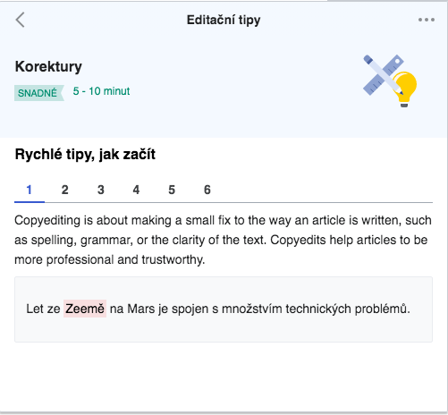 |
Comment Actions
If so, it should be logged as a separate bug please.
Hi @Etonkovidova - do you mean the scrollbar being visible? I think that is fine as it depends on the browser.
However, is the visual bug in the mp4 where there is a white background shown above and below the "Suggested edits" header still occurring on the iPhone?
If so, it should be logged as a separate bug please.
Interesting that the bug that I mentioned in (1) of this comment is not visible the gif above.
Here is an additional screenshot to illustrate (1) of this comment. The vertical size of the "growthexperiments-quickstart-tips-tip-example-text" will increase.
vs
This will be resolved when padding 16px is added below this content element as noted on point [v] of task T254527.