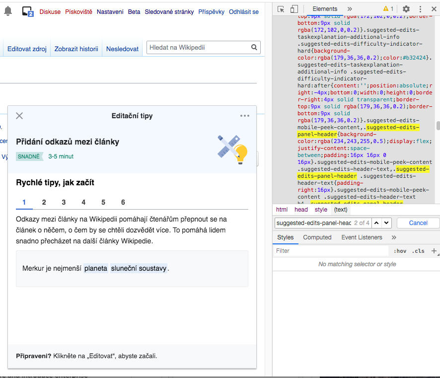
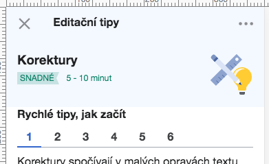
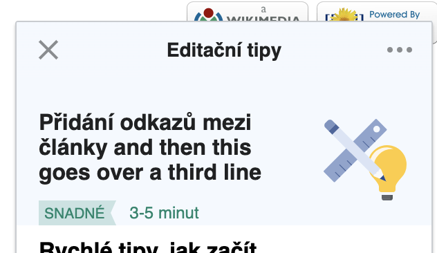
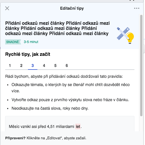
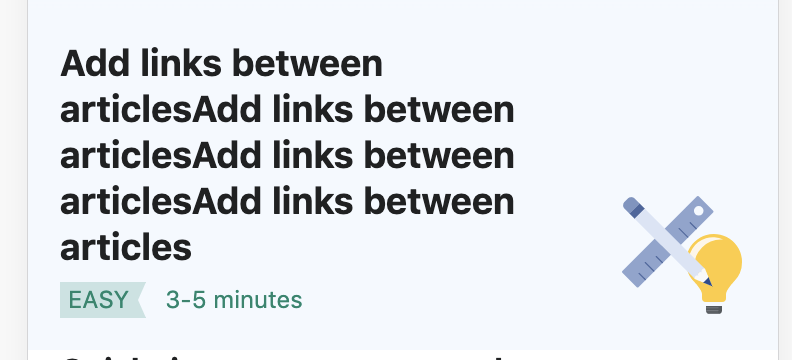
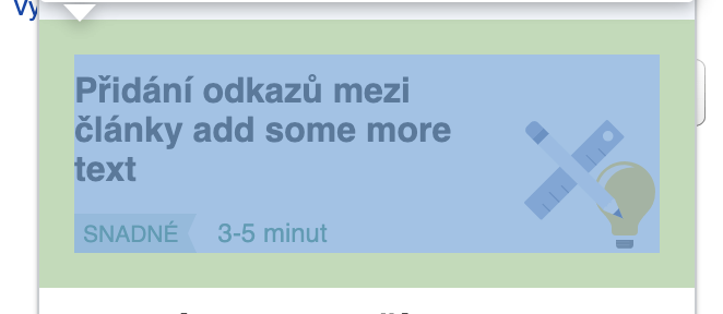
This task tracks design fixes on the panel header of the suggested edits screen which were found on both Desktop and Mobile versions.
| Actual (CS Betalabs 04-Jun) Desktop | Expected (Zeplin mock) |
 | 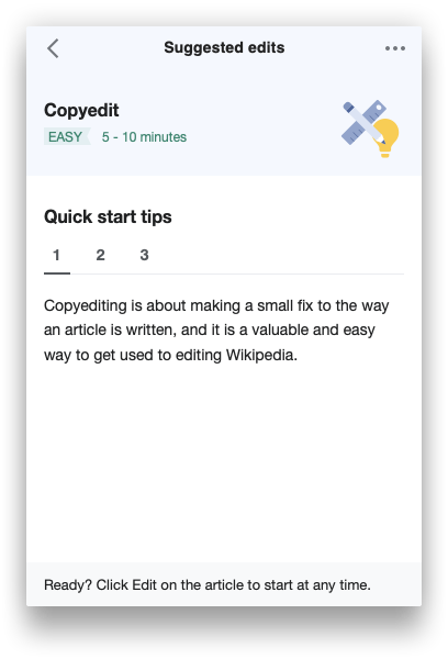 |
There are some alignment and padding issues:
i. There should be no minimum height set. Remove the min-height:96px on .suggested-edits-panel-header
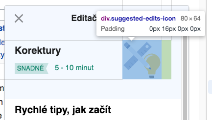
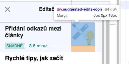
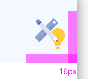
ii. SE icon should be anchored to the bottom right corner of the header, with 16px space between icon and the respective right and bottom edges of the panel (as per the SE tile button on the root screen):
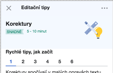
iii. Remove the vertical misalignment between the difficulty tag and the duration text
Actual 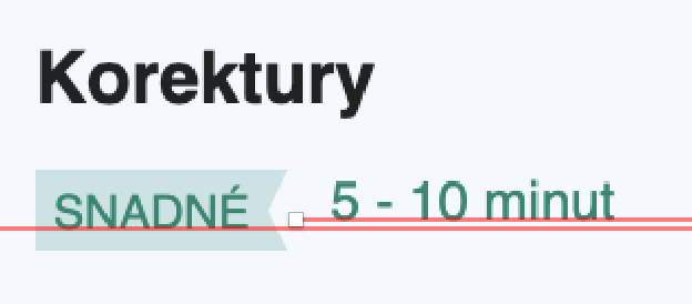 | Expected 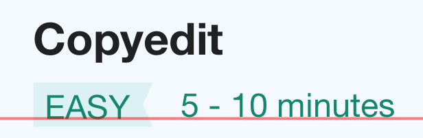 |