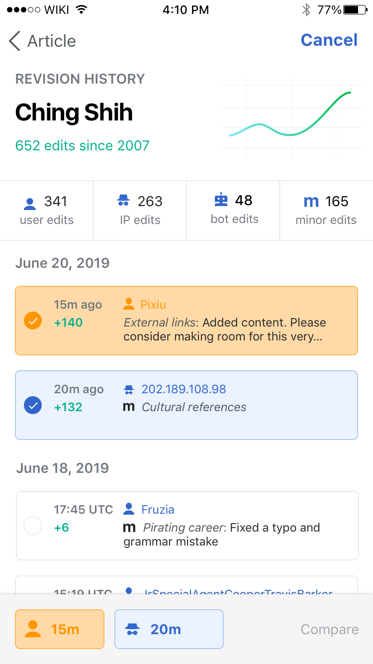
Currently, there's some mismatch between the touch selection states for elements in the History view. This leads the user to believe that some elements that are tappable here aren't and vice versa.
- Add "touch down" selection state for individual revisions in the list. Similar to the Compare and back buttons, would be beneficial to add a "touch down" selection state (perhaps reducing the element's alpha like those navigation bar elements) to indicate the revisions are tappable.
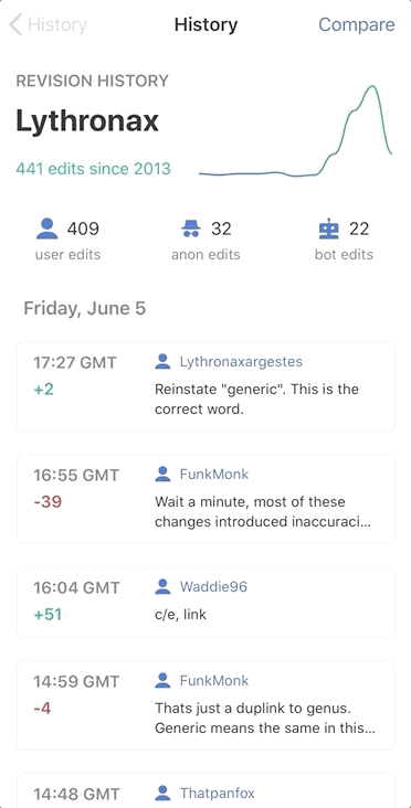
- There's currently no functionality in tapping individual revisions in the bottom revision comparison bar, so perhaps we can remove the touch selection state here.
Proposed design solution
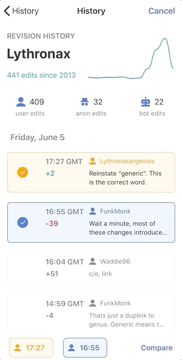
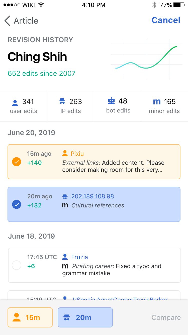
Would it be possible to 'pulse' the corresponding revision on tap by gently increasing the fill saturation and then returning it to its normal state? This way users will be able to tell that the item that they tapped on is related to one of the selected revisions.
| Blue tapped on default | Blue tapped on dark | Orange tapped on default | Orange tapped on dark |
 |  |  | 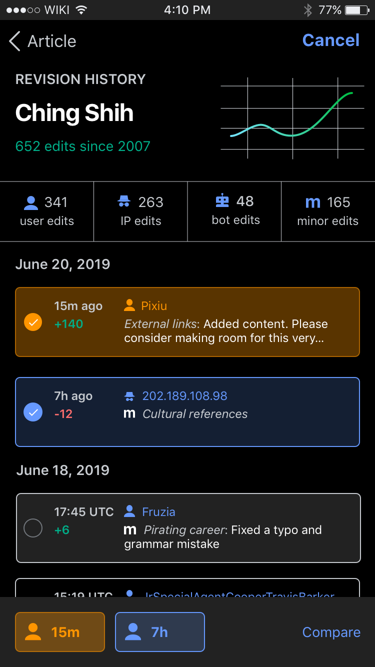 |
| https://zpl.io/2vwALQJ | https://zpl.io/2ZemYdG | https://zpl.io/amo7KJ3 | https://zpl.io/aBLdonk |
Design details
For default
Change background fill color to #FFDAA6 (Orange) and #CADCFF (Blue) in the toolbar and the list view
If possible ease in/out of color change.
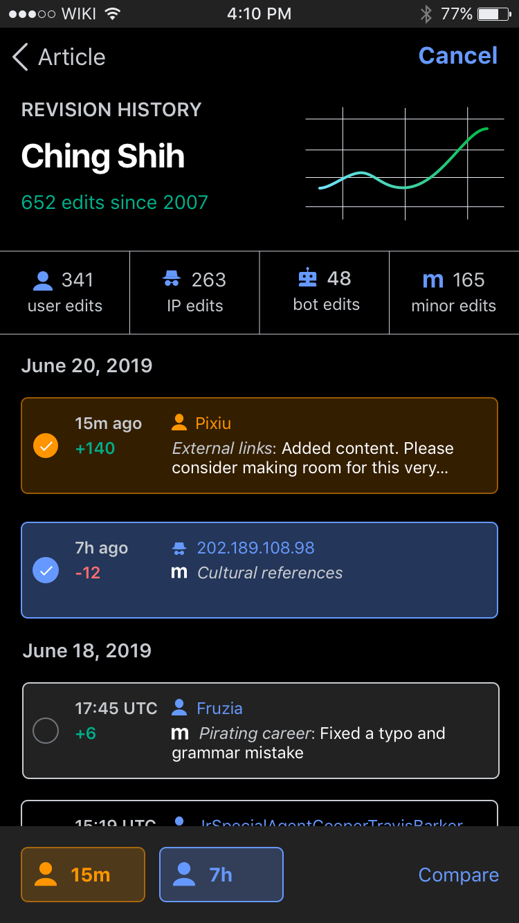
For other themes
Change background fill to the same colors but with increased opacity to 35% (vs 20%)
If possible ease in/out of color change.
For Article as a Living Document
This same highlight should apply (let's use the blue color) when the reader taps through to History via the 'veiw changes' button on the modal in the experiment.