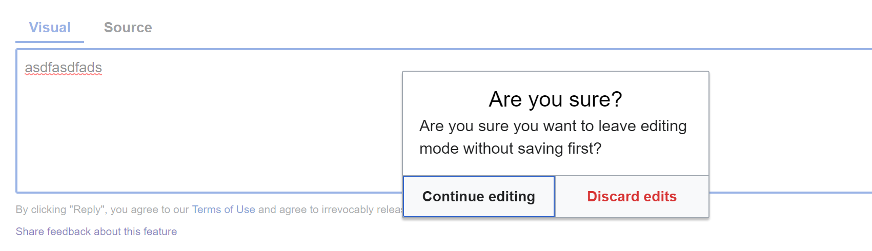
Problem:
The modal + red button is excessive for a reply interface
Screenshot:
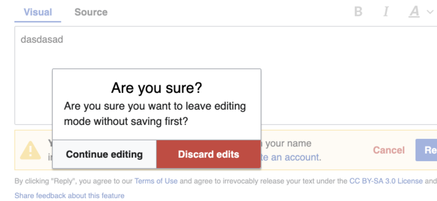
Possible Solutions:
- Make dialog box less aggressive by downgrading the button from ButtonWidget (destructive)
- Removing this message completely and storing/cache
- Changing language in the dialog box (note: can you actually save a reply?)