Actual desktop  | Expected desktop 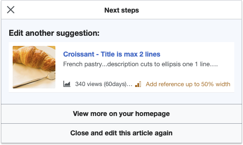 |
Actual mobile 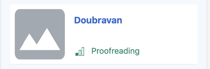 | Expected mobile 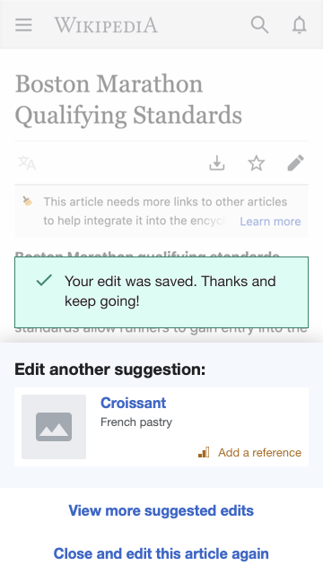 |
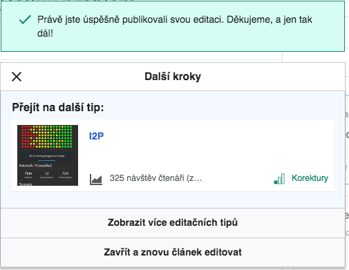
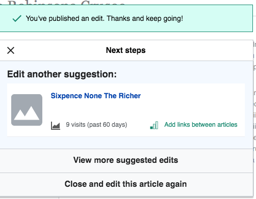
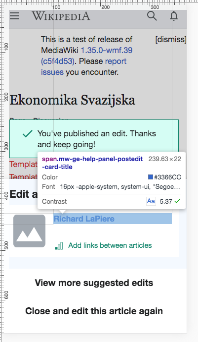
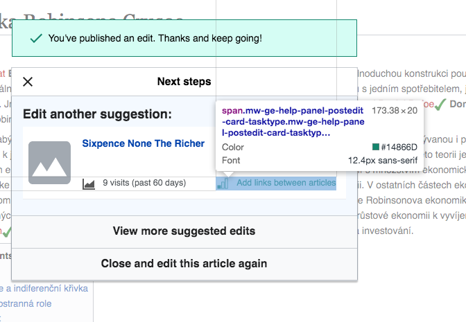
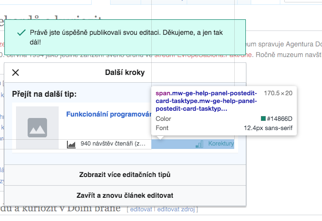
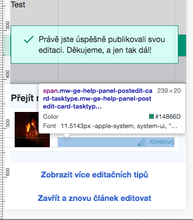
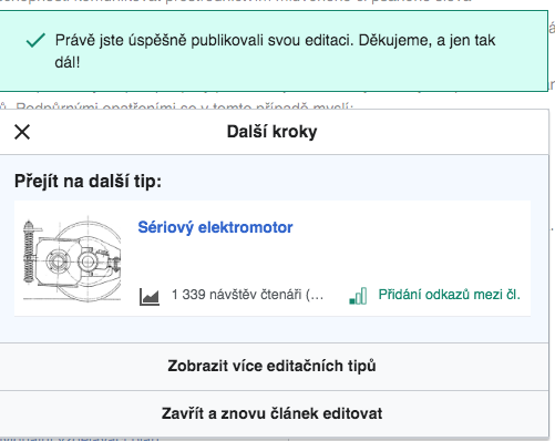
This task addresses a number of minor style issues related to the text inside of the post-edit dialog suggested edit card.
Specific issues :
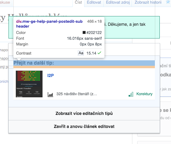
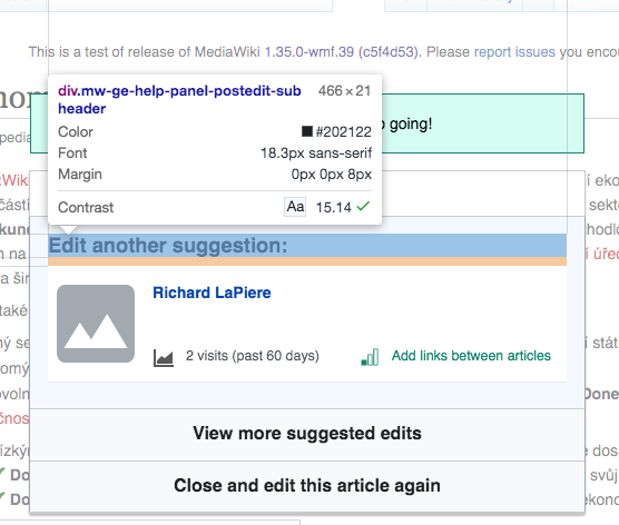
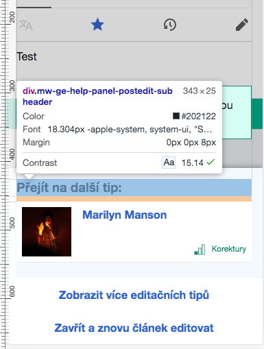
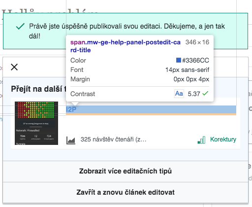
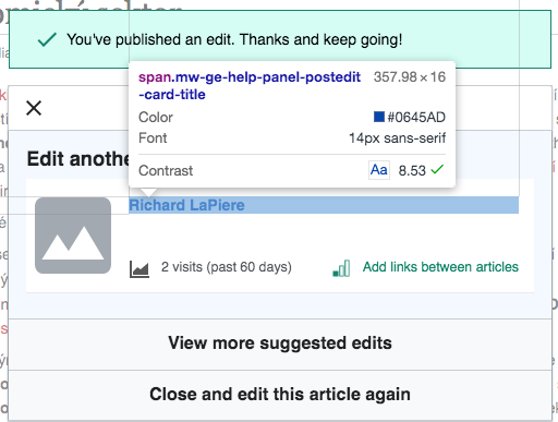
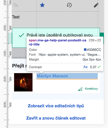
i. "Next suggestion" header
Expected: Header style uses the OOUI Fieldset header style which is font-size:~18.2px on Mobile, and font-size:16px on Desktop
Actual: font-size is larger on both desktop and mobile
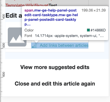
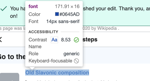
ii. Next suggestion font-color on Desktop
Expected: Should use standard Progressive Button style which is color #36c
Actual: Using a blue not in the standard colour palette
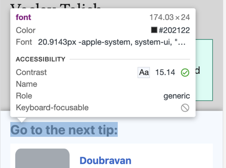
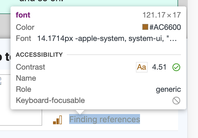
iii. Task difficulty text font-size
Expected: Task difficulty text font-style uses the Wikipedia hatnote thumbcaption style which is font-size:13px on Mobile, and font-size:12.4px on Desktop
Actual: On mobile the font-size is larger than expected at ~14.17px
(Note that the Task difficulty icon and text is also not vertically centered, but this was filed separately as T255613)
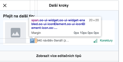
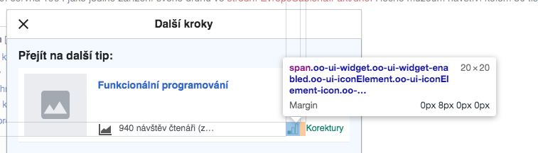
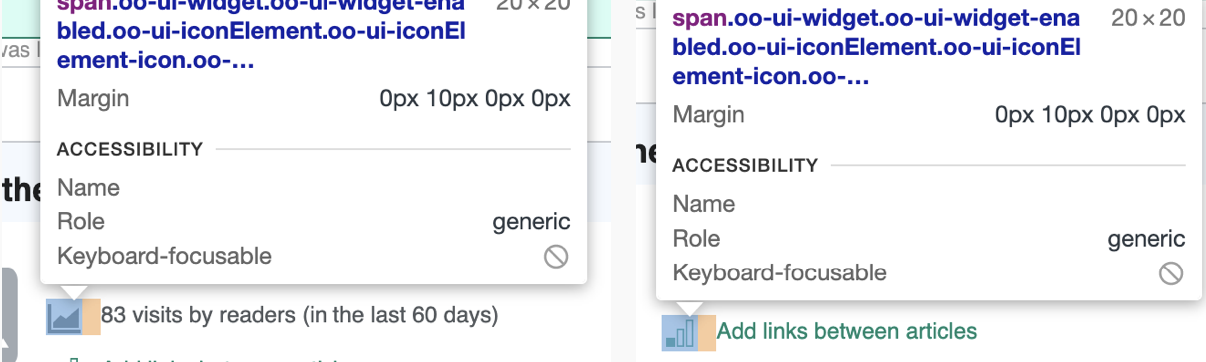
iv. Icon and text spacing
Expected: Spacing between icon and text (for visits and task type) is 8px
Actual: margin set to 10px
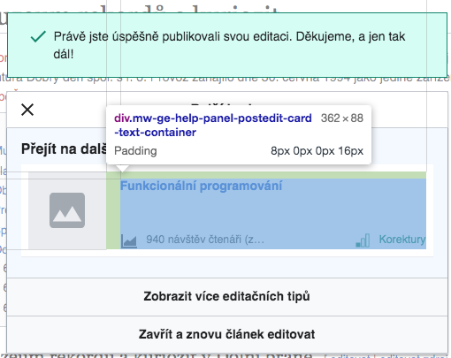
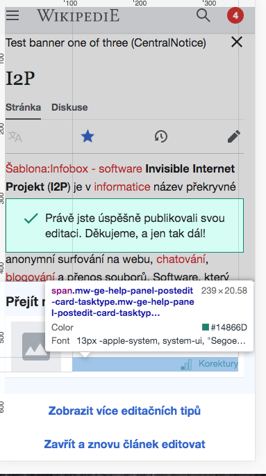
v. Remove the right and bottom padding from .mw-ge-help-panel-postedit-main .mw-ge-help-panel-postedit-card-text-container
Actual 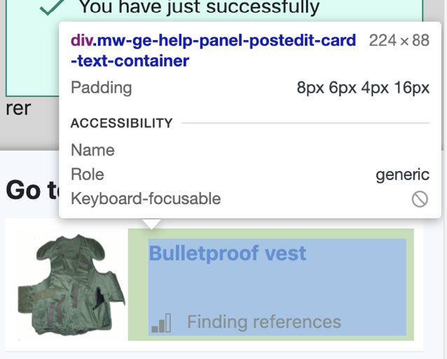 | Expected:  |
vi. Task type element on Mobile and desktop should be right aligned and anchored to the bottom of the ‘card’ “text container”.
vii. Page views stat is shown on the same row as the task type, taking maximum 50% of the flex-box space before text overflows