Create storybook pages to show tokens.
Grouping (in this order) of all Storybook parts should look like this:
(global tokens are marked with an asterisk)
- Visual Guide
- Colors (we know it’s technically redundant but it’s good for consistency) - they are basically the WMF color palette
- Typography
- Spacing
- Iconography
- Components
- Button
- Dropdown
- ...
- Design Tokens
- *Colors - all global colors (base); providing hex is enough; having rgba can be done in the future if we see a benefit
- *Opacity (T?)
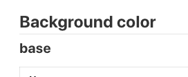
- Background colors
- Borders T257057
- Border style (contains: *border style, border widths and border radius)
- Border colors
- Text colors
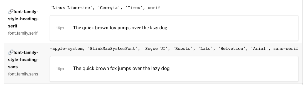
- Font family (contains: *global font-family (T256852), font family per text style)
- Font weight (contains: *global font-weight (T256852), font weight per text style)
- Font size (contains: *global font sizes (T256852), font sizes per text style)
- Line height (contains: *global font sizes (T256855), font sizes per text style)
- Dimensions
- *Static sizes (T256854)
- Paddings (contains: padding + internal paddings)
- Heights and widths (contains: min-heights and predefined widths)
- *Width breakpoints (T256856)
- *Shadows (T256858)
- *Transitions (contains: duration, property) (T256859)
- *Z-index (T256860)
- *Cursors (T256861)
- Icons
- Icon sizes
- Icon colors
Visualizing the connection between tokens (if any):
| Name | Source | Example |
| $token-name | $source-token-name | illustrated value (if possible) + the css value |
Table with columns: Name, Source, Example (holds the value and visual example, e.g. color square)
where
Name is the name of the token
Source is the tokens the alias refers to ( e.g. global tokens)
Example - a visual representation of the token (if possible) and under it the actual css value
Making the source a link to the actual token is not a hard requirement. It’s more of an improvement if we find it’s easy to achieve.
Acceptance criteria:
- The tokens are grouped as visualized in the list above. The order of pages is also as it is shown in the list, e.g. Font Family comes before Font Weight.
- The connection between tokens is expressed as visualized in the table above
- The source token being a link is not a hard requirement, because the value of the token is visible. It is a nice to have if it is easily achievable
- Visualize the token value as an element if possible: colors can be filled squares, font can be letters (Aa), spacing can be black squares. E.g. https://www.lightningdesignsystem.com/design-tokens/
- Component level tokens are not visualized in the Design System Tokens pages. They will be later shown as part of the comopnent stories, or not at all. TBD.
Open questions:
- Is there a way to do a search in storybook (beyond CTRL + F)?
- Accessibility check in storybook for the color tokens, size tokens? Like here https://design.wikimedia.org/style-guide/visual-style_colors.html (AAA shows the level of accessibility achieved)