Description
Referencing T255902 for guidance, build the wvui-input for Vue.js search.
Design requirements
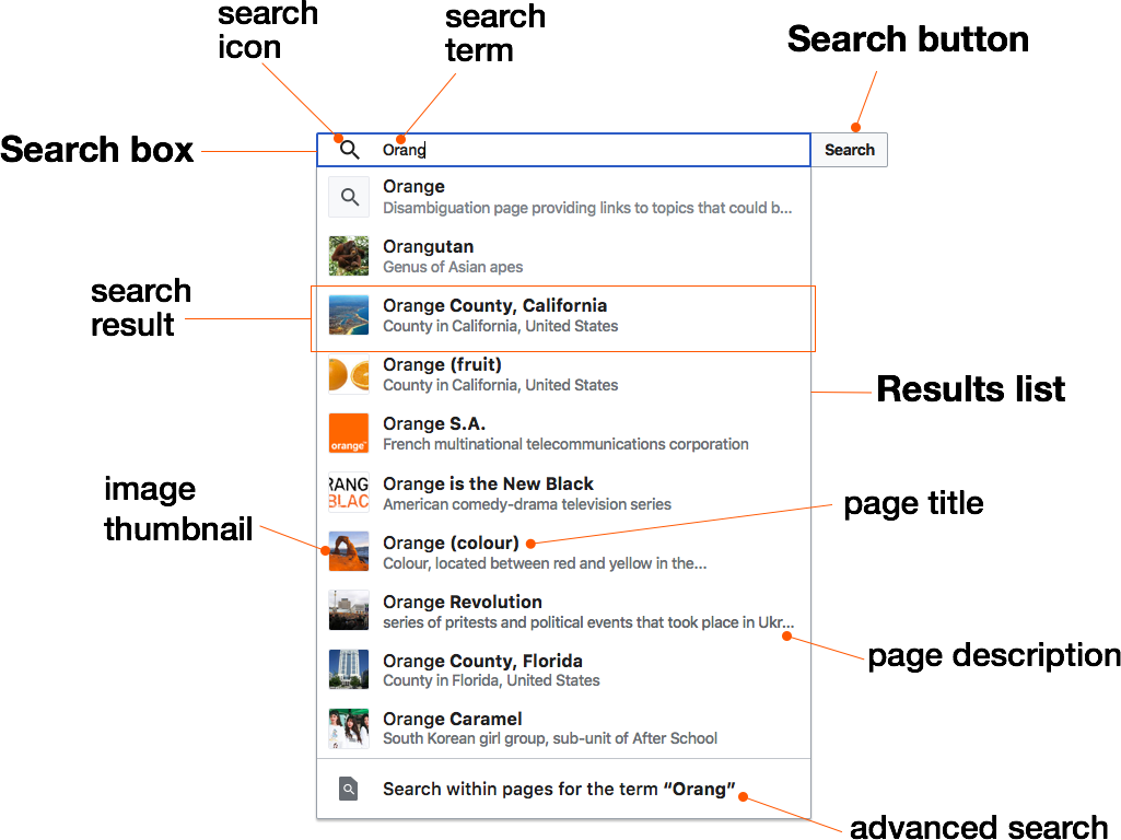
Search box + search button
The search box follows OOUI guidelines in terms of styling and interactivity. Please refer to either OOUI or the demo for additional details.
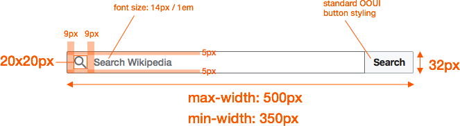
Specs
Note: when the search box is inactive there's a border that wraps around the search box + the search button. It's a bit difficult to show in static mocks so please refer to the interactive demo.
States
| state | image | notes |
|---|---|---|
| inactive |  | bounding border #A2A9B1 |
| hover search box |  | search button becomes visible (OOUI/"Normal"), search box border darkens (#72777D) |
| hover search button |  | search button background lightens (#FFFFFF) / text lightens (#404244), search box border initial |
| active & focus | 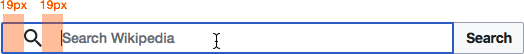 | search box border (2px / #3366CC), search icon opacity (1), search box grows 20px wider from the left |
| has value | 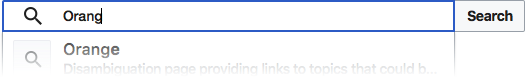 | search box text color #000 / bottom-left corner border radius (0) |
Patches
https://github.com/wikimedia/wvui/pull/46
https://github.com/wikimedia/wvui/pull/57
https://github.com/wikimedia/wvui/pull/58
https://github.com/wikimedia/wvui/pull/63
Acceptance criteria
- All component acceptance criteria in T255902 are covered.
- input border changes on :hover to darker color #72777d
- clear uses wrong icon, needs to be "clear" icon, not "close"
- with "end icon" should be "infoFilled", not "info"