Page MenuHomePhabricator

Use WMF Gerrit's logo as favicon
Closed, ResolvedPublic

Description

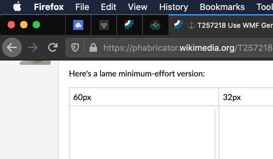
Gerrit's theme comes with a logo, but we use the default Gerrit logo as favicon.

This makes it hard to identify WMF Gerrit tabls in a browser. Especially when trying to upstream Gerrit changes and hence also having some upstream Gerrit tabs open.

We should use WMF Gerrit's also as favicon. This would help identify WMF Gerrit tabs.

Event Timeline

Change 609764 had a related patch set uploaded (by QChris; owner: Christian Aistleitner):
[operations/puppet@production] gerrit: Add Code Review logo as favicon

https://gerrit.wikimedia.org/r/609764

Change 609764 merged by Dzahn:
[operations/puppet@production] gerrit: Add Code Review logo as favicon

https://gerrit.wikimedia.org/r/609764

QChris claimed this task.

Did we use a different favicon previously? I find it hard to tell it apart from the metawiki favicon (which can be quite annoying with lots of tabs); I don't recall having that problem before.

Did we use a different favicon previously?

We used the default gerrit icon before. That's

gerrit.png (16×16 px, 512 B)

I find it hard to tell it apart from the metawiki favicon (which can be quite annoying with lots of tabs)

I can see that. And I find many of our logos hard to tell apart.
Many use the circle that's broken in three parts with a green-blue backgroud and a silouette of something. I guess it's the "community" style logo.
Meta wiki uses this layout with a globe.
Toolserver used this layout with a globe and a gear. (Well at least that logo is a thing of the past)
Cloud Services uses this layout with a unicorn.
Toolforge uses this layout with a hammer and anvil.
I'm sure there are many more.
And Gerrit uses this layout with a stylized git logo. (I'm totally not sure how that logo came into existence)

They are all hard to tell apart, unless they are really big.

The point is: If we have a logo, we should use it. If we would not use it, why would we have the logo at all?

If the logo is too similar to some other of our logos, you have a point. We should find different enough logos then, which I'd fully support.

Old gerrit used the logo only as a normal logo (on the corner of the webpage), for that it works pretty well. It's common for websites to have a different logo and favicon, exactly because many logos either don't have the right shape for a favicon or would be too hard to recognize in that size. Wikipedia for example has a puzzle globe logo and "W" favicon.

It's common for websites to have a different logo and favicon, [...]

Yet, it's far, far more common to have the logo (or at least part thereof) as favicon.

Let's go through the list of Wikimedia projects for example https://wikimediafoundation.org/our-work/wikimedia-projects/
That holds for

  • Wikibooks
  • Wikiquote
  • Commons
  • Wikisource
  • Wikiversity
  • Wikispecies
  • Wikidata
  • MediaWiki
  • Wikivoyage
  • Wikinews
  • Meta-Wiki

That leaves Wikipedia and Wiktionary. One could argue that the W favicon is the W from the text underneath the Wikipedia globe and hence part of the logo and should go into the list above. But meh, let's not do that. That leaves Wiktionary, where logos are a bit mixed. Some use some dictonary or a dictionary entry, but most use Scrabble-like letter tiles. So one could argue that the Scrabble-tile-like favicon just as the ['w] favicon matches the logo for most languages in Wiktionary as well.

Then it's 11 projects that have their logo as favicon. And 2 where there is resemblance, but it's maybe less clear cut.
But 0 cases match what we had with the old Gerrit, where the favicon does not bear any resemblance to the logo.

And it's hard to compare Gerrit to other services that we run, as Gerrit (for whatever reason) received it's own WMF-styled logo, which most services lack.

So I think all of the above indicate that we should keep Gerrit's WMF-styled logo as favicon.

But let's ignore all that evidence for a moment. Because I think you made a really good and relevant point when you said that with lots of open tabs, it might get confused with meta-wiki.

I guess if more people complain, it's best to be pragmatic and ignore corporate-identity, product-identity, site-identity, whatever-identity and simply switch to the old standard Gerrit logo. That old standard Gerrit logo (even with many open tabs) stands out as "I'm straight from the 90s", so it must be Gerrit :-)

This makes it hard to identify WMF Gerrit tabls in a browser.

For what it’s worth, I find it much harder to identify WMF Gerrit tabs now… I don’t typically have any tabs with other Gerrit installations open, but I do have tabs for Meta and Wikidata open, and both have fairly similar favicons (especially Meta).

Change 611914 had a related patch set uploaded (by QChris; owner: QChris):
[operations/puppet@production] Revert "gerrit: Add Code Review logo as favicon"

https://gerrit.wikimedia.org/r/611914

For what it’s worth, I find it much harder to identify WMF Gerrit tabs now

Let's revert then :-) The change above should bring us back to the old favicon after a Gerrit restart (which is scheduled for tomorrow).

We could also make the favicon a little more distinct, e.g. enlarge the git icon in the middle to overlap the circle and touch the edges of the image. I can attempt that (not right now but eventually) if you think that's a reasonable approach.

We could also make the favicon a little more distinct, e.g. enlarge the git icon in the middle to overlap the circle and touch the edges of the image. I can attempt that (not right now but eventually) if you think that's a reasonable approach.

That's even better! \o/ Then I'll block the reverting for now then.

The best version of the logo that I'm aware of is at

https://raw.githubusercontent.com/wikimedia/puppet/2bf83622125f756dada3a54185acef6bc3dbc6aa/modules/gerrit/files/homedir/review_site/static/wikimedia-codereview-logo.cache.png

the .ico is at

https://raw.githubusercontent.com/wikimedia/puppet/2bf83622125f756dada3a54185acef6bc3dbc6aa/modules/gerrit/files/homedir/review_site/static/wikimedia-codereview-logo.cache.ico

(There is also a corresponding .svg, but that does not render correctly for me)

Change 611914 abandoned by QChris:
[operations/puppet@production] Revert "gerrit: Add Code Review logo as favicon"

Reason:
Tgr will rework the logo. So we may not need to revert.

https://gerrit.wikimedia.org/r/611914

+1 on the favicon confusion :)

We could also make the favicon a little more distinct, e.g. enlarge the git icon in the middle to overlap the circle and touch the edges of the image. I can attempt that (not right now but eventually) if you think that's a reasonable approach.

Perhaps use only the middle green portion without the blue/red circle outline.

Where is the logo from? I would have expected to find it on Commons but didn't.
More importantly, what license is it under?

Here's a lame minimum-effort version:

60px32px16px
wikimedia-codereview-logo-v1.png (60×60 px, 3 KB)
wikimedia-codereview-logo-v1-fav.png (32×32 px, 1 KB)
wikimedia-codereview-logo-v1-fav.png (16×16 px, 747 B)

Admittedly not an improvement.
Slightly more effort version:

wikimedia-codereview-logo-v2.png (60×60 px, 3 KB)
wikimedia-codereview-logo-v2-fav.png (32×32 px, 1 KB)
wikimedia-codereview-logo-v2-16px.png (16×16 px, 722 B)

Bare git icon as suggested by Krinkle:

wikimedia-codereview-logo-v4.png (60×60 px, 1 KB)
wikimedia-codereview-logo-v4-32px.png (32×32 px, 1 KB)
wikimedia-codereview-logo-v4-16px.png (16×16 px, 571 B)

Attempt at introducing Wikimedia colors (did not go well):

wikimedia-codereview-logo-v3.png (60×60 px, 1 KB)
wikimedia-codereview-logo-v3-fav.png (32×32 px, 1 KB)
wikimedia-codereview-logo-v3-16px.png (16×16 px, 642 B)

(As a reference point/maybe an idea, here's the codesearch favicon I threw together in 5 minutes by comining the MediaWiki+Git logos: https://commons.wikimedia.org/wiki/File:MediaWiki_codesearch_logo.svg, haven't received any complaints yet...)

the "slightly more effort version" is by far my favorite. +1. thanks for that one

I'd recommend filling in the internal blanks with white pixels to make it stand out more in typical browser tabs:

Screenshot 2020-07-18 at 04.03.55.png (510×872 px, 112 KB)

Perhaps this applying even this change only to the cuurrent "Meta-Wiki" logo would help sufficiently distinguish it from Meta-Wiki.

Where is the logo from? I would have expected to find it on Commons but didn't.

The logo got introduced in https://gerrit.wikimedia.org/r/c/operations/puppet/+/392181

More importantly, what license is it under?

No clue about the license. The change that introduces the logo lists @thcipriani as author.

The center piece of this logo is licensed CC BY 3.0 by Jason Long. – https://git-scm.com/downloads/logos

The center piece of this logo is licensed CC BY 3.0 by Jason Long. – https://git-scm.com/downloads/logos

Yes, this logo is a mash up of the public domain community logo + the git-scm logo. IANAL, but this link seems relevant: https://creativecommons.org/faq/#if-i-derive-or-adapt-material-offered-under-a-creative-commons-license-which-cc-licenses-can-i-use

When remixing BY or BY-NC material, it is generally recommended that your adapter’s license include at least the same license elements as the license applied to the original material.

I don't feel a great deal of ownership over this logo; it's a derivative of two fairly well-known works. I'd have a natural inclination to make this PD; however, the adapter's license chart on that page seems to discourage only PD licenses. CC-BY works fine for me.

I'd recommend filling in the internal blanks with white pixels to make it stand out more in typical browser tabs

That might work well in night mode, not so much for light color schemes (which are the default for most browsers, I think).

It seems we're left now with too many choices to move forward :-)

We lack a clear winner here. I'll wait till the end of this week. Then I'll pick the entry with most yays and puppetize it. (If no entry has more yays than the others, I'll be bold and switch our Gerrit favicon to a picture of my grinning face :-) ... or something similar).

(Of course we have a bias here, as probably hundreds of our Gerrit users love the current new favicon unconditionally and hence are not looking for this ticket :-D So they cannot chime in. But let's ignore that bias for now)

One yay for me for the old / upstream favicon, which is far more distinct than any of the versions from T257218#6316301. Using the WMF colors is, to me, not a benefit, because it makes the favicon more similar to several others (Meta, Wikidata, Wikidata Query Service), making the Gerrit tabs harder to recognize. (I rarely have any non-WMF Gerrit tabs open which I’d need to distinguish from WMF Gerrit, so WMF Gerrit having the same favicon as other Gerrits would not be an issue for me.)

I'd recommend filling in the internal blanks with white pixels to make it stand out more in typical browser tabs

That might work well in night mode, not so much for light color schemes (which are the default for most browsers, I think).

Why would use of white be disturbing in light mode? For the most part, I would expect it to be an unnoticable change since on such a bright background transparent is effectively identical to white anyway, right?

Below are three examples of favicons that use white pixels (IRCCloud, Gitter, Phabricator)

Screenshot 2020-07-28 at 17.57.12.png (97×117 px, 4 KB)
Screenshot 2020-07-28 at 18.00.16.png (102×110 px, 3 KB)
Screenshot 2020-07-28 at 18.00.15.png (127×426 px, 11 KB)

All three would imho be significantly worse if that their white pixels were transparent. They would look weaker in light mode, but also drown the icon in dark mode - as is currently the issue with the proposed Gerrit icon. Note that the below is not actually in dark mode. In Firefox, background windows/tabs have a darker background as well.

Screenshot 2020-07-28 at 17.57.17.png (174×751 px, 88 KB)

It seems we're left now with too many choices to move forward :-)

We lack a clear winner here. I'll wait till the end of this week. Then I'll pick the entry with most yays.

The poll is at V21

...I'll be bold and switch our Gerrit favicon to a picture of my grinning face :-) ... or something similar).

This option is missing from the poll.

Why would use of white be disturbing in light mode? For the most part, I would expect it to be an unnoticable change since on such a bright background transparent is effectively identical to white anyway, right?

That's what I mean, it would be mostly unnoticeable (and hence not solve the problem of easy mistaking with Meta).

One yay for me for the old / upstream favicon

How about putting that in the Wikimedia circle? The colors would still be pretty distinctive, but it would have some level of Wikimedia identity. It's not a pretty logo, but at favicon sizes you don't see more than the color scheme, anyway.

wikimedia-codereview-logo-v5.png (60×60 px, 2 KB)
wikimedia-codereview-logo-v5-32px.png (32×32 px, 1 KB)
wikimedia-codereview-logo-v5-16px.png (16×16 px, 731 B)

I think this is easily the most identifiable option suggested so far.

I too, I definitely like that new comer

wikimedia-codereview-logo-v5.png (60×60 px, 2 KB)

I would definitely have voted for it in V21 if it was there ;)

The poll has ended. 54 people voted.

The green git logo got most approval (57%) followed by Gerrit's standard icon (50%) and the Community-style logo with Git icon (42%). The rest is far off (<=20%).

(Multiple votes were allowed, so it obviously does not add up to 100%)

@Krinkle: You said you maybe want to do more voting and include the newcomer. Is this still on the agenda or should I puppetize the green git logo?

Change 619163 had a related patch set uploaded (by QChris; owner: Christian Aistleitner):
[operations/puppet@production] gerrit: Switch favicon to green git logo

https://gerrit.wikimedia.org/r/619163

Since it seems the second poll with the circled original gerrit did not happen, I'll try to move forward with the green git icon (winner of V21).

Change 619163 merged by Dzahn:
[operations/puppet@production] gerrit: Switch favicon to green git logo

https://gerrit.wikimedia.org/r/619163

The "green git logo" has won the poll with 56% approval and with the merge above it has now been deployed as the Gerrit favicon.

This should mean the ticket is resolved, afaict.

Shame about T257218#6342783, I really liked it (and didn’t vote in the poll for that reason). But okay.

Shame about T257218#6342783, I really liked it (and didn’t vote in the poll for that reason). But okay.

I also liked the T257218#6342783 logo best. But I wanted to respect the poll's outcome, so I of course took the winner logo.