Page MenuHomePhabricator

Adjust the location of the tools within visual mode's toolbar
Closed, ResolvedPublic

Description

This task is about making it easier for people to reach the text formatting tools when drafting a comment with the Reply tool's visual mode on a wide screen.

Background

This issue surfaced in the mediawiki.org usability test we ran for Version 2.0 of the Reply tool (T246191). These quotes describe the issues people encountered:

  • "On a wide screen the styling buttons are quite far on the right edge from the area where my mouse is typically (above the text)." | source
  • "I needed one big second to find where the style buttons were. I think they are too far to the right (on a large screen like mine)." | source

Approaches

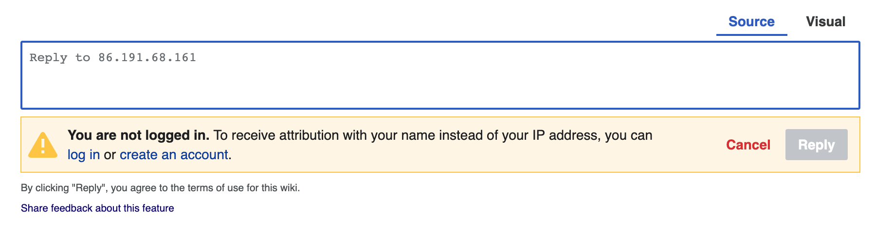
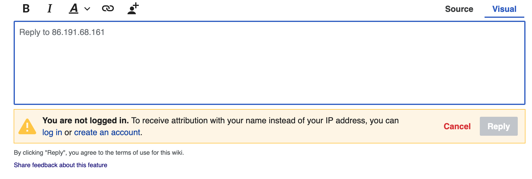
  • Approach #1: move the text tools to the side of the screen where people start typing [i]; move the text input mode tabs to the opposite side of the screen.
    • The order of the text tools should not be changed
    • The text tools that are presented within the toolbar should not be changed
    • The visual mode should be presented such that it is aligned with the position of the "Reply" button.
    • In LTR languages, the visual tab should be presented to the left of the source tab
    • In RTL languages, the visual tab should be presented to the right of the source tab

Open questions

  • 1, Does changing the location of the text input tabs cause Junior Contributors to be less distracted by them?
    • In the testing we did (see T257281), changing the location of the text input tabs did not seem to affect Junior Contributors' focus. This finding, coupled with the finding below, leads us to think changing the location of the visual mode's text tools to the left side of the text input area in LTR languages, and the right side in RTL languages, will have a net positive impact. Read: people will be able to access the text tools more easily without causing any negative side effects that would outweigh this benefit. Note: we acknowledge "negative side effects" alluded to above could surface once the Reply Tool is accessible and used by a greater number of people.
  • 2. Does changing the location of the text tools make it easier for people using the Reply tool on wider screens to "reach" them?

Done

  • "Approach #1" is implemented
  • "Open questions" are answered

i. Read: on the left side of the screen in left-to-right languages and on the right side of the screen for right-to-left languages.

Event Timeline

Change 609839 had a related patch set uploaded (by Esanders; owner: Esanders):
[mediawiki/extensions/DiscussionTools@master] Switch toolbar and mode switcher

https://gerrit.wikimedia.org/r/609839

Notes from convo with @Esanders:

  • Does this horizontal switch make it more apparent that there isn't symmetry in the toolbars? When you are in source it's very clear now that there are no tools.
  • @mention should have the new header which will help when there are no local suggestions
  • when a user wraps their signature in tags it reduces the button size even further and is itsy bitsy.

Screen Shot 2020-07-07 at 11.02.12 AM.png (144×1 px, 45 KB)

  • Does this horizontal switch make it more apparent that there isn't symmetry in the toolbars? When you are in source it's very clear now that there are no tools.

Yep, the source mode looks a bit strange (visual mode is probably okay, but that doesn’t matter, as placing the switch at different places in visual and source mode would be a terrible decision). Maybe a dropdown like the one that VisualEditor uses could make it visually more pleasant:

VisualEditor switch menu.png (129×224 px, 3 KB)

Maybe a dropdown like the one that VisualEditor uses could make it visually more pleasant:

VisualEditor switch menu.png (129×224 px, 3 KB)

The dropdown is unnecessary, just replace the pencil icon with the currently active mode. The dropdown needs multiple user actions: 1) click icon 2) hover over intended mode 3) click mode. This is very inefficient UX and VE should move away from it, but that's a different topic.
The toggle should work with one click at the same location regardless of the mode. This is easily achieved by just hiding the inactive tab with CSS and ensuring the two element have the same width.

Note: patchdemo is not loading so I can't evaluate the proposed solution...

Clicking on the current mode’s icon to get to the other mode is unintuitive for me. Clicking the other mode’s icon (i.e. hiding the current mode’s icon) seems better, but I think some user studies are needed to ensure that at least senior contributors can find out how to switch. Also, a single toggle at the far end also looks ugly for me; probably integrate it into the toolbar (in visual mode) and keep it at the near end (i.e. at the left for LTR languages)?

P.S. patchdemo is fine for me. Either it was a temporary issue, or it’s an issue at your end.

Notes from the conversation @iamjessklein and I had today:

@Esanders: the implementation you posted above looks good. Jess and I don't see anything further to be done here [i] for now [ii]

  • A clarifying question for you that came up: is the reason tool's source and visual mode text input areas have different heights [iii] because we treat the height of the source mode's input area to be the "editable area" + the "preview area" whereas the visual mode's input area is solely the height of the "editable area" alone?

i. @Demian / @Tacsipacsi: we appreciate the feedback you shared about the treatment of the text input mode tabs themselves. Although, revising how these tabs/the switcher is implemented is out of scope for this particular task. @iamjessklein if you have more to share here, please do.
ii. Adjustments may need to be made, but those adjustments should come after we've tested the usability of the current implementation. This work will happen in T257281.
iii.

sourcevisual
Screen Shot 2020-07-10 at 10.23.10 AM.png (476×1 px, 77 KB)
Screen Shot 2020-07-10 at 10.23.05 AM.png (604×1 px, 86 KB)

Notes from today's conversation with @Esanders and @iamjessklein:

@Esanders: the implementation you posted above looks good. Jess and I don't see anything further to be done here [i] for now [ii]

  • A clarifying question for you that came up: is the reason tool's source and visual mode text input areas have different heights [iii] because we treat the height of the source mode's input area to be the "editable area" + the "preview area" whereas the visual mode's input area is solely the height of the "editable area" alone?

Ed shared there is not a clear way of making the text inputs in the tool's visual and source modes the same height.

With the above in mind, we are going to stick with what Ed implemented above [i]. Read: we are not going to iterate on the implementation until we have evidence it is necessary. Said "evidence" would come most quickly via the test we will be running in: T257281.

Reason for the above: we do not yet know how people are using the tool's two input modes in relation to one another, and subsequently, whether the text inputs varying in height creates problems for people.


i. http://patchdemo.wmflabs.org/wikis/d24f36b58213af4b88912a2e8484de95/w/index.php/Talk:Main_Page

Meta
I'm moving this task to "Blocked" as it being deployed depends on T257281 being resolved. The task description reflects this.

Let's go with V2.1 (toolbar on the left) - in T257281 we learned through testing with junior contributors on usertesting.com that Reply v2.1 was in fact usable. That fact combined with the on-wiki conversations with Senior Contributors describing Reply v2.0 pain points for large viewports indicates that it's just a better experience.

One tweak that I identified during testing that should be made before shipping is that the tabs should be re-ordered so they read from Left to Right as "visual" and then "source."

cc. @Esanders @ppelberg

To clarify the thought process around the tab switching: I observed many junior contributors get a bit lost in the interface when they were searching for the tabs and/or tools. I'd like to attempt to mitigate that issue by ordering the tools and tabs in a hierarchy that mirrors the users reading patterns.

Let's go with V2.1 (toolbar on the left) - in T257281 we learned through testing with junior contributors on usertesting.com that Reply v2.1 was in fact usable. That fact combined with the on-wiki conversations with Senior Contributors describing Reply v2.0 pain points for large viewports indicates that it's just a better experience.

Sounds good. I've added this outcome to the task description's "Open questions" section.

One tweak that I identified during testing that should be made before shipping is that the tabs should be re-ordered so they read from Left to Right as "visual" and then "source."

I've edited the task description's "Approaches" section to include this adjustment.

cc. @Esanders @ppelberg

Next steps

  • Adjust the implementation such that the following happens:
    • In LTR languages, the visual tab should be presented to the left of the source tab
    • In RTL languages, the visual tab should be presented to the right of the source tab

Change 609839 merged by jenkins-bot:
[mediawiki/extensions/DiscussionTools@master] Swap toolbar and mode switcher

https://gerrit.wikimedia.org/r/609839

Next steps

  • Adjust the implementation such that the following happens:
    • In LTR languages, the visual tab should be presented to the left of the source tab
    • In RTL languages, the visual tab should be presented to the right of the source tab

Done (I updated the patch before merging it)