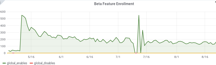
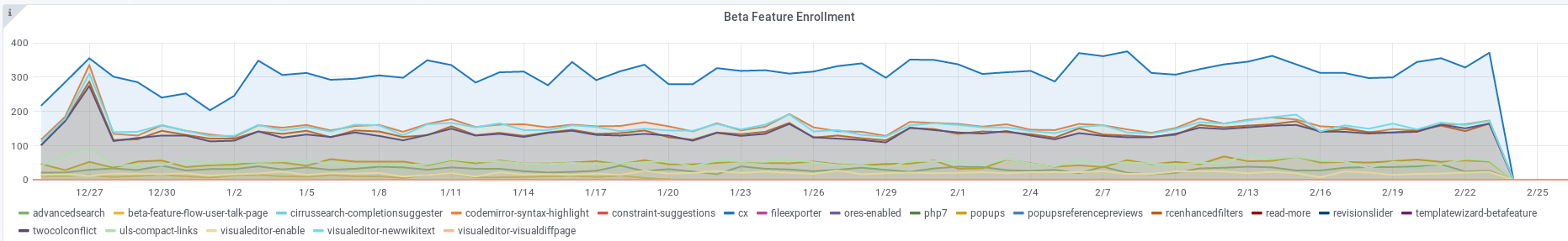
At first glance, it looks like this graph shows user rejection of our feature, immediately after first use:
However, the migration we engineered naturally converts the beta preference opt-out over to the new preference and it might be causing most of the effect seen here.
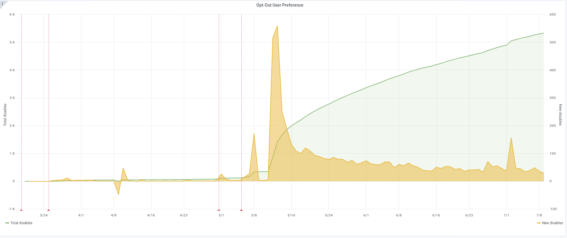
Review the daily aggregation script, modify to calculate another field, the total of both beta and new opt-outs. This should make the real trend more obvious.
Acceptance criteria:
- New metrics will include the sum of beta- and new-preference opt-out.
- Can stop recording the old metric, we'll never migrate back to it.
- Grafana shows new metric.
- Can include the old metric when plotting historical metrics.
In a follow-up task, find the number of unique users of the feature per day and compare to the disablement count. It's unclear how to interpret this ratio, hopefully it approximates user satisfaction.