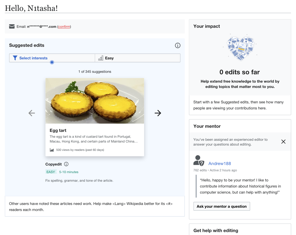
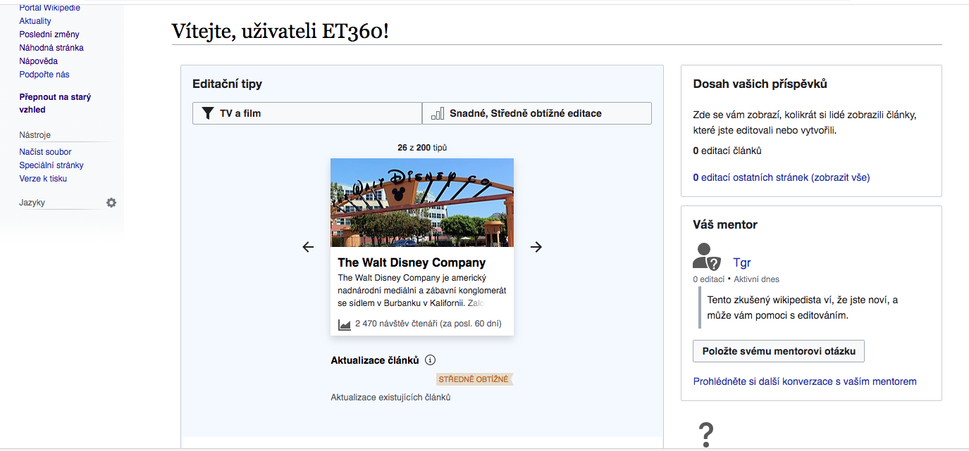
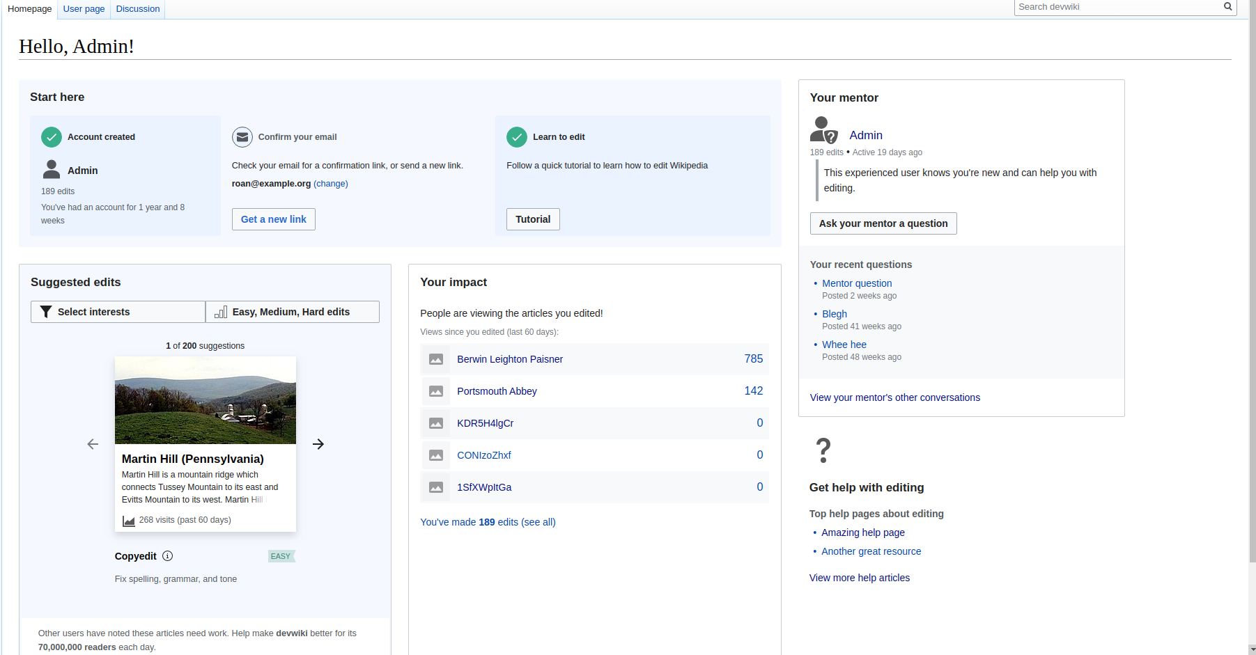
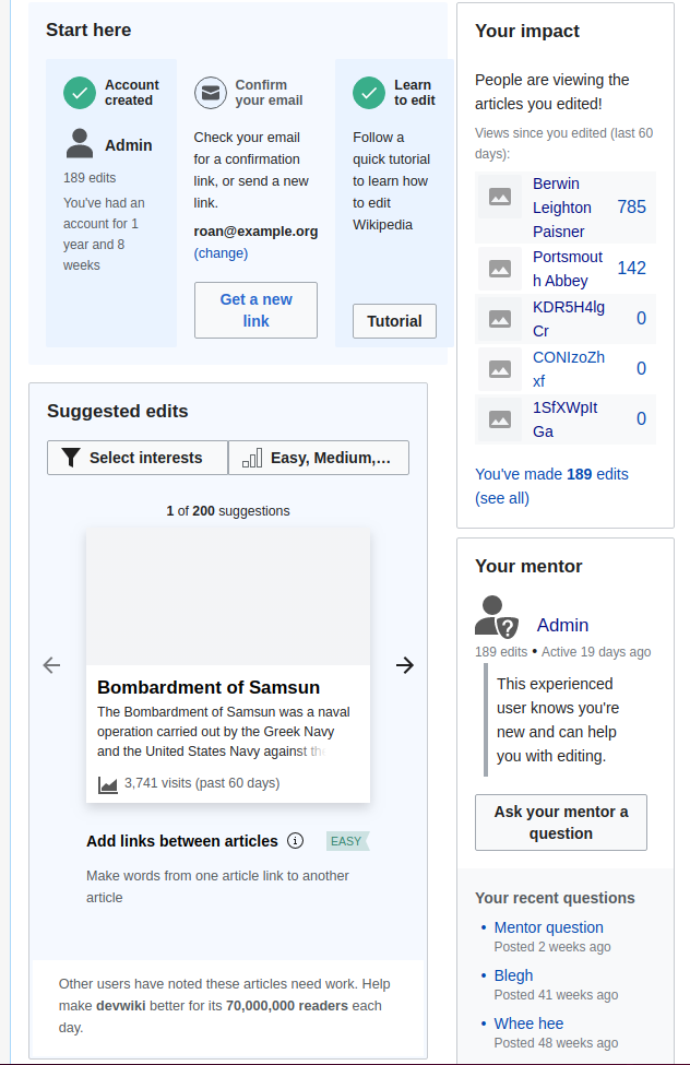
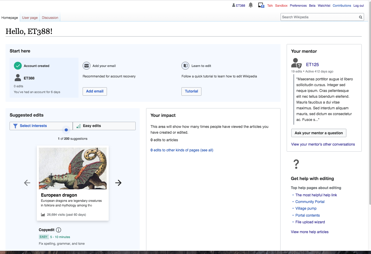
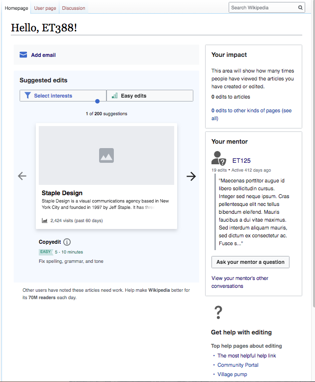
For the variant tests in T246533: Variant tests: "initiation part 2" test (C vs. D), there are some layout changes to the homepage on desktop that variant C and D have in common.
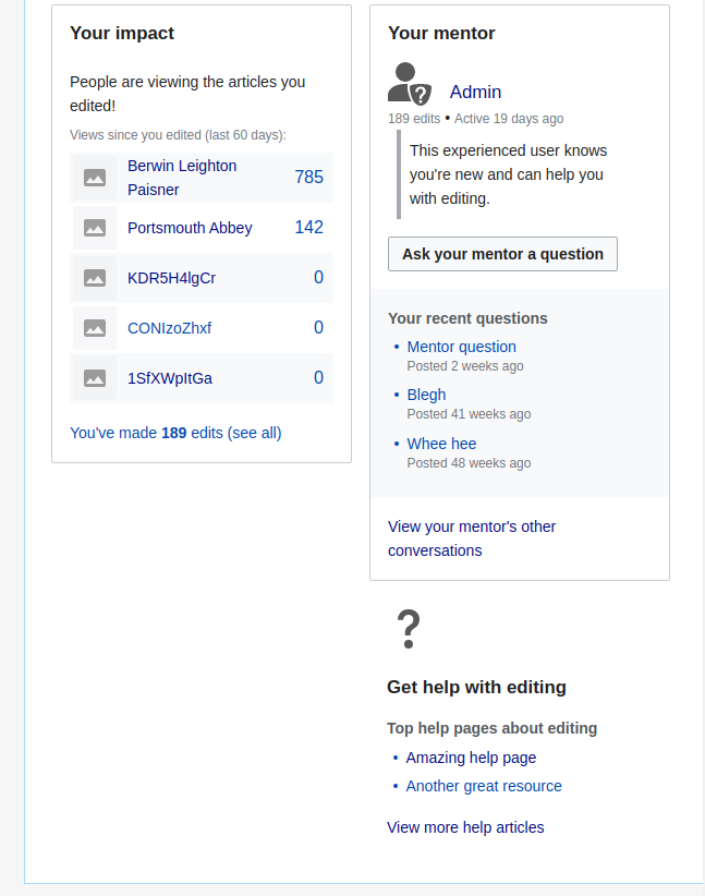
- Move the impact module to the (right-hand side) sidebar, at the top (above the mentorship module)
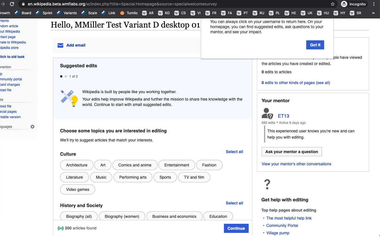
- Widen the suggested edits module to take up the space where the impact module was
See this mockup.
This should only apply to variants C and D, and not variant A.
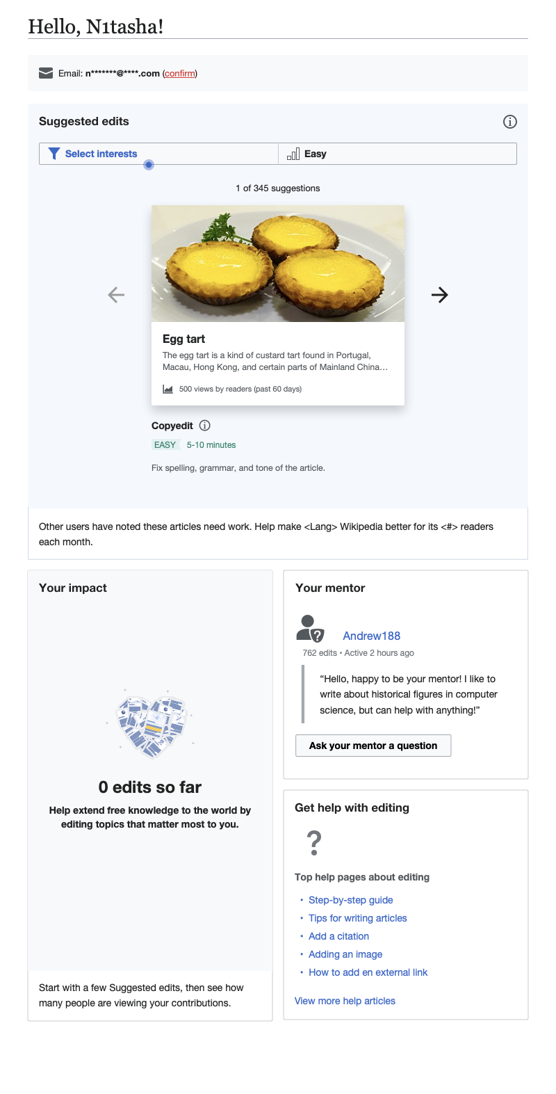
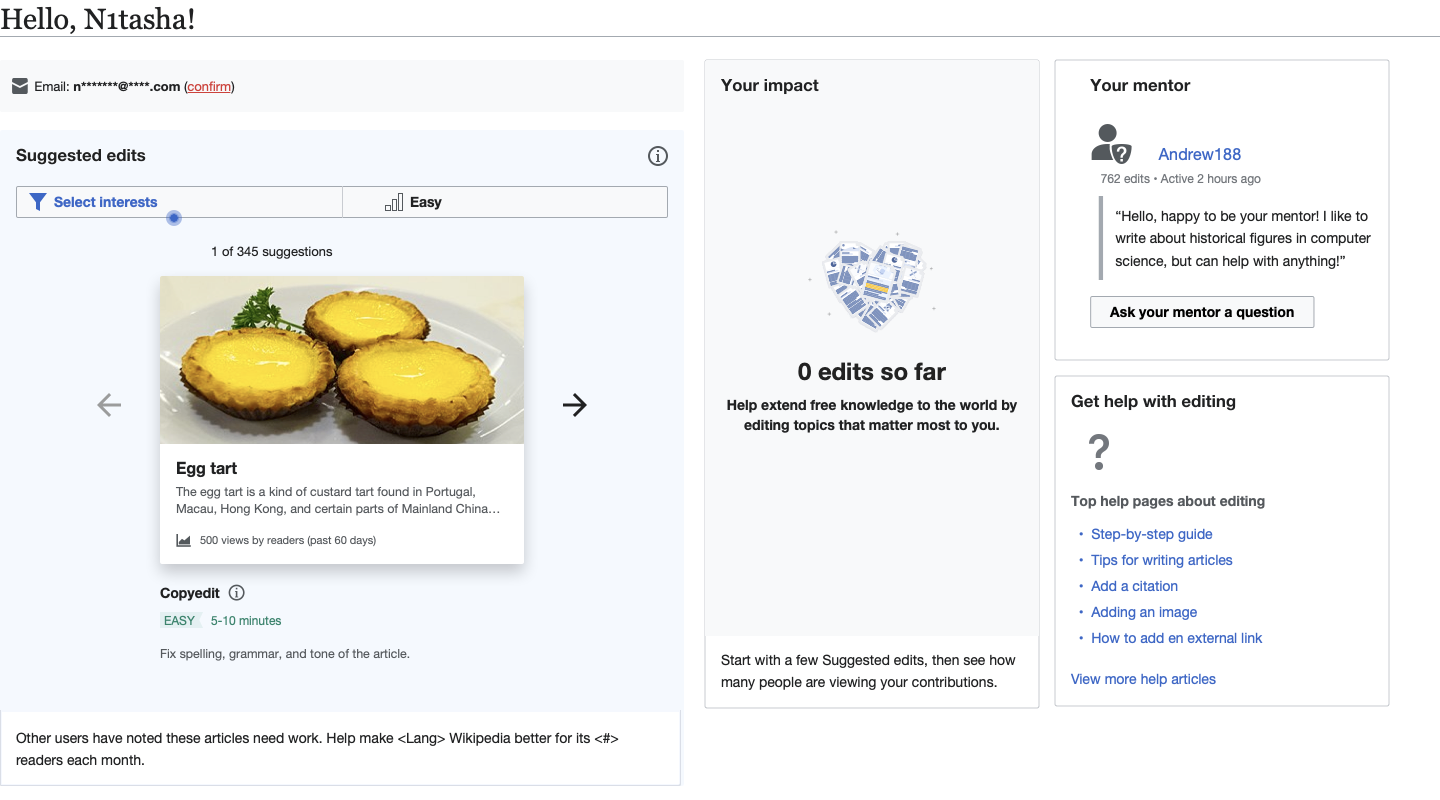
Layout specs
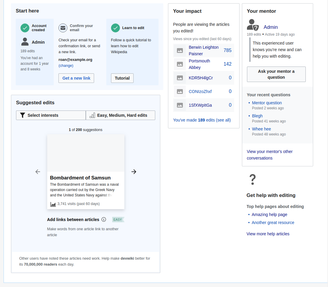
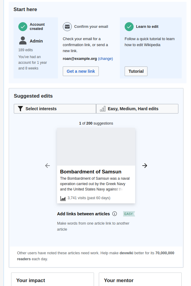
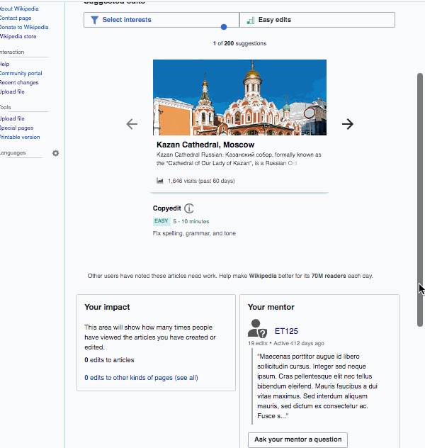
There are 2 breakpoints in variants C & D, which result in 3 possible layouts.
Standard 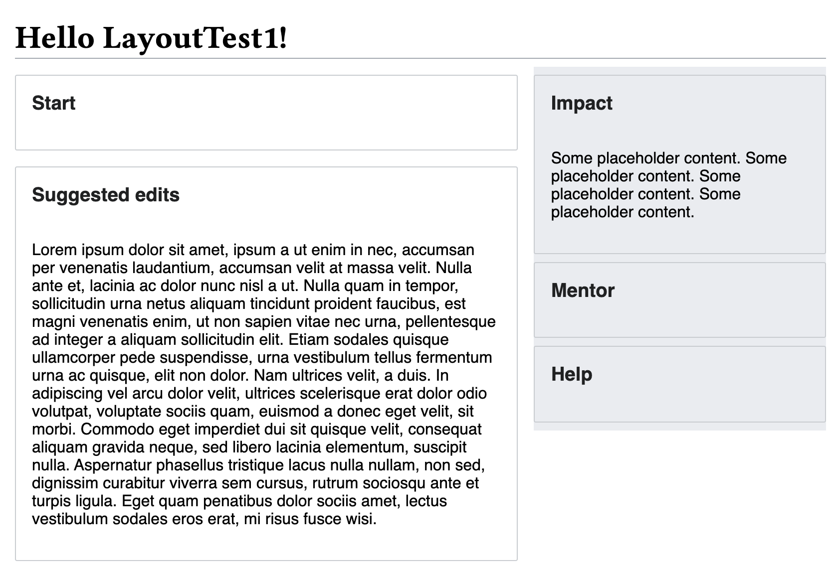 | Narrow 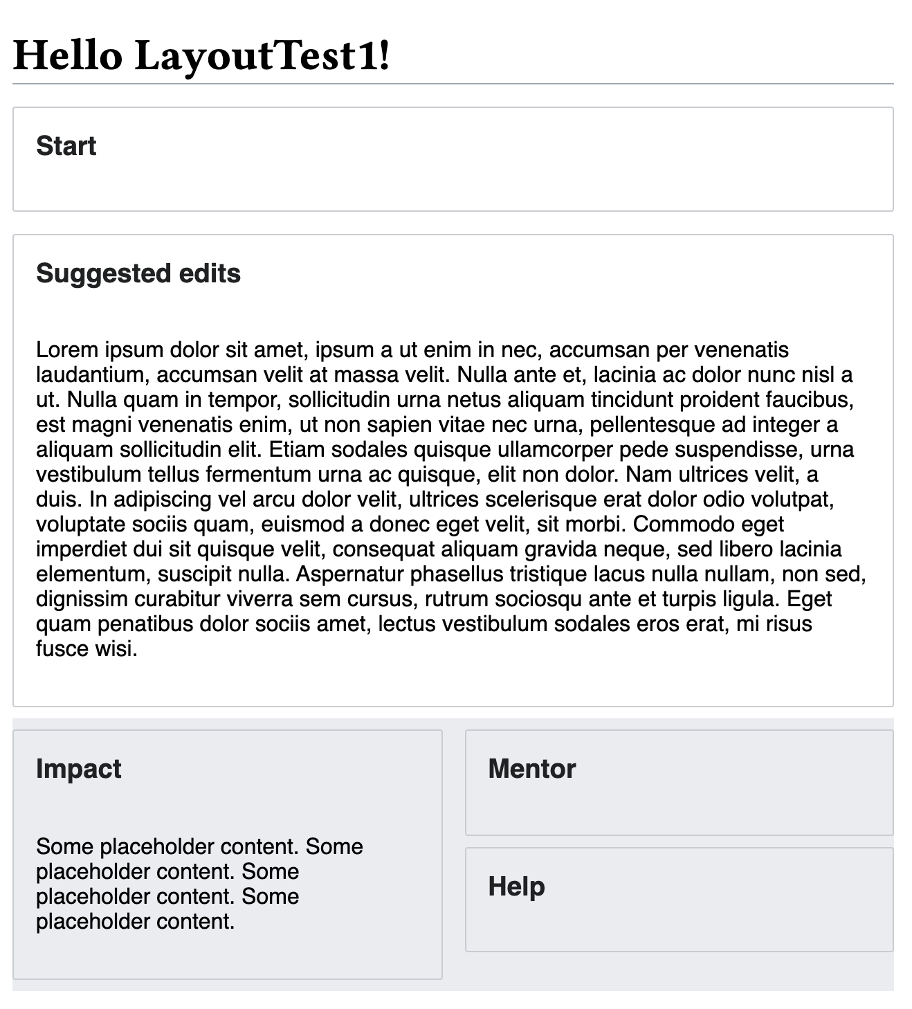 | Wide  |
Details on the following codepen: https://codepen.io/reets/pen/dyGaxQO?editors=1100
1. "Standard" layout
- The .growthexperiments-homepage-container changes max and min widths:
- { min-width: 600px; /*RH changed from 800px*/ }
- { max-width: 1440px; /*RH changed from 1600px*/ }
- The .growthexperiments-homepage-group-main has a width:64% (previously 75%)
- The .growthexperiments-homepage-group-sidebar has a width:36% (previously 25%)
- The Impact module is moved to the sidebar, on top of the help and mentor items
- The .growthexperiments-homepage-module has reduced margins: 8px (previously 12px)
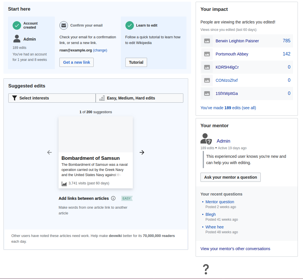
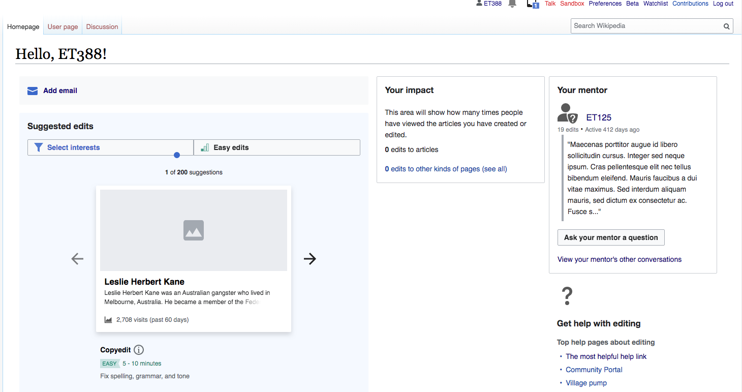
2. Narrow layout
- This involves modifying the existing from @media (max-width: 1024px) to @media (max-width: 800px)
- The Impact module takes up width:calc(50% - 8px); of the sidebar, the help and mentor modules are in a second column with the same width.
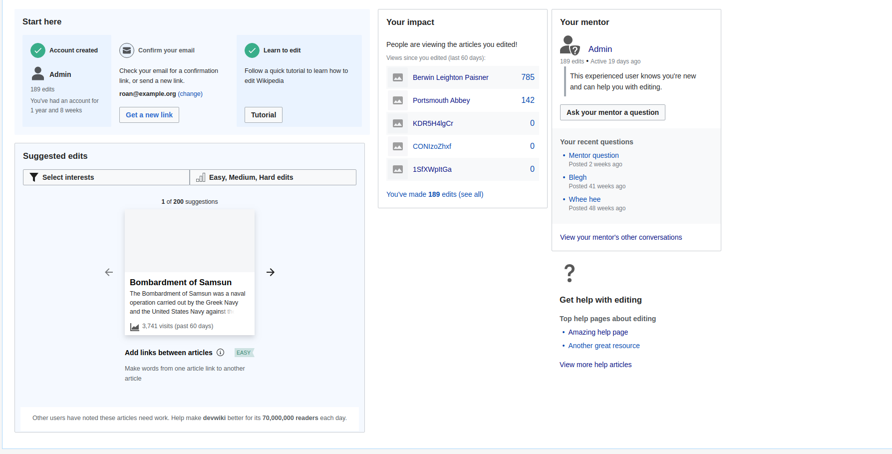
3. Wide layout
- This involves adding a new breakpoint for @media (min-width:1280px)
- Both the main and sidebar containers have width:50%
- Within the sidebar, the Impact module takes up width:calc(50% - 8px); of the sidebar, the help and mentor modules are in a second column with the same width.
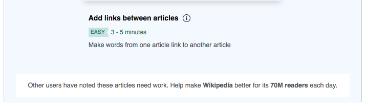
Suggested edits module changes are broken out into T258704