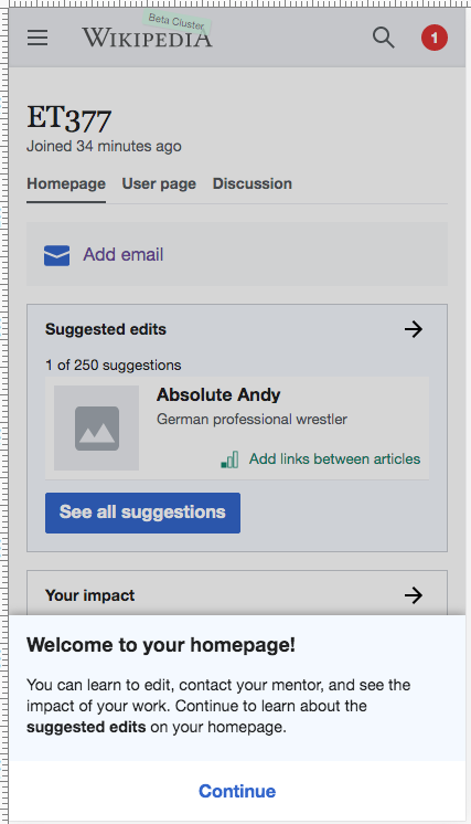
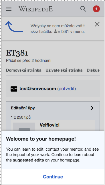
From T250440: Variant tests: C-mobile:
- When the user first arrives on their homepage, they should get a drawer that comes up from the bottom of the screen. When the drawer is open, the rest of the screen is shaded over.
- Header: "Welcome to your homepage!"
- Body: "You can learn to edit, contact your mentor, and see the impact of your work. Continue to learn about the suggested edits on your homepage."
- The drawer is dismissable by tapping outside of it.
- The user can tap "Continue" at the bottom to open the onboarding.
- After the user dismisses the drawer or taps continue, they will never see this drawer again.
- With the advent of this drawer, we should remove the "Welcome to your homepage!" header on the banner that explains to users how to return, implemented in T224883: Homepage: discovery of homepage after account creation (mobile).
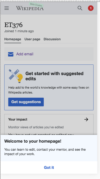
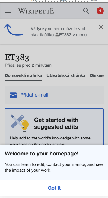
From T250451: Variant tests: D-mobile:
- When the user first arrives on their homepage, they should get a drawer that comes up from the bottom of the screen. When the drawer is open, the rest of the screen is shaded over.
- Header: "Welcome to your homepage!"
- Body: "You can learn to edit, contact your mentor, and see the impact of your work."
- The drawer is dismissable by tapping "Got it" or outside of it
- After the user dismisses the drawer, they will never see this drawer again.
- With the advent of this drawer, we should remove the "Welcome to your homepage!" header on the banner that explains to users how to return, implemented in T224883: Homepage: discovery of homepage after account creation (mobile).
Mockups in Zeplin: variant C, variant D
Var C 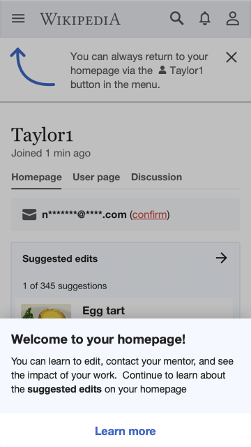 | Var D 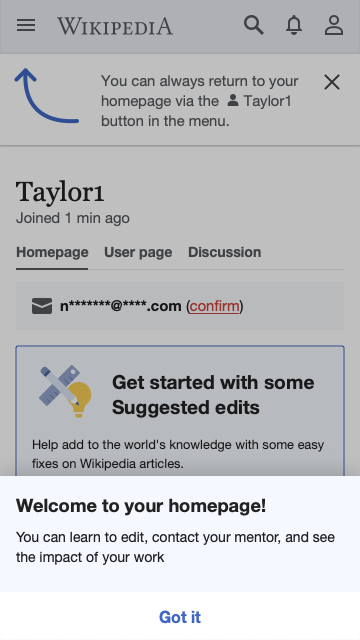 |
Basically, both Variants C-mobile and D-mobile now have a drawer in the same place under the same circumstances (first arrival to page), but the content is different between them. The text differs, and Variant C's has a call-to-action button.
The desktop version of this task is T258009: Variant C/D: welcome popup on desktop, which uses a different form factor, but the same language. We may wish to share a hidden preference for dismissing both of these forms of welcome.
The "dismissed" state should be synchronized between the desktop and mobile versions of this feature. In other words, if the user dismisses the welcome popup on desktop, that should also hide the welcome drawer on any future mobile visits, and vice versa.