Page MenuHomePhabricator

Variant C: onboarding
Closed, ResolvedPublic

Assigned To
Authored By
Catrope
Jul 15 2020, 4:44 AM
Referenced Files
F33924452: Screen Shot 2020-11-24 at 3.07.32 PM.png
Nov 24 2020, 11:22 PM
F33924454: Screen Shot 2020-11-24 at 3.08.13 PM.png
Nov 24 2020, 11:22 PM
F33924450: Screen Shot 2020-11-24 at 3.07.21 PM.png
Nov 24 2020, 11:22 PM
F33884749: image.png
Nov 9 2020, 9:51 PM
F33878754: image.png
Nov 9 2020, 9:51 PM
F33890525: image.png
Nov 9 2020, 9:51 PM
F33888494: image.png
Nov 9 2020, 9:51 PM
F33886674: image.png
Nov 9 2020, 9:51 PM

Description

From T250331: Variant tests: C-desktop (and also referred to in T250440: Variant tests: C-mobile):

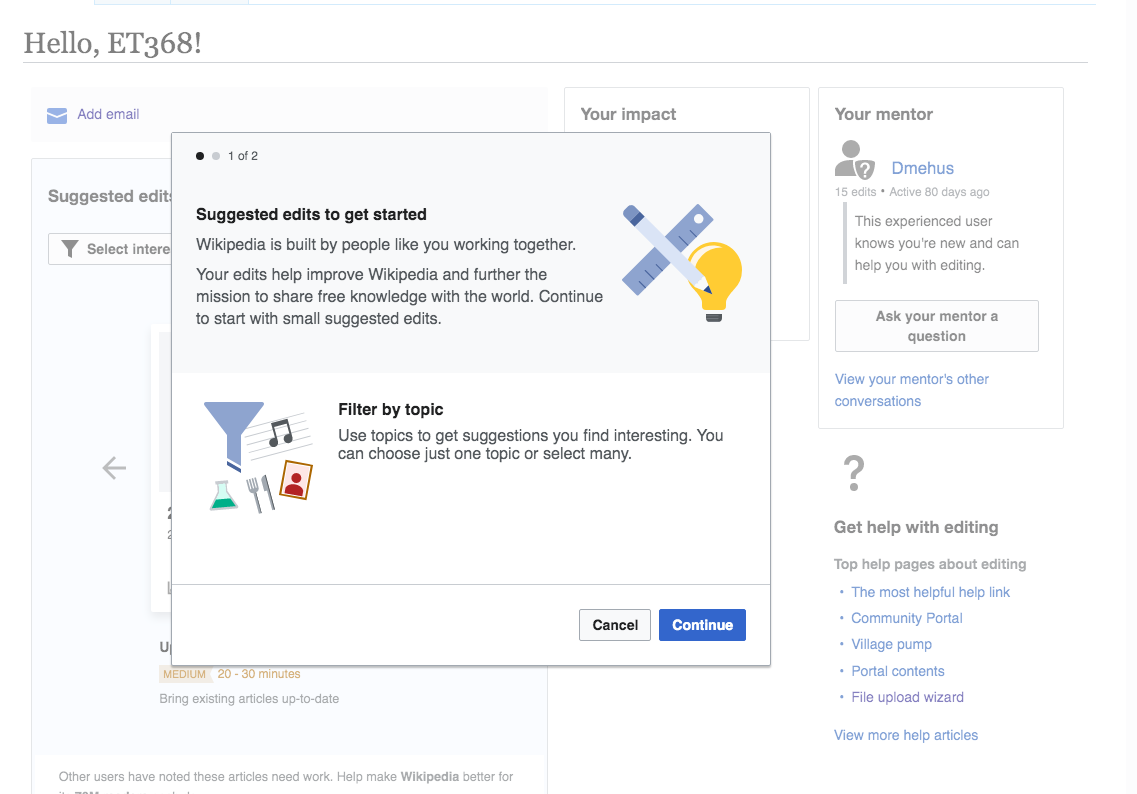
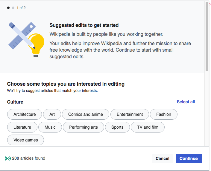
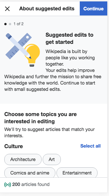
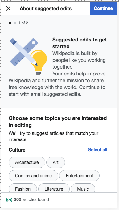
  • When the user clicks the blue arrow button on the popup, they see the first of two onboarding overlays. The first one is an intro overlay that does not have topic selection inside the overlay like in Variant A.
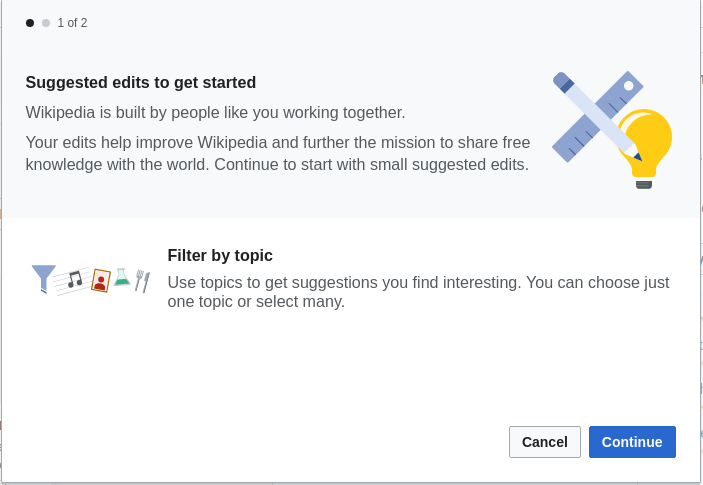
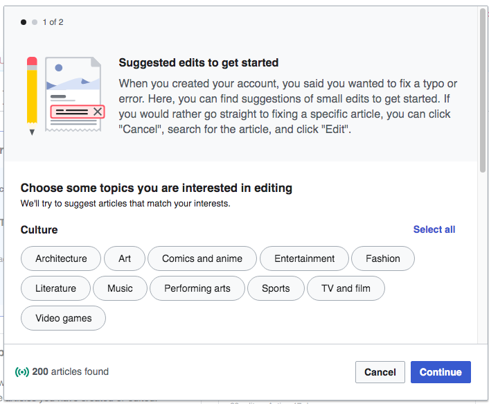
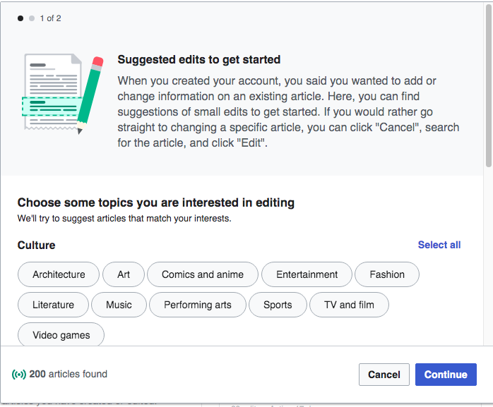
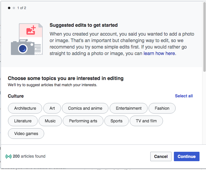
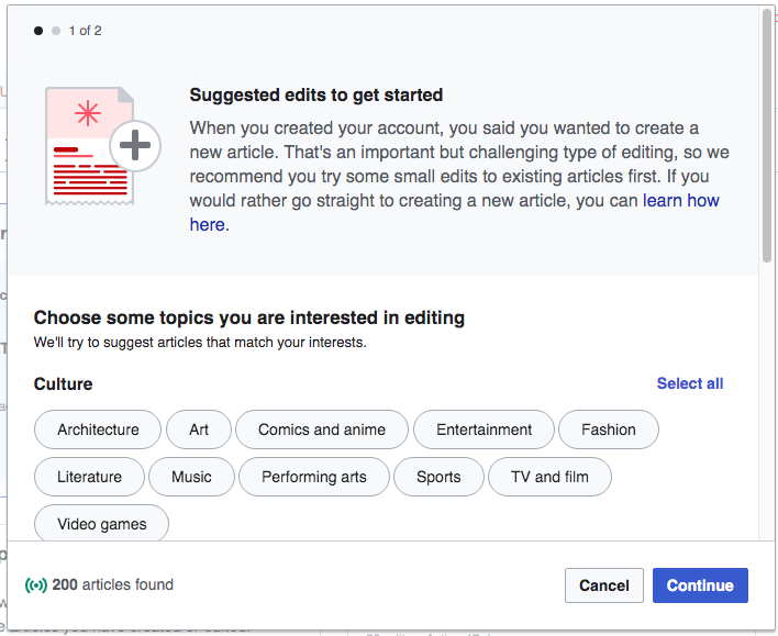
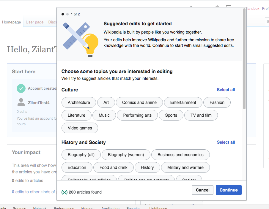
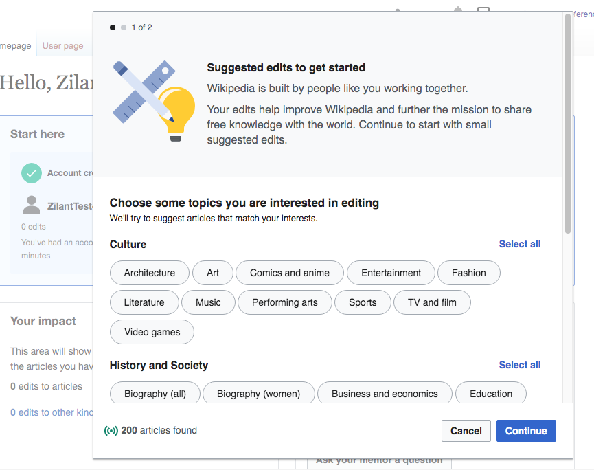
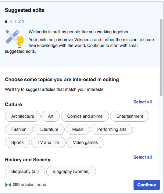
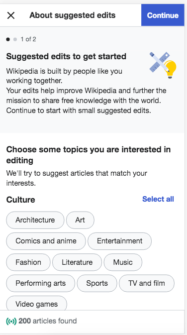
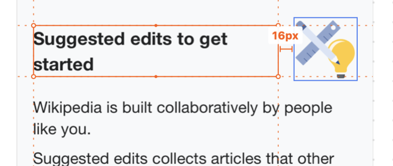
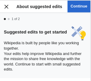
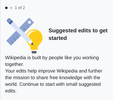
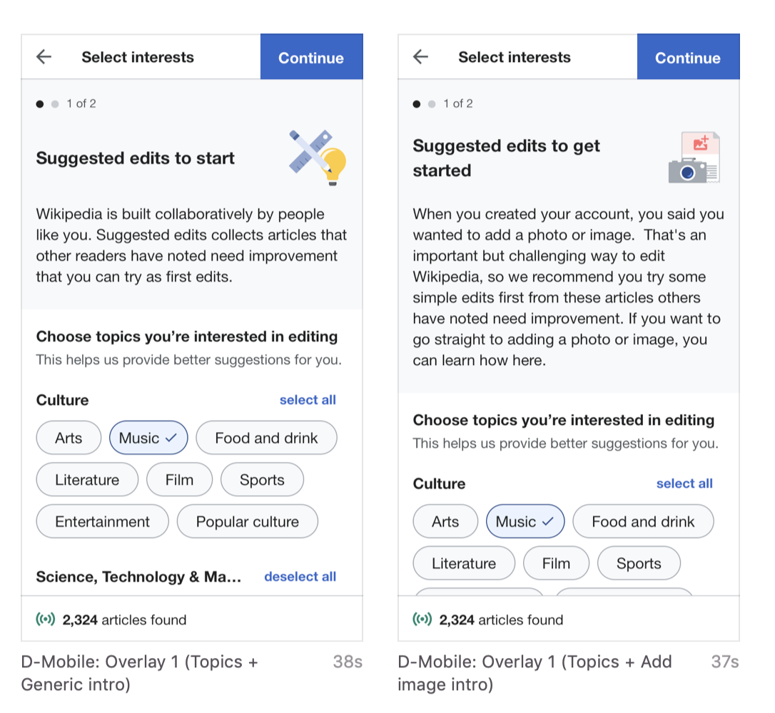
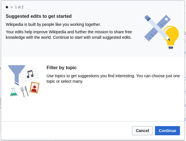
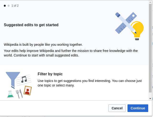
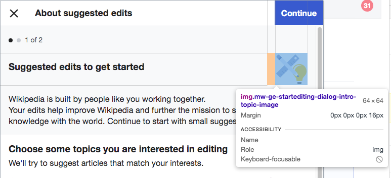
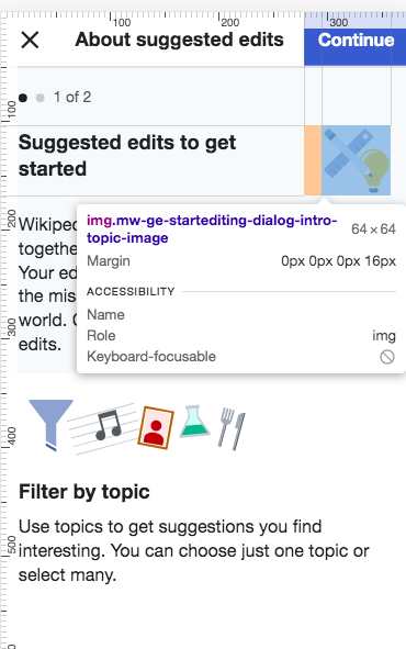
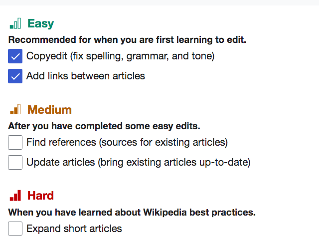
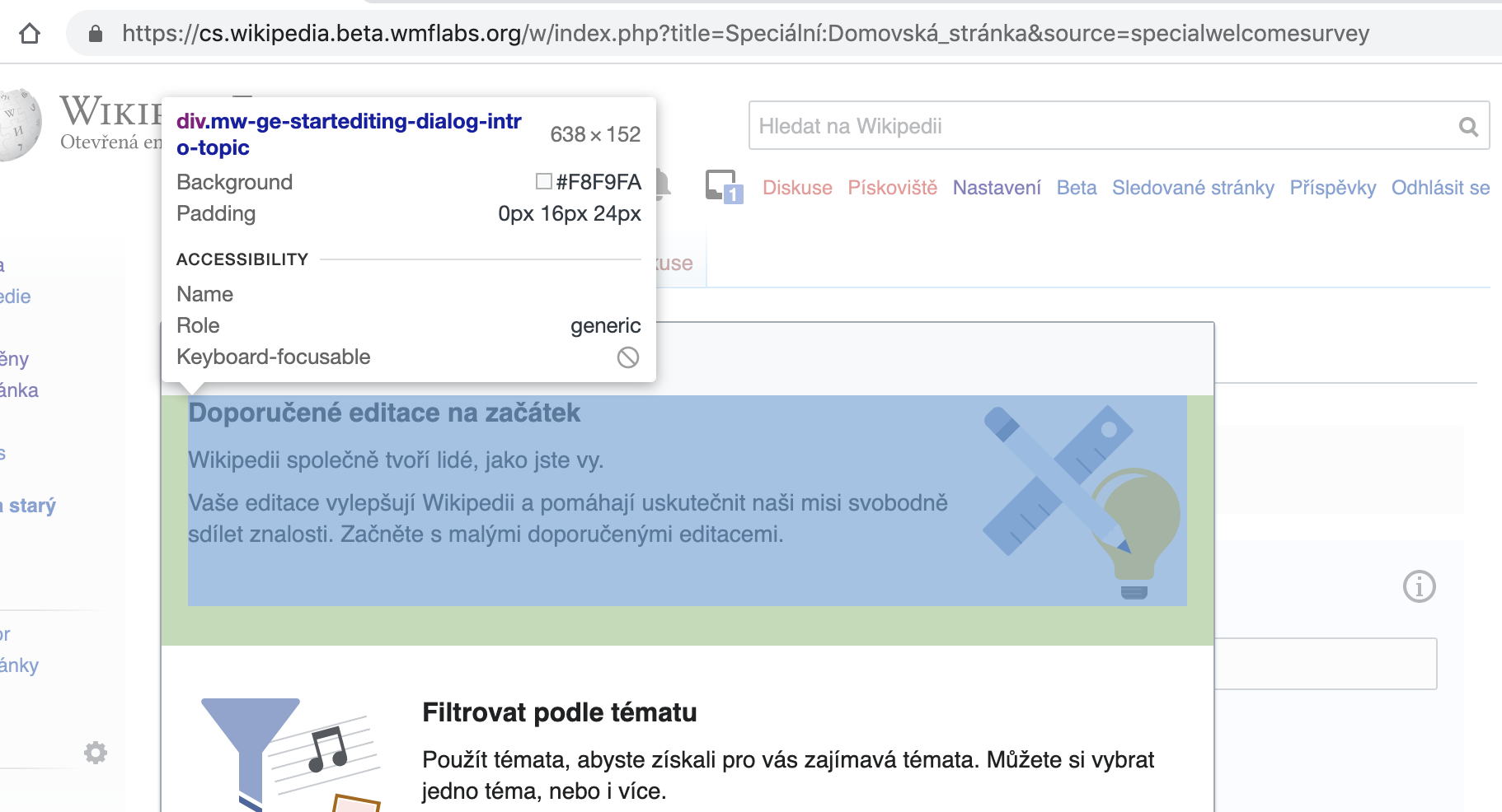
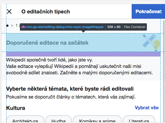
    • Top section: same content as our existing first overlay as implemented in T235723: Newcomer tasks: intro and difficulty overlays ("Suggested edits to get started...Wikipedia is built by people like you...Your edits help improve...")
    • Bottom section
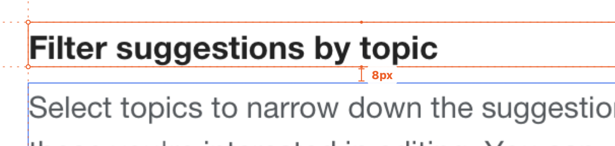
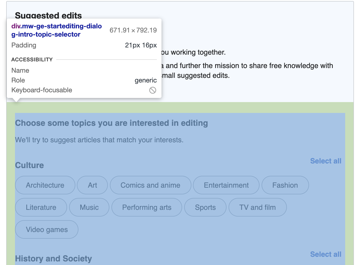
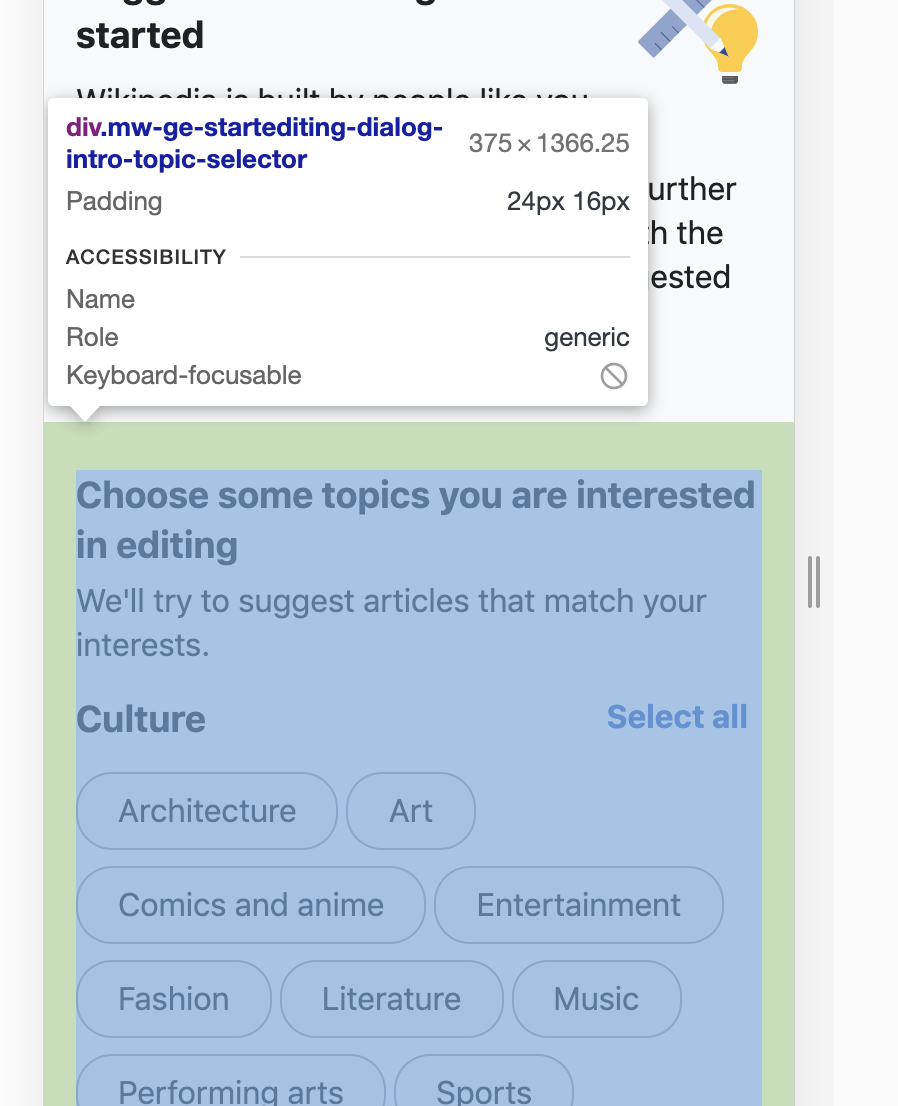
      • Header: "Filter by topic"
      • Body: "Use topics to get suggestions you find interesting. You can choose just one topic or select many."
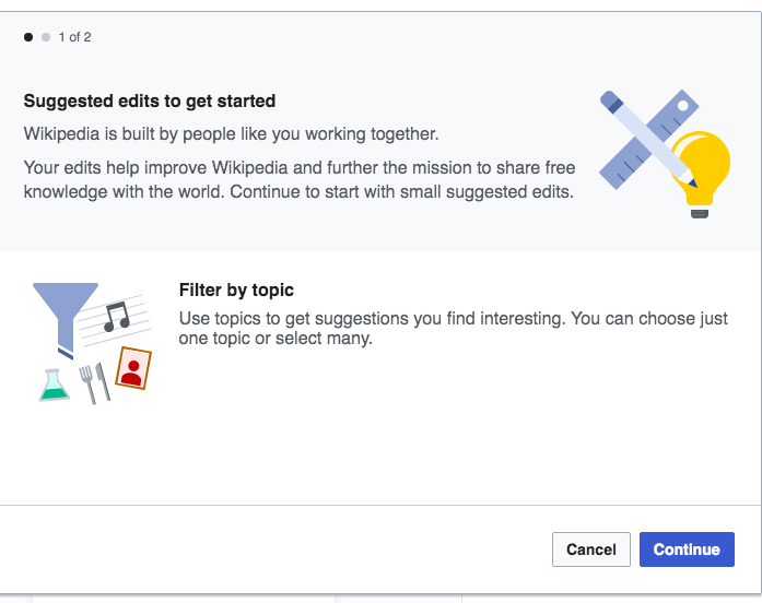
    • Asset for new intro overlay:
Landscape format (Mobile) SVG PNG@2x
Topics-landscape@2x.png (128×432 px, 9 KB)
Square format (Desktop) SVG PNG@2x
Topics-square@2x.png (256×256 px, 10 KB)
  • They can dismiss the overlay by clicking away.
  • They can click "Continue" to go to the next overlay.
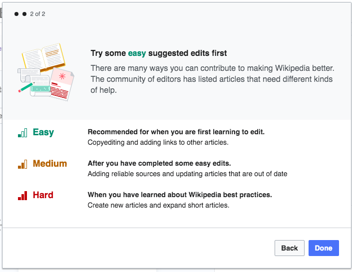
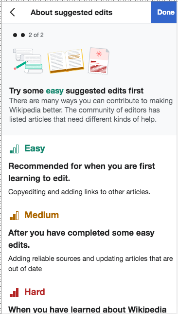
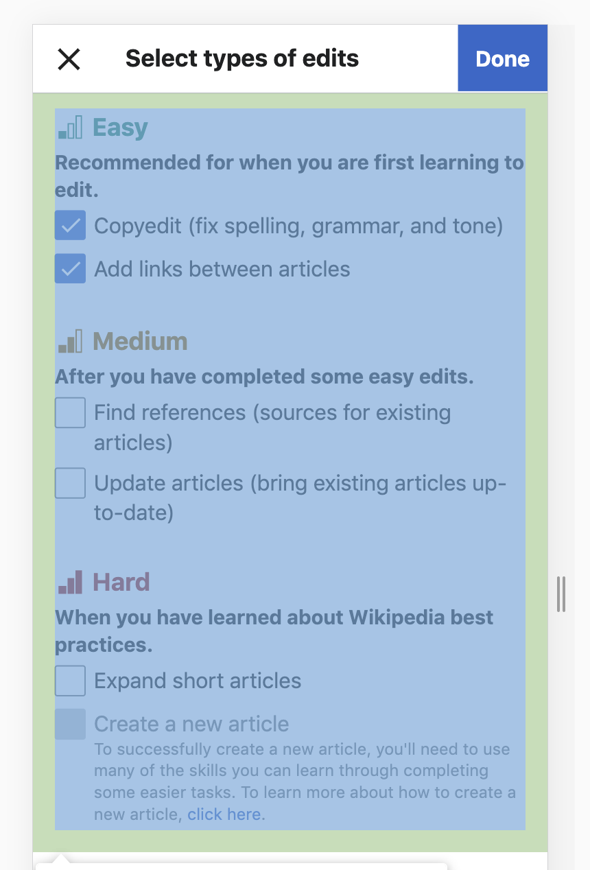
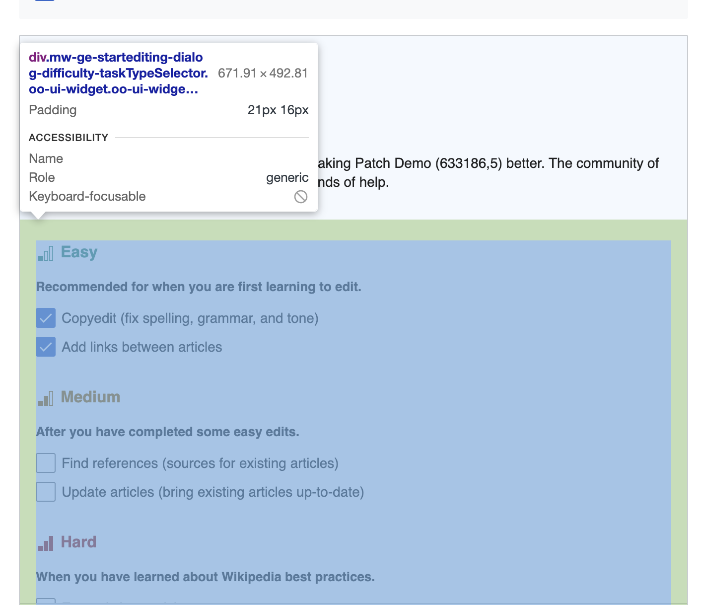
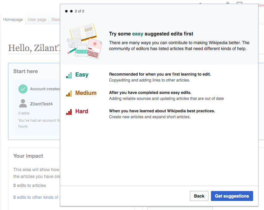
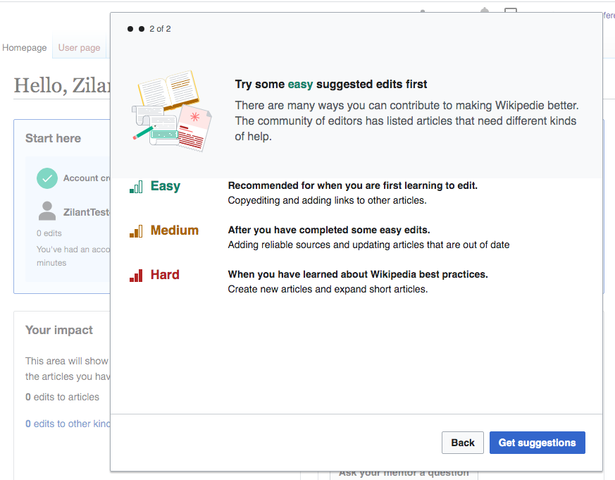
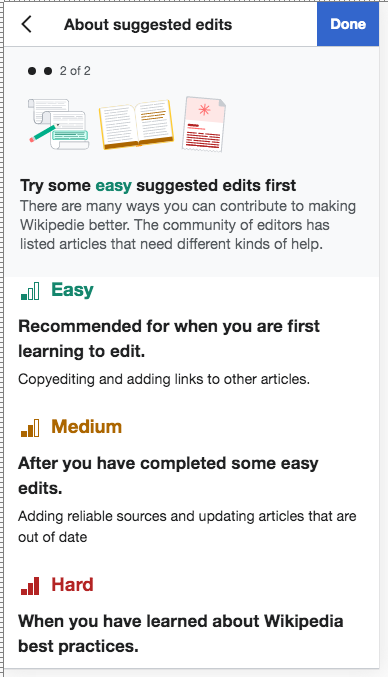
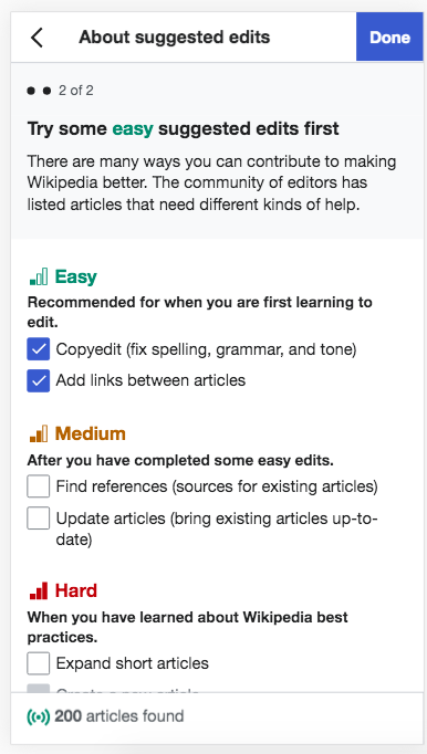
  • The second overlay is the exact same difficulty overlay as implemented in T235723 for Variant A. Its back button returns to the previous overlay.
  • When the user clicks "Done", the overlays and popup are gone, and the user is just on their homepage.

Mockups: desktop step 1, desktop step 2, mobile step 1, mobile step 2

Note that we can't simply make these changes to the existing intro overlay (from variant A), because that overlay is used (almost) unchanged in variant D. The onboarding flow will have to be bifurcated between variants C and D.

Event Timeline

There are a very large number of changes, so older changes are hidden. Show Older Changes

The attached patch creates the modified version of the onboarding dialog and connects it to the info icon created by T258020: Variant C: Info icon in suggested edits module. It doesn't yet connect it to the popup, because the popup doesn't exist yet (T258009: Variant C/D: welcome popup on desktop is not done yet).

One thing that was confusing while implementing this: the Zeplin mocks show the new image as a 128x128px square, but the actual image asset given in this task is not square. Instead, I decided to set the image's width to 128px, which results in a height of 80px.

Screenshot from 2020-09-08 20-49-53.png (485×703 px, 50 KB)

Change 626051 had a related patch set uploaded (by Catrope; owner: Catrope):
[mediawiki/extensions/GrowthExperiments@master] StartEditingDialog: Make the mobile info icon also launch the dialog

https://gerrit.wikimedia.org/r/626051

Some questions for @RHo from @kostajh's code review:

  • The mocks use two different images, a square one (128x128px) on desktop and a rectangular one (216x64) on mobile. The difficulty overlay also uses different images for desktop and mobile with these exact same dimensions, so this looks intentional. Could you upload the square 128x128 version? Right now only the 216x64 version is uploaded to the task, so that's what I'm using on desktop for now even though it's wrong.
  • Kosta pointed out that the desktop mock for the intro overlay doesn't have a "cancel" button, but the variant A version of the dialog does. I didn't notice this difference and accidentally kept the "cancel" button in the variant C version. Is this difference intentional? Should I remove the cancel button for variant C?
  • Kosta pointed out that the desktop mocks for the intro and difficulty overlays show a horizontal line above the footer buttons, as is standard in OOUI. In variant A, we went out of our way to remove this line. Is this an intentional change, and should we bring this line back? If so, is it OK if we bring it back in both variant A and variant C, so as to reduce cosmetic differences between the variants?
  • Kosta pointed out that the mobile mocks show the dialog title on mobile as About Suggested edits. He notes that this should probably be About suggested edits (because MediaWiki doesn't do Title Case), but either way, the variant A version has Suggested edits as the dialog title on mobile. Is this an intentional change? And would it be OK to make this change in variant A too, to avoid having to keep two different dialog titles around?

Some questions for @RHo from @kostajh's code review:

  • The mocks use two different images, a square one (128x128px) on desktop and a rectangular one (216x64) on mobile. The difficulty overlay also uses different images for desktop and mobile with these exact same dimensions, so this looks intentional. Could you upload the square 128x128 version? Right now only the 216x64 version is uploaded to the task, so that's what I'm using on desktop for now even though it's wrong.

– Ah yes, I will add to the task description after this comment.

  • Kosta pointed out that the desktop mock for the intro overlay doesn't have a "cancel" button, but the variant A version of the dialog does. I didn't notice this difference and accidentally kept the "cancel" button in the variant C version. Is this difference intentional? Should I remove the cancel button for variant C?

– It was intentional to help push users through the onboarding, but on second thoughts it's not good to force users through to the second screen if they are not interested, so I've updated the mock to include a "cancel".

  • Kosta pointed out that the desktop mocks for the intro and difficulty overlays show a horizontal line above the footer buttons, as is standard in OOUI. In variant A, we went out of our way to remove this line. Is this an intentional change, and should we bring this line back? If so, is it OK if we bring it back in both variant A and variant C, so as to reduce cosmetic differences between the variants?

– Yes let's bring the line back for variant A as well as C and D.

  • Kosta pointed out that the mobile mocks show the dialog title on mobile as About Suggested edits. He notes that this should probably be About suggested edits (because MediaWiki doesn't do Title Case), but either way, the variant A version has Suggested edits as the dialog title on mobile. Is this an intentional change? And would it be OK to make this change in variant A too, to avoid having to keep two different dialog titles around?

– It is intentional to have "About X" so that the user is not confused, especially on mobile, that they are in the Suggested edits module, but rather they in an intro/onboarding screen. I will defer to @MMiller_WMF to confirm on this one, but the reason for capitalising is because we consider the feature name to be "Suggested edits", similar to "Wikipedia".

I've merged the patches but I'll try to summarize here the follow-up issues:

  1. Instrumentation, different module names are used for different steps of the start editing dialog (see here)
  2. Use different images for desktop/mobile (T258016#6453292)
  3. Bring back footer line for variant A/C/D (T258016#6453292)
  4. Use "About ..." message with either "Suggested edits" or "suggested edits" (T258016#6453292)
  5. The first step of the dialog should probably have a minimum height on desktop, which would be the same as the height of the second step. As it is, you press "continue" and then have to move the mouse to click "Done".

Change 626050 merged by jenkins-bot:
[mediawiki/extensions/GrowthExperiments@master] StartEditingDialog: Display without topic selector in variant C

https://gerrit.wikimedia.org/r/626050

Change 626051 merged by jenkins-bot:
[mediawiki/extensions/GrowthExperiments@master] StartEditingDialog: Make the mobile info icon also launch the dialog

https://gerrit.wikimedia.org/r/626051

Change 626795 had a related patch set uploaded (by Catrope; owner: Catrope):
[mediawiki/extensions/GrowthExperiments@master] StartEditingDialog: Various fixes for variant C onboarding

https://gerrit.wikimedia.org/r/626795

Some questions for @RHo from @kostajh's code review:

  • The mocks use two different images, a square one (128x128px) on desktop and a rectangular one (216x64) on mobile. The difficulty overlay also uses different images for desktop and mobile with these exact same dimensions, so this looks intentional. Could you upload the square 128x128 version? Right now only the 216x64 version is uploaded to the task, so that's what I'm using on desktop for now even though it's wrong.

– Ah yes, I will add to the task description after this comment.

Thanks! Fixed in my latest patch.

  • Kosta pointed out that the desktop mock for the intro overlay doesn't have a "cancel" button, but the variant A version of the dialog does. I didn't notice this difference and accidentally kept the "cancel" button in the variant C version. Is this difference intentional? Should I remove the cancel button for variant C?

– It was intentional to help push users through the onboarding, but on second thoughts it's not good to force users through to the second screen if they are not interested, so I've updated the mock to include a "cancel".

OK, that's easy for me then, because it's already implemented that way :)

  • Kosta pointed out that the desktop mocks for the intro and difficulty overlays show a horizontal line above the footer buttons, as is standard in OOUI. In variant A, we went out of our way to remove this line. Is this an intentional change, and should we bring this line back? If so, is it OK if we bring it back in both variant A and variant C, so as to reduce cosmetic differences between the variants?

– Yes let's bring the line back for variant A as well as C and D.

Done in my latest patch

  • Kosta pointed out that the mobile mocks show the dialog title on mobile as About Suggested edits. He notes that this should probably be About suggested edits (because MediaWiki doesn't do Title Case), but either way, the variant A version has Suggested edits as the dialog title on mobile. Is this an intentional change? And would it be OK to make this change in variant A too, to avoid having to keep two different dialog titles around?

– It is intentional to have "About X" so that the user is not confused, especially on mobile, that they are in the Suggested edits module, but rather they in an intro/onboarding screen. I will defer to @MMiller_WMF to confirm on this one, but the reason for capitalising is because we consider the feature name to be "Suggested edits", similar to "Wikipedia".

OK, that makes sense. Should we make this change only for variant C/D, or also for the existing dialog in variant A?

I've merged the patches but I'll try to summarize here the follow-up issues:

  1. Instrumentation, different module names are used for different steps of the start editing dialog (see here)

Let's deal with this as part of T262485: Variant C/D: instrumentation

  1. Use different images for desktop/mobile (T258016#6453292)

Done in my latest patch

  1. Bring back footer line for variant A/C/D (T258016#6453292)

Done in my latest patch

  1. Use "About ..." message with either "Suggested edits" or "suggested edits" (T258016#6453292)

Waiting for Marshall/Rita to confirm the exact text and whether it should apply to variant A as well (which I'd prefer, it'd be easier)

  1. The first step of the dialog should probably have a minimum height on desktop, which would be the same as the height of the second step. As it is, you press "continue" and then have to move the mouse to click "Done".

Fixed in my latest patch, although with a custom getBodyHeight() implementation rather than a min-height.

@Catrope @kostajh @RHo

  1. Use "About ..." message with either "Suggested edits" or "suggested edits" (T258016#6453292)

Waiting for Marshall/Rita to confirm the exact text and whether it should apply to variant A as well (which I'd prefer, it'd be easier)

"Suggested edits" should not be capitalize, unless it's at the beginning of a sentence. Therefore, it should be "About suggested edits". My reasoning is that it looks like a typo because the first word is capitalized and not the second. And I think that capitalizing both word ("Suggested Edits"), makes it look like a trademarked brand, which I don't think fits our tone.

And yes, @Catrope, it is fine to apply it to Variant A.

Change 626795 merged by jenkins-bot:
[mediawiki/extensions/GrowthExperiments@master] StartEditingDialog: Various fixes for variant C onboarding

https://gerrit.wikimedia.org/r/626795

Change 627576 had a related patch set uploaded (by Catrope; owner: Catrope):
[mediawiki/extensions/GrowthExperiments@master] StartEditingDialog: Change header text

https://gerrit.wikimedia.org/r/627576

Change 627576 merged by jenkins-bot:
[mediawiki/extensions/GrowthExperiments@master] StartEditingDialog: Change header text

https://gerrit.wikimedia.org/r/627576

Checked in betalabs.
(1) They can dismiss the overlay by clicking away.

  • the spec is not in place - with the popup everything else becomes inactive.

(2) Done - no capitalization of Suggested edits in the title on mobile or in the tooltip

"Suggested edits" should not be capitalize, unless it's at the beginning of a sentence. Therefore, it should be "About suggested edits".

Screen Shot 2020-09-18 at 5.36.47 PM.png (638×362 px, 66 KB)
Screen Shot 2020-09-18 at 5.39.12 PM.png (197×769 px, 78 KB)

(3) Done - see the animated gif below.

  1. The first step of the dialog should probably have a minimum height on desktop, which would be the same as the height of the second step. As it is, you press "continue" and then have to move the mouse to click "Done".

Fixed in my latest patch, although with a custom getBodyHeight() implementation rather than a min-height.

SE popup2.gif (695×907 px, 134 KB)

The screenshots for review.
Desktop

Screen Shot 2020-09-18 at 4.48.08 PM.png (552×697 px, 70 KB)
Screen Shot 2020-09-18 at 4.48.24 PM.png (545×705 px, 87 KB)

Note: The size of the popup seems bigger than in the mockup .
<div class="oo-ui-window-frame" style="transition: all 0.25s ease-out 0s; width: 700px; height: 512px;">

Screen Shot 2020-09-18 at 5.19.34 PM.png (794×1 px, 155 KB)

e.g. with width: 600px;:

Screen Shot 2020-09-18 at 5.19.34 PM.png (794×1 px, 155 KB)

Adding the custom messages reflecting Welcome survey responses.

Welcome survey responseOnboarding message
To fix a typo or error in a Wikipedia article
Screen Shot 2020-09-20 at 1.20.29 PM.png (583×706 px, 98 KB)
To add or change information to a Wikipedia article
Screen Shot 2020-09-20 at 1.19.40 PM.png (577×698 px, 100 KB)
To add a photo or image to a Wikipedia article
Screen Shot 2020-09-20 at 1.16.03 PM.png (578×699 px, 97 KB)
To create a new Wikipedia article
Screen Shot 2020-09-20 at 1.18.17 PM.png (579×708 px, 102 KB)
I'm participating in a program, class, or event; To read Wikipedia; Other
Screen Shot 2020-09-20 at 1.21.06 PM.png (573×705 px, 90 KB)

Hi @Catrope - Can we continue to vary based on WelcomeSurvey responses for this onboarding, BUT when a user clicks on the "?" icon in the initiated module header, we always show the single general icon and text for everyone?

@MMiller_WMF to confirm but I am asking on the assumption we would want the same customized onboarding for var C & D, and at the same time not have the help "?" in the SE module header be customized (since a user may not look at that message until much later)

I've split this out to a leftover task: T263608: Variant C: don't personalize onboarding dialog when accessed from info icon

Hi @Catrope please see comments on a couple of design tweaks needed below, along with same question @Etonkovidova asked about Desktop pop-up width.

Mobile

Screen Shot 2020-09-18 at 5.36.47 PM.png (638×362 px, 66 KB)
Screen Shot 2020-09-18 at 5.56.19 PM.png (645×366 px, 73 KB)
  • The Suggested edits image should only be 64x64px:
    image.png (436×638 px, 61 KB)
  • The body text ("Wikipedia is built by..." and "Use topics to get...") should be small font size than the headers. It should use the 14.8px size that is from the style OOUI Mobile/Smaller UI text/Inline-help.
  • There should be 8px padding above the body text and the header (across both onboarding screens):
    image.png (288×1 px, 96 KB)

*There should be 16px padding on the RHS - on the second onboarding some of the text looks like it is a bit close to the right edge

image.png (966×512 px, 76 KB)

The screenshots for review.
Desktop

Screen Shot 2020-09-18 at 4.48.08 PM.png (552×697 px, 70 KB)
Screen Shot 2020-09-18 at 4.48.24 PM.png (545×705 px, 87 KB)
  • Can the body text style in the first onboarding screen under Filter by topic" use the same line-height as the body text under "Suggested edits to get started"? At the moment it's looking a tad tight.

*All the text on the second onboarding screen should be left aligned. At the moment the top text section "Try some..." is a bit more indented left than the Easy, Med, Hard descriptions below.

Note: The size of the popup seems bigger than in the mockup .
<div class="oo-ui-window-frame" style="transition: all 0.25s ease-out 0s; width: 700px; height: 512px;">

Screen Shot 2020-09-18 at 5.19.34 PM.png (794×1 px, 155 KB)

e.g. with width: 600px;:

Screen Shot 2020-09-18 at 5.19.34 PM.png (794×1 px, 155 KB)

Is this something that is automatically set due to the page width? If so that's fine, else it would be preferable to change to the *640px* width in the mocks please!

Change 632602 had a related patch set uploaded (by Catrope; owner: Catrope):
[mediawiki/extensions/GrowthExperiments@master] StartEditingDialog: Styling tweaks

https://gerrit.wikimedia.org/r/632602

  • The Suggested edits image should only be 64x64px:
    image.png (436×638 px, 61 KB)

This has already been fixed since your comment.

  • The body text ("Wikipedia is built by..." and "Use topics to get...") should be small font size than the headers. It should use the 14.8px size that is from the style OOUI Mobile/Smaller UI text/Inline-help.

What we have now is that the headers ("Suggested edits to get started", "Filter by topic") are a larger font size (18.28px) and the body texts are the base font size (16px). I think we might have done that as part of your big font size overhaul. Is that OK, or should the body text still be 14.8px for a larger font size difference?

  • There should be 8px padding above the body text and the header (across both onboarding screens):
    image.png (288×1 px, 96 KB)

Fixed in my latest patch.

*There should be 16px padding on the RHS - on the second onboarding some of the text looks like it is a bit close to the right edge

image.png (966×512 px, 76 KB)

There already is 16px padding (or margin) on the left+right hand sides in both panels, although it's 24px on the intro panel and 1em (=16px) on the difficulty panel for some reason. This appears to have been done deliberately, and only on mobile (on desktop both panels have 24px left+right side padding). If you want me to remove this odd exception and make it 24px everywhere, I would be more than happy to do that.

  • Can the body text style in the first onboarding screen under Filter by topic" use the same line-height as the body text under "Suggested edits to get started"? At the moment it's looking a tad tight.

Done in my latest patch.

*All the text on the second onboarding screen should be left aligned. At the moment the top text section "Try some..." is a bit more indented left than the Easy, Med, Hard descriptions below.

Those are not explicitly aligned and have never been. Aligning them wasn't too hard though, so I've done it in my patch.

Is this something that is automatically set due to the page width? If so that's fine, else it would be preferable to change to the *640px* width in the mocks please!

OOUI has standard dialog widths that you can choose from, including "medium" (500px) and "large" (700px). But setting a custom size wasn't too hard, so I've done that in my patch.

  • The body text ("Wikipedia is built by..." and "Use topics to get...") should be small font size than the headers. It should use the 14.8px size that is from the style OOUI Mobile/Smaller UI text/Inline-help.

What we have now is that the headers ("Suggested edits to get started", "Filter by topic") are a larger font size (18.28px) and the body texts are the base font size (16px). I think we might have done that as part of your big font size overhaul. Is that OK, or should the body text still be 14.8px for a larger font size difference?

You're right, the body text for this is now 16px on Mobile after the font style overhaul.

*There should be 16px padding on the RHS - on the second onboarding some of the text looks like it is a bit close to the right edge

image.png (966×512 px, 76 KB)

There already is 16px padding (or margin) on the left+right hand sides in both panels, although it's 24px on the intro panel and 1em (=16px) on the difficulty panel for some reason. This appears to have been done deliberately, and only on mobile (on desktop both panels have 24px left+right side padding). If you want me to remove this odd exception and make it 24px everywhere, I would be more than happy to do that.

Yes, but can we make it so that on Mobile there is 1em (16px) padding on left and right everywhere?

*All the text on the second onboarding screen should be left aligned. At the moment the top text section "Try some..." is a bit more indented left than the Easy, Med, Hard descriptions below.

Those are not explicitly aligned and have never been. Aligning them wasn't too hard though, so I've done it in my patch.

Thank you 😬

Is this something that is automatically set due to the page width? If so that's fine, else it would be preferable to change to the *640px* width in the mocks please!

OOUI has standard dialog widths that you can choose from, including "medium" (500px) and "large" (700px). But setting a custom size wasn't too hard, so I've done that in my patch.

Thank you 😬

Change 632602 merged by jenkins-bot:
[mediawiki/extensions/GrowthExperiments@master] StartEditingDialog: Styling tweaks

https://gerrit.wikimedia.org/r/632602

Change 633186 had a related patch set uploaded (by Kosta Harlan; owner: Kosta Harlan):
[mediawiki/extensions/GrowthExperiments@master] Create StartEditing RL module, apply consistent side padding

https://gerrit.wikimedia.org/r/633186

Previous patch merged, new patch in code review for this comment:

Yes, but can we make it so that on Mobile there is 1em (16px) padding on left and right everywhere?

Also, the previous patch causes an issue noted here https://gerrit.wikimedia.org/r/c/mediawiki/extensions/GrowthExperiments/+/632602/4/modules/homepage/ext.growthExperiments.Homepage.StartEditingDialog.less#22, either @Catrope or I will fix that soon.

Change 633240 had a related patch set uploaded (by Catrope; owner: Catrope):
[mediawiki/extensions/GrowthExperiments@master] StartEditingDialog: Use explicit margins instead of un-reset

https://gerrit.wikimedia.org/r/633240

Change 633240 merged by jenkins-bot:
[mediawiki/extensions/GrowthExperiments@master] StartEditingDialog: Use explicit margins instead of un-reset

https://gerrit.wikimedia.org/r/633240

Left and right padding is fixed per patch https://gerrit.wikimedia.org/r/c/mediawiki/extensions/GrowthExperiments/+/633186

Var CDesktop step 1
image.png (902×1 px, 150 KB)
step 2
image.png (1×1 px, 170 KB)
Mobile step 1
image.png (1×854 px, 185 KB)
Mobile step 2
image.png (1×860 px, 134 KB)
Var DDesktop step 1
image.png (1×1 px, 144 KB)
step 2
image.png (1×1 px, 150 KB)
Mobile step 1
image.png (1×898 px, 123 KB)
Mobile step 2
image.png (908×852 px, 97 KB)

Change 633186 merged by jenkins-bot:
[mediawiki/extensions/GrowthExperiments@master] StartEditing: Set left/right padding to 16px for desktop/mobile

https://gerrit.wikimedia.org/r/633186

Checked in testwiki wmf.13- the style adjustments are also applied to the intro overlays in variant A. The latest patch - Set left/right padding to 16px for desktop/mobile is in place; just like the screenshots in @RHo comment above.

The screenshot below are just for a general overview (and, in case of variant C, comparison with A)

variant C (comparing to variant A on cswiki)

wmf.13cswiki
Desktop step 1
Screen Shot 2020-10-14 at 3.28.34 PM.png (704×905 px, 146 KB)
Screen Shot 2020-10-14 at 3.28.21 PM.png (684×865 px, 134 KB)
Desktop step 2
Screen Shot 2020-10-14 at 3.52.51 PM.png (675×851 px, 117 KB)
Screen Shot 2020-10-14 at 3.52.14 PM.png (681×873 px, 122 KB)
Mobile step 1
Screen Shot 2020-10-14 at 4.20.27 PM.png (684×380 px, 80 KB)
Screen Shot 2020-10-14 at 4.19.50 PM.png (679×386 px, 81 KB)
Mobile step 2
Screen Shot 2020-10-14 at 4.17.30 PM.png (679×382 px, 75 KB)
Screen Shot 2020-10-14 at 4.17.47 PM.png (677×388 px, 78 KB)

variant D

betalabs
Desktop step 1
Screen Shot 2020-10-14 at 4.45.33 PM.png (636×538 px, 89 KB)
Desktop step 2
Screen Shot 2020-10-14 at 4.40.29 PM.png (635×527 px, 82 KB)
Mobile step 1
Screen Shot 2020-10-14 at 4.35.58 PM.png (673×376 px, 83 KB)
Mobile step 2
Screen Shot 2020-10-14 at 4.36.13 PM.png (682×386 px, 82 KB)

Looking at var C only per this task, some items still to be fixed (or were maybe reverted at some point?):

Screen(s)ActualExpectedDetails
Desktop step 1 and 2
Screen Shot 2020-10-14 at 3.28.34 PM.png (704×905 px, 146 KB)
and {
image.png (796×1 px, 132 KB)
}
image.png (224×804 px, 63 KB)
Bottom padding in the desktop module intro area should only be 24px (not 35px) - and should include the bottom of the graphic
Mobile step 1
Screen Shot 2020-10-14 at 4.20.27 PM.png (684×380 px, 80 KB)
image.png (702×776 px, 165 KB)
Image should only be 64x64px
Mobile step 1
Screen Shot 2020-10-14 at 4.20.27 PM.png (684×380 px, 80 KB)
image.png (336×792 px, 95 KB)
The title is vertically centered with the graphic, the topic message text should be below the title and graphic.
Mobile step 2
Screen Shot 2020-10-14 at 4.17.30 PM.png (679×382 px, 75 KB)
image.png (212×618 px, 10 KB)
Level icon and text should be vertically centered

Looking at var C only per this task, some items still to be fixed (or were maybe reverted at some point?):

All these screenshots are from variant A though (as you can tell by the presence of the start module in the background, and the topic filters below the intro section.

Bottom padding in the desktop module intro area should only be 24px (not 35px) - and should include the bottom of the graphic

My patch changes the CSS so that the image is part of the height of the intro area (it previously wasn't, as you pointed out), and reduces the padding to 24px (down from 35px on desktop, 40px on mobile). However, similar to my comments at T258017#6549150, the Zeplin mocks show a 24px bottom padding on desktop but 16px on mobile. For now, I'm making it 24px on both, but if the lower padding on mobile is intended, I can change that. There are several other instances of this, as I point out in that comment.

Level icon and text should be vertically centered

Fixed in my patch. I had already done this for the task type selector, but I forgot that what's displayed in the variant C onboarding isn't a task type selector but the generic difficulty explanation (without checkboxes), so my earlier fix didn't apply there. The font size was also wrong there, I fixed that too.

Image should only be 64x64px

It is, in variant C (mobile only) and D (desktop and mobile). You're looking at variant A, where it's expected that the image is still 128x128px (as it is in variant C on desktop, as well, per the Zeplin mocks).

The title is vertically centered with the graphic, the topic message text should be below the title and graphic.

I can do that, but it looks a bit odd for me locally, because the text is on one line for me:

Screenshot from 2020-10-16 12-26-44.png (271×302 px, 23 KB)

Since this looks a bit odd, and involves non-trivial code changes, I've separated it into its own patch. I've also only implemented it on mobile, because it wouldn't look good on desktop. I also haven't implemented it in variant A, because it wouldn't look good there either because the image is so much larger:
Screenshot from 2020-10-16 13-05-42.png (331×375 px, 33 KB)

Change 634596 had a related patch set uploaded (by Catrope; owner: Catrope):
[mediawiki/extensions/GrowthExperiments@master] StartEditingDialog: Styling tweaks for variant C

https://gerrit.wikimedia.org/r/634596

Change 634597 had a related patch set uploaded (by Catrope; owner: Catrope):
[mediawiki/extensions/GrowthExperiments@master] StartEditingDialog: Center intro text next to image in variant C/D on mobile

https://gerrit.wikimedia.org/r/634597

Change 634755 had a related patch set uploaded (by Catrope; owner: Catrope):
[mediawiki/extensions/GrowthExperiments@master] StartEditingDialog: Make image in difficulty banner top aligned, fix padding

https://gerrit.wikimedia.org/r/634755

While working on the big 24px->16px change mentioned in T258019#6557184, I noticed that the text in the difficulty banner in the variant C onboarding dialog was vertically centered on desktop, but should instead be top-aligned according to the mocks. The attached patch fixes that in both variant A and variant C.

Looking at var C only per this task, some items still to be fixed (or were maybe reverted at some point?):

All these screenshots are from variant A though (as you can tell by the presence of the start module in the background, and the topic filters below the intro section.

Sorry, I was going off of the screenshots from T258016#6544922 as var C. Incidentally it looks like the console commands to change the variant and initiated state are no longer working for me.

Bottom padding in the desktop module intro area should only be 24px (not 35px) - and should include the bottom of the graphic

My patch changes the CSS so that the image is part of the height of the intro area (it previously wasn't, as you pointed out), and reduces the padding to 24px (down from 35px on desktop, 40px on mobile). However, similar to my comments at T258017#6549150, the Zeplin mocks show a 24px bottom padding on desktop but 16px on mobile. For now, I'm making it 24px on both, but if the lower padding on mobile is intended, I can change that. There are several other instances of this, as I point out in that comment.

Got it thanks, I have update the Zeplin for mobile, as it was indeed inconsistently applied.

Level icon and text should be vertically centered

Fixed in my patch. I had already done this for the task type selector, but I forgot that what's displayed in the variant C onboarding isn't a task type selector but the generic difficulty explanation (without checkboxes), so my earlier fix didn't apply there. The font size was also wrong there, I fixed that too.

OK cool.

Image should only be 64x64px

It is, in variant C (mobile only) and D (desktop and mobile). You're looking at variant A, where it's expected that the image is still 128x128px (as it is in variant C on desktop, as well, per the Zeplin mocks).

OK that's fine. Though FWIW on variant A mobile the image should also be 64x64px (see Zeplin from that era http://zpl.io/VQdAxw4) , but think we just missed this in testing back then.

The title is vertically centered with the graphic, the topic message text should be below the title and graphic.

I can do that, but it looks a bit odd for me locally, because the text is on one line for me:

Screenshot from 2020-10-16 12-26-44.png (271×302 px, 23 KB)

I think this is mitigated with the 16px between the intro and the message:

image.png (1×1 px, 360 KB)

Since this looks a bit odd, and involves non-trivial code changes, I've separated it into its own patch. I've also only implemented it on mobile, because it wouldn't look good on desktop. I also haven't implemented it in variant A, because it wouldn't look good there either because the image is so much larger:

Screenshot from 2020-10-16 13-05-42.png (331×375 px, 33 KB)

Per my comment above about variant A mobile also being 64x64px, could we make the same changes across the board?

Change 634596 merged by jenkins-bot:
[mediawiki/extensions/GrowthExperiments@master] StartEditingDialog: Styling tweaks for variant C/D

https://gerrit.wikimedia.org/r/634596

Change 634755 merged by jenkins-bot:
[mediawiki/extensions/GrowthExperiments@master] StartEditingDialog: Make image in difficulty banner top aligned, fix padding

https://gerrit.wikimedia.org/r/634755

One patch remains, waiting for feedback from @RHo.

I'm being a bit silly here: I just removed variant A, so it doesn't make sense for me to complain that something doesn't look good in it. I've also added the 16px bottom padding so it looks better:

Screenshot from 2020-10-21 12-47-35.png (422×379 px, 46 KB)

However, I'm still doing this on mobile only for now, because this is what it would look like on desktop:

CurrentWhat it would look like
Screenshot from 2020-10-21 12-49-52.png (491×647 px, 50 KB)
Screenshot from 2020-10-21 12-51-33.png (491×642 px, 50 KB)

And it seems to be that the one on the left matches the Zeplin mocks better than the one on the right.

Change 634597 merged by jenkins-bot:
[mediawiki/extensions/GrowthExperiments@master] StartEditingDialog: Center intro text next to image on mobile

https://gerrit.wikimedia.org/r/634597

Change 635904 had a related patch set uploaded (by Catrope; owner: Catrope):
[mediawiki/extensions/GrowthExperiments@master] StartEditingDialog: Use smaller padding for mobile in various places

https://gerrit.wikimedia.org/r/635904

Change 635904 had a related patch set uploaded (by Catrope; owner: Catrope):
[mediawiki/extensions/GrowthExperiments@master] StartEditingDialog: Use smaller padding for mobile in various places

https://gerrit.wikimedia.org/r/635904

This reduces the top and bottom padding on the topic description div to 16px on mobile (keeping 24px on desktop), to match the Zeplin mocks.

Change 635904 merged by jenkins-bot:
[mediawiki/extensions/GrowthExperiments@master] StartEditingDialog: Use smaller padding for mobile in various places

https://gerrit.wikimedia.org/r/635904

For C variant.

ExpectedDetailsBetalabs after fix(es)
Desktop
image.png (224×804 px, 63 KB)
Bottom padding in the desktop module intro area should only be 24px (not 35px) - and should include the bottom of the graphic
Screen Shot 2020-11-04 at 10.34.38 AM.png (456×827 px, 73 KB)
Mobile
image.png (702×776 px, 165 KB)
Image should only be 64x64px
Screen Shot 2020-11-04 at 10.14.16 AM.png (353×773 px, 79 KB)
Mobile
image.png (336×792 px, 95 KB)
The title is vertically centered with the graphic, the topic message text should be below the title and graphic.
Screen Shot 2020-11-04 at 10.33.05 AM.png (591×370 px, 70 KB)
Screen Shot 2020-11-04 at 11.09.10 AM.png (252×366 px, 33 KB)
Screen Shot 2020-11-04 at 11.09.43 AM.png (204×377 px, 31 KB)
Mobile
image.png (212×618 px, 10 KB)
Level icon and text should be vertically centered
Screen Shot 2020-11-04 at 10.16.38 AM.png (131×363 px, 23 KB)
Screen Shot 2020-11-04 at 10.17.10 AM.png (483×640 px, 72 KB)

Check once more and only 1 of the issues is not quite fixed.

Expected descriptionActual
Bottom padding in the desktop module intro area should only be 24px (not 35px) - and should include the bottom of the graphic
image.png (986×1 px, 217 KB)
Mobile Image should only be 64x64px
image.png (592×776 px, 71 KB)
The title is vertically centered with the graphic, the topic message text should be below the title and graphic.
image.png (570×748 px, 61 KB)
{F33890525}Title is not quite vertically centered (I think this is caused by the margin-bottom:0.5em on the class .mw-ge-startediting-dialog-intro-topic-title
Level icon and text should be vertically centered
image.png (118×742 px, 10 KB)

Additionally the same unexpected wrapping of the intro text has been captured on leftovers task T267569.

Change 643129 had a related patch set uploaded (by Catrope; owner: Catrope):
[mediawiki/extensions/GrowthExperiments@master] StartEditingDialog: Actually vertically center intro-topic-title

https://gerrit.wikimedia.org/r/643129

Change 643129 merged by jenkins-bot:
[mediawiki/extensions/GrowthExperiments@master] StartEditingDialog: Actually vertically center intro-topic-title

https://gerrit.wikimedia.org/r/643129

For Design review - the last patch is for the following issue:

The title is vertically centered with the graphic, the topic message text should be below the title and graphic.
image.png (570×748 px, 61 KB)
image.png (630×790 px, 76 KB)
Title is not quite vertically centered (I think this is caused by the margin-bottom:0.5em on the class .mw-ge-startediting-dialog-intro-topic-title

Checked on betalabs:

body.growthexperiments-homepage-mobile-summary .mw-ge-startediting-dialog-intro-topic-imageWrapper .mw-ge-startediting-dialog-intro-topic-title {
    flex-grow: 1;
    margin-bottom: 0;
}
Screen Shot 2020-11-24 at 3.07.21 PM.png (401×373 px, 59 KB)
Screen Shot 2020-11-24 at 3.07.32 PM.png (420×399 px, 68 KB)

For a wider mobile screen:

Screen Shot 2020-11-24 at 3.08.13 PM.png (422×564 px, 76 KB)