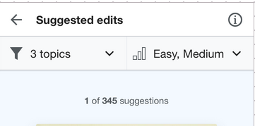
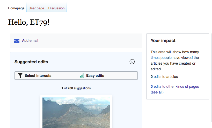
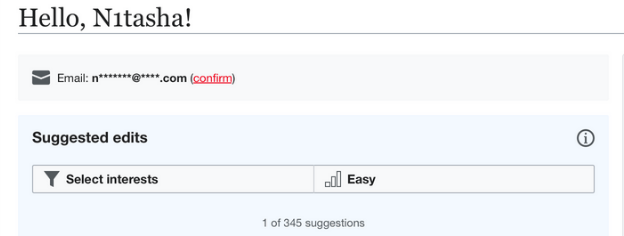
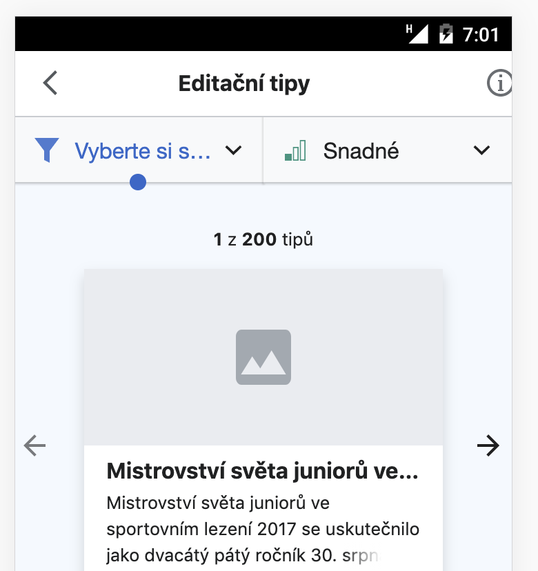
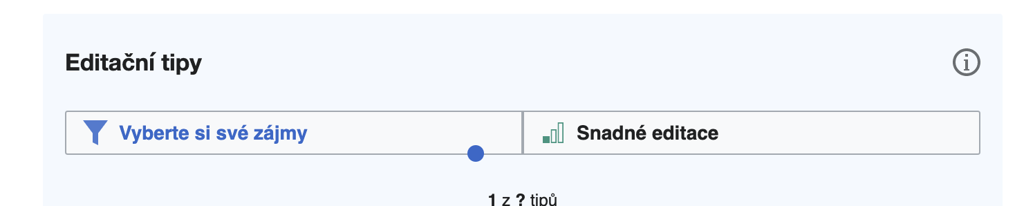
T250331: Variant tests: C-desktop and T250440: Variant tests: C-mobile call for the suggested edits module to have an (i) icon in the top right corner that opens the onboarding dialog (intro overlay and difficulty overlay).
Description
Description
Details
Details
Customize query in gerrit
| Status | Subtype | Assigned | Task | ||
|---|---|---|---|---|---|
| Resolved | MMiller_WMF | T238887 [EPIC] Growth: Homepage variant tests | |||
| Resolved | RHo | T246533 Variant tests: "initiation part 2" test (C vs. D) | |||
| Resolved | MMiller_WMF | T250331 Variant tests: C-desktop | |||
| Resolved | MMiller_WMF | T250440 Variant tests: C-mobile | |||
| Resolved | Tgr | T258020 Variant C: Info icon in suggested edits module |
Event Timeline
Comment Actions
Change 623650 had a related patch set uploaded (by Kosta Harlan; owner: Kosta Harlan):
[mediawiki/extensions/GrowthExperiments@master] Variation C: Add info icon to Suggested Edits module
Comment Actions
The icon is added in the patch, though it won't do anything until T258016: Variant C: onboarding is built out.
Comment Actions
Change 623650 merged by jenkins-bot:
[mediawiki/extensions/GrowthExperiments@master] Variation C: Add info icon to Suggested Edits module
Comment Actions
Moving into QA for the placement of the icon; we could QA the functionality as part of T258016
You can switch to variant C with this in your browser console:
new mw.Api().saveOption(
	'growthexperiments-homepage-variant',
	'C'
);
Then press "Enter" then reload the page.
Comment Actions
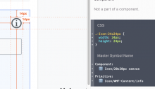
@RHo - If I understood the mockup correctly, there seems to be a difference between the desktop mockup where the mockup has the following:
-Icon-24x24px {
width: 24px;
height: 24px;
}
and betalabs has
growthexperiments-homepage-module-suggested-edits.growthexperiments-homepage-module-desktop .growthexperiments-homepage-module-header-icon .oo-ui-iconWidget {
    min-width: 30px;
    min-height: 30px;
}| betalabs with 30pxX30px | betalabs with 24pxX24px |
 |  |
 |  |
Note: The browser console snippet does not work for the SE overlay, so when you review the above, please return the task to QA column.
Comment Actions
Potentially relatedly I filed a regression where the icon sizes on mobile are too large T262018. Can you perhaps check and file a new regression (or else bug) that the Desktop version of SE is now using the old info icon:
Unexpected old icon on Desktop (CS betalabs):
Ahh apologies but this is actually because of the spec in Zeplin being presented confusingly @Etonkovidova. Due to a quirk in the way that the symbols file is setup in my Sketch design file, this class name "-Icon-24x24px" doesn't reflect the actual canvas size of the OOUI icon set, which is 20x20px.

So actually the betalabs is incorrect, but for the wrong reason because it is using the smaller legacy thin info icon instead of the new one we have on the mobile SE-edits card.
Expected icon and size:

Potentially relatedly I filed a regression where the icon sizes on mobile are too large T262018. Can you perhaps check and file a new regression (or else bug) that the Desktop version of SE is now using the old info icon:
Unexpected old icon on Desktop (CS betalabs):
and betalabs hasgrowthexperiments-homepage-module-suggested-edits.growthexperiments-homepage-module-desktop .growthexperiments-homepage-module-header-icon .oo-ui-iconWidget {
min-width: 30px;
min-height: 30px;
}
|betalabs with 30pxX30px | betalabs with 24pxX24px
|{F32244206}|{F32244209}
|{F32244217}|{F32244219}

Note: The browser console snippet does not work for the SE overlay, so when you review the above, please return the task to QA column.
Comment Actions
@RHo which label text should be used for the "i" icon when the user hovers (if on desktop), or for screen readers on mobile? Something like "More information about suggested edits"?
Comment Actions
Change 625889 had a related patch set uploaded (by Kosta Harlan; owner: Kosta Harlan):
[mediawiki/extensions/GrowthExperiments@master] [WIP] Suggested Edits: Variant C, add info icon
Comment Actions
Change 625889 merged by jenkins-bot:
[mediawiki/extensions/GrowthExperiments@master] Suggested Edits: Variant C, add info icon
Comment Actions
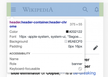
The specs for the info icon (20x20px) are in place:
.oo-ui-iconElement-icon {
    background-size: contain;
    background-position: center center;
    background-repeat: no-repeat;
    position: absolute;
    top: 0;
    min-width: 20px;
    width: 1.42857143em;
    min-height: 20px;
    height: 100%;
}
Mobile
| betalabs | mockup |
 |  |
Desktop - it seems that the darkness/boldness of the icon is not the same as in the mockup (I could be wrong though):
| betalabs | mockup |
 |  |
Comment Actions
Thanks @Etonkovidova for noticing, yes the Desktop is using the legacy info icon. @kostajh - would it be possible to use the same icon that is in Mobile on Desktop as well here? Thanks!
Comment Actions
It's the same icon, it's just sized differently on Vector/desktop than on Minerva/mobile.
.growthexperiments-homepage-module-header {
	.oo-ui-buttonWidget {
		// The circle in the icon is 15x15px normally, we want it to be 20px.
		// But the header already has a larger than usual font size (1.2em), correct for that
		font-size: ( 20 / 15 ) / 1.2em;
	}
}
That rule was added as part of the work done for T258016: Variant C: onboarding. If you remove the font-size override, then desktop looks the same as mobile:


Should we remove that font-size override on desktop?
Comment Actions
The info icon is definitely appearing differently between Mobile and Desktop when it is after the task type on CS Beta today, with Mobile showing the expected new icon.
Info icon after task type - correct new info icon on Mobile, old legacy icon on Desktop:
Desktop 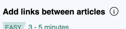 | links to the legacy svg data:image/svg+xml,%3Csvg xmlns=%22http://www.w3.org/2000/svg%22 width=%2220%22 height=%2220%22 viewBox=%220 0 20 20%22%3E%3Ctitle%3Einfo%3C/title%3E%3Cpath d=%22M9.5 16A6.61 6.61 0 013 9.5 6.61 6.61 0 019.5 3 6.61 6.61 0 0116 9.5 6.63 6.63 0 019.5 16zm0-14A7.5 7.5 0 1017 9.5 7.5 7.5 0 009.5 2zm.5 6v4.08h1V13H8.07v-.92H9V9H8V8zM9 6h1v1H9z%22/%3E%3C/svg%3E |
Mobile  | links to this new info icon svg: data:image/svg+xml,%3Csvg xmlns=%22http://www.w3.org/2000/svg%22 width=%2220%22 height=%2220%22%3E %3Cpath fill=%22%2354595D%22 d=%22M10 0c5.523 0 10 4.477 10 10s-4.477 10-10 10S0 15.523 0 10 4.477 0 10 0zm0 2a8 8 0 100 16 8 8 0 000-16zm1 6v7h1v1H8v-1h1V9H8V8h3zm0-4v2H9V4h2z%22/%3E %3C/svg%3E |
Info icon on SE header - both Mobile and Desktop are using the legacy info icon and both need to be updated.
Desktop 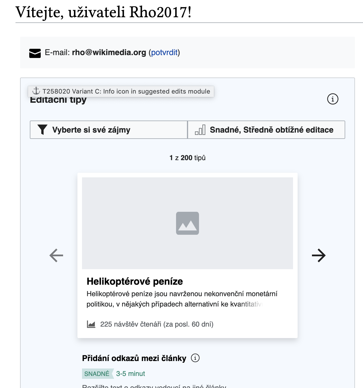 | links to the legacy svg data:image/svg+xml,%3Csvg xmlns=%22http://www.w3.org/2000/svg%22 width=%2220%22 height=%2220%22 viewBox=%220 0 20 20%22%3E%3Ctitle%3Einfo%3C/title%3E%3Cpath d=%22M9.5 16A6.61 6.61 0 013 9.5 6.61 6.61 0 019.5 3 6.61 6.61 0 0116 9.5 6.63 6.63 0 019.5 16zm0-14A7.5 7.5 0 1017 9.5 7.5 7.5 0 009.5 2zm.5 6v4.08h1V13H8.07v-.92H9V9H8V8zM9 6h1v1H9z%22/%3E%3C/svg%3E |
Mobile 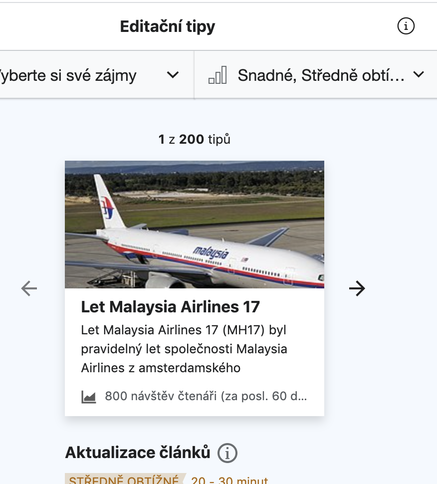 | links to the legacy svg data:image/svg+xml,%3Csvg xmlns=%22http://www.w3.org/2000/svg%22 width=%2220%22 height=%2220%22 viewBox=%220 0 20 20%22%3E%3Ctitle%3Einfo%3C/title%3E%3Cpath d=%22M9.5 16A6.61 6.61 0 013 9.5 6.61 6.61 0 019.5 3 6.61 6.61 0 0116 9.5 6.63 6.63 0 019.5 16zm0-14A7.5 7.5 0 1017 9.5 7.5 7.5 0 009.5 2zm.5 6v4.08h1V13H8.07v-.92H9V9H8V8zM9 6h1v1H9z%22/%3E%3C/svg%3E |
Comment Actions
Ah, I'm sorry I didn't realize this related to the custom info icon we added in T236854: [mobile] Newcomer tasks - UI issues with Suggested edits module and Difficulty overlay.
&.growthexperiments-homepage-module-mobile-overlay,
	&.growthexperiments-homepage-module-mobile-details {
		.suggested-edits-taskexplanation-additional-info {
			.oo-ui-iconElement .oo-ui-iconElement-icon {
				// Use an unpadded version of the info icon on mobile (T236854)
				/* @embed */
				background-image: url( ../../../images/info-unpadded.svg );
				max-width: 20px;
			}
		}
}
Comment Actions
Unassigning until I actually start work on that, someone else could claim in the meantime.
Comment Actions
Change 630989 had a related patch set uploaded (by Gergő Tisza; owner: Gergő Tisza):
[mediawiki/extensions/GrowthExperiments@master] Use custom info icon in variant C suggested edits header
Comment Actions
Change 631168 had a related patch set uploaded (by Kosta Harlan; owner: Kosta Harlan):
[mediawiki/extensions/GrowthExperiments@master] Use 20px size for info-unpadded icon on desktop/mobile
Comment Actions
Change 630989 merged by jenkins-bot:
[mediawiki/extensions/GrowthExperiments@master] Use custom info icon in variant C suggested edits header
Comment Actions
Change 631168 merged by jenkins-bot:
[mediawiki/extensions/GrowthExperiments@master] Use 20px size for info-unpadded icon on desktop/mobile
Comment Actions
Checked - the info icons seem to be in place
| Info icon on SE header | Should be | Result |
|---|---|---|
| Desktop | new | new |
| Mobile | new | new |
| Info icon after task type | Should be | Result |
|---|---|---|
| Desktop | old | old |
| Mobile | new | new |
New info icon on SE header
| desktop | mobile |
 |  |
Overall look:
| Desktop | Mobile |
 |  |
Comment Actions
Sorry I think I was unclear. We should only use the new icon everywhere, including after the Desktop task type.
Also, it looks as thought the mobile info icon should be further to the RHS of the dialog header than the mock (should be the same distance as the "<" chevron from the LHS edge of the header. )

This is fine.
Info icon after task type Should be Result Desktop old old Mobile new new
Actually Desktop should be new as well.
Overall look:
Desktop Mobile
Comment Actions
Change 632216 had a related patch set uploaded (by Kosta Harlan; owner: Kosta Harlan):
[mediawiki/extensions/GrowthExperiments@master] Use info-unpadded icon for task explanation widget
Comment Actions
Actually Desktop should be new as well.
Have uploaded a patch for this.
Also, it looks as thought the mobile info icon should be further to the RHS of the dialog header than the mock (should be the same distance as the "<" chevron from the LHS edge of the header. )
@RHo The default right margin for an OOUI icon as the action in a MobileFrontend overlay is 1em, see T218731: Regression: Mark all as read button in notifications overlay larger than header where this was introduced for the "mark all as read" icon used by Echo. We can override this and unset the margin but it will be inconsistent with the margin users see in the Echo overlay dialog:
Should we override the margin-right: 1em rule?
Comment Actions
Change 632216 merged by jenkins-bot:
[mediawiki/extensions/GrowthExperiments@master] Use info-unpadded icon for task explanation widget
Comment Actions
The new info icon (span class="oo-ui-iconElement-icon oo-ui-icon-info-unpadded") is everywhere now. Moving to Design Review to address the question in https://phabricator.wikimedia.org/T258020#6516995.
Comment Actions
Hi, I agree this is right for the mark all as read button on, but this is in a button, our "i" info icon should be like the frameless "X" icon on the LHS and be flush 1em (=16px) from the edge of the screen, as it is on the mobile header:

Comment Actions
@RHo and I talked about this on chat:
- set margin-right: 8px for the icon on mobile
- on desktop, shift the icon such that the right edge of it is flush with the right side of the filters (margin-right: -8px, or thereabouts) and set overflow: visible on the header so there is room for the box around the icon to display when hovering.
Comment Actions
Change 632722 had a related patch set uploaded (by Kosta Harlan; owner: Kosta Harlan):
[mediawiki/extensions/GrowthExperiments@master] SE Variant C: Info icon placement
Comment Actions
Change 632722 merged by jenkins-bot:
[mediawiki/extensions/GrowthExperiments@master] SE Variant C: Info icon placement
Comment Actions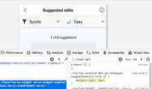
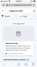
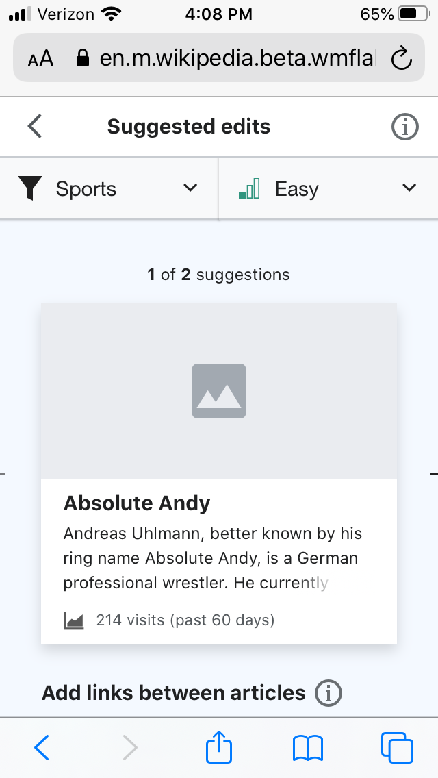
The code is in place - looks ok to me:

The following screenshot is from a real device - iPHone 6s iOS 13.7
Comment Actions
hi @Etonkividova - I am testing on CS Betalabs today (12-Oct) and on my Pixel 4 device it looks fine, but on the web browser I am consistently getting the incorrect icon placement on Mobile:
 | Inspector showing icon cut-off  | vs Left icon with inspector  |
Would you mind re-testing to see if you can reproduce? If not please move on to PM Review.
It looks fine on Desktop though.
Comment Actions

@RHo If you saw it on a real device - it's a real issue. Can you please file it with specific detail about device/OS etc. ?
Also, I filed T265427: [mobile] variant C - make transition between overlays smoother.
Yes, I saw the issue consistently when I was testing - did not report it since it was only in mobile browser emulator. The real device - iPhone 6s - did no display the issue. I checked again - the issue is present in Chrome and FF mobile browser emulators. Mobile emulator incorrectly display the info icon for all popular viewport widths (360-414).
@RHo If you saw it on a real device - it's a real issue. Can you please file it with specific detail about device/OS etc. ?
Also, I filed T265427: [mobile] variant C - make transition between overlays smoother.
Comment Actions
Thanks for checking again, I only saw this on the emulator, it looks fine in my Android device.
Also, I filed T265427: [mobile] variant C - make transition between overlays smoother.
Thank you! I left a comment on the task.