Page MenuHomePhabricator

[M] Improve QuickView accessibility features
Closed, ResolvedPublic

Description

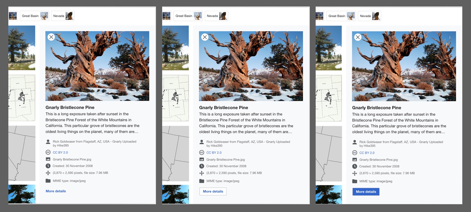
As part of the initial QuickView implementation, Eric did a lot of work to enable keyboard navigation to, from, and within the Quickview component. There are a few things we could do to make this even better:

  1. Better focus styles for close button. Currently, we're using the default outline, which looks a little awkward around the round button. @mwilliams is considering alternate designs here.
  2. The call to action button should be a link since it takes the user to a different page. We've considered adding a LinkButton base component, which is a link styled to look like a button. That said, it's typically not ideal for UX to show the user a button when they're actually clicking on a link, so perhaps we should reconsider
  3. Review the w3 spec on asides and see if we need to do anything else to ensure the QuickView UX works via screen reader

Acceptance criteria:

  • Close button has visually-hidden label or title and visible focus styles
  • More Details button is a link styled like a button
  • Code meets standards set in the w3 spec

COVID-19 Deployment Criteria

  • Can you roll back this change without lasting impact? - Yes
    1. A recovery plan is required as this will help identify our capacity for recovering from the failure
    2. THIS IS A KEY QUESTION, if you can’t answer it, you shouldn’t deploy
  • Is specialized knowledge required to support this change in production? If so, are there multiple people with this knowledge? - No specialized knowledge needed
  • Is there a way to increase confidence about the correctness of this change?
    1. Reviews (Design, Code, etc)
    2. Testing coverage (unit tests, integration tests)
    3. Manual testing (e.g. Beta, vagrant, docker)

Event Timeline

AnneT renamed this task from Improve keyboard navigation of media search quickview panel to Improve QuickView accessibility features.Aug 13 2020, 7:50 PM
AnneT updated the task description. (Show Details)
AnneT moved this task from Doing to Needs Design on the Structured-Data-Backlog (Current Work) board.
AnneT added a subscriber: mwilliams.

Better focus styles for close button. Currently, we're using the default outline, which looks a little awkward around the round button. @mwilliams is considering alternate designs here.

Currently it looks like we are making a square blue border around the X circle. Could we try a border around the circle to make it stand out a little less?

Screen Shot 2020-08-18 at 12.26.11 PM.png (1×1 px, 2 MB)

The call to action button should be a link since it takes the user to a different page. We've considered adding a LinkButton base component, which is a link styled to look like a button. That said, it's typically not ideal for UX to show the user a button when they're actually clicking on a link, so perhaps we should reconsider

Good point! Technically using a button here is incorrect but I really think this CTA needs to have a bit more visual weight and to be higher up in the layout hierarchy since this a new interaction type and don't want to hide how to get to the file page since that has been the behavior for many years.

That being said, a blue bold link style could get the job done. Here are a few options from text link to primary progressive. Initially we didn't want to use the blue button since we try to only have one blue button per page but I think the search button is in a very different context and we could use it if we wanted.

cta.jpg (684×1 px, 362 KB)

@mwilliams Thanks for weighing in and for the design options!

For the focus style: I think the round blue border is perfect.

For the "more details" link: I definitely see the reasoning for styling this like a primary button. @egardner, I think I'm going to just set up a one-off link that looks like a button rather than creating a new LinkButton component as we had previously discussed since this is a pattern we will rarely use.

CBogen renamed this task from Improve QuickView accessibility features to [M] Improve QuickView accessibility features.Aug 26 2020, 4:19 PM

Change 622658 had a related patch set uploaded (by Anne Tomasevich; owner: Anne Tomasevich):
[mediawiki/extensions/WikibaseMediaInfo@master] Improve QuickView accessibility

https://gerrit.wikimedia.org/r/622658

Change 622658 merged by jenkins-bot:
[mediawiki/extensions/WikibaseMediaInfo@master] Improve QuickView accessibility

https://gerrit.wikimedia.org/r/622658

@Etonkovidova, would you be willing to test this again on production? I was able to verify the close and more details buttons, but I don't have the right tools to verify w3 accessibility compliance.

@Etonkovidova, would you be willing to test this again on production? I was able to verify the close and more details buttons, but I don't have the right tools to verify w3 accessibility compliance.

Re-checking (wmf.8) - Images` filter page result has lower score - 86 than Audio, Video, and Categoriespages -94. The lower score is mainly based on "Image elements do not have [alt] attributes" warning.

Manually check seems to be ok; aside element is present for Quickview.

I'm marking this task as Resolved and add it to my follow-up list of tasks related to accessibility.